This teardown reveals that the Slidesgo 'AI App' template is a visually polished shell that lacks any actual AI substance. While it offers strong typography and layout patterns, it fails by omitting a problem slide, providing nonsensical placeholder metrics, and including 'meta' advice that should never reach an investor.
Key takeaways
- Delete all 'meta' slides that explain how to pitch; investors already know the genre and want to see your specific business.
- Ensure the deck actually addresses its title; this template lacks any mention of AI models, datasets, or inference costs.
- Use the 'one-number layout' for key metrics to ensure high-impact data isn't buried in text-heavy slides.
- Replace generic org charts with a team slide highlighting the specific track records of the founders and key hires.
- Always include a clear 'Ask' slide stating the amount being raised, valuation, and how many months of runway it provides.
What this deck actually is
The file is called "AI App Pitch Deck," it was created in PowerPoint on 1 October 2023, and it is not a pitch deck for an AI app. It is a free Slidesgo presentation template — a design shell with placeholder text — that has been downloaded by founders who searched for an AI pitch deck and assumed the name described the contents.
That distinction matters, because the way you read this file changes completely depending on what you think it is. If you treat it as a real deck, almost every criticism below reads as a failure. If you treat it as what it is — a layout kit with an instruction manual bolted to the front — then some of those same slides are genuinely useful, and the failures become a checklist of everything you still have to supply yourself.
The download is 41 pages. Twenty of them are the actual presentation, ending with a "Thanks!" slide on page 20. The remaining 21 pages are Slidesgo housekeeping: an icon pack, alternative resource links, licence terms for free and premium users, a fonts-and-colours reference sheet, editable timeline graphics and eight pages of icon libraries. None of that ever goes in front of an investor, and the number of decks that have been sent out with a "Fonts & colors used" page still attached is not zero.
Here is the sharpest thing about this template, and it is worth sitting with before the slide-by-slide: there is nothing about AI anywhere in it. Not a model, not a dataset, not an inference cost, not a moat, not a hallucination-rate benchmark, not a single sentence about why an AI product is different from any other software product. The word "AI" appears in the title and then never returns. If you are raising for an AI company and you start from this file, the template will not prompt you for one thing that an AI investor actually asks about.
Slide-by-slide walkthrough
Slide 1 — Title: "AI App Pitch Deck"
Dark purple background, the trailing-underscore motif that runs through the whole deck, and the subtitle "Here is where your presentation begins." Visually this is the strongest slide in the file: the typography (Trispace for display, Maven Pro for body) is confident, the palette (#0b0218, #8134ec, #ceabff, #4654f0) is coherent, and it does not look like the beige default that most founder decks open with.
What it does not have is a positioning line. A title slide should carry the company name and a one-sentence description a stranger could repeat correctly. This one carries a filename.
Slide 2 — "Content of this template"
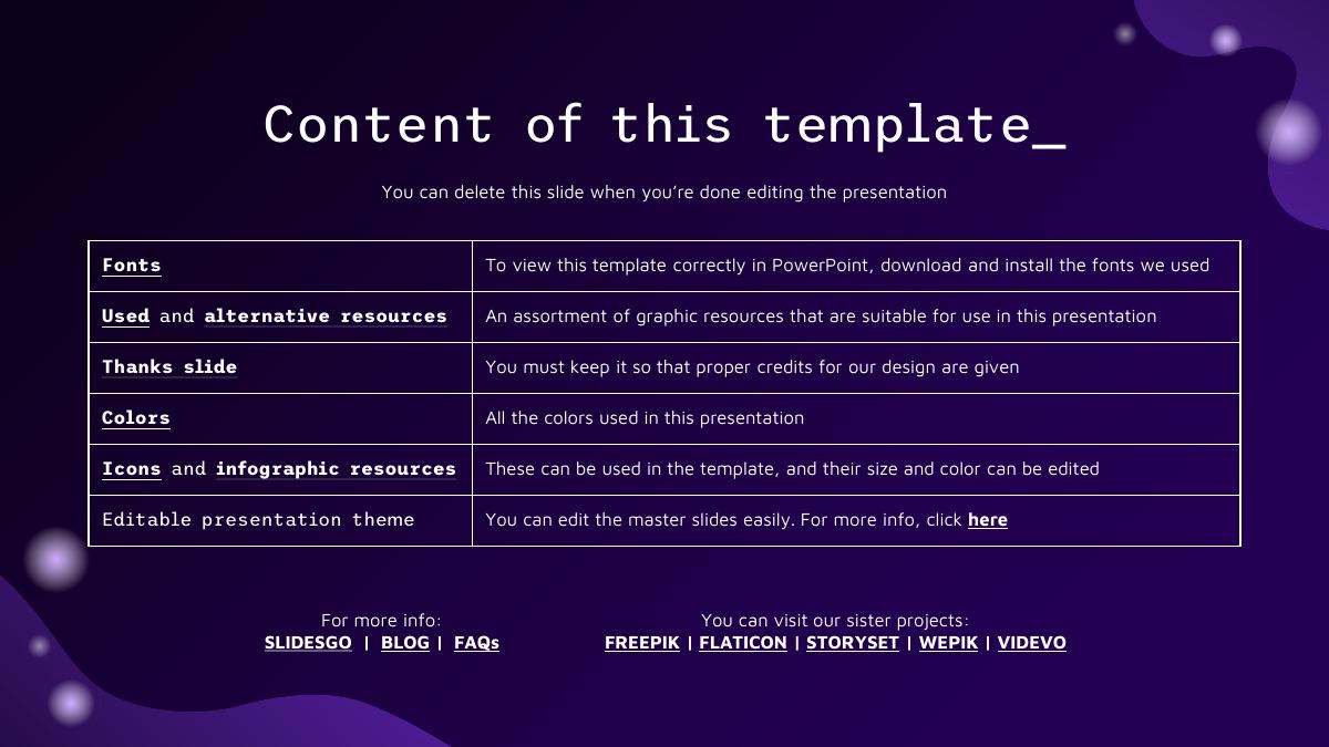
A Slidesgo index explaining the fonts, resources, thanks slide, colours and editable theme, with links to Slidesgo, Freepik, Flaticon, Storyset, Wepik and Videvo. The slide itself says "You can delete this slide when you're done editing the presentation." Delete it. It is the single clearest tell that a deck was downloaded rather than built.
Slide 3 — Table of contents
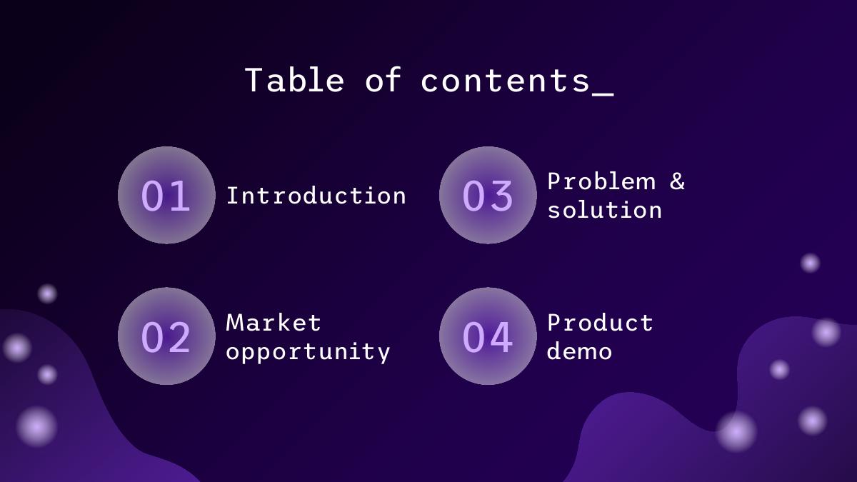
Four numbered sections: 01 Introduction, 02 Market opportunity, 03 Problem & solution, 04 Product demo. Two problems. First, the running order is wrong: problem should come before market, because market size is only meaningful once the reader knows whose pain you are sizing. Second, and more damaging, the deck promises four sections and then only ever delivers one divider — section 01. Sections 02, 03 and 04 are announced and never opened. A reader who is following the contents page loses the thread by slide 8.
Slide 4 — "What is a pitch deck?"
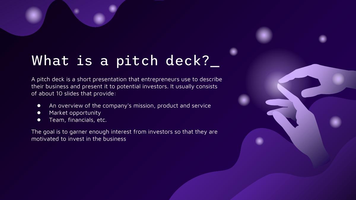
A definition slide: a pitch deck is a short presentation entrepreneurs use to describe their business to potential investors, usually around 10 slides, covering mission, product, market, team and financials. Useful advice, wrong document. This is a slide explaining the genre of the document it is inside of, in a file that will be sent to people who read several of these a day. Delete.
Slide 5 — Section divider: "01 Introduction"
The only divider in the deck. It is clean and it works — but a 20-slide deck with one divider is worse than a 20-slide deck with none, because the asymmetry makes the missing three feel like an error rather than a choice.
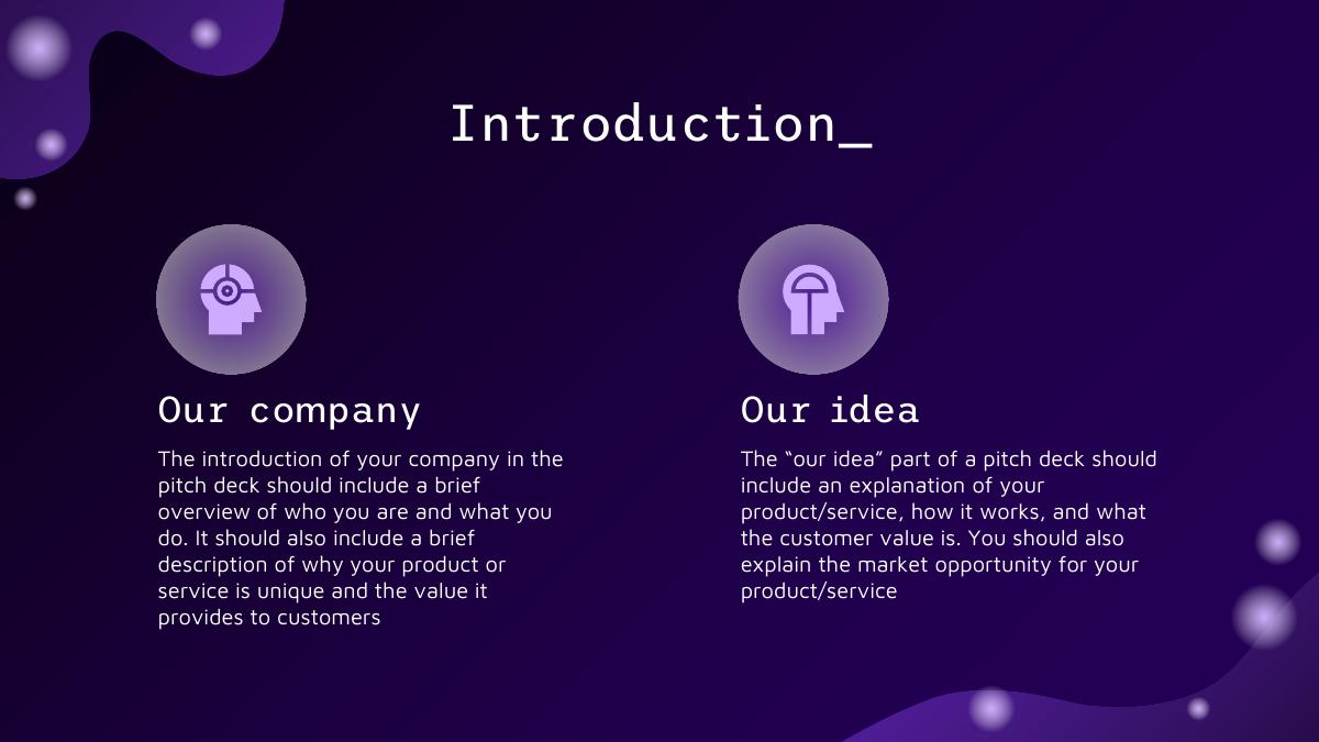
Slide 6 — "Introduction": Our company / Our idea
Two columns of instructions. The left says your introduction should include a brief overview of who you are and what you do, plus why your product is unique. The right says the "our idea" section should explain your product, how it works, the customer value, and the market opportunity.
This is a good prompt and a bad slide. As a prompt it is precise: it asks for four specific things. As a slide it is two paragraphs of grey text where an investor expects one sentence and a product screenshot. Keep the questions, throw away the layout.
Slide 7 — "Main ideas of a pitch deck": Presentation / Investors / Value
Three columns of meta-advice: presentations should be concise and visual; you should research investors and understand their preferences; the value of a product is what customers will pay for it. All true, all generic, none of it about your company. Second meta slide in four content slides.
Slide 8 — "Key ideas in market opportunity"
Four rows — research new markets, innovative solutions, stay ahead of trends, seasonal spikes — each with a sentence of business-school advice. This is the slide where the template quietly gives up on being a pitch deck. Section 02 was supposed to be "Market opportunity," and instead of a market model, the reader gets four tips about how to think about markets.
Note also the give-away in row four: "identify times of year when demand for certain products may spike, such as holidays or special occasions." That is retail advice, sitting in a template named after AI software.
Slide 9 — "Six recommendations"
A 2×3 grid: keep it simple, use visuals, keep it short, make it memorable, test and iterate, focus on main points. It is genuinely decent guidance — "avoid trying to cram in information in excess," "practice presenting your deck beforehand with friends or colleagues for feedback" — and it is the third meta slide in a row. By this point, five of the eight content slides so far have been about pitching rather than being a pitch.
Slide 10 — Big-number traction: 333,000 / 9h 55m 23s / 386,000 km
The best-designed slide in the deck and the first that behaves like a real pitch. Three stacked figures, each with a one-line caption: "333,000 — Users bought our product," "9h 55m 23s — Estimated delivery time per unit," "386,000 km — Avg. distance travelled by logistics team."
Steal the layout, notice the trap. Those three metrics describe a physical logistics business, not an app: units delivered, kilometres travelled by a team. Founders who drop their own numbers into this layout without rewriting the captions end up presenting a logistics dashboard for a software company. And "333,000 users bought our product" is the wrong shape of metric regardless — it has no time window, no growth rate, and no retention attached.
Slide 11 — "4,498,300,000"
One number, full bleed: "Number of users analyzed in our market research." Four and a half billion — more than half the planet — presented as your research sample. As a design pattern (one enormous figure, one caption, nothing else) it is excellent and worth copying. As a placeholder it teaches exactly the wrong instinct: that bigger numbers are more persuasive. In a real meeting, an unsourced 4.5 billion invites one question — "analysed how?" — and the answer is usually the end of the credibility.
Slide 12 — "Revenue by quarter"
Four quadrants: Q1 20%, Q2 20%, Q3 35%, Q4 25%, each with the caption "Highlight the main sources of revenue." The percentages sum to 100, so this is revenue mix by quarter, not growth — a chart that shows seasonality and hides the only thing an investor wants from a revenue slide, which is absolute dollars over time and the slope between them. A footnote instructs you to "follow the link in the graph to modify its data," which is the template speaking, not you.
If you keep one financial slide, make it monthly revenue in currency, twelve to eighteen months, with the y-axis labelled. Percentage-of-total charts are what founders reach for when the absolute numbers are small.
Slide 13 — "Competition comparison"
A six-by-five yes/no matrix: rows Mercury, Mars, Saturn, Venus, Jupiter, Earth; columns Team A through Team E. Every value is Yes or No.
The structure is right — feature rows, competitor columns — and the placeholder content shows the failure mode perfectly. Look at the pattern: Venus is Yes across all five, which in a real deck would mean every competitor already does the thing. The version founders build looks the opposite: a column of Yes down their own product and a wall of No everywhere else, which reads as unserious to anyone who knows the market. Six rows is also two too many; pick the three or four axes on which the buying decision is actually made and defend those.
Slide 14 — "Product infographics"
Six labelled blocks: Visuals ("showcase the design of your product"), Features ("what makes your product unique?"), Price ("share the cost and price with investors"), Users ("speak about the target audience"), Availability ("when is the product expected to be ready?"), Updates ("do you plan on updating it?").
This is the closest the template comes to section 04, "Product demo," and it is a set of six questions rather than a demo. The questions are good ones — pricing and availability are things founders routinely omit — but no arrangement of hexagons substitutes for one large screenshot of the product doing the thing.
Slide 15 — "Timeline of your presentation"
Eight steps describing the order in which you should present: overview, company introduction, customer pain points, how your product solves the problem, unique value proposition, market size and competition, financial needs and use of funds, call to action.
Read that list again. It is a better deck outline than the deck it sits in. The template tells you to identify pain points, explain your funding needs and close with a call to action — and then never provides a problem slide, an ask slide or a closing slide. This is the fourth meta slide, and it is the one that most clearly indicts the rest of the file.
Slide 16 — "Organizational chart"
A four-tier hierarchy: Sun (CEO), then Jupiter and Neptune as department heads, then Venus, Mars, Ceres and Earth as managers, then Mercury, Uranus, Titan, Saturn and Pluto as employees. Twelve boxes, planet names throughout.
This is the wrong artefact for a fundraise. Investors at seed and Series A are underwriting three or four specific people, not a reporting structure: who has built this before, who has sold into this market, why this pair is the right pair for this problem. An org chart with twelve boxes signals that headcount is the achievement. If you are past 60 people, an org chart belongs in the data room, not on slide 16.
Slide 17 — "Market size overview"
A three-ring model: outer circle $75M, middle circle $55M, inner circle $35M, with correct definitions attached — total market, target market, and the portion currently captured.
The definitions are sound and the concentric structure is the right way to present TAM, SAM and SOM. The numbers are the problem. A $75M total addressable market is, for almost any venture-backed software company, a disqualifying figure — it is a good small business and a bad venture return. And a claimed $35M already captured out of a $75M total says you own 47% of your own market with no revenue evidence anywhere else in the deck. Placeholder numbers that do not reconcile with each other train founders to keep numbers that do not reconcile with each other.
Slide 18 — "Roadmap infographics"
A Gantt chart, January through May, with five rows labelled Task 01 to Task 05, plus two team blurbs underneath. Tasks, not milestones. The distinction is the whole point of a roadmap slide: "Task 03" tells an investor nothing, while "close design partner #3," "SOC 2 Type I," "$40k MRR" tell them what the money buys and when they can check whether you were right.
Slide 19 — "KPI dashboard"
Three percentages — 70% ("development was mostly good in the beginning"), 45% ("the company faced some difficulties halfway"), 100% ("bugs were fixed and the final product is ready") — beside a table listing Jupiter at 50% / 2,000,000 and Saturn at 20% / 50,000 under two unnamed columns.
Nothing here is a KPI. Three of the figures are a sentiment narrative about a development cycle, and the table has unlabelled columns whose values are 40× apart with no unit. This is the last content slide before the close, and it is where a real deck puts the metrics that justify the ask — retention, payback, pipeline. The template puts a mood ring.
Slide 20 — "Thanks!"
"Do you have any questions?" with placeholder contact details (youremail@freepik.com, +91 620 421 838, yourwebsite.com) and the Slidesgo credits block. Two live risks here. First, decks go out every week with the Freepik email still on the final slide. Second, the credits line is a licence condition, not decoration — under the free tier you must keep the attribution.
More structurally: this is a thank-you slide where the ask should be. Nowhere in 20 slides does the deck state an amount, a valuation, a use of funds or a runway.
Slides 21–41 — Slidesgo resources and licence terms
Icon pack, alternative vector and photo resources, instructions for free users, instructions for premium users, the fonts-and-colours reference (Trispace, Maven Pro, and the seven-colour palette), Storyset illustrations, editable timeline graphics and eight pages of icon sets across nine categories. Reference material for the person editing the file. Delete all 21 pages before the deck leaves your laptop.
What this deck does better than most startup pitch decks
Typography discipline. Two fonts, one display and one body, applied consistently across 20 slides. Most founder decks use four typefaces and three of them by accident. · A committed palette. Seven defined colours anchored on near-black #0b0218 with violet accents. It is distinctive without being loud, and the contrast holds up when projected in a bright room. · The one-number layout. Slides 10 and 11 are the pattern most decks get wrong: a single figure at display size with one short caption and nothing competing for attention. Copy this exactly for your two strongest metrics. · Correct market-size vocabulary. Slide 17 defines total, target and captured market properly and nests them visually. The definitions are more rigorous than what most seed decks put on the same slide. · Sensible slide inventory. Traction, revenue, competition, product, team, market, roadmap and KPIs — as a checklist of what a deck should contain, the template is close to complete. · An honest presentation outline. The eight steps on slide 15 are a better narrative spine than most decks follow, including the instruction to close on a specific call to action.
Where this deck would fail in an investor meeting
No ask. Twenty slides, zero mention of how much is being raised, at what stage, for what, or for how many months of runway. · No problem. Section 03 is titled "Problem & solution" in the contents and never appears. No customer, no pain, no cost of the status quo. · No AI. A template named "AI App" that never mentions a model, training data, inference economics, evaluation, or the defensibility question every AI investor opens with. · Five meta slides. Slides 2, 4, 7, 9 and 15 talk about how to pitch instead of pitching. That is a quarter of the deck spent on the reader's education rather than your company. · Structural promises broken. Four sections announced on slide 3; one divider delivered. · Numbers that do not reconcile. A $75M total market with $35M already captured, a 4.5-billion-person research sample, and a KPI table with unlabelled columns. · An org chart instead of a team slide. Twelve boxes of hierarchy where investors want three names and their track records. · Tasks instead of milestones. The roadmap shows activity, not the checkpoints the round is supposed to buy. · Live placeholder contact details. A Freepik email address and an unrelated phone number on the final slide.
Template deck vs. investor deck
Opening slide Deck title, "here is where your presentation begins" Company name plus a one-line description a stranger can repeat
Problem Named in the contents, never appears One specific customer, one quantified pain
Product Six labelled prompts on an infographic One large screenshot of the product doing the job
Traction Placeholder logistics metrics with no time window One chart, monthly, with the y-axis labelled in currency or users
Market $75M / $55M / $35M rings that do not reconcile Bottom-up sizing from price × reachable customers, sourced
Competition Six-row yes/no matrix with planet names Three or four axes that decide the actual purchase
Team Twelve-box org chart, four tiers Three to five people and why each is unfair advantage here
Roadmap Task 01 to Task 05 across five months Milestones tied to what the round funds
Close "Thanks! Do you have any questions?" The ask: amount, use of funds, runway, next step
How you would rebuild this into a deck that raises
Delete 26 of the 41 pages. Cut all 21 resource pages (21–41) and the five meta slides (2, 4, 7, 9, 15). You are left with roughly 14 slides of structure, which is close to the right length. · Add the problem slide the contents promised. One customer, one workflow, the time or money the status quo costs them, and where that number comes from. · Turn slide 14 into a real product slide. One screenshot, one caption saying what the user does and what changes. Move price, availability and roadmap answers into the slides that already exist for them. · Make it about AI, if it is an AI company. Add what the model does that a rules engine cannot, what proprietary data or feedback loop compounds, your gross margin after inference cost, and how you evaluate output quality. None of that is in the template and all of it comes up in the meeting. · Rewrite traction on the slide 10/11 layout. Keep the one-number design; replace kilometres and units with your two defensible metrics, each with a time window attached. · Replace the percentage revenue chart with dollars over time. Monthly, twelve to eighteen months, absolute values, one line. · Rebuild the market rings bottom-up. Price × reachable customers, with the arithmetic on the slide. If the honest total is $75M, this is not a venture business, and the deck should not pretend otherwise. · Swap the org chart for founders. Three to five photographs, one line each on what makes that person the right person for this specific problem. · Convert tasks to milestones. Each roadmap row becomes something an investor can verify: a revenue number, a certification, a named customer, a hire. · End on the ask, not on thanks. Amount, instrument, use of funds in three buckets, months of runway, and the specific next step you want from the reader. · Deal with the licence. Free-tier use requires keeping the Slidesgo attribution. Either buy the premium licence or accept a credit line on a deck you are using to raise money.
The transferable lesson
The reason this template is worth studying is not that it is bad. The design is better than most decks founders build from scratch, and the slide inventory is close to right. It fails for a subtler reason: it supplies the container and none of the argument. Twenty slides of layout, five of them explaining how to pitch, and not one sentence that could only be true of one company.
That is the same failure mode as the majority of real decks that get passed on. Not ugly, not disorganised — just interchangeable. Swap the logo and the deck could belong to any of three hundred companies raising the same round. Investors reject on that quickly, and they rarely say so out loud, which is why founders keep sending the same deck into silence.
The test is simple. Go through your own deck slide by slide and, for each one, ask whether a competitor could put their name on it unchanged. Every slide that survives that swap is a slide doing no work. On this template, all 20 of them survive it — which is exactly what a template is, and exactly what your deck must not be.
Frequently asked questions
- Is the AI App pitch deck a real startup deck?
- No. It is a free presentation template published by Slidesgo and created in PowerPoint on 1 October 2023. Every figure in it, including 333,000 users, 4,498,300,000 users analysed and a $75M market, is placeholder content that shipped with the file. There is no company, round or outcome behind it, so it should be read as an instruction set rather than a pitch.
- Does the AI App pitch deck template cover anything about AI?
- No. Despite the name, the word AI appears only in the title. There is no slide on the model, the training data, inference economics, evaluation and hallucination rates, or why the product is defensible against a general-purpose model. Founders raising for an AI company must add all of that themselves.
- How many slides are in the AI App pitch deck template?
- The download is 41 pages. The presentation itself ends on page 20 with a Thanks slide; pages 21 to 41 are Slidesgo housekeeping — icon packs, alternative resources, licence terms for free and premium users, and a fonts-and-colours reference. Of the 20 presentation slides, roughly 14 carry usable structure once the meta slides are removed.
- Which slides should founders delete before pitching?
- Delete the Content of this template slide, the What is a pitch deck slide, the Main ideas of a pitch deck slide, the Six recommendations grid and the Timeline of your presentation slide, plus all 21 resource pages at the back. All five talk about pitching instead of pitching, and leaving any of them in signals the file was never read end to end.
- What is missing from the AI App pitch deck template?
- The ask and the problem. No slide states an amount raised, a valuation, a use of funds or a runway, and the section titled Problem and solution on the contents page never actually appears. The deck also has no closing call to action, despite one of its own advice slides instructing founders to end on one.
- Can you use Slidesgo pitch deck templates commercially?
- Slidesgo allows free users to modify the template and use it for personal and commercial projects provided the attribution slide is kept. Premium users may remove the attribution. Neither tier allows reselling, sublicensing or redistributing the template. For a fundraise, either buy the licence or accept a Freepik credit line on your final slide.