Bellwethr is a software platform designed to solve the 'cancellation friction' problem in the subscription economy. The deck highlights a significant gap in the market: most companies either 'hold customers hostage' by making cancellation difficult (e.g., the Wall Street Journal or Planet Fitness) or 'surrender' by letting customers leave without gathering data or offering alternatives. Bellwethr proposes a middle path using a 'Retention Engine' powered by machine learning. The product allows companies to build dynamic offboarding flows that ask users why they are leaving and then serve perso…
Key takeaways
- The 'cancellation flow' is an underserved revenue opportunity for subscription businesses.
- Traditional retention methods (phone calls, certified letters) damage brand reputation and ignore customer preferences.
- Bellwethr uses a 'Smart Resolution' framework: Discover -> Resolve -> Optimize.
- The platform employs a ranking system (1-10) to balance customer satisfaction with business value (preventing 'gaming').
- Dynamic decisioning allows different users to see different retention offers based on their specific reasons for leaving.
- The product includes a configuration dashboard for managing plans, rewards, and offboarding experiences without technical intervention.
What this deck actually is
The Bellwethr deck is a mid-stage product pitch, likely for a Seed or Series A round, focusing on a B2B SaaS "Retention Engine." The core thesis is that the "cancellation flow" is a neglected goldmine for revenue preservation. While many startups focus on acquisition, Bellwethr positions itself as the automated solution for the "exit" phase of the customer lifecycle, using machine learning to offer personalized alternatives to cancellation.
The single most important finding in this deck is its focus on "Smarter Resolution" through dynamic decisioning . Rather than just offering a static "Cancel" button or a "Call to Cancel" hurdle, Bellwethr proposes a software layer that analyzes user intent and serves specific "intermediates" (like pauses, downgrades, or discounts) based on a value-ranking system. It moves the conversation from customer support to automated revenue operations.
Slide-by-slide walkthrough
Slide 1: Title Slide
The opening slide introduces Bellwethr with a broad value proposition: "Retaining Existing Customers & Winning Back Former Customers." The imagery is standard corporate stock—people looking at a laptop—which provides little context for the specific technical nature of the product.
Investors look for immediate clarity on what the company does. The title is functional but leans heavily into a general business outcome rather than a specific product category. The subtitle "Winning Back Former Customers" hints at a secondary feature (re-engagement) that isn't as heavily emphasized in the later product screenshots, which focus primarily on the offboarding flow.
A stronger version of this slide would include a punchy one-sentence tagline that defines Bellwethr's category, such as "The Machine Learning Platform for Automated Customer Retention." This would immediately signal that this is a technical solution rather than a consultancy or agency.
Slide 2: Consumers Have The Power
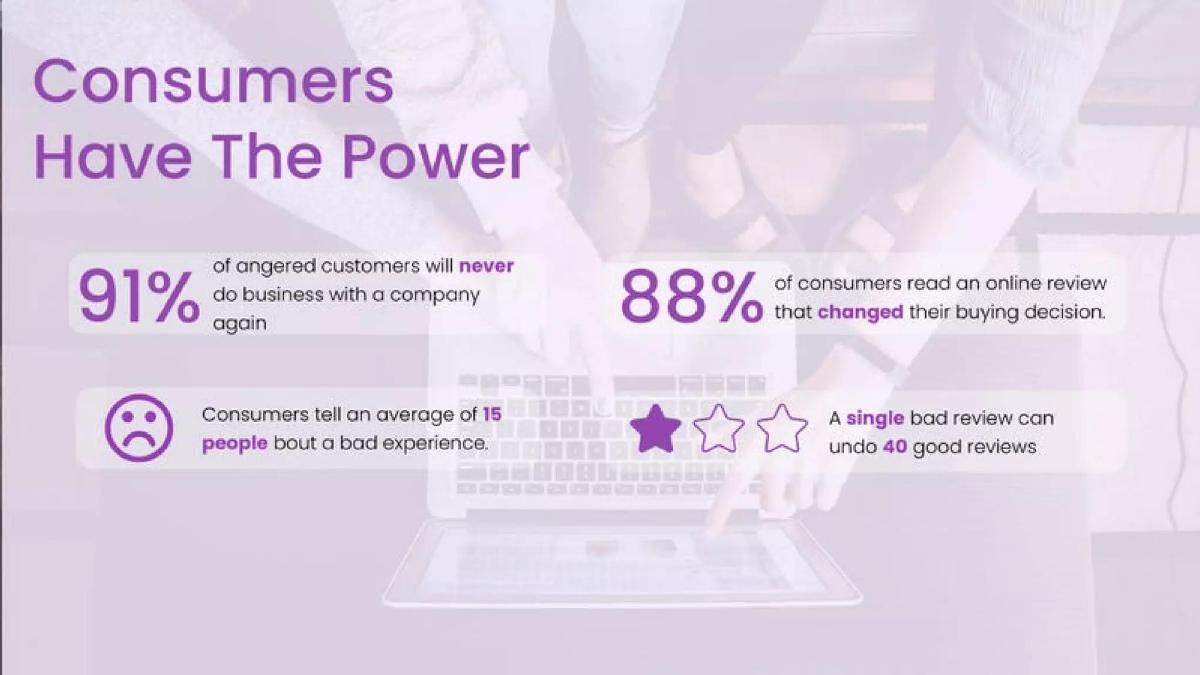
This slide establishes the stakes using four key statistics: 91% of angered customers never return, 88% are influenced by online reviews, a bad experience is shared with 15 people, and one bad review offsets 40 good ones. It uses icons like sad faces and stars to emphasize the emotional and reputational impact of poor service.
This is a classic "Problem" slide, but it focuses on the "cost of a bad experience" rather than the "inefficiency of current retention methods." Investors read this as a justification for why customer experience matters, though it feels slightly generic. The statistics are powerful but are common knowledge in the CX (Customer Experience) space.
The strongest version of this slide would link these macro-statistics directly to the "cancellation friction" problem the deck addresses later. Instead of "angered customers," it could focus on "customers attempting to cancel," bridging the gap between general dissatisfaction and the specific moment Bellwethr intervenes.
Slide 3: Customer Success Is the New Growth Driver
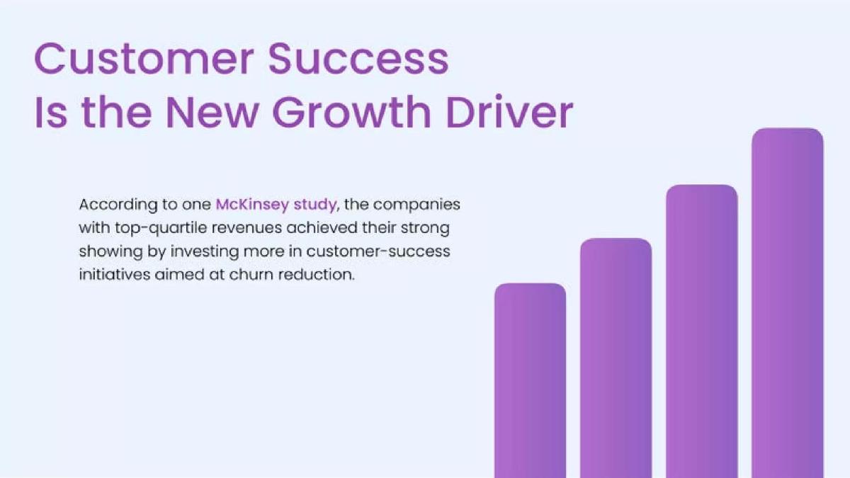
Bellwethr cites a McKinsey study stating that top-quartile revenue companies invest more in customer success aimed at churn reduction. A purple bar chart visually represents this growth, though the axes are not labeled with specific units or timeframes.
The slide attempts to validate the market opportunity by appealing to authority (McKinsey). The chart is purely illustrative; without specific data points or a source for the chart itself, it serves as a visual metaphor for "more investment equals more growth."
To improve this, the deck should provide a specific CAGR (Compound Annual Growth Rate) for the retention software market or cite a metric that correlates churn reduction directly to valuation multiples. Providing a source for the bar chart would also add necessary credibility.
Slide 4: Climbing Customer Lifetime Value (CLV)
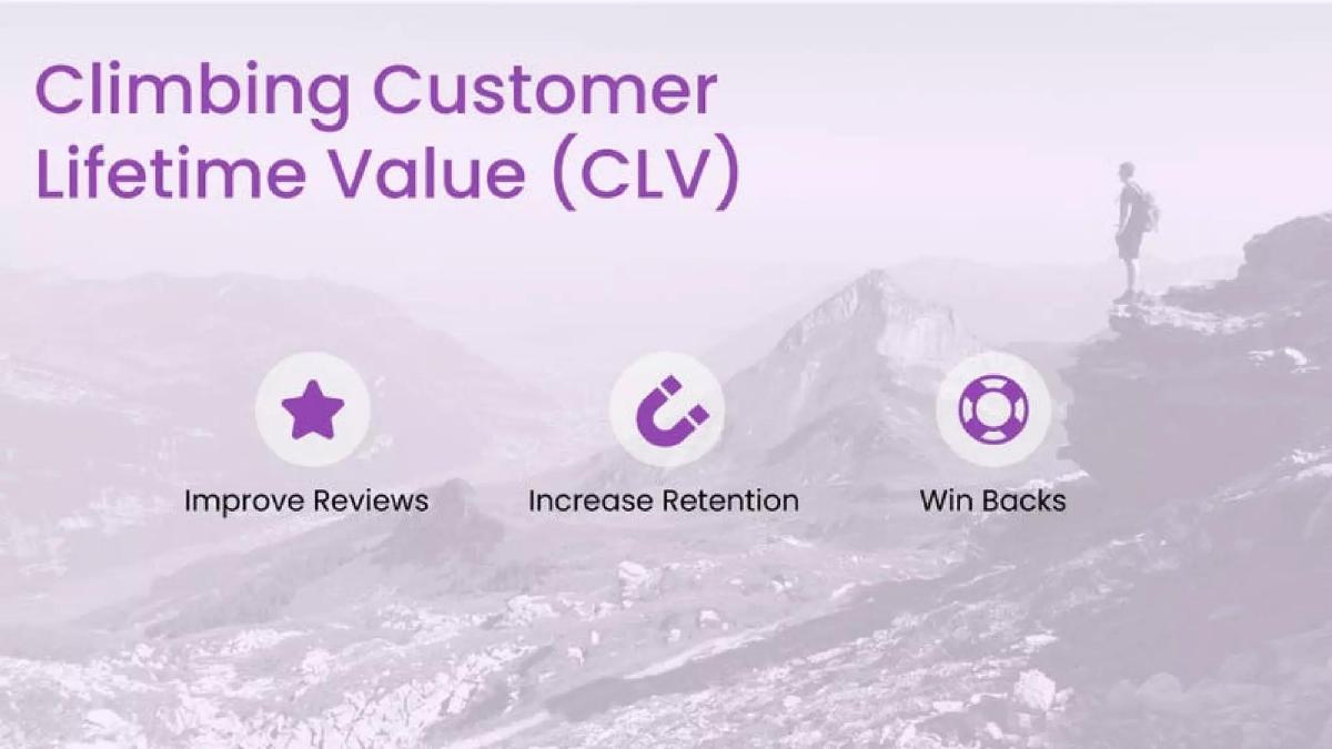
Using icons for a star (Improve Reviews), a magnet (Increase Retention), and a life preserver (Win Backs), this slide defines the three pillars of Bellwethr's intended impact on CLV. The background photo of a person on a mountain peak reinforces the "climbing" metaphor.
This slide acts as a bridge between the problem and the solution. It tells the investor how the company plans to move the needle. However, it remains at a very high level, describing "what" will happen without yet explaining the "how."
A stronger version would define which of these three pillars is the primary product focus. By trying to claim all three—reviews, retention, and win-backs—the deck risks appearing unfocused. The subsequent slides focus almost exclusively on retention during the cancellation flow, so this slide should perhaps prioritize that icon.
Slide 5: Start At The End: Reverse Engineering
This slide introduces a pivotal shift in the narrative: viewing the "exit process" as an opportunity rather than a negative. It uses a literal "EXIT" door image to ground the concept of reverse engineering the customer journey.
This is the "Insight" slide. It challenges the standard business assumption that an exiting customer is a lost cause. Investors appreciate these kinds of reframings because they suggest the founder has found a "wedge" in a crowded market—in this case, the offboarding flow.
To make this stronger, Bellwethr could quantify the volume of "lost" data or revenue that occurs during these unoptimized exits. For example, "Every year, companies lose $X billion because they treat the exit as a door instead of a conversation."
Slide 6: Holding Customers Hostage
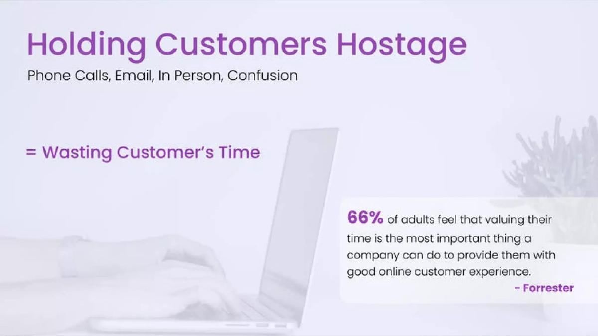
The slide attacks the current status quo: making it difficult to cancel via phone calls, email, or in-person visits. It cites Forrester, stating 66% of adults value their time above all else in customer experience.
This identifies the "Enemy." By labeling traditional retention tactics as "holding customers hostage," Bellwethr positions itself as the modern, consumer-friendly alternative. This creates a moral and logical imperative for a digital-first solution.
The slide is effective but could be improved by showing the specific cost to the business of these old methods—such as the high cost of call center labor or the "hidden" cost of brand damage from social media backlash.
Slide 7: Wall Street Journal Hostage Holding
This slide provides social proof of the "Hostage" problem through four Twitter screenshots directed at the Wall Street Journal. Users complain about being unable to cancel online and being forced to call in. One user calls the policy "sleezy."
This is a highly effective slide because it shows real-world frustration and brand damage. It moves the problem from the theoretical to the visceral. It highlights that even prestigious brands like the WSJ are failing at this specific touchpoint.
The strongest version of this slide would include a "before and after" implication. While it shows the "before" (the mess), it doesn't yet show how Bellwethr would have saved these specific customers. A small caption suggesting how a digital flow could have saved the "half price" offer mentioned in the tweet would be powerful.
Slide 8: Planet Fitness Hostage Holding
Following the WSJ example, this slide uses Planet Fitness to illustrate the problem in the fitness sector. It shows a Quora answer explaining that you must send a "certified letter" or go in person to cancel. A YouTube thumbnail titled "THIS IS SO CRAZY" adds to the sense of consumer outrage.
By using two very different industries (Media and Fitness), Bellwethr demonstrates that this is a horizontal problem affecting all subscription-based businesses. It reinforces the scale of the TAM (Total Addressable Market).
To improve this, the deck could add a brief bullet point on the "regulatory risk" these companies face (e.g., the FTC's "click-to-cancel" initiatives), which would add a sense of urgency for businesses to adopt a software solution like Bellwethr.
Slide 9: Surrender
This slide contrasts the "Hostage" model with the "Surrender" model: companies that just let people leave without any attempt to keep them or gather data. It lists "No attempt at resolution" and "No information as to what went wrong" as the core failings.
This defines the other side of the failed spectrum. If Slide 6-8 were about "too much friction," Slide 9 is about "missed opportunity." It sets up a middle path: the "Smart Resolution."
A stronger version of this slide would use a screenshot of a boring, standard "Your account has been cancelled" page. This would make the "Surrender" concept feel as real as the "Hostage" concept shown in the previous slides.
Slide 10: Smarter Resolution
Bellwethr proposes a three-step framework: 1. Discovering what went wrong, 2. Working to resolve the issue, 3. Not wasting time if no resolution is possible. It’s a logical, balanced approach to offboarding.
This is the "Solution" slide. It sounds reasonable and professional. However, it is still conceptual. Investors are likely thinking, "How does the software actually do this?" at this point in the deck.
The slide should include a mention of "Automation" or "AI" here to distinguish the service from a manual consulting framework. Without that, it sounds like a set of best practices rather than a scalable software product.
Slide 11: Netflix Resolution and Options
Bellwethr shows a screenshot of Netflix's cancellation flow, which offers a downgrade to a basic plan ($8.99/mo) and reminds the user their data will be saved for 10 months. This is presented as an example of a "Smart" experience.
This slide acts as a benchmark. It tells the investor, "We want to give every company the same sophisticated tools that Netflix uses." It validates the strategy by showing that a market leader already does this.
The deck should explicitly state whether Bellwethr provides these types of screens or if this is just an example of a good flow. It’s slightly ambiguous if this is the product UI or a competitor's example.
Slide 12: Ipsy Improved Cancellation Experience
Similar to the Netflix slide, this showcases Ipsy's flow: offering flexibility (pausing), listening to reasons for leaving, communicating consequences (lost benefits), and asking for feedback. It includes a link to a UX design article for further reading.
This further reinforces the "industry best practice" narrative. It breaks down the components of a successful flow: "Meaningful offers," "Account pause," and "Clear path." It shows Bellwethr understands the mechanics of retention psychology.
The slide is a bit text-heavy. The four points could be more concisely phrased to focus on the outcomes of these steps (e.g., "50% of users chose a pause over a cancellation") rather than just describing the steps themselves.
Slide 13: Smart Resolution (The Timeline)
This slide introduces a four-step process map: "Cancel Account" -> "Understand Why" -> "Attempt to Resolve" -> "Easy Cancel." It lists specific categories like "Unhappy with product," "Price," and "Frequency," along with resolutions like "Discounts," "Pause," and "Different product."
This is the first look at the product's logic. It shows how Bellwethr categorizes churn reasons and maps them to specific "Intermediates." It demonstrates a systematic approach to what is usually a chaotic process.
The strongest version of this slide would show how these paths are selected. Is it a hard-coded decision tree, or is there an engine deciding this? The phrase "Smart Resolution" suggests an engine, but the slide shows a static map.
Slide 14: Smart Resolution (Flow Diagram)
This is a more detailed version of the previous slide, showing a checklist of reasons (Too expensive, Technical issues, etc.) and arrows pointing to specific outcomes like "Customer Support," "Discount," or "Pause Account."
This slide clarifies the "logic engine" behind the product. It’s a good visualization of the user journey. It makes the abstract concept of "Smart Resolution" feel like a tangible piece of software architecture.
To improve this, Bellwethr should add "Success Rates" to the arrows. For example, "40% of 'Too Expensive' users stay when offered a 20% discount." This would prove the logic isn't just theoretical but is based on effective interventions.
Slide 15: Dynamic Experiences
This is a critical slide. It introduces "Machine learning models" that optimize for the experience most likely to resolve. It shows a split-path (A/B test style) where "User 1" gets a 2-month pause while "User 2" gets a 1-month pause, leading to different confirmation summaries.
This is the "Secret Sauce." It moves the product from a "Rules Engine" to a "Learning Engine." Investors look for this kind of scalability. It suggests that the product gets better over time and requires less manual configuration from the customer.
The slide would be stronger if it explained why User 1 got a different offer than User 2. What data points (tenure, usage, LTV) drove that machine learning decision? Clarifying the inputs would make the "Machine Learning" claim more credible.
Slide 16: Retention Engine Bellwethr
The slide summarizes the product cycle in four steps: 1. Gather Data, 2. Attempt to Resolve, 3. Optimize, 4. Win Back. It shows a laptop dashboard and a smartphone "Yay!" success screen.
This is the "Product Reveal." After 15 slides of theory and examples, we see the actual interface. The UI looks clean and professional, focusing on a dashboard that presumably tracks these interventions.
The "Win Back" step (Step 4) is finally mentioned again here, but the slide doesn't explain how it works. Is it an email sequence? Retargeting ads? The deck is very strong on offboarding but vague on the "Win Back" portion of its title promise.
Slide 17: Prevent Gaming Of System
This slide addresses a common investor concern: "Will users just click cancel to get a discount?" It shows a ranking system (1-10) where "Switch Products" is ranked high (9) and "Free Month" is ranked low (1).
This shows high "Founder Empathy" for the business owner. It proves the team has thought through the secondary consequences of their product. By ranking alternatives, they show how they protect the client's margins.
A stronger version would explicitly state that the ML model optimizes for Long Term Value (LTV) rather than just "Resolution." A resolution that gives away the product for free forever is a bad business outcome, and this slide begins to address that.
Slide 18: Optimize Based On Outcomes
Similar to the previous slide, this one ranks "messaging" based on business value. "News / Product Info" is ranked 10, while "Free" is ranked 1. It’s essentially a prioritization list for the content served during the offboarding flow.
This slide feels a bit redundant following Slide 17. Both focus on ranking options from 1-10. It suggests the software has a "Weighting" system that the user can configure.
This slide could be merged with Slide 17 to make room for a "Case Study" or "Metrics" slide. Showing a single real-world result from a pilot would be more powerful than two slides of hypothetical rankings.
Slide 19: Settings (User Journey)
This slide uses five screenshots to show a cohesive user journey: Why are you leaving? -> Would you like to pause? -> We’re not ready to see you leave (30% off)! -> Goodbye summary (showing the recipes and followers the user will lose).
This is the most effective "Solution" slide in the deck. It shows the "Loss Aversion" tactic in the final screen ("23K+ Latest Recipes..."), which is a powerful psychological trigger in retention. It makes the product feel very real and very "smart."
The transition between "Pause" and "30% off" seems a bit aggressive. The slide would be better if it showed this as a "Choice" or a "Sequence" based on user behavior rather than just a linear stack of screens.
Slide 20: Performance Dashboard
A screenshot of the Bellwethr backend titled "Offboarding Experience Performance." It lists different plans (Bronze, Silver, Platinum) and "Account Pause Options" with toggles to "Active" or "Deactivate."
This proves the product is a "No-Code" or "Low-Code" platform. A business user can manage their retention strategy without calling a developer. This is a key selling point for B2B SaaS.
The "Performance" part of the title is missing from the screenshot. The UI shown is a "Configuration" screen, not a "Performance" dashboard. An investor wants to see a chart showing "Churn before Bellwethr" vs. "Churn after Bellwethr."
Slide 21: Configuration Interface
This shows the granular control a user has over an "Alternative." For the "Bronze Chef Plan," the user can set a description, price, URL, and a "Reward (Value 1-10)."
This slide confirms how the ranking system from Slides 17 and 18 is actually implemented. The user assigns a "Value" to each offer, and the system presumably uses that as an input for its optimization model.
The "Reward (Value 1-10)" field is a bit cryptic. Does "10" mean it's good for the customer or good for the business? Clearer labeling in the UI would make the product feel more intuitive.
Slide 22: Partners
The final slide shows logos for Techstars, Nvidia Inception Program, and the Open Data Institute (ODI). No other text or "Ask" is present.
This provides necessary "Credibility." Being part of Techstars and the Nvidia program suggests the company has passed some level of professional and technical vetting. However, the deck ends abruptly.
The strongest version of this slide would include a "Call to Action" or an "Ask." How much are they raising? What is the timeline? Without an "Ask" slide, the deck feels like a product demo rather than a fundraising tool.
Concrete fixes in priority order
Add a "Results/Metrics" slide: The deck is entirely theoretical and instructional. It needs data from a pilot or early customer showing a specific percentage reduction in churn (e.g., "Reduced churn by 15% for Client X"). · Clarify the "Ask": The deck ends without stating how much capital is being raised or what it will be used for (e.g., "Raising $1.5M to scale the ML engine"). · Define the Target Customer: While it shows WSJ and Planet Fitness, it doesn't state who Bellwethr's actual current customers or target segments are (e.g., "Mid-market Shopify Plus brands"). · Show a true "Performance Dashboard": Replace one of the configuration screenshots with a reporting view showing saved revenue, prevented cancellations, and A/B test results. · Explain the "Win Back" feature: The title promises win-backs, but the product screenshots only show offboarding. Briefly explaining the re-engagement logic would complete the story.
Frequently asked questions
- What does Bellwethr actually do?
- Bellwethr is a B2B SaaS platform that uses machine learning to automate the customer offboarding (cancellation) process, offering personalized alternatives to churn.
- How does the machine learning aspect work?
- The deck mentions machine learning models that optimize the experience most likely to resolve a cancellation based on user intent and business value.
- Does Bellwethr have real customers yet?
- The deck uses Netflix and Ipsy as examples of 'Smarter Resolution' but focuses its own UI screenshots on a fictional 'MyKitchen' app and a configuration dashboard.
- Is this a no-code solution for businesses?
- Yes, the deck shows a configuration dashboard where business users can activate/deactivate plans, set pause options, and rank discounts without code.
- What problem is Bellwethr solving?
- Bellwethr targets the 'Hostage Holding' model (forced phone calls) and the 'Surrender' model (letting users leave without a word).