Berry is a South Korean mobile application designed to streamline the restaurant discovery process. The deck identifies a common consumer pain point: the time-consuming nature of searching through text-heavy blogs and the disappointment when a restaurant's actual atmosphere doesn't match its online photos. Berry's solution is a platform centered on 10-second video reviews, providing a more authentic glimpse into a venue's vibe. The presentation is highly visual, relying on UI mockups and situational photography rather than dense data. While it effectively communicates the user experience and…
Key takeaways
- The core value proposition is enabling users to find quality restaurants in just 10 seconds (Slide 1).
- The problem is framed as a disconnect between online search results (Naver, MangoPlate) and the actual physical atmosphere of a location (Slides 2-4).
- Berry utilizes 10-second video reviews to help users make faster, more informed decisions (Slide 5).
- The app features a map-based discovery interface to find nearby restaurants with good atmospheres (Slide 6).
- User-generated content is encouraged through a simplified video recording and sharing interface (Slide 7).
- The company's long-term vision is to 'Gather every preference about locations,' suggesting an expansion beyond just restaurants (Slide 8).
- The deck provides a direct App Store link (appsto.re/kr/ZT5cjb.i), indicating the product was live at the time of the presentation (Slide 9).
- There is a complete absence of financial metrics, user growth data, or competitive analysis in the provided slides.
The Visual Discovery Pitch: A Slide-by-Slide Analysis
The Berry pitch deck, presented at a Honghap Valley Demo Day, is a study in minimalist, visual-first storytelling. It avoids the typical clutter of corporate presentations, opting instead for a narrative flow that mirrors the user's emotional journey. However, this approach leaves significant gaps in the business case that an analyst must address.
Slide 1: Title and Hook
The cover slide introduces the brand with a clean, modern logo and a clear value proposition: "10초만에 맛집을 찾는 방법!" which translates to "How to find a restaurant in 10 seconds!" This immediately sets a performance benchmark for the product. It also includes the Instagram handle (@berryappkr) and an App Store link, signaling that the product is live and social-ready.
Slide 2: The Search Fatigue
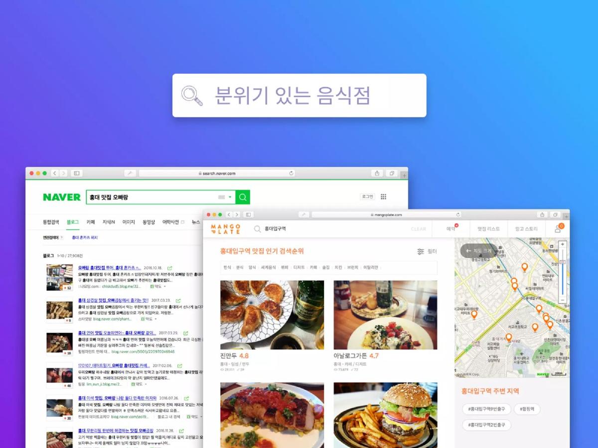
This slide visualizes the current state of restaurant discovery in South Korea. It shows screenshots of Naver (the dominant local search engine) and MangoPlate (a popular restaurant review app). The search query shown is "Atmospheric restaurant." The slide highlights the overwhelming amount of text, links, and map pins a user must navigate, setting the stage for a "simpler way."
Slide 3: The Effort of Discovery
A lifestyle photo shows a user at a laptop with a smartphone and a notebook, accompanied by the text "Searching hard..." (열심히 검색을 하고...). This slide emphasizes the labor-intensive nature of the current discovery process, framing it as a chore rather than a pleasure.
Slide 4: The Expectation Gap
This is the emotional climax of the problem statement. The text reads "The atmosphere is worse than I thought..." (생각보다 분위기가 별로...). The image shows a dimly lit, cluttered, and somewhat unappealing interior of a restaurant. This directly connects the failure of current search methods (Slide 2) to a poor real-world outcome, creating a strong case for a more authentic discovery tool.
Slide 5: The Solution - 10-Second Video
Berry introduces its core product feature here. The text states: "Berry helps users make choices with 10-second video reviews." By limiting the video length, Berry promises a quick consumption experience that captures the movement, sound, and lighting of a venue—elements that static photos often fail to convey accurately.
Slide 6: Map-Based Discovery
This slide showcases the app's UI. It features a map interface with video thumbnails instead of standard pins. The text "Easily find nearby atmospheric restaurants with a map" suggests that the app is designed for spontaneous, location-based decision-making. The UI looks polished, with categories for restaurants, cafes, bakeries, and bars.
Slide 7: Content Creation
To sustain a video-based platform, user-generated content (UGC) is vital. This slide shows the recording interface, which includes a prompt: "You need to record for 4 more seconds." This indicates a forced minimum/maximum length to ensure consistency across the platform. The caption "Take delicious videos and share them easily!" focuses on the ease of the contribution side of the network.
Slide 8: The Vision
Moving beyond the immediate product, this slide states the company's goal: "Gather every preference about locations." The background is an isometric illustration of a city with heart icons and video thumbnails floating over buildings. This suggests that Berry views itself as a data company or a social layer for the physical world, not just a restaurant directory.
Slide 9: Contact and Call to Action
The final slide provides contact information (contact@berryapp.co) and repeats the App Store link. The background image of a person taking a photo of their food reinforces the core user behavior the app relies on.
What Works in the Berry Deck
Strong Narrative Arc: The deck follows a classic problem-solution-vision structure. It identifies a relatable pain point (wasting time on bad restaurants) and offers a specific, tangible solution (short video). The transition from the frustration of Slide 4 to the clarity of Slide 5 is effective storytelling.
Visual Consistency: The use of a consistent color palette (purple-to-blue gradients) and high-quality UI mockups gives the impression of a professional, well-designed product. For a consumer app where "atmosphere" is a selling point, the aesthetic of the deck itself matters.
Clear Product Focus: There is no ambiguity about what the app does. By the end of Slide 7, the viewer understands exactly how a user interacts with the platform as both a consumer and a creator.
What is Missing from the Berry Deck
Market Validation and Traction: While the app is live, there is no data on how many people are using it. Investors need to see metrics like downloads, active users, or the number of videos uploaded to gauge product-market fit. Without these, it is impossible to tell if the "10-second" hook is actually resonating with users.
Business Model: The deck does not explain how Berry intends to generate revenue. Potential avenues like sponsored listings, data licensing, or transaction fees (reservations) are not mentioned. This is a significant omission for a Demo Day presentation where the goal is typically to attract investment.
Competitive Landscape: Berry is entering a crowded market. Beyond the search engines mentioned in Slide 2, they face competition from Instagram, TikTok, and established review sites. The deck fails to explain their unique moat—why would a user open Berry instead of just looking at a restaurant's Instagram Stories?
The Team: Startups at this stage are often judged more on the founders than the product. The total absence of a team slide is a major weakness. Investors want to know if the founders have experience in consumer tech, local search, or video platforms.
Founder's Guide: What to Copy and What to Avoid
Copy the "Show, Don't Tell" approach: Instead of writing a paragraph about why text reviews are bad, Berry used a screenshot of a cluttered search page (Slide 2). Instead of describing a bad user experience, they showed a photo of a disappointing restaurant (Slide 4). This is much more persuasive than bullet points.
Avoid the data vacuum: A Demo Day deck should be a balance of vision and evidence. Berry leans too far into vision. If you have a live product, you must include a traction slide. Even if the numbers are small, showing a growth trend or high engagement rates (e.g., "average user views 15 videos per session") provides the necessary proof of concept.
Define your 'Why Now': Why is a video-first restaurant app viable today when it might not have been five years ago? Is it the rise of TikTok? Better mobile bandwidth? The deck misses the opportunity to explain why the market is ready for this specific format change.
Final Thoughts
The Berry deck is an excellent example of a "teaser" or a high-level pitch meant to accompany a verbal presentation. It excels at conveying the product's look and feel. However, as a standalone fundraising document, it lacks the structural integrity required to move an investor toward a term sheet. It identifies a real problem but fails to prove that Berry is the specific team and business model capable of capturing the opportunity.
Frequently asked questions
- What is the primary problem Berry is trying to solve?
- Berry addresses the inefficiency and unreliability of traditional restaurant discovery. Slide 2 shows the clutter of search results on platforms like Naver and MangoPlate, while Slide 4 illustrates the disappointment of arriving at a restaurant that lacks the expected atmosphere. The deck suggests that text and static photos are insufficient for conveying the true 'vibe' of a place.
- How does Berry's solution differ from existing platforms like Yelp or TripAdvisor?
- Unlike text-heavy review sites, Berry focuses exclusively on short-form video. Slide 5 explicitly states that Berry helps users choose via 10-second video reviews. This format is intended to be faster to consume and harder to manipulate than written reviews or professionally staged photos, providing a more authentic view of the establishment.
- What stage of development is Berry in according to the deck?
- The deck suggests Berry is in the post-launch phase. Slide 1 and Slide 9 both display an Apple App Store short-link, and Slide 7 shows a functional UI for recording and sharing videos. This indicates the product is live and available for user acquisition, rather than being a mere concept or prototype.
- What is Berry's ultimate business objective?
- While the immediate focus is on restaurant discovery, Slide 8 reveals a broader ambition: 'Gather every preference about locations.' This implies that Berry intends to build a comprehensive data layer of user preferences across various types of physical venues, potentially moving into travel, retail, or general lifestyle discovery.
- What critical information is missing from this pitch deck?
- The deck is missing almost all standard 'investor' slides. There is no mention of the business model (how they make money), the market size (TAM/SAM/SOM), the competitive landscape, or the team. Furthermore, there are no growth metrics, such as Daily Active Users (DAU) or retention rates, which are typically expected in a Demo Day presentation.