The Bento pitch deck is a 10-slide artifact from the 2015 on-demand delivery boom. It eschews traditional deck structures—omitting team bios, market size, and a specific funding ask—to focus entirely on the product experience and operational efficiency. The deck relies on high-quality photography to sell the 'Asian food in minutes' value proposition while using a single, powerful unit economics slide to prove the business model's viability. With an average month-over-month growth rate of 37% and a projected jump from 1% to 28% total margin per unit, the deck presents a lean, data-driven argum…
Key takeaways
- The deck reports a 37% average month-over-month growth rate in annualized revenue between March and September (Slide 8).
- Bento claims a 4.5-star rating on Yelp across 60 reviews to validate product-market fit (Slide 7).
- Customer repeatability is highlighted with 30% retention at 14 days and 40% at 28 days (Slide 7).
- Actual unit economics for October show a slim $0.16 (1%) total margin per Bento (Slide 9).
- The company projected a margin increase to $4.07 (28%) by December 2015, primarily through a 73% reduction in packaging costs (Slide 9).
- The deck completely omits a Team slide, leaving the founders' backgrounds unknown to the viewer.
- There is no 'Ask' slide or use of funds, making the specific fundraising goal unclear.
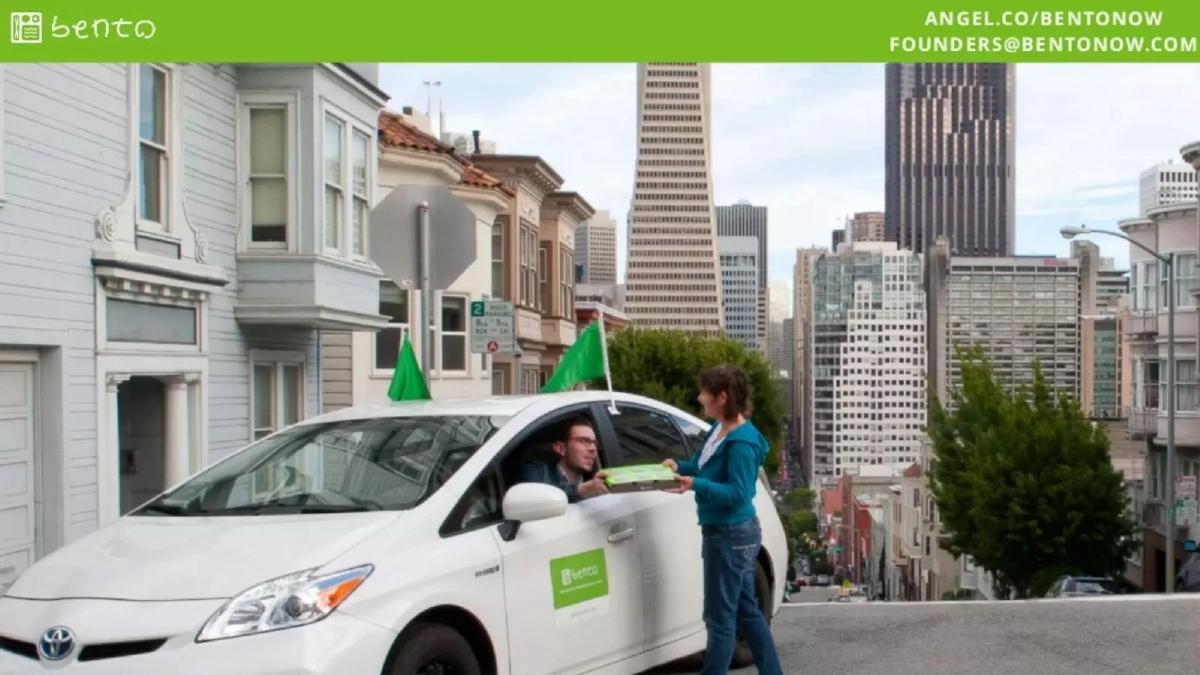
- The product relies on a 'curbside' delivery model to achieve speed, as shown in the delivery interaction photo (Slide 6).
The 2015 On-Demand Aesthetic
The Bento pitch deck is a fascinating time capsule of the mid-2010s 'Uber for X' era. At just 10 slides, it is remarkably brief. It doesn't follow the standard Sequoia or Y Combinator templates. Instead, it functions more like a visual lookbook designed to evoke a specific lifestyle: healthy, fast, and tech-enabled. The deck is light on text and heavy on full-bleed imagery, a strategy that works well for consumer food brands but leaves significant gaps in the business case.
The Hook: Visual Identity (Slides 1-3)
Slide 1 and Slide 2 are nearly identical title cards. They establish the brand immediately: a bright green color palette, a friendly sans-serif logo, and a clear value proposition: 'Delicious Asian food delivered in minutes.' The inclusion of the AngelList URL and a generic 'founders@' email address on every single slide suggests this deck was designed for wide distribution or as a follow-up to a brief introductory meeting.
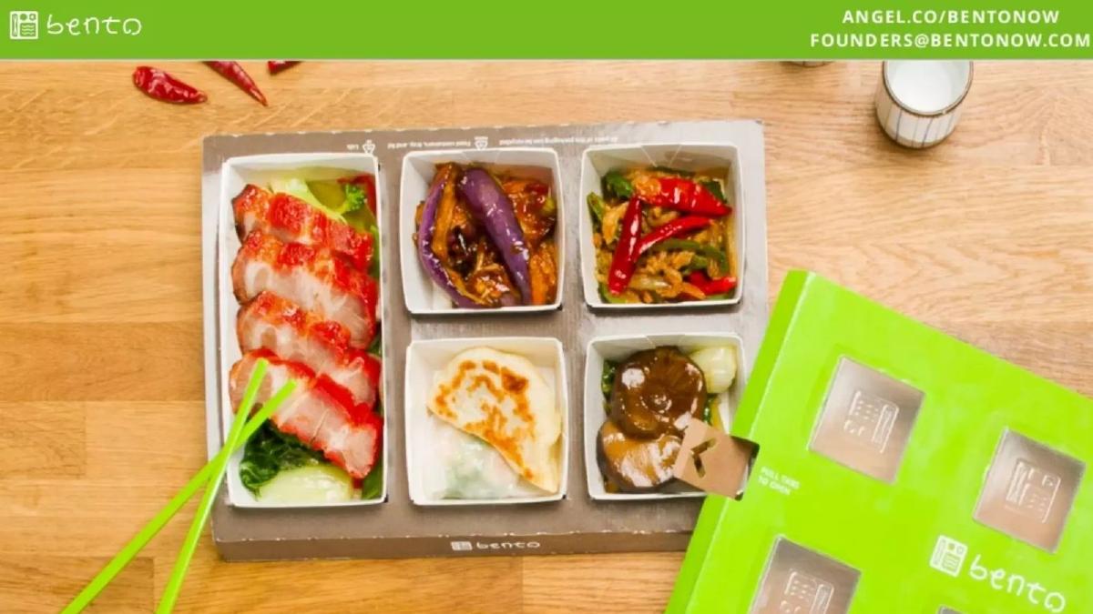
Slide 3 is the first 'product' slide, and it does more work than the text-heavy slides of most competitors. It shows the physical Bento box. We see five distinct compartments: a main dish (char siu pork) and four sides (eggplant, stir-fry, gyoza, and mushrooms). This slide communicates the 'patent pending packaging' mentioned in the company's description without needing a technical diagram. It looks premium, organized, and—most importantly—different from the standard plastic containers used by most delivery services in 2015.
The User Experience (Slides 4-6)
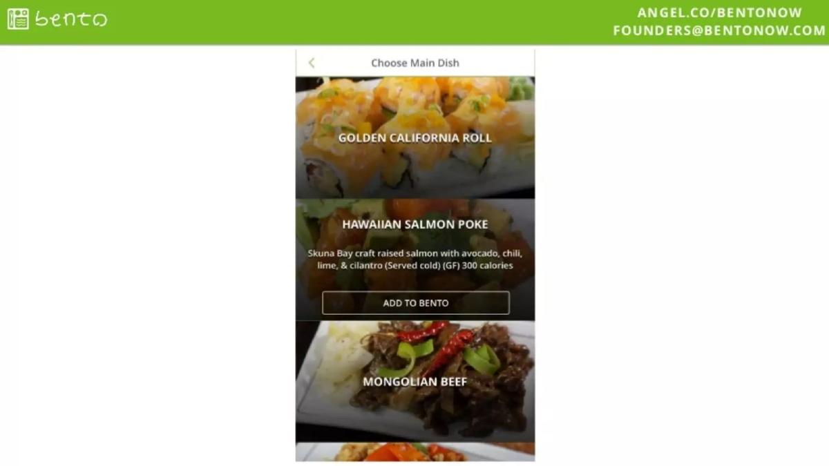
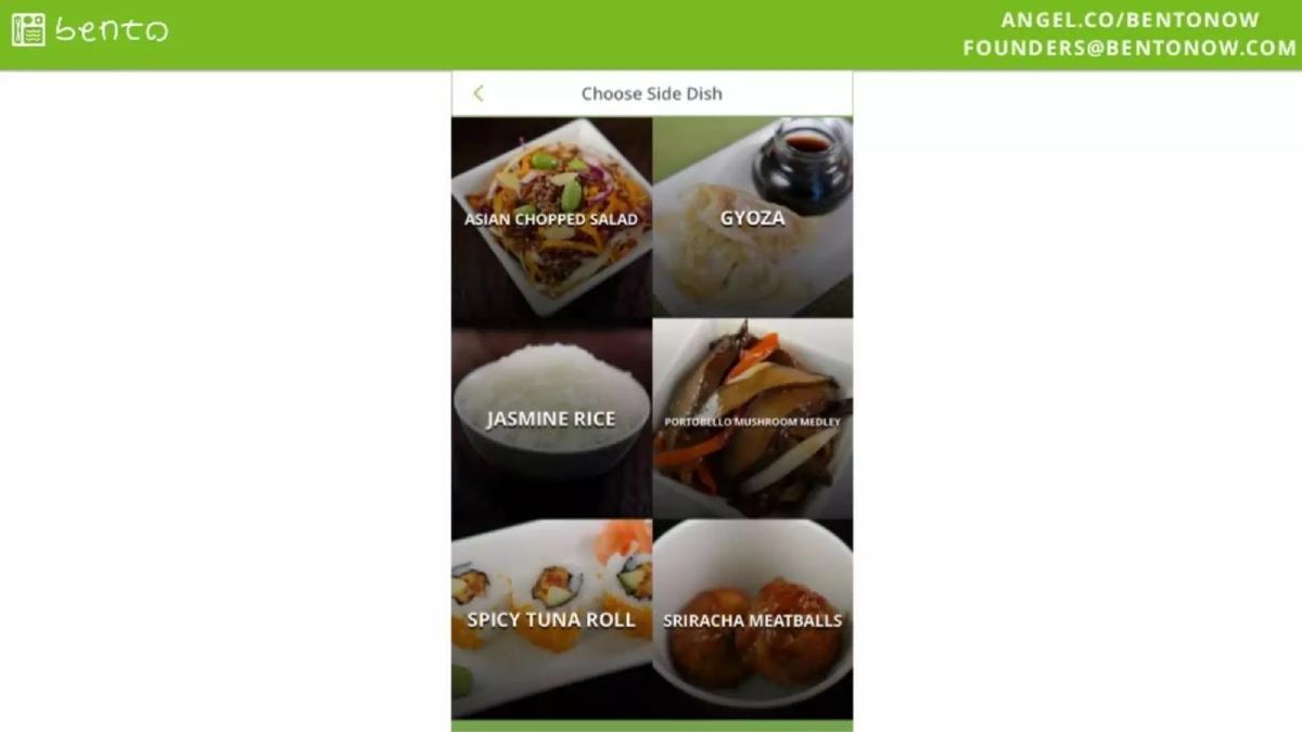
Slide 4 and Slide 5 walk through the app interface. The UI is simple: 'Choose Main Dish' and 'Choose Side Dish.' By showing the Golden California Roll, Hawaiian Salmon Poke, and Mongolian Beef, Bento emphasizes variety. Slide 5 shows the side options, including Asian Chopped Salad and Sriracha Meatballs. The photography is high-quality, reinforcing the 'delicious' part of the mission statement. These slides demonstrate that the ordering process is frictionless, requiring only a few taps to build a meal.
Slide 6 is a critical operational slide disguised as a lifestyle photo. It shows a white Toyota Prius with green Bento flags and a logo on the door. A driver is handing a box to a customer on a steep San Francisco street (likely Nob Hill or North Beach). This confirms the 'curbside' delivery model. In 2015, the biggest bottleneck for delivery was the 'last 50 feet'—drivers finding parking and navigating apartment hallways. By showing the customer meeting the car, Bento signals to savvy investors that they have solved a major margin-killer in the delivery business.
Validation and Retention (Slide 7)
Slide 7 , titled 'Customer Feedback,' provides the first hard data points. A 4.5-star Yelp rating across 60 reviews is a solid early signal for a seed-stage startup. However, the 'Repeatability' metrics are the real stars here. Bento claims 30% retention at 14 days and 40% at 28 days. In the food delivery space, where customer acquisition costs (CAC) are notoriously high, showing that 40% of users come back within a month is a powerful argument for long-term viability. It suggests that the product isn't just a novelty; it's a habit.
The Growth Story (Slide 8)
Slide 8 presents 'Annualized Revenue by Month.' The chart shows a climb from $98K in March to a peak of $705K in August. The headline metric is '37% M/M Avg Growth.' While the average is impressive, a critical analyst would notice the September bar: it drops to $534K. The deck doesn't explain this 24% month-over-month decline. Whether it was due to seasonal shifts, a reduction in marketing spend, or operational hiccups, leaving a downward trend as the final data point on a growth slide is a risky move that invites tough questions during due diligence.
The Path to Profitability (Slide 9)
Slide 9 is arguably the most important slide in the deck: 'Unit Economics Per Bento.' It compares 'Oct (Actual)' to a projection for 'Dec ’15.' In October, the company was barely breaking even with a $0.16 (1%) margin per box. The delivery cost ($5.53) and packaging ($2.19) were the primary drains. The projection for December shows a massive shift to a $4.07 (28%) margin. This is achieved through three main levers: increasing the average Bento value from $13.40 to $14.50, reducing delivery costs to $4.85, and—most dramatically—slashing packaging costs from $2.19 to $0.58. This 73% reduction in packaging cost suggests a move toward bulk manufacturing of their custom boxes, which is a classic 'scale' argument.
The Closing (Slide 10)
Slide 10 returns to the title card aesthetic, featuring a photo of the closed Bento box with chopsticks. It repeats the contact information. Notably, there is no 'Ask' slide. There is no mention of how much money they are raising, what the valuation cap is, or what the milestones for the next 18 months will be. This makes the deck feel more like a 'teaser' than a full investment memorandum.
What Works
Visual Storytelling: The deck is beautiful. For a food business, the quality of the food photography is a proxy for the quality of the product. Bento nails this. · Operational Clarity: Slide 6 (the delivery photo) and Slide 9 (unit economics) explain the business model more effectively than paragraphs of text. You understand exactly how the food gets to the customer and where the profit comes from. · Retention Focus: Highlighting 28-day repeatability (Slide 7) shows the founders understand that growth without retention is a 'leaky bucket' problem. · Unit Economics Transparency: Many seed decks hide their margins. Bento puts their 1% actual margin front and center, then provides a logical (if ambitious) path to 28%.
What is Missing
The Team: This is the most glaring omission. Investors at the seed stage are primarily betting on the founders. Without a team slide, we don't know if these are Michelin-starred chefs, logistics experts from FedEx, or first-time entrepreneurs. · The Market (TAM): There is no mention of the size of the San Francisco food market or the broader national opportunity. This makes it unclear if Bento is intended to be a local boutique service or a global platform. · Competition: In 2015, San Francisco was crowded with food startups like Sprig, SpoonRocket, and Munchery. Bento doesn't address how it differentiates from these well-funded incumbents. · The Ask: A pitch deck is a tool to get a check. By not stating the amount being raised or the intended use of funds, the deck fails to create a sense of urgency or a clear 'next step' for the investor. · Revenue Context: The dip in revenue in September (Slide 8) is a red flag that needs an explanation. Without a 'Roadmap' or 'Future Outlook' slide, the investor is left wondering if the business has already peaked.
What a Founder Should Copy
The 'Unit Economics' Comparison: Showing 'Actual' vs. 'Projected' margins is a great way to demonstrate that you have a handle on your costs and a plan to scale. It shows maturity and financial literacy. · Minimalist UI Slides: Don't just show a screenshot of your app; show the flow. Slides 4 and 5 make the Bento experience feel inevitable and easy. · Lifestyle/Operational Photography: Using a photo to explain a complex logistics solution (curbside delivery) is much more effective than a bulleted list of 'operational advantages.' · Consistent Branding: The green header and footer, combined with the recurring logo and contact info, make the deck feel professional and cohesive.
Final Analysis
The Bento deck is a high-signal, low-noise presentation. It assumes the investor already knows the 'why' (people want healthy food fast) and focuses entirely on the 'how' (custom packaging, curbside delivery, and repeatable habits). While the lack of a team slide and a formal ask are significant departures from fundraising best practices, the deck's strength lies in its transparency regarding unit economics. It presents a business that is operationally difficult but financially rewarding at scale. For a modern founder, the takeaway is clear: if your product is visual and your data is strong, you don't need 20 slides of fluff to tell a compelling story.
Frequently asked questions
- Why does the deck omit a team slide?
- In the 2015 San Francisco seed environment, many founders relied on warm introductions and AngelList profiles (linked on every slide) to establish credibility. While omitting a team slide is generally a mistake, Bento likely assumed investors would click the 'angel.co/bentonow' link for bios, prioritizing the product's visual appeal and growth metrics in the deck itself.
- How does Bento justify its 15-minute delivery claim?
- The deck uses Slide 3 and Slide 6 to illustrate a 'curbside' delivery model. By having customers meet drivers at the curb and using custom, pre-packaged containers, Bento eliminates the 'last 50 feet'—parking and entering buildings—which is the most time-consuming part of food delivery.
- Is the 37% M/M growth sustainable based on the data shown?
- Slide 8 shows revenue peaking in August at $705K (annualized) before dipping to $534K in September. While the average is 37%, the final month shown indicates a significant contraction, which would likely be a major point of questioning during a partner meeting.
- What is the significance of the packaging cost reduction on Slide 9?
- Bento's path to profitability relied on moving from $2.19 to $0.58 in packaging costs. This suggests a shift from small-batch custom boxes to high-volume manufacturing, indicating that their 'patent pending packaging' was a core pillar of their unit economics, not just a branding exercise.
- Why is there no market size (TAM) slide?
- Bento likely viewed the 'food delivery in SF' market as self-evidently large during the 2015 on-demand craze. By focusing on repeatability (Slide 7) rather than TAM, they argued that their specific niche (healthy Asian food) had high enough frequency to build a massive business regardless of the total market ceiling.