Dailivery is a Zurich crowdsourced delivery startup that pitched investors in November 2019 with an eight-slide deck for moving items too large for normal parcel services. The deck is visually disciplined and honest about how early the company is, with an MVP launched, a first paying customer and CHF 20K raised. Its fatal gap is omission: no market size, no business model, no unit economics, no named competitor and no funding ask, with the only real price point (CHF 68.00) buried inside a phone mockup.
Key takeaways
- Dailivery's 2019 pitch deck is only eight slides long and omits market size, business model, competition, unit economics and the funding ask entirely.
- The single most valuable number in the deck, a CHF 68.00 delivery price, appears only inside a phone screenshot and is never stated as average order value.
- The strongest positioning line in the deck, 'from a small parcel up to your living-room couch', is buried on the differentiation slide instead of the cover.
- A marketplace deck that never explains the driver payout and the platform take rate gives investors nothing to underwrite, no matter how good the design is.
- Dailivery's team slide lists two first names and two roles, with no surnames, backgrounds or links, discarding free credibility on the slide that decides most seed meetings.
- The deck's most strategically important fact, early leads with Swiss marketplace platforms, is buried as one bullet in a milestone list rather than presented as go-to-market.
- Closing on a contact slide with no amount, no use of funds and no milestone forces an interested investor to email just to learn what is being asked.
- A short deck is only a strength when the slides you kept are the ones an investor needs to decide; eight slides of narrative with no economics is half a deck with good typography.
What this deck actually is
Dailivery's file is a genuine investor pitch deck, but it is a very small one. Eight slides, 720x450 points, exported from PowerPoint on a Mac in October 2019 and circulated publicly the following month. The company is Dailivery GmbH, incorporated in Zurich in June 2019, and the pitch is for a crowdsourced delivery app that moves items too big for a normal parcel service — the kind of thing you buy on a Swiss classifieds marketplace and then have no way to get home.
Eight slides is not automatically a problem. Some of the best-known seed decks are ten to twelve. What matters is which eight. Dailivery spends its eight on: title, problem, solution, product, differentiation, team, milestones, contact. That is a coherent narrative spine. What it does not spend a single slide on is market size, business model, unit economics, competition, go-to-market, or the amount of money it wants. There is one number in the entire deck — "20K Raised" — and one price in a phone mockup: CHF 68.00.
So the honest classification is this: Dailivery is a well-designed early-stage teaser deck that has been asked to do the job of a seed deck. It communicates the idea cleanly and in about ninety seconds. It gives an investor almost nothing to underwrite. Read as a teaser meant to earn a first meeting, it mostly works. Read as the document that gets a term sheet, it is missing the second half of itself.
Slide-by-slide walkthrough
Slide 1 — Title: "We provide the easiest way to deliver your items"
Dark charcoal background, the red Dailivery wordmark, a one-line positioning statement, and a byline: "Oliver Gloor | Founder @ Dailivery | oliver@dailivery.com". The design language is set here and never breaks — charcoal, one red accent, generous whitespace, a single typeface. Visually this is one of the more disciplined small decks you will see.
The tagline is clear but soft. "The easiest way to deliver your items" describes a feeling, not a category. Compare it to what the deck actually reveals four slides later: crowdsourced drivers moving oversized goods in Switzerland. That sentence is more specific, more defensible, and more memorable, and it is nowhere on the cover. A title slide is the one line an investor repeats to a partner who was not in the room. "Easiest way to deliver your items" will not survive that retelling; "Uber for the stuff that doesn't fit in a parcel, in Switzerland" would.
Putting the founder's direct email on the cover is a small, good decision. It removes a step for anyone who wants to reply.
Slide 2 — Problem: three headaches, no evidence
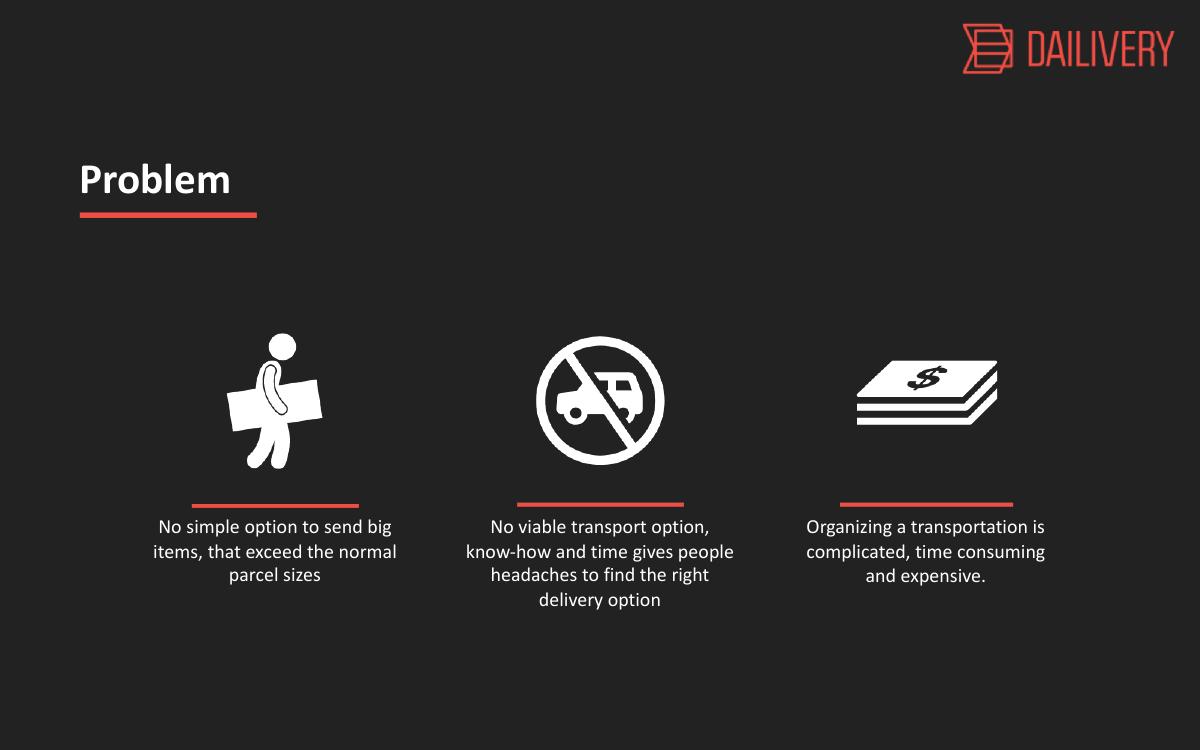
Three icon columns: no simple option to send big items that exceed normal parcel sizes; no viable transport option, and the know-how and time required to find one causes headaches; organizing transportation is complicated, time consuming and expensive.
The first of those three is a real, specific, non-obvious problem. Parcel carriers have hard size and weight limits, and above those limits the consumer falls off a cliff into freight quotes, van rentals and asking a friend. That is a genuine market gap and it is the strongest sentence in the deck.
The other two are restatements of the first in softer language. "Complicated, time consuming and expensive" is the generic problem statement of every marketplace deck ever written. So the slide has one idea wearing three costumes, and none of them carry a number. How many oversized shipments happen in Switzerland per year? What does a van rental or a two-man delivery actually cost today? How many marketplace listings fail to convert because the buyer cannot collect the item? Any one of those figures, cited, would turn this slide from an assertion into an argument.
Slide 3 — Solution: "A mobile app that provides the easiest way to deliver items"
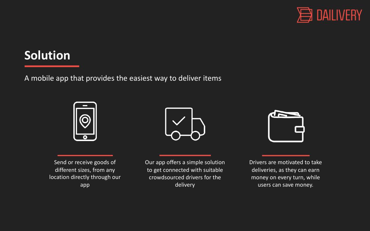
Three columns again, mirroring the problem slide's structure: send or receive goods of different sizes from any location directly through the app; the app connects you with suitable crowdsourced drivers; drivers are motivated because they earn money on every trip, while users save money.
Mirroring problem and solution in matching three-column layouts is a good rhetorical device — the eye maps pain to fix without being told. The third column is the most important one on the slide because it is the only place the deck acknowledges it is building a two-sided marketplace with a supply side that has to be recruited and kept busy.
But "drivers can earn money on every turn, while users can save money" is doing enormous unexamined work. Save money compared to what baseline? Earn how much per delivery? If the driver earns enough to bother and the user saves versus the incumbent alternative, the platform's margin lives in the gap between those two numbers — and that gap is the entire business. The deck never shows it. This is the slide where a single line of arithmetic would have changed the investor's read of the whole file.
Slide 4 — Product: the app, and the only real number in the deck
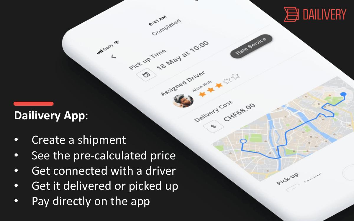
A phone mockup with five bullets beside it: create a shipment, see the pre-calculated price, get connected with a driver, get it delivered or picked up, pay directly in the app.
The mockup is the most informative artifact in the file, and probably by accident. It shows a completed delivery: pick-up time 18 May at 10:00, assigned driver "Aline Holt" with a three-star rating, a delivery cost of CHF 68.00, and a routed map. That screen tells an investor more than three text slides do. It says the product exists in enough fidelity to have a completed-order state. It says pricing is quoted up front rather than metered. It says there is a rating system, which implies a trust layer for the supply side. And CHF 68.00 anchors the price point of a real job.
The failure is that none of that is written down. The deck never says "average order value is roughly CHF 68" or "we take X% of that". The number is sitting in a screenshot where a fast reader will never register it. If CHF 68 is the real AOV, it belongs in 60-point type on a business model slide that does not exist.
"Pre-calculated price" is also a quiet product claim worth more space. Instant quoting for irregular, oversized items is genuinely hard — it means the company has a pricing model for volume, distance and handling. That is closer to a moat than anything on the next slide.
Slide 5 — "Why is Dailivery better?"
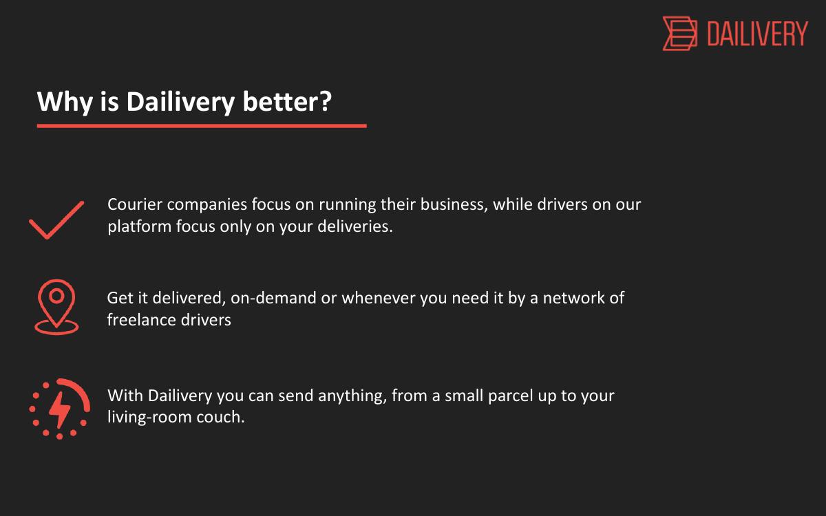
Three checkmarked lines: courier companies focus on running their business while platform drivers focus only on your deliveries; get it delivered on demand or whenever you need it by a network of freelance drivers; you can send anything from a small parcel up to your living-room couch.
This is the competition slide with the competitors removed. The deck names one category — "courier companies" — and never names an actual company, never shows a comparison grid, never mentions the incumbents any Swiss investor will immediately think of, from the national post's bulky-goods service to classifieds-adjacent delivery options to the European players already operating crowdsourced transport at the time this deck was written. In late 2019 that space was not empty, and an investor who knows it will assume the founder does not.
The third line — "from a small parcel up to your living-room couch" — is the best sentence in the deck. It is concrete, it is visual, and it defines the product's range in eleven words. It should be the headline of the slide, or arguably of the company.
The first line is the weakest: "courier companies focus on running their business, while drivers on our platform focus only on your deliveries" is a claim about attention, not a structural advantage, and it inverts under pressure. A courier company's whole business is reliably completing deliveries; a freelance network's structural weakness is that no one is obligated to show up.
Slide 6 — Founding Team: two people, two lines
Two circular black-and-white portraits. Oliver, Founder — Design Lead & Business Developer. Mario, CTO & Co-Founder — Tech Lead & Full Stack Developer.
The pairing is right for the stage: one commercial and design founder, one technical founder who can ship. A two-person founding team with a real CTO clears a bar that a surprising number of marketplace decks do not.
But the slide gives no surnames, no LinkedIn links, no previous companies, no domain background, no years of experience. At seed, the team slide is frequently the slide that decides the meeting, because there is nothing else to underwrite. An investor reading this cannot tell whether Mario has shipped a production marketplace before or is writing his first one, whether either founder has logistics experience, or whether they have worked together previously. Every one of those is a five-word addition. Withholding them is a pure, unforced loss.
Slide 7 — Money, Milestones: 20K and four bullets
A large "20K Raised" on the right, a checkmark noting the next goal is "getting 100 user using our service", and four milestone bullets on the left: incorporated Dailivery GmbH in June 2019; first leads with marketplace platforms in Switzerland in August 2019; first paying customer during beta; launch of MVP in October 2019.
This slide is doing the work of four missing slides — traction, financials, roadmap and ask — and it cannot carry the load. Take the problems in order.
"20K Raised" has no currency symbol and no source. CHF or EUR? Founder capital, friends and family, an accelerator, a grant? Twenty thousand francs is a real signal if it came from a third party who did diligence, and almost no signal if it is the founders' own money. The deck lets the reader guess, and readers guess unkindly.
"First paying customer during beta" is the sentence with the most latent value and the least detail. One paying customer, for how much, for what kind of item, and did they come back? "First leads with marketplace platforms in CH" is arguably the most strategically important line in the entire deck — a distribution partnership with the classifieds platform where oversized goods are sold is the whole go-to-market — and it is buried as bullet two of four, with no partner named and no stage described.
"Next goal, getting 100 user using our service" is honest and appropriately small for the stage. It is also, notably, not a fundraising goal. Which brings us to the omission that defines this deck.
Slide 8 — Contact Us: there is no ask
hello@dailivery.com, Dailivery GmbH, Sihlquai 131, 8005 Zurich, and the website. A clean closing slide.
And that is the end. The deck never states how much money it is raising, at what valuation or on what instrument, what the money would be spent on, or what milestone the money would buy. An investor who read all eight slides, liked the founder, and wanted to write a check would have to email to find out what they are being asked for.
The company clearly knew what it needed — it had just raised 20K, it had an MVP, it wanted 100 users. The gap between "we have 20K and an MVP" and "we want 100 users" has a price. The deck's job was to name it.
What this deck does better than most startup pitch decks
It is honest about how early it is. "First paying customer during beta" and "next goal, 100 users" are two of the least inflated statements you will find in a seed deck. Nothing here is dressed up as traction that is not traction. · The visual system never breaks. Eight slides, one charcoal background, one red accent, one typeface, consistent left-aligned headers with the same red underline. It looks like one company made it in one sitting with taste. · Problem and solution are structurally mirrored. Three columns answering three columns lets the reader map pain to fix without a single connecting sentence. · The product slide shows a real screen in a real state. Not an aspirational render of a feature roadmap — a completed order with a driver, a rating, a route and a price. That is evidence. · It picks a genuinely under-served wedge. Items above parcel size is a specific gap with a specific victim, and it is much more defensible than "delivery" in general. · It respects the reader's time. Eight slides read in ninety seconds. Many decks that say less take thirty.
Where this deck would fail in an investor meeting
No market size. Not a TAM, not a bottom-up estimate, not even a count of oversized shipments in Switzerland. The investor cannot size the outcome, so they cannot justify the risk. · No business model. The deck never says how Dailivery makes money. Commission on the delivery? Flat fee? Driver subscription? CHF 68.00 appears in a screenshot and the take rate on it is never mentioned. · No unit economics. Driver payout, platform margin, customer acquisition cost, repeat rate — all absent. For a marketplace, this is the analysis. · No named competition. "Courier companies" is not a competitive landscape, and every investor in this space in 2019 could name four alternatives from memory. · No go-to-market. The marketplace-platform leads on slide 7 are the go-to-market strategy, mentioned once as a bullet and never developed. · No supply-side plan. A crowdsourced network needs drivers with vans before it needs customers, and the deck never explains how those drivers get recruited, vetted, insured or kept busy. · No ask. Eight slides ending in a contact page with no amount, no use of funds and no milestone attached to the raise. · The team slide withholds free credibility. No surnames, no links, no backgrounds — on the slide that decides most seed meetings. · Regulatory and liability silence. Freelancers driving strangers' furniture raises insurance, damage-liability and employment-classification questions in Switzerland. Not naming them reads as not having considered them.
Teaser deck vs. seed deck: what the eight slides are missing
Title "Easiest way to deliver your items" Category + geography + wedge in one line
Problem Three qualitative headaches One sharp problem plus a cited number
Solution App connects users to crowdsourced drivers Same, plus why this structure wins
Product Five bullets, one real screen Same — this slide already works
Business model Absent (CHF 68 hidden in a mockup) AOV, take rate, contribution per delivery
Competition "Courier companies" Named players, positioning grid
Traction One bullet inside a milestone list Deliveries, GMV, repeat rate, driver count
Go-to-market One bullet about marketplace leads Named partner channel plus supply plan
Team Two first names, two roles Full names, backgrounds, why this pair
How you would rebuild this deck without adding much length
Rewrite the cover to name the wedge. "Dailivery — on-demand delivery for everything too big for a parcel. Switzerland." The reader now knows the category, the boundary and the geography before slide two. · Cut the problem slide to one column and add a number. Keep "no simple option for items above parcel size", delete the two restatements, and attach one cited figure: oversized listings on Swiss classifieds per year, or the cost of the current alternative. · Promote CHF 68 to its own business model slide. Average order value, driver payout, platform take, contribution per delivery. Four numbers on one slide answers the question every marketplace investor asks first. · Turn "Why is Dailivery better?" into a named comparison. Rows for the incumbent parcel carrier, van rental, a moving company and doing nothing; columns for max size, lead time, price and booking effort. Let the grid make the argument. · Split slide 7 into traction and ask. Traction gets deliveries completed, paying customers, drivers onboarded, and the marketplace partnership by name. Ask gets the amount, the runway it buys and the milestone at the end of it. · Add one supply-side slide. Where the drivers come from, how they are vetted, what they earn per hour, and what insurance covers a damaged couch. This is the question that kills crowdsourced-logistics rounds. · Fix the team slide in five minutes. Surnames, one line of background each, LinkedIn URLs. Free credibility that is currently being left on the table. · Keep the design exactly as it is. The restraint is an asset. Adding four slides in the same system still leaves a twelve-slide deck that reads in three minutes.
The transferable lesson
Dailivery's deck fails in a way that is unusually common and unusually fixable: everything it contains is true, clear and well-made, and the things an investor actually decides on are simply not in the file. The founders had a real product, a real first customer, a real distribution idea and a real number — CHF 68.00 — and they left the number in a screenshot, the distribution idea in bullet two of four, and the ask out entirely.
A short deck is a strength only when the slides you kept are the slides that carry the decision. Eight slides of narrative with no market, no model, no economics and no ask is not a tight deck; it is half a deck with good typography. Before you cut, ask which slide an investor would need to say yes, and make sure that one survives.
The test is blunt: hand your deck to someone who has never heard of your company and ask them what you sell, who pays, how much you make per transaction, and how much you are raising. If they can only answer the first, you have built a teaser and called it a pitch.
Frequently asked questions
- What is Dailivery?
- Dailivery is a Swiss startup, incorporated as Dailivery GmbH in Zurich in June 2019, that built a mobile app connecting people who need to send or receive oversized items with a network of freelance crowdsourced drivers. Users create a shipment, see a pre-calculated price, get matched to a driver, and pay in the app. Its pitch deck was published in November 2019, shortly after its MVP launch.
- Is the Dailivery deck a real investor pitch deck?
- Yes, but a very early and very short one. It was exported from PowerPoint in October 2019 and runs eight slides: title, problem, solution, product, differentiation, team, milestones and contact. It functions well as a teaser deck designed to earn a first meeting, but it lacks the market, business model, traction and ask slides an investor needs to make an investment decision.
- How many slides is the Dailivery pitch deck and what do they cover?
- Eight slides. Slide one is the title and founder contact, two is the problem of items exceeding parcel size, three is the crowdsourced app solution, four is the product with a phone mockup, five is differentiation versus courier companies, six is the two-person founding team, seven is money and milestones including CHF 20K raised, and eight is a contact page.
- What is the biggest weakness in Dailivery's pitch deck?
- The absence of a business model. The deck never states how Dailivery earns revenue, what drivers are paid, or what the platform's take rate is. The only price in the entire file, CHF 68.00, appears in a phone screenshot rather than on a slide. For a two-sided marketplace, the spread between what the customer pays and what the driver receives is the business, and it is never shown.
- Which slides from the Dailivery deck should founders copy?
- Two things are worth copying. First, the mirrored three-column problem and solution slides, which let a reader map each pain to its fix without a connecting sentence. Second, the product slide's use of a real completed-order screen showing a driver, a rating, a route and a price, which proves the product exists far more convincingly than a feature list.
- How short can a seed pitch deck be?
- Length is not the constraint; coverage is. Ten to twelve slides is typical for a seed round, and shorter decks work when the surviving slides answer what you sell, who pays, how much you make per transaction, and how much you are raising. Dailivery's eight slides carry the narrative but answer only the first of those four questions, which is why the deck reads as incomplete rather than tight.