The Bliss pitch deck is a masterclass in demonstrating execution velocity. In just 14 slides, the founders transition from a simple problem—fragmented engineering metrics—to a proven business model with 70 paying customers and an $84,000 ARR, achieved only four months after launch. The deck shines because it doesn't just promise a tool; it promises a management framework for quantifying technical debt and productivity. By positioning Bliss as a 'visibility' layer for non-technical stakeholders, the founders move the product out of the crowded 'developer linter' space and into the lucrative 'e…
Key takeaways
- Speed to market is a powerful signal: Bliss went from concept to $84k ARR in under six months.
- Quantifying the abstract (like 'technical debt') is a winning value proposition for management-focused SaaS.
- High margins (90% stated) are critical for software startups to demonstrate scalability to investors.
- Social proof, such as marquee logos (Intuit, Xero) and experienced advisors, de-risks early-stage deals.
- A 'committed' lead or significant portion of the round (66% in this case) creates essential fundraising urgency.
- Targeting a specific persona (Engineering Managers) is more effective than pitching a general developer tool.
What this deck actually is
The Bliss pitch deck is a 14-slide Seed round presentation focused on a "GitHub for management" style value proposition. It targets engineering managers who struggle with the opacity of developer output and code quality. The deck is structured as a traditional problem-solution-traction narrative, designed to raise $750,000 via convertible equity.
The single most important finding in this deck is its highly efficient capital-to-traction ratio . At the time of the pitch, the company had already achieved an $84,000 annual revenue run rate (ARR) with 70 paying customers, having launched only months prior. This specific data point, combined with a 90% margin, transforms a theoretical "developer tool" pitch into a proven "business workflow" pitch. While the deck leans heavily into the "software is eating the world" trope, its core strength lies in its ability to quantify code quality—traditionally a subjective "gut feeling" for managers—into a dashboard of "Good Lines" vs. "Technical Debt."
Slide-by-slide walkthrough
Slide 1: Title Slide
The title slide for Bliss is functional and minimalist. It establishes the core value proposition immediately: "Code quality metrics for engineering managers." By naming the specific persona (engineering managers) rather than a broad category (software development), the deck sets a clear target for the investor's mental model. The contact information for CEO Brian York is prominently displayed, which is a standard but helpful practice for direct investor outreach.
From an investor’s perspective, this slide communicates focus. The subtitle doesn't try to be "the future of AI-driven development" or "DevOps 2.0." It stays grounded in the specific utility of the product. The branding is clean, featuring a blue circular logo that suggests a polished, professional tool rather than a "hacker" project. The inclusion of "proprietary & confidential" is a standard legal boilerplate but adds a layer of formality to the round.
The strongest version of this slide would include a one-sentence "hook" that highlights the traction mentioned later in the deck. For example, "Empowering 70+ companies to quantify engineering productivity." This would prime the investor for the high-growth story that follows, rather than starting with a purely descriptive title.
Slide 2: Summary
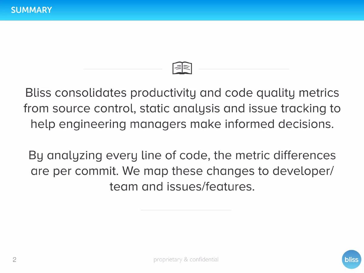
Slide 2 provides a high-level overview of the product’s mechanics. It explains that Bliss consolidates metrics from source control, static analysis, and issue tracking. The text emphasizes that analysis happens at the "per commit" level and maps these changes to specific developers, teams, and features. This is a critical technical distinction, as it suggests the tool provides granular, actionable data rather than just high-level trends.
An investor reads this as the "How it Works" slide. By listing the data sources (source control, static analysis, issue tracking), Bliss demonstrates that it sits at the intersection of three major developer workflows. The mention of mapping changes to "developer/team" hints at the "management" aspect of the tool—it’s not just about the code; it’s about the people writing it. This slide attempts to bridge the gap between technical execution and business oversight.
To improve this slide, the text could be broken down into three distinct value pillars. Currently, the paragraph format is dense. Using bullet points to highlight the "Consolidate," "Analyze," and "Map" functions would make the information easier to scan. Additionally, an illustration showing the data flow from "Tools" to "Bliss" to "Manager" would be more effective than the generic book icon currently used.
Slide 3: Problem
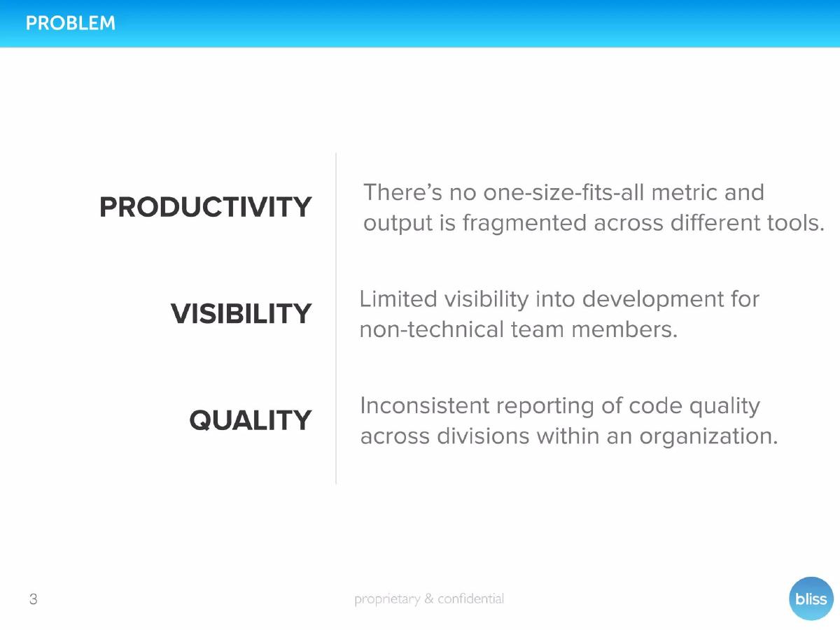
The problem slide identifies three specific pain points: Productivity (fragmented output), Visibility (limited insight for non-technical members), and Quality (inconsistent reporting). The layout is structured with bold headers, making it easy to digest. It correctly identifies that the "problem" isn't just that code is bad, but that the reporting and visibility of that code are broken for the people who manage it.
Investors look for "hair on fire" problems. The most compelling point here is "Visibility." In many organizations, non-technical stakeholders (CEOs, Product Managers) feel blind to what happens in the codebase. By framing the problem as a "visibility" issue, Bliss positions itself as a communication tool, not just a debugger. The "fragmented across different tools" point also suggests a consolidation play, which often implies high stickiness in an enterprise environment.
The strongest version of this slide would quantify these problems. How many hours are lost to "fragmented reporting"? What is the cost of "inconsistent quality" in terms of bugs or technical debt? Adding a "Cost of Inaction" metric would elevate this from a list of annoyances to a list of financial drains that an investor would be eager to plug.
Slide 4: Solution
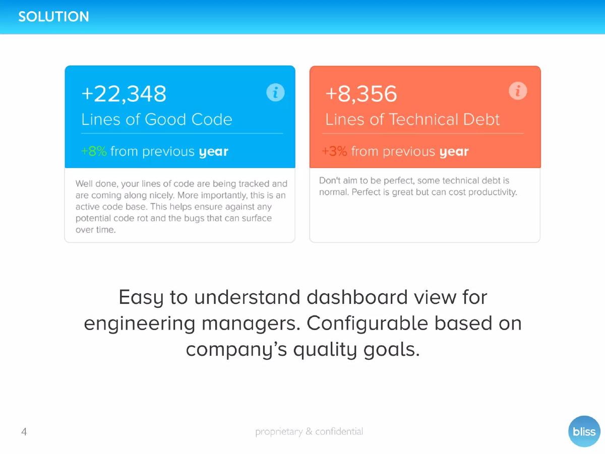
Slide 4 introduces the solution through a visual representation of the product’s output. It shows two metric cards: "Good Code" (+22,348 lines) and "Technical Debt" (+8,356 lines). The text explains that this helps engineering managers track active codebases and ensure against "code rot." It also mentions that the dashboard is "configurable based on company’s quality goals."
The investor sees the "magic moment" of the product here. The color coding (blue for good, orange for debt) makes the value proposition intuitive. The copy—"Well done, your lines of code are being tracked"—suggests a gamified or encouraging user experience. More importantly, the slide explicitly mentions "Technical Debt," which is a universal pain point in software development. Showing how Bliss quantifies this abstract concept is the deck's primary selling point.
This slide would be stronger if it showed the action taken as a result of these metrics. Knowing you have 8,356 lines of debt is step one; the slide should ideally hint at how Bliss helps the manager fix it or reallocate resources. A "before and after" scenario or a "so what?" statement for each metric would bridge the gap between data and decision-making.
Slide 5: Proprietary Technology
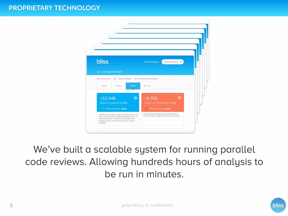
This slide focuses on the technical moat. It claims to have built a "scalable system for running parallel code reviews," which allows "hundreds hours of analysis to be run in minutes." The visual is a screenshot of the dashboard, showing metrics filtered by individual contributors and timeframes (1 week, 1 month, etc.).
For an investor, "proprietary technology" needs to justify why this isn't easily replicable. The claim of "hundreds of hours in minutes" is a classic speed-to-value proposition. It implies that Bliss is doing something computationally heavy that a manual reviewer could never achieve. The inclusion of the "Individual Contributors" view reinforces the management utility—it’s a tool for performance reviews and resource allocation.
The strongest version of this slide would explain why it is scalable. Is it a unique algorithm? A proprietary way of parallelizing static analysis? The phrase "proprietary technology" is a heavy claim; backing it up with a specific patent-pending process or a unique architectural diagram would make it more believable. As it stands, it’s a strong claim without deep technical evidence in the text.
Slide 6: Timeline & Traction
This is arguably the most important slide in the deck. It shows a rapid progression from "Initial concept" in January to a "launched" product in February, leading to "70 paying customers" and an "$84,000 annual revenue run rate" by the time of the pitch. It also notes "90% margins" and massive scale: "1 billion lines of code reviewed."
Investors love this slide because it shows extreme execution velocity. Launching and reaching $84k ARR in a matter of months is a high-signal indicator of product-market fit. The "90% margins" are standard for SaaS but good to see explicitly stated. The "1 billion lines of code" metric provides a sense of the system’s robustness—it isn't just a prototype; it’s a battle-tested engine handling massive data volumes.
This slide is very strong, but it could be improved by showing the growth curve rather than just two points in time. A simple bar chart showing the monthly growth in customers or ARR from February to the present would visually demonstrate the momentum that the $84k figure suggests. It would also benefit from clarifying if the $84k is GAAP revenue or a projection based on the most recent month.
Slide 7: Go To Market
The GTM slide explains the company’s initial focus on startups for "faster sales cycles and more homogeneous stacks." It features two testimonials from startup executives (Cloverpop and ShareRoot). The slide notes that this startup focus was exclusive from March 2015 through June 2015.
An investor reads this as a tactical "wedge" strategy. Startups are easier to sell to, but the ultimate prize is the enterprise. The testimonials are high quality because they speak to the specific value propositions mentioned earlier: explaining technical debt to stakeholders and having "impactful conversations" with development teams. This validates that the "Visibility" problem identified on Slide 3 is actually being solved for real customers.
The strongest version of this slide would outline the next phase of the GTM strategy. If the startup focus ended in June 2015, what is the current focus? The slide hints at enterprise, but it doesn't detail the sales motion (e.g., inside sales, partnerships, or self-serve). A clearer roadmap of how they get from "startups" to "global enterprise" would provide more confidence in the scalability of the business.
Slide 8: Current Focus
Following the GTM slide, "Current Focus" details the move into the enterprise space. It lists features like "behind firewall" deployment, "Roll-up reporting," and "private cloud" installation. It also displays logos for Xero, Intuit, and Accellion as enterprise customers.
This slide is designed to de-risk the investment by showing that the company can move upmarket. Enterprise customers have different requirements (security, firewalls, custom reporting), and Bliss is checking those boxes. The inclusion of Xero and Intuit is significant—these are major tech companies, suggesting that Bliss’s value proposition scales beyond small startup teams.
To improve this slide, the deck should clarify the status of these enterprise logos. Are they paid customers, pilots, or just users of the free tier? The "Enterprise Customers" heading suggests they are clients, but in a seed deck, investors will look for specific deal sizes or seat counts for these marquee names to verify the "Enterprise" revenue model mentioned on the next slide.
Slide 9: Revenue Model
The revenue model is split into two tiers: Website (Self-serve) and Enterprise. Website pricing ranges from $29/month to $249/month based on the number of repositories. Enterprise starts at $1,500/month for 50 active repositories. The slide also features a "Team Leaderboard" graphic, showing metrics like "Good/Debt Ratio" for specific employees.
Investors look for pricing power and scalability here. The $1,500/month starting point for Enterprise is a healthy jump from the $249/month top-tier self-serve plan, indicating a clear path to high ACV (Annual Contract Value). The "Team Leaderboard" graphic is interesting—it shows how the product is used for performance management, which justifies the "per repository" or "per team" pricing model.
The strongest version of this slide would include the "Average Revenue Per User" (ARPU) or the split between self-serve and enterprise revenue. If the $84k ARR is mostly from $29/month plans, that’s a different story than if it’s from two $1,500/month enterprise deals. Adding "Land and Expand" metrics (e.g., how many customers started at $29 and moved to $249) would demonstrate account growth potential.
Slide 10: Ecosystem (Competition)
Slide 10 uses a 2x2 matrix to map the competitive landscape. The Y-axis represents "Business-side" vs. "Developer" focus, and the X-axis represents "Line of Code" vs. "Team" scope. Bliss places itself in the top right quadrant: "Business-side" focus with a "Team" scope.
This matrix is effective because it differentiates Bliss from traditional static analysis tools like RuboCop or Coverity (which are developer-focused) and from simple dashboard tools. By positioning itself as the only tool that is both "Business-side" and "Team-level," Bliss claims a unique niche. It isn't just a tool for the individual coder; it's a tool for the organization.
However, 2x2 matrices are often viewed with skepticism by investors if the axes feel arbitrary. The "Business-side" label is a bit vague. A more powerful comparison would be a feature-comparison table showing that while others provide raw data, Bliss provides "Actionable Management Insights" or "Technical Debt Financialization"—features the competitors lack.
Slide 11: Financing
This slide outlines the "Ask." Bliss is raising $750k in convertible equity, with $500k already committed. It lists the "Use of proceeds" (hiring engineers, sales reps, and enterprise optimization) and specific "Milestones" (1k paying customers, $1m ARR, 50 enterprise customers).
This is a very strong financing slide because it shows substantial momentum. Having 66% of the round already committed ($500k of $750k) creates a sense of urgency and social proof for new investors. The milestones are concrete and quantitative, providing a clear map of what the $750k is expected to buy in terms of business growth.
The "Use of proceeds" could be even more specific by attaching dollar amounts or percentages to each category. For example, "60% to Engineering, 30% to Sales, 10% to Marketing." This shows the investor that the founders have a disciplined budget. The mention of "convertible equity" is also important for setting the structure of the deal upfront.
Slide 12: Team
The team slide features CEO Brian York and CTO Ian Connor. It highlights York’s experience in self-funding businesses to profitability (Encore.io) and Connor’s successful exit (Pubget acquired by CCC). It also lists four prominent investors/advisors, including David Koehn from Oracle and Bhavin Shah (Refresh, acquired by LinkedIn).
For a Seed stage startup, the team is often the most important factor. Bliss presents a balanced leadership: a CEO with a track record of capital-efficient growth and a CTO with exit experience. The inclusion of the "Investors" section acts as further social proof, showing that industry veterans from companies like Oracle and Social Starts are already backing the vision.
The strongest version of this slide would highlight the technical pedigree of the engineering team if there are more members. While the founders have impressive backgrounds, the product relies heavily on "proprietary technology" (Slide 5), so highlighting specialized experience in static analysis or machine learning would reinforce that claim. As it stands, it’s a very solid "proven founders" slide.
Slide 13: Why Now?!
The "Why Now?" slide relies on the "Software is eating the world" narrative. It points to the disparity between software growth and developer talent, and the shift toward remote work (citing a 2014 New York Times article). The argument is that as teams become more remote and talent becomes scarcer, management needs better tools to ensure quality and productivity.
While the remote work trend is a valid tailwind, this is the weakest slide in the deck. The "Software is eating the world" quote is a cliché in venture capital and doesn't add much specific value. The data points about remote working from 2014 and 2020 projections feel like standard industry filler rather than a unique insight into why now is the perfect moment for Bliss specifically.
A stronger "Why Now" would focus on the explosion of the "DevOps" stack. With the move to microservices and CI/CD, code is being shipped faster than ever, making manual review impossible. That is a technical "Why Now" that directly leads to the need for Bliss’s automated, scalable analysis. Linking the product to a specific change in the way software is built, rather than just the fact that it is being built, would be more compelling.
Slide 14: End Slide / Appendix
The final slide is not actually part of the Bliss pitch; it is a promotional slide for CH Agency, the designer of the deck. It offers a link to other pitch decks and promotes their services for SaaS CEOs.
In a real investor presentation, this slide should be replaced with a "Thank You / Q&A" slide that keeps the contact information visible. It is common practice to leave a slide up during the discussion period, so it should ideally feature the logo, the one-sentence value prop, and the contact details again.
The strongest end to a deck is a "Summary of Strengths" slide or a list of "Appendix" links (e.g., detailed technical architecture, full customer list, or cohort analysis) that the founders can jump to during the Q&A. This keeps the momentum of the pitch going even after the formal presentation ends.
Concrete fixes in priority order
Quantify the Problem: On Slide 3, move beyond descriptive pain points. State the average percentage of developer time lost to technical debt or the financial cost of a bug caught in production vs. development. This turns a "nice-to-have" tool into a "must-have" cost-saver. · Visualize the Growth Curve: On Slide 6, replace the bracketed list with a month-over-month growth chart for ARR and customers. Investors are buying a trajectory, not just a snapshot. Showing the slope of that line is more powerful than just stating $84k. · Define the Technical Moat: On Slide 5, provide more detail on the "scalable system for running parallel code reviews." If it’s truly proprietary, explain the specific innovation (e.g., a custom graph-based analysis) that differentiates it from open-source linters. · Clarify Enterprise Logos: On Slide 8, specify the relationship with Xero, Intuit, and Accellion. Are these enterprise-wide deployments or single-team trials? Transparency here builds trust during the due diligence phase. · Update the "Why Now": Replace the general "Software is eating the world" slide with one focused on the shift to CI/CD and automated deployment pipelines. Explain that the velocity of modern development makes Bliss's automated metrics a necessity, not a luxury. · Show a User Workflow: The deck shows metrics but doesn't show how a manager uses them to change behavior. A slide showing a "Manager Action Loop"—where a metric triggers a specific intervention or resource shift—would prove the product's utility as a management tool.
Frequently asked questions
- What was Bliss's traction at the time of the pitch?
- At the time of this deck, Bliss had an $84,000 annual revenue run rate (ARR) with 70 paying customers and 90% margins.
- Who is the target customer for Bliss?
- Bliss targets engineering managers, CTOs, and non-technical CEOs who need visibility into development productivity and code quality.
- How much money was Bliss raising in this deck?
- The company was raising a $750,000 seed round via convertible equity financing, with $500,000 already committed.
- What is Bliss's revenue model?
- Bliss uses a tiered SaaS model: a self-serve "Website" tier ($29–$249/month) and an "Enterprise" tier starting at $1,500/month.
- How does Bliss differentiate itself from other static analysis tools?
- Bliss differentiates itself by focusing on the "Business-side" and "Team" level, whereas competitors like RuboCop or Coverity focus more on individual lines of code for developers.