Burner’s Series A deck is an exercise in extreme brevity, relying on high-impact visuals and a clear market narrative rather than dense data. By 2012, the 'gig economy' was nascent, and Burner successfully positioned its disposable phone number app as the essential privacy layer for independent workers, Etsy sellers, and P2P participants. The deck features a compelling quarterly revenue chart showing consistent growth from Q4 2012 through Q2 2015, alongside a massive market stat of 73 billion SMS messages. While it lacks traditional slides for team, competition, and unit economics, the focus…
Key takeaways
- The deck uses specific user personas like 'The Tie Haberdashery' and 'Cooper’s Christmas Trees' to ground the product in real-world utility (Slides 2-3).
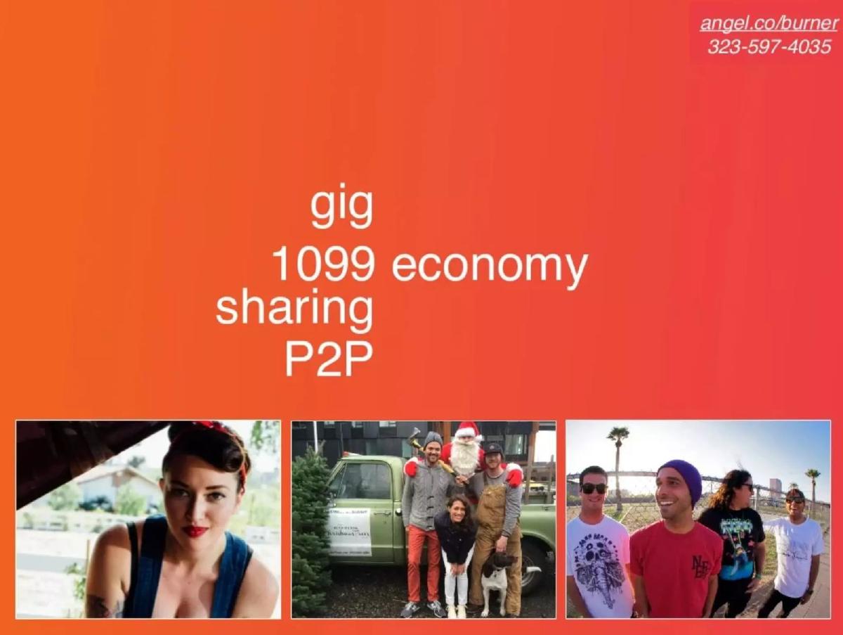
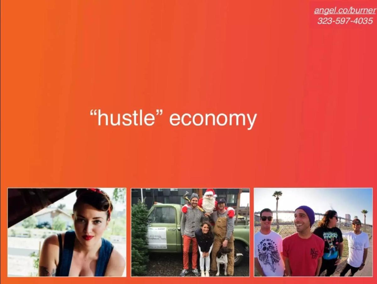
- Burner identifies its core market as the 'hustle economy,' encompassing gig, 1099, sharing, and P2P sectors (Slides 5-6).
- A quarterly revenue bar chart demonstrates consistent upward momentum over 11 consecutive quarters (Slide 7).
- The product roadmap highlights rapid iteration with features like Touch ID lock, Auto-reply, and a Chrome extension (Slide 8).
- A pilot program with Etsy sellers provides social proof and validates the B2B2C use case (Slide 9).
- The deck cites a massive total addressable market indicator of 73,000,000,000 SMS messages (Slide 10).
- The deck completely omits a team slide, competitive analysis, and a specific 'ask' or use of funds (Slides 1-11).
- The presentation maintains a consistent visual identity using a bright orange-to-red gradient and minimalist typography (Slides 1-11).
The Minimalist Narrative of Ad Hoc Labs
The Burner pitch deck, produced by Ad Hoc Labs in 2012, is a fascinating artifact from the early days of the gig economy. At just 11 slides, it is shorter than the average venture deck, yet it manages to communicate a powerful shift in consumer behavior. The deck doesn't get bogged down in technical specifications of how VoIP works; instead, it focuses entirely on the who and the why . By 2012, the term 'sharing economy' was beginning to peak, and Burner positioned itself as the essential privacy layer for this new world.
Slides 1-4: Defining the New Professional
The deck opens with a simple title slide featuring the iconic flame-and-handset logo. Notably, every slide in the deck includes a call to action in the top right corner: a link to their AngelList profile and a Burner phone number (323-597-4035). This is a subtle but effective way to encourage investors to test the product immediately.
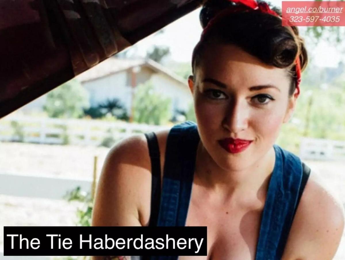
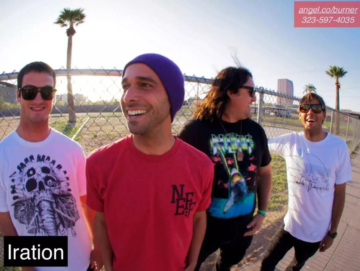
Slide 2 ('The Tie Haberdashery') , Slide 3 ('Cooper’s Christmas Trees') , and Slide 4 ('Iration') function as a triptych of user personas. Rather than using stock photos of 'business people,' Burner uses authentic, gritty imagery of a woman working on a car, a group at a Christmas tree lot (including a man in a Santa suit and a dog), and a reggae-rock band. These slides serve to de-stigmatize the product. They tell the investor: 'This isn't for criminals; it's for the local business owner, the seasonal worker, and the touring artist who needs a professional line without a second handset.'
Slides 5-6: The Macro Thesis
Slide 5 introduces the core terminology: 'gig,' '1099 economy,' 'sharing,' and 'P2P.' This is the 'Market Opportunity' slide, though it uses very few words. It connects the faces we saw in the previous slides to a massive economic trend. By grouping these terms, Burner argues that their addressable market is anyone who doesn't have a traditional 9-to-5 job.
Slide 6 doubles down on this with the phrase 'hustle' economy . This was a prescient branding move. In 2012, 'hustle' was becoming a badge of honor for independent workers. By aligning the product with this identity, Burner moved from being a utility app to a lifestyle brand for the self-employed. The repetition of the persona photos at the bottom of these slides reinforces the connection between the abstract 'economy' and the real people using the app.
Slide 7: Proof of Traction
Slide 7 ('Quarterly revenue') is arguably the most important slide in the deck. It shows a bar chart spanning from Q4 2012 to Q2 2015. The growth is remarkably consistent. There are no 'flat' periods; every quarter shows an increase over the previous one. While the Y-axis lacks specific dollar amounts, the visual of 11 consecutive quarters of growth is a powerful signal of product-market fit. It suggests that as the 'hustle economy' grows, Burner grows with it. This slide provides the quantitative 'teeth' to the qualitative narrative established in the first half of the deck.
Slides 8-9: Product Velocity and Partnerships
Slide 8 ('Recent features') lists a series of updates: Chrome extension, Android wear, Emoji support, Touch ID lock, Unlimited usage, Auto-reply, and MMS. This slide is designed to show 'shipping velocity.' It tells investors that the team is capable of maintaining a modern feature set and expanding across platforms (web, mobile, and wearables). The inclusion of 'Touch ID lock' is particularly relevant for a privacy app, showing they are leveraging the latest hardware capabilities.
Slide 9 ('Etsy Pilot') provides a specific case study. It features a woman looking at her phone with speech bubbles containing testimonials like 'every seller NEEDS' and 'a large order was placed.' This slide suggests a B2B2C strategy. If Burner can become a recommended tool for Etsy's millions of sellers, their acquisition costs drop significantly. It moves the product from a 'nice-to-have' privacy tool to a 'must-have' business tool that facilitates commerce.
Slides 10-11: The Scale and the Close
Slide 10 is a 'shocker' slide, displaying the number 73,000,000,000 SMS . This represents the total volume of messages in the market they are disrupting or participating in. It’s a way of saying, 'The pond we are swimming in is enormous.' It provides the 'TAM' (Total Addressable Market) context without the typical boring spreadsheet breakdown.
Slide 11 is the closing slide, repeating the logo and the contact information. It is a clean, confident finish to a very focused presentation.
What Works in This Deck
1. Narrative Focus: The deck doesn't try to be everything to everyone. It picks one specific trend—the rise of the independent worker—and hammers it home. This makes the pitch memorable.
2. Visual Consistency: The use of the orange-red gradient and the 'black box' text overlays creates a professional, cohesive look that feels like a consumer brand, not a corporate presentation.
3. Social Proof through Personas: By using real-world examples like a Christmas tree lot, they solve the 'use case' problem immediately. An investor doesn't have to wonder who would use this; they've been shown three distinct groups.
4. Traction Visuals: The revenue chart is simple and undeniable. It removes the need for complex financial modeling in the initial pitch by proving that the current strategy is already working.
What Is Missing
1. The Team: There is no mention of the founders, their backgrounds, or why they are the right people to build this. For a Series A, the 'Team' slide is usually considered mandatory.
2. Unit Economics: While we see revenue growth, we don't see margins, Customer Acquisition Cost (CAC), or Lifetime Value (LTV). Investors would want to know if this growth is profitable or if they are 'buying' revenue.
3. Competition: The deck ignores other VoIP players like Google Voice or Skype. A slide addressing their competitive advantage (e.g., ease of 'burning' a number vs. permanent numbers) would have been beneficial.
4. The Ask: There is no slide stating how much money they are raising or what they plan to do with it. While this information might have been in the email or the AngelList profile, its absence in the deck makes the presentation feel more like a 'company update' than a 'fundraising pitch.'
What a Founder Should Copy
1. The 'Show, Don't Tell' Personas: Instead of saying 'our target market is 1099 workers,' show photos of those workers in their environments. It creates an emotional connection and immediate understanding.
2. The CTA on Every Slide: Putting your contact info and a link to your round (like the AngelList URL) on every slide is a brilliant way to ensure that no matter where an investor stops reading, they know how to take the next step.
3. Minimalist Feature Lists: Slide 8 is a great example of how to show product progress without a wall of text. Use bullet points of actual shipped features to prove you are a 'shipping machine.'
4. Trend Alignment: If your startup benefits from a major macro trend (like the gig economy or AI), make that the center of your deck. Use the language of that trend to make your company feel inevitable.
Frequently asked questions
- Why does the deck focus so much on small businesses like Christmas tree lots?
- Burner used these examples to move away from the 'burner phone' stigma associated with illicit activity. By highlighting 'The Tie Haberdashery' and 'Cooper’s Christmas Trees,' they positioned the app as a professional tool for the 'hustle economy.' This showed investors that the product had a legitimate, high-frequency use case among the growing population of 1099 contractors and independent sellers who need to separate their personal and professional lives.
- Is the revenue chart on Slide 7 effective without specific dollar amounts?
- While the chart lacks a Y-axis with specific dollar figures, it is highly effective at showing 'up and to the right' momentum. For a Series A, investors are often more concerned with the growth rate and the consistency of that growth than the absolute revenue number, provided the scale is appropriate. The chart shows 11 quarters of uninterrupted growth, which signals product-market fit and a scalable acquisition model.
- What is the significance of the '73,000,000,000 SMS' slide?
- This is a classic 'Big Number' slide used to illustrate the scale of the communication market. By stating 73 billion SMS, Burner is suggesting that even capturing a fraction of a percent of this volume represents a massive business opportunity. It frames Burner not just as an app, but as a significant player in the global telecommunications and messaging infrastructure.
- How did Burner raise $2M without a team slide?
- In 2012, Burner (Ad Hoc Labs) was already a known entity with significant traction. When a product has 11 quarters of proven revenue growth and a clear narrative in a trending sector like the 'sharing economy,' the founders' reputation often precedes the deck. However, for most founders, omitting the team slide is a high-risk move that is generally not recommended.
- What does the 'Etsy Pilot' slide tell us about their strategy?
- The Etsy Pilot slide (Slide 9) indicates a strategic shift toward platform partnerships. By showing that Etsy sellers 'need' the service to manage orders and maintain privacy, Burner demonstrated a low-cost acquisition channel. It proved the app wasn't just for individual consumers, but could be integrated into the workflows of larger e-commerce ecosystems.