Cubie Messenger’s 2012 pitch deck is a masterclass in 'show, don't tell.' Instead of spending slides on theoretical market sizes, the company leads with a bar chart showing over 5 million organic downloads in less than a year. The core of the deck is a visual comparison between the 'boring' text interface of WhatsApp and Cubie’s expressive, doodle-filled environment. By highlighting that 30% of their 800 million monthly messages are non-text, Cubie proved that their feature set wasn't just a gimmick, but a fundamental shift in user behavior. While the deck lacks a formal 'Ask' or revenue mode…
Key takeaways
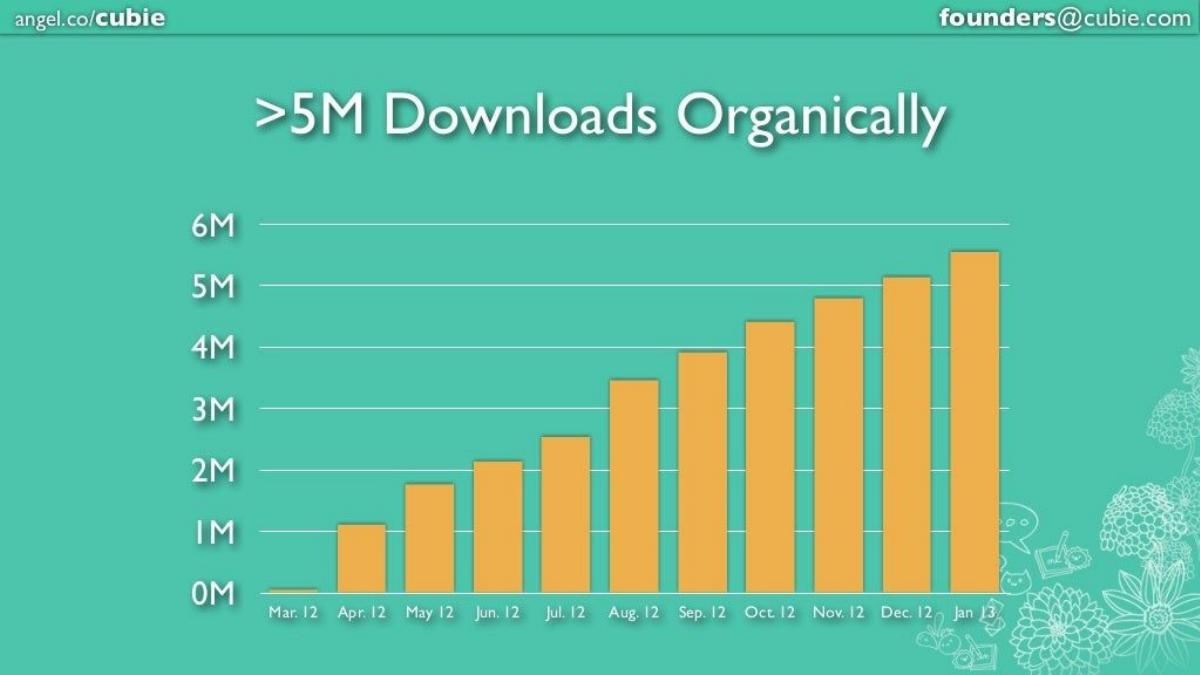
- The company achieved over 5 million downloads entirely through organic channels between March 2012 and January 2013 (Slide 2).
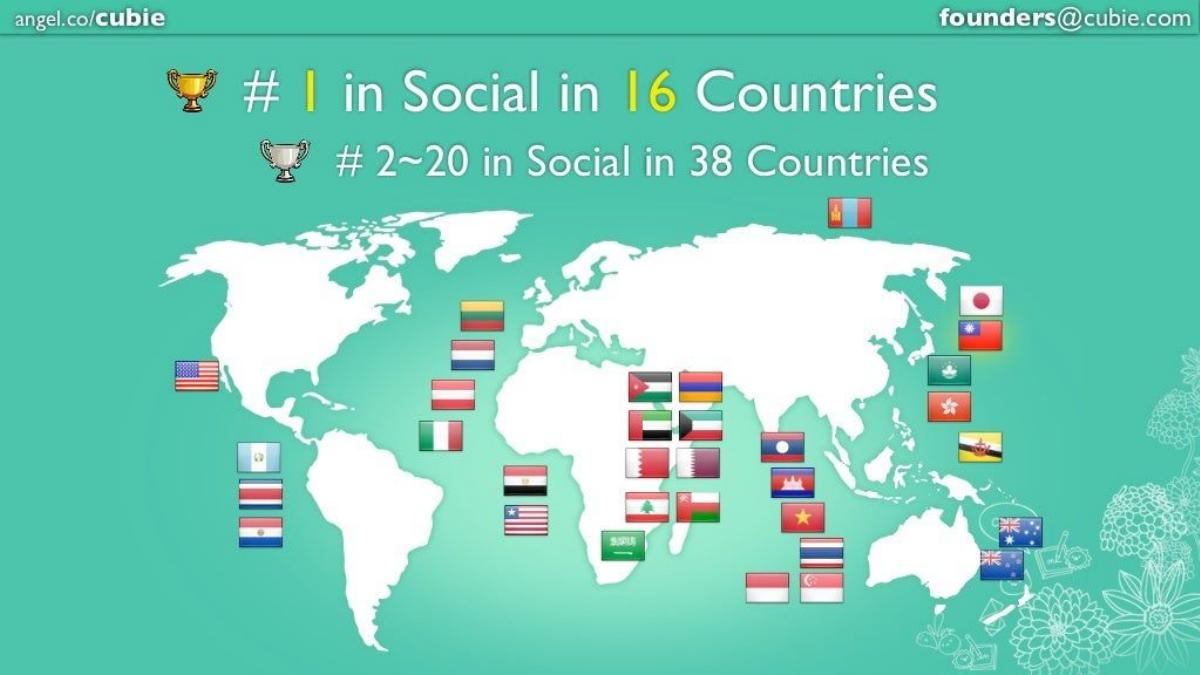
- Cubie successfully reached the #1 social app ranking in 16 different countries and top 20 in 38 countries (Slide 3).
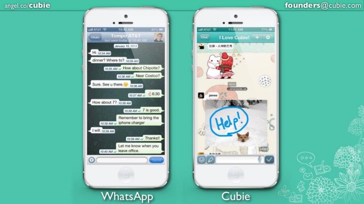
- A direct side-by-side comparison with WhatsApp is used to frame the problem of 'boring' text-only communication (Slide 5).
- The platform processes 800 million messages per month, demonstrating significant infrastructure scale (Slide 9).
- Engagement depth is proven by the fact that 240 million messages (30%) consist of doodles, stickers, or images (Slide 9).
- The deck leverages social proof through 4.5-star ratings on both Google Play and the App Store (Slide 10).
- The team includes notable advisors such as Andrew Chen and Hiroyuki Watanabe to bolster credibility (Slide 11).
- The company had already raised a $1.1M Seed round from investors including 500 Startups and B Dash Ventures prior to this deck (Slide 11).
Executive Summary: The Power of Organic Growth
The Cubie Messenger pitch deck from 2012 is a quintessential example of a 'traction-first' presentation. At a time when the mobile messaging wars were reaching a fever pitch, Cubie needed to prove that there was room for a specialized player alongside giants like WhatsApp and LINE. They did this not through complex financial modeling, but by showcasing a vertical growth curve and a highly engaged user base that was using the app exactly as intended.
Slide-by-Slide Teardown
Slide 1: Title and Positioning
The cover slide introduces the brand with its owl mascot and the tagline "Messaging Beyond Chat." It immediately establishes the value proposition: this is not just another text app. The slide includes links to the App Store and Google Play, signaling that the product is live and cross-platform. The inclusion of the AngelList URL and founder email in the header and footer is a standard but effective way to ensure contact info is always visible.
Slide 2: The Growth Curve
Slide 2 is the 'hook.' It displays a bar chart showing growth from near-zero in March 2012 to ">5M Downloads Organically" by January 2013. The keyword here is 'Organically.' By emphasizing that they didn't pay for these users, Cubie demonstrates strong virality and product-market fit. The month-over-month growth is consistent, which is exactly what Series A investors look for to de-risk the investment.
Slide 3: Global Reach
This slide uses a world map populated with flags to show international dominance. The headline claims "#1 in Social in 16 Countries" and "#2~20 in Social in 38 Countries." This proves that the 'doodle' and 'sticker' culture was not just a local phenomenon in their home market but had global appeal, particularly across Asia, the Middle East, and parts of Europe and the Americas.
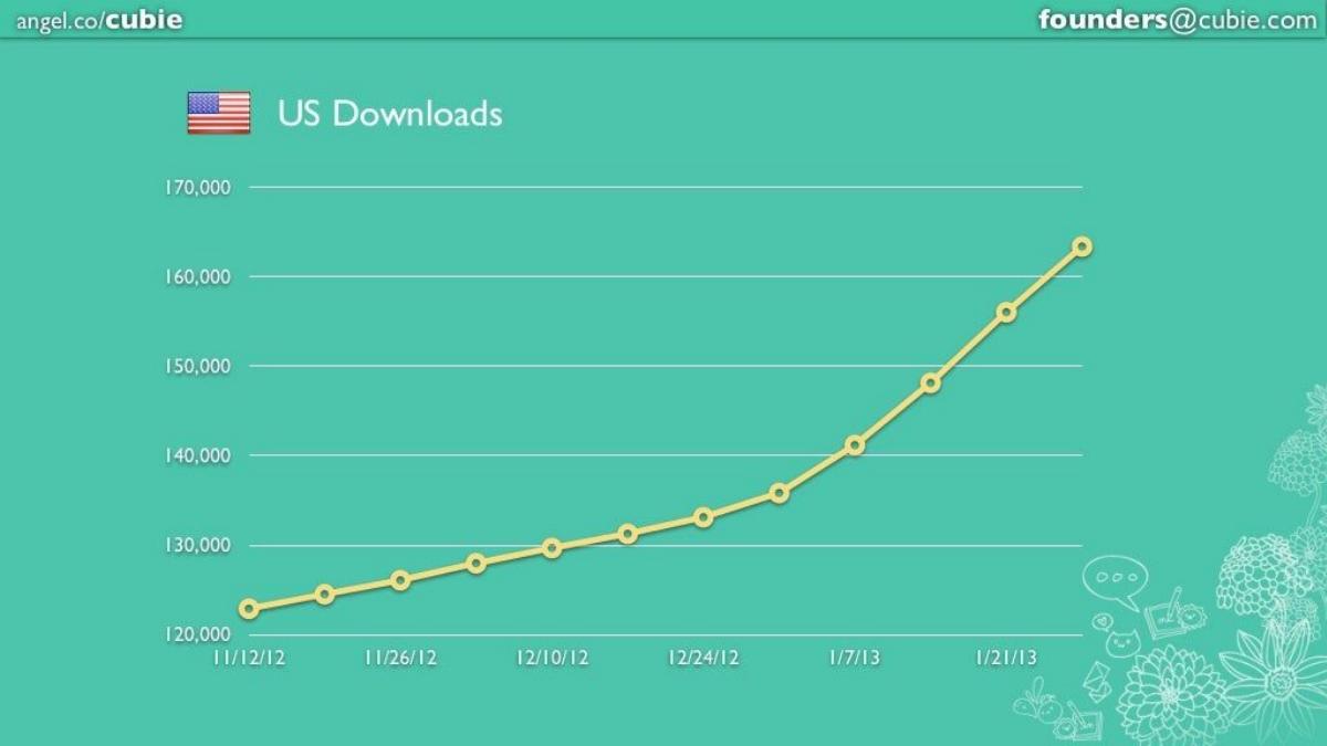
Slide 4: US Market Penetration
Recognizing that US investors often prioritize domestic growth, Slide 4 zooms in on "US Downloads." It shows a line graph growing from approximately 123,000 in November 2012 to over 160,000 by late January 2013. While the numbers are smaller than the global total, the upward trajectory (hockey stick shape) suggests that the app is beginning to find its footing in the competitive US market.
Slide 5: The Competitive Comparison
This is the most critical strategic slide in the deck. It places a screenshot of WhatsApp next to a screenshot of Cubie . The WhatsApp side shows a standard, text-heavy conversation about a phone charger. The Cubie side shows a vibrant, colorful chat featuring a large sticker of a bear and a hand-drawn 'Help!' doodle over a photo of a dog. This visual contrast perfectly illustrates the 'Messaging Beyond Chat' mission statement without needing a single bullet point of text.
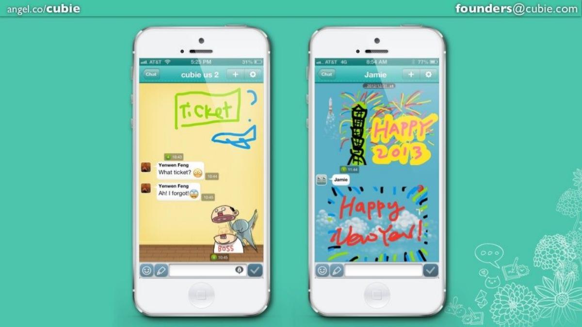
Slide 6: Feature Deep Dive - Doodling
Slide 6 focuses on the 'Doodle' feature. It shows two iPhone mockups where users have drawn directly on the screen—one showing a flight ticket and another showing a 'Happy 2013' New Year's greeting. This highlights the creative utility of the app, moving it away from 'utility' and toward 'self-expression.'
Slide 7 & 8: Community and Social Space
These slides showcase the "Space" feature, which appears to be a feed of user-generated content. Slide 7 shows elaborate digital art (including a Batman doodle and a 'Gangnam Style' character), while Slide 8 shows photo editing and stick-figure animations. By showing likes and comments, Cubie demonstrates that the app is a social network, not just a 1-to-1 messenger, which typically leads to higher retention rates.
Slide 9: Engagement at Scale
This slide provides the 'hard' data to back up the 'soft' visuals of the previous slides. It states they are "Processing 800M Messages per Month." More importantly, it uses a pie chart to show that "30% Messages are Doodles, Stickers, Images, ..." (240 million messages). This is the 'aha' moment for an investor: it proves that the features shown on Slide 5 aren't just bells and whistles—they are being used at a massive scale.
Slide 10: Social Proof
Slide 10 focuses on user sentiment. It shows 4.5-star ratings on both major app stores and includes two tweets from users calling it the 'cutiest chat messenger ever' and praising the 'stupid drawings.' This humanizes the data and proves that the brand has emotional resonance with its core demographic.
Slide 11: Team, Advisors, and History
The final slide introduces co-founders Yenwen Feng and Cjin Cheng . It also lists two high-profile advisors: Andrew Chen (a well-known growth expert) and Hiroyuki Watanabe . Finally, it lists the $1.1M Seed Round investors, including 500 Startups and NTT Investment Partners. This slide serves to build trust; if these sophisticated investors and advisors are already on board, the Series A investor is in good company.
What Works in This Deck
Visual Evidence: The deck relies on screenshots rather than descriptions. By showing the product in action, the founders allow the investor to immediately understand the user experience.
Focus on Organic Growth: In the mobile app world, high CAC (Customer Acquisition Cost) is a red flag. By highlighting 'Organic' downloads on Slide 2, Cubie proves they have a viral loop.
Behavioral Validation: The 30% non-text message metric on Slide 9 is the strongest data point in the deck. It validates the entire product thesis in one number.
What is Missing
The Business Model: There is no mention of how Cubie makes money. While common in 2012 for social apps, a modern Series A deck would require at least a slide on monetization strategy (e.g., sticker stores, ad platforms, or premium features).
The Ask: The deck ends without stating how much money they are looking to raise or what the milestones for the next 18 months are. This makes the deck feel more like a company update than a proactive pitch.
Market Size: There is no TAM/SAM/SOM analysis. While the messaging market is obviously huge, investors generally want to see the founder's perspective on the specific niche they are capturing.
Founders: What to Copy
The Side-by-Side Comparison: If you are entering a crowded market, use Slide 5's approach. Don't just list features; show your product next to the incumbent to make the difference visceral.
Lead with Traction: If you have a growth curve like Slide 2, put it at the front. It earns you the right to talk about features later because the investor is already convinced people want the product.
Use Social Proof Early: Don't wait until the end to show you are loved. The app store ratings and user tweets on Slide 10 are powerful tools for building credibility with B2C investors.
Frequently asked questions
- How does Cubie define its competitive advantage?
- Cubie defines its advantage through 'Messaging Beyond Chat.' On Slide 5, they contrast their interface with WhatsApp, showing that while WhatsApp is restricted to text bubbles, Cubie allows for integrated doodles, stickers, and drawings directly on top of photos. They position themselves as a creative platform rather than just a utility, backed by data showing that 30% of their users actively use these non-text features.
- What specific traction metrics did Cubie use to impress investors?
- Cubie focused on three pillars of traction: volume, growth, and engagement. They reported over 5 million organic downloads (Slide 2), a processing volume of 800 million messages per month (Slide 9), and high global rankings, including #1 in 16 countries (Slide 3). The most critical metric was the 30% non-text message ratio, which validated their specific product hypothesis.
- Who were the key people involved in the Cubie Series A?
- The deck identifies co-founders Yenwen Feng and Cjin Cheng. It also highlights a strong advisory board featuring growth expert Andrew Chen and Hiroyuki Watanabe. The investor base at the time of the deck included 500 Startups, NTT Investment Partners, Gumi, B Dash Ventures, Biglobe, and Pinehurst Advisors, as shown on Slide 11.
- Is there a business model or revenue plan in the deck?
- No. The 11-slide deck is entirely focused on user acquisition, product features, and engagement metrics. There is no mention of how the company intended to monetize the 800 million monthly messages, nor are there any slides detailing unit economics, burn rate, or future revenue streams like sticker shops or premium features.
- What is the primary weakness of this pitch deck?
- The primary weakness is the lack of a 'The Ask' slide and a 'Business Model' slide. While the engagement metrics are world-class for a Series A, the deck fails to explain how the $1.1M (or subsequent funding) would be spent or how the company would eventually become profitable. It relies almost entirely on the 'growth first, monetize later' philosophy prevalent in 2012.