Gusto’s Series A deck is a masterclass in minimalist presentation, adhering to a self-imposed 'Style Tip' of fewer than 10 words per slide (Slide 1). Raised in 2014 under the name ZenPayroll, the $20M round was supported by a deck that prioritized high-level narrative over granular data tables. The deck follows a classic 16-slide sequence: vision, market, pain, product, and traction. Notably, the version preserved for public record is a template, using placeholders to guide the narrative rather than revealing proprietary 2014 metrics. This teardown examines how Gusto structured its argument f…
Key takeaways
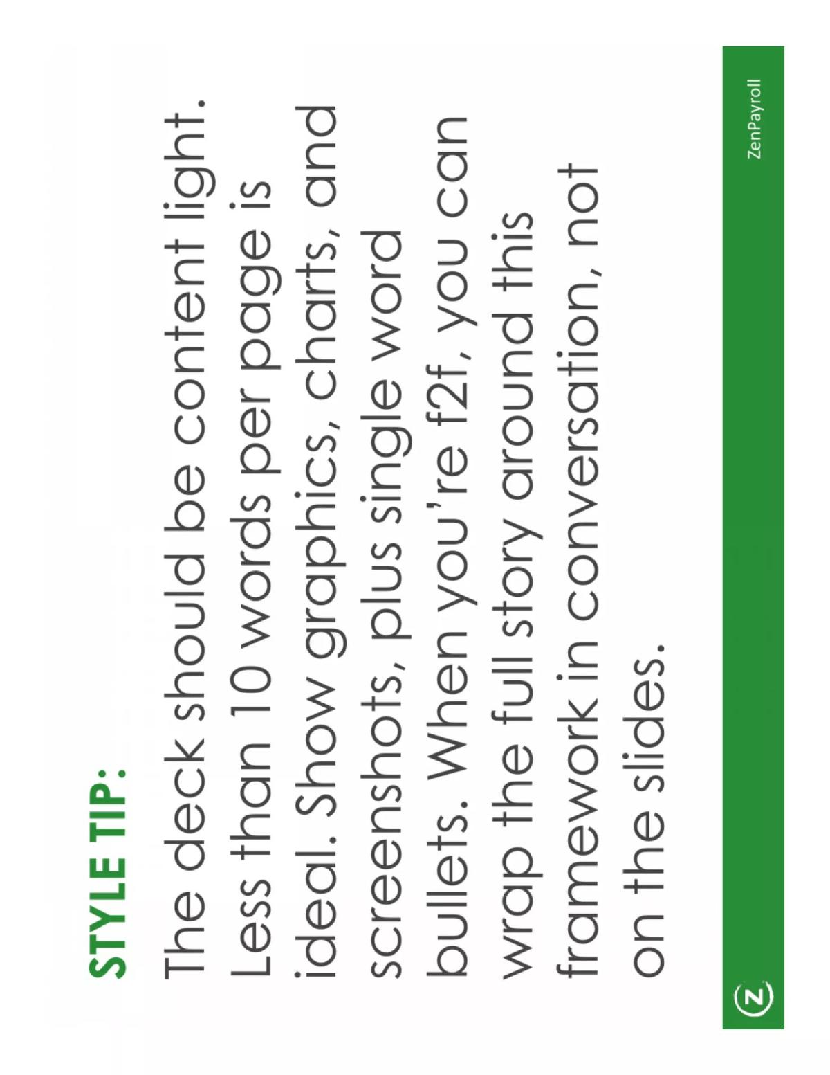
- The deck enforces a strict minimalist aesthetic, suggesting founders use fewer than 10 words per page to keep focus on the speaker (Slide 1).
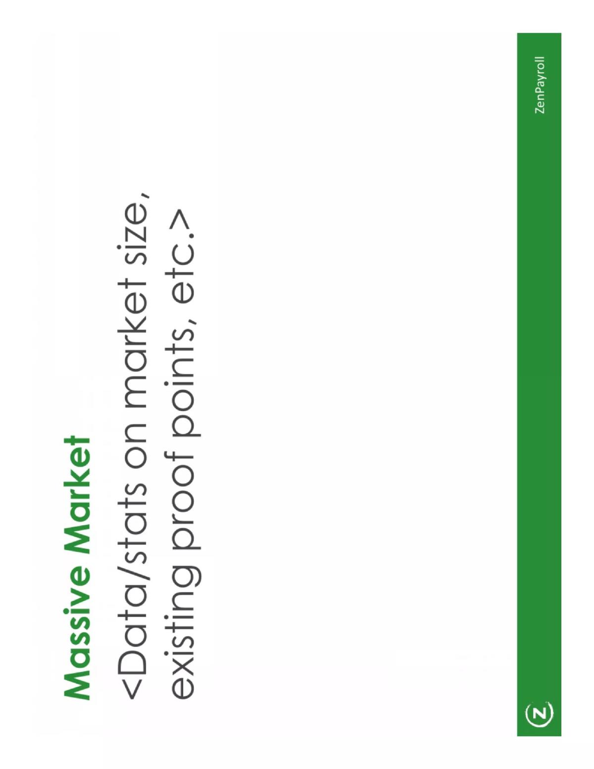
- Gusto frames the opportunity as a 'Massive Market' early in the deck to establish the scale of the disruption (Slide 4).
- The narrative emphasizes 'Current Pain,' positioning the product as a necessary solution to a broken existing system (Slide 6).
- A dedicated 'This is Only Possible Now' slide highlights macro-trends and enabling technologies as the catalyst for success (Slide 8).
- The 'Traction' slide is positioned late in the deck, used to validate the vision rather than lead with it (Slide 9).
- The deck includes a specific 'Customer Acquisition' slide to explain the mechanics of growth beyond just the product (Slide 11).
- A 'Summary' slide reinforces 3-5 key takeaways, ensuring the core message is retained after the presentation (Slide 13).
- The presentation concludes with a clear 'Fundraising' ask, including placeholders for the amount and current participants (Slide 14).
The Minimalist Blueprint for a $20M Series A
In 2014, ZenPayroll (now Gusto) raised a $20 million Series A round led by General Catalyst and Kleiner Perkins. The deck they used, preserved here as a template, is famous in the startup world for its extreme minimalism. While many founders attempt to cram every possible metric onto a slide, Gusto took the opposite approach, prioritizing a clean narrative and a 'less is more' philosophy. This teardown analyzes the 16-slide structure that helped them transition from a promising seed-stage company to a major FinTech player.
Slide 1: The Style Tip
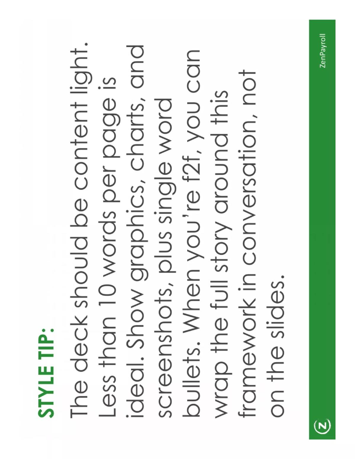
The deck begins not with a logo, but with a manifesto. Slide 1 sets the tone for the entire presentation: "The deck should be content light. Less than 10 words per page is ideal." This is a bold directive. It tells the founder that the slides are not the pitch; the founder is the pitch. The slides are merely visual punctuation. By limiting text, Gusto ensures that the investor's attention remains on the speaker, preventing the common pitfall of the 'reading room' atmosphere where investors ignore the founder to scan bullet points.
Slides 2-3: Branding and Vision
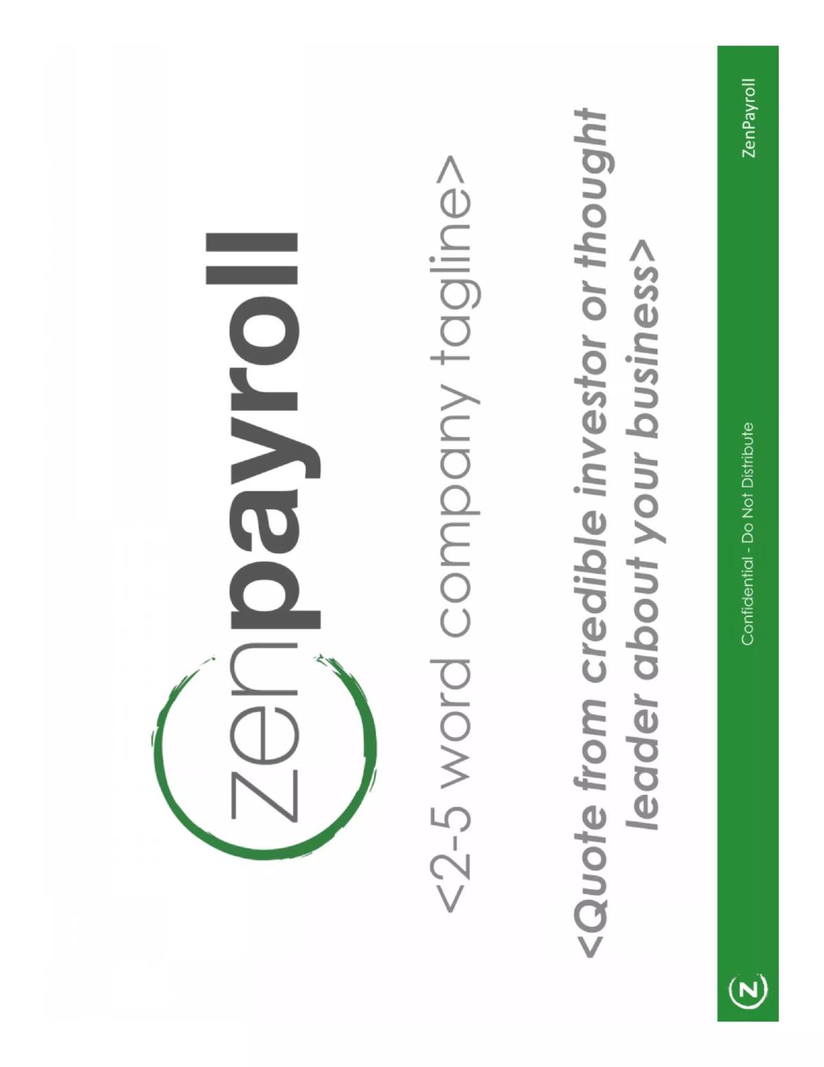
Slide 2 is a standard title slide featuring the ZenPayroll logo and placeholders for a tagline and a quote from a credible investor. Slide 3 moves immediately into the Vision . The template calls for a "Bold, declarative statement" that is "Ambitious. Big." For a payroll company, this vision likely revolved around the democratization of sophisticated HR tools for small businesses, but the template leaves the specific wording open to emphasize that the vision must be the guiding light for the entire deck.
Slides 4-5: Market and Landscape
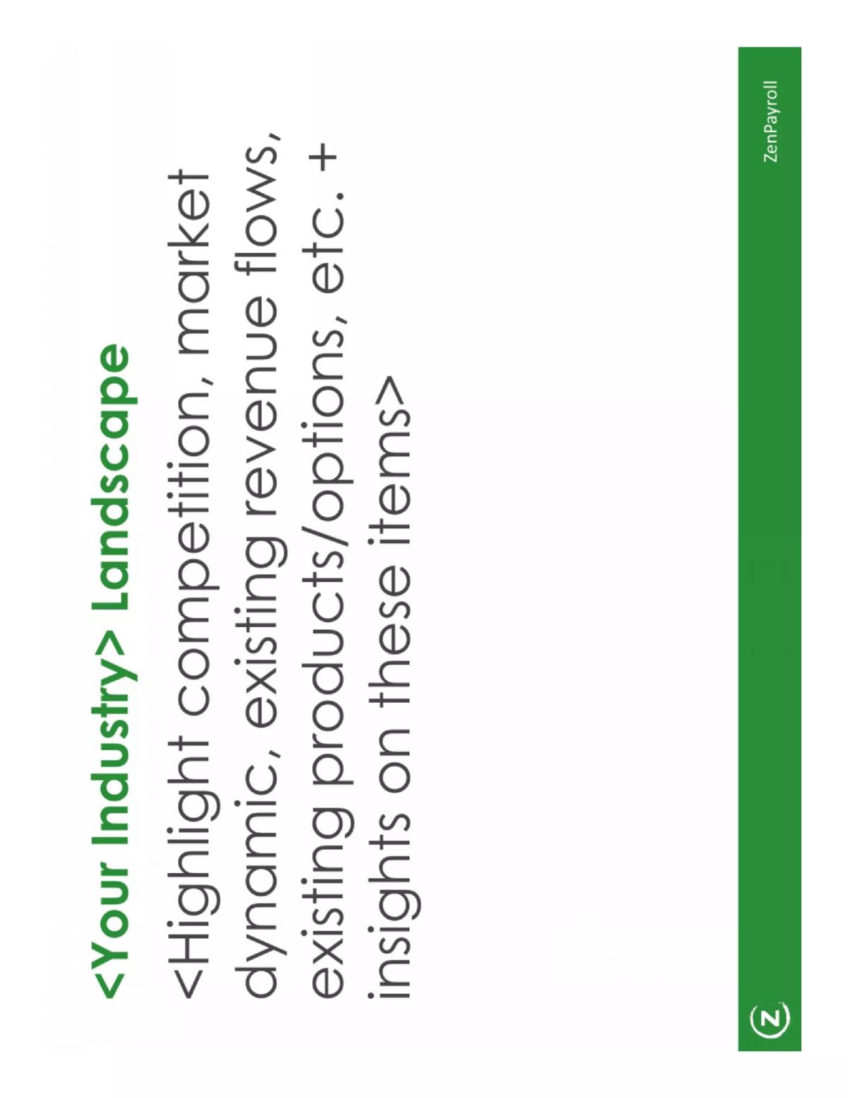
Slide 4, titled "Massive Market," focuses on data and stats regarding market size. In the context of 2014, this would have involved the millions of small businesses still using manual processes or legacy software like ADP. Slide 5, "Your Industry Landscape," shifts from size to dynamics. It suggests highlighting competition and revenue flows. The goal here isn't just to show who else exists, but to provide "insights on these items" that prove the founder understands the chess board better than anyone else.
Slides 6-7: Pain and Product
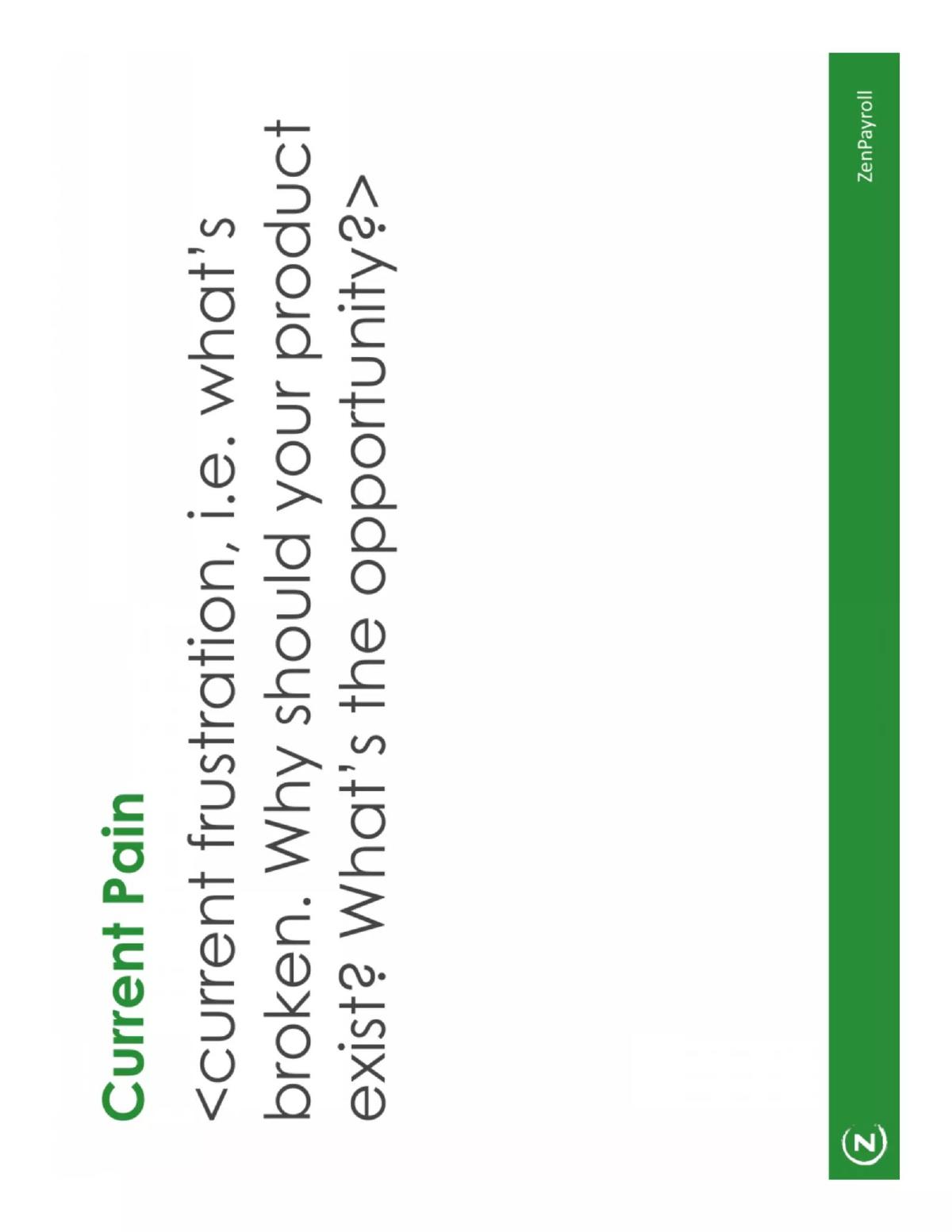
Slide 6 addresses "Current Pain." The template asks: "What's broken. Why should your product exist?" This is the emotional hook of the deck. For Gusto, the pain was the complexity and 'un-zen' nature of traditional payroll. Slide 7 introduces "Your Product" as the antidote. It recommends using screenshots and emphasizing "one or two key insights or features" rather than a laundry list of capabilities. This keeps the focus on the product's unique value proposition.
Slide 8: The 'Why Now' Factor
One of the most important slides in any Series A deck is Slide 8: "This is Only Possible Now." This slide is designed to explain why the timing is perfect. It points toward "macro-trends" and "new enabling technologies." In 2014, this likely referred to the proliferation of cloud computing and the shift toward mobile-first business management, which allowed a startup to offer services that were previously too expensive or technically difficult to deliver to small businesses.
Slides 9-11: Execution and Growth
Slide 9 covers "Traction." Interestingly, this appears halfway through the deck rather than at the start. It suggests listing usage stats and roadmap plans. Slide 10, "Business Model," outlines how the company makes money, including "alternative ways to make money" in the long term. Slide 11, "Customer Acquisition," is a critical addition. It forces the founder to explain the mechanics of their growth—how they will actually reach the 'Massive Market' described in Slide 4.
Slides 12-14: The Team and The Ask
Slide 12, "Who We Are," follows the standard format of photos and short bios, emphasizing "relevant previous experiences." Slide 13 provides a "Summary" of 3-5 key takeaways. This is a strategic move to reinforce the narrative before the final ask. Slide 14, "Fundraising," is the closing slide, where the founder lists the amount being raised and any investors already committed to the round.
Slides 15-16: Closing and Disclaimer
Slide 15 repeats the title slide information with contact details, and Slide 16 is a "Disclaimer" noting that this specific format is particularly relevant for "B2B or SaaS" companies. This reinforces that while the template is a guide, the content must be authentic to the specific business model.
What Works in This Deck
The primary strength of the Gusto deck is its narrative discipline . By adhering to the '10 words per slide' rule, the deck avoids the clutter that often plagues FinTech pitches. It follows a logical progression: start with a big vision, prove the market is huge, identify the pain, show the solution, and explain why the timing is right. This sequence builds a cumulative case for investment. Furthermore, the inclusion of a 'Customer Acquisition' slide (Slide 11) shows a level of operational maturity often missing in early-stage decks; it proves the founders aren't just building a product, but a distribution engine.
What Is Missing
Because this is a template version of the 2014 deck, it lacks the specific unit economics that would be required in a modern Series A pitch. There is no mention of Customer Acquisition Cost (CAC), Lifetime Value (LTV), or churn rates—metrics that are now standard for SaaS fundraising. Additionally, while the deck mentions 'Industry Landscape,' it lacks a specific Competitive Advantage slide that explicitly details the 'moat' or defensibility of the business against incumbents like ADP or Paychex. In a crowded market, simply being 'better' or 'more zen' is often not enough for a $20M check; investors want to see structural advantages.
Founder's Guide: What to Copy
Founders should absolutely copy the 'Why Now' slide (Slide 8) . Most decks explain the 'What' and the 'How,' but fail to explain the 'When.' Creating a sense of historical inevitability is a powerful way to motivate VCs. Founders should also adopt the Summary slide (Slide 13) . After a 30-minute meeting, an investor may only remember a fraction of what was said; providing a slide that explicitly lists the three things they must remember is a highly effective way to control the post-meeting internal partner discussion. Finally, the minimalist aesthetic is a valuable lesson: if a slide requires a paragraph of text to explain, it’s probably a bad slide. Use the speaker notes for the details and the slides for the impact.
Frequently asked questions
- Why does the deck use placeholders instead of real data?
- The version of the Gusto (ZenPayroll) deck available publicly is a template version of their actual Series A deck. It serves as a structural guide for other founders, showing the exact sequence and 'Style Tips' they used to raise $20M, while protecting the specific internal metrics and competitive insights from their 2014 raise.
- What is the significance of the 'Style Tip' on Slide 1?
- Slide 1 explicitly advises keeping content light, with fewer than 10 words per page. This strategy forces the founder to lead the conversation rather than having investors read ahead. It emphasizes that slides should be visual aids (graphics, charts, screenshots) rather than a replacement for the founder's verbal pitch.
- How does Gusto handle the competition in this deck?
- Gusto uses Slide 5, 'Your Industry Landscape,' to highlight market dynamics and existing revenue flows. Instead of a simple feature-comparison grid, the template suggests providing insights into why existing options are failing, setting the stage for the 'Current Pain' slide that follows.
- What is the role of the 'Why Now' slide in their fundraising strategy?
- Slide 8, 'This is Only Possible Now,' is crucial for Series A rounds. It answers why a payroll startup can succeed in 2014 when others failed previously. It points to new enabling technologies and macro-trends, creating a sense of urgency for the investor to act on a specific window of opportunity.
- Is a summary slide necessary in a 16-slide deck?
- According to Gusto's template (Slide 13), yes. The summary slide is intended to distill the entire pitch into 3-5 key takeaways regarding market size, product-market fit, and traction. This ensures that even if an investor forgets the details, they remember the core pillars of the investment thesis.