Circulate's 10-slide deck, built in PowerPoint 2007 and exported on 21 August 2013, pitched a user-curated social platform exclusively for long-form articles, enforcing a 350-character minimum per post and a newspaper layout on the theory that form drives content quality. The product insight is real and the roadmap is unusually specific, but the file - literally named 'investordeck' - has no funding ask, no valuation, no use of funds, no traction, no users, no market size figure, no pricing, no financial projection, no go-to-market plan and not a single product screenshot. Its market case is…
Key takeaways
- Circulate's 10-slide August 2013 deck is named 'investordeck' and contains no ask - no amount, no instrument, no valuation and no use of funds anywhere in the file.
- There is no traction because there is no product: the beta launch is listed as a future milestone dated September 2013, the month after the deck was made.
- The entire market case is one uncited quotation from Greylock partner Josh Elman given a full page; there is no market size figure anywhere in the ten slides.
- The only defensibility claim is 'patent pending' on a 350-character post minimum - a UI validation rule presented as intellectual property in a category whose real moat is network effects.
- The competition matrix gives Circulate a green tick in all five self-selected rows against eight rivals, and omits Medium, the most direct competitor in 2013.
- The problem slide dismisses Facebook as 'baby photos and bikini pics' and Reddit as 'memes and LOL cats' - contempt for mass-market users, written permanently into a publicly posted document.
- The deck's strongest idea, curator-run paid subscriptions with a platform revenue share, is the third sub-bullet of the business model slide behind Google AdSense, and carries no price, take rate or forecast.
- Half the four-person 'Team - Core Members' slide is not the team: one angel investor and one outside securities attorney sit alongside the two co-founders, and no one on the page has a media or publishing background.
What this deck actually is
Ten slides, built in Microsoft Office PowerPoint 2007, saved to PDF on 21 August 2013 at 10:57 UTC. The cover says "Circulate — August 2013" and the file was named investordeck , so there is no ambiguity about intent: this is a seed-stage investor deck for a social platform, and it was uploaded to a public slide-sharing site where it has lived ever since, personal mobile number included.
The idea is a single, clean sentence. Facebook, Twitter and Reddit optimise for short, disposable content, so long-form articles get buried. Circulate is a sharing platform that only accepts articles, enforces a 350-character minimum per post, and lays the result out like a newspaper. Users curate publications, discuss what they share, and can charge subscriptions for their pages, with Circulate taking a cut and running AdSense alongside.
As a thesis in 2013, that is a defensible thing to try. Medium was a year old. Instapaper and Pocket were proving people wanted to save long reads. Flipboard was proving people wanted them laid out beautifully. A social layer specifically for substantive articles was a live question, and the deck opens by quoting a Greylock partner saying exactly that.
What it is not is a deck that gives an investor anything to underwrite. Across ten slides there is not one product screenshot, not one user, not one usage number, not one dollar of revenue or projection, no market size, no acquisition plan, no competitive moat beyond a feature table, and — on a document literally named investordeck — no ask. No amount, no instrument, no valuation, no use of funds. The last slide is an email address and a personal cell phone.
That combination is what makes Circulate worth studying. It is not a bad deck in the sense of being ugly or incoherent. It is tidy, it is legible, it makes its argument in order. It is a deck that describes a product to an audience that came to price a company.
Slide-by-slide walkthrough
Slide 1 — Cover
A blue circular logo with a serif "C" over a faint globe, the wordmark "Circulate", and "August 2013" underneath. Nothing else.
The date is genuinely good practice and rarer than it should be — a dated deck tells the reader which version they are holding and lets the founder send an updated one without confusion. The logo is competent, on-brand for the newspaper positioning, and consistently repeated as a small mark in the corner of all nine following slides.
What is missing is the one line that makes a cover work: what Circulate is. A reader who opens this file cold learns nothing from page one except that a company exists and it is August. "The social network for long-form reading" would have cost eight words and would have meant the reader arrives at the problem slide already oriented. There is also no stage, no round, no geography, and no founder name on the cover, so the file cannot introduce itself if it gets forwarded — which, being on a public slide site, it certainly was.
Slide 2 — The Josh Elman quote
An entire page given to one quotation: "The opportunity to own the place where people go for long-form reading is a very large opportunity, especially for advertising." Attributed to Josh Elman, Greylock Partners.
Choosing an investor quote rather than a founder claim is smart. It says the category is validated by someone the audience respects, and it says it in the audience's own language. Elman was, at that moment, one of the most credible growth voices in consumer social — Twitter, LinkedIn, Facebook — so the name carries.
But a borrowed quote is not a market slide, and this deck treats it as one. There is no date on the quote, no source, no link, no publication. There is no market size anywhere in the ten slides — no number of long-form readers, no digital advertising spend, no share of attention, no comparable platform's user base. The quote asserts that the opportunity is "very large" and then the deck simply moves on, having outsourced its market case to a sentence with no citation.
There is a second, subtler problem. A partner at Greylock saying a category is large is a reason for Greylock to fund someone in it. It is not a reason to fund you. Using a famous investor's enthusiasm as slide two, before you have shown anything you built, quietly frames the pitch as "this category is hot" rather than "we are the team that wins it". Founders who lead with someone else's validation usually end up competing on the category thesis instead of on their own evidence.
Slide 3 — The Problem
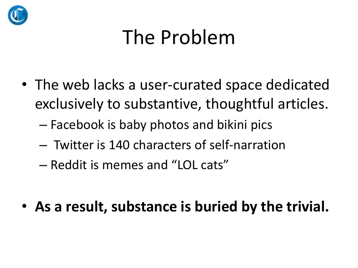
"The web lacks a user-curated space dedicated exclusively to substantive, thoughtful articles." Three sub-bullets follow: "Facebook is baby photos and bikini pics", "Twitter is 140 characters of self-narration", "Reddit is memes and 'LOL cats'". Bolded conclusion: "As a result, substance is buried by the trivial."
The structure of the argument is right, and the conclusion line is the best-written sentence in the deck. Naming the three incumbents rather than gesturing at "social media" is also correct: it tells the reader exactly which behaviour you are trying to displace.
The execution is a problem in two directions. First, the tone. "Baby photos and bikini pics" is a throwaway line that does real work against the founder — it is dismissive of the actual users of the largest consumer product ever built, and in a room it reads as contempt for the mass market you eventually need. Investors listen for whether a founder respects users, because product decisions flow from that. This slide answers the question badly, and it does so in writing, permanently, on a public document.
Second, the argument is false in a way that is easy to check. In August 2013, Reddit was not memes and LOL cats: r/AskHistorians, r/TheoryOfReddit and the long-form subreddits were already flagship examples of substantive discussion at scale, and Reddit's own front page routinely surfaced multi-thousand-word posts. Longreads had existed since 2009. Medium had launched publicly in 2012. Instapaper had sold to Betaworks in 2013. The problem slide argues that nothing exists, when the honest and stronger argument was that several things existed, none had won, and here is why the winning mechanic is different. Overstating the vacuum invites the first investor question to be a correction.
And there is no user evidence of any kind. No survey, no interview, no quote from a frustrated reader, no data on article completion rates or sharing behaviour. The problem is asserted from the founder's own taste.
Slide 4 — The Solution
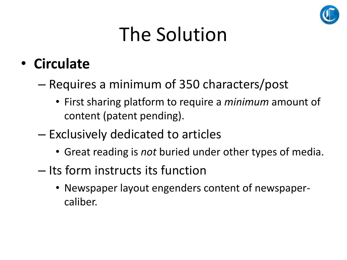
Three mechanics under the Circulate name. A minimum of 350 characters per post, described as "First sharing platform to require a minimum amount of content (patent pending)". Exclusive dedication to articles, so "great reading is not buried under other types of media". And "its form instructs its function" — a newspaper layout that "engenders content of newspaper-caliber".
"Its form instructs its function" is a real product insight and the most interesting line in the deck. Constraints shape behaviour; Twitter's 140 characters produced a specific culture, and inverting the constraint to a floor rather than a ceiling is a legitimate, non-obvious design bet. Stated in five words, it is memorable.
Then comes "patent pending" on a 350-character minimum, and it costs the founder credibility twice over. A minimum post length is a form-field validation rule; presenting it as defensible intellectual property signals a misunderstanding of what a moat is in consumer social, where the moat is network effects and habit, never a UI constraint a competitor can copy in an afternoon. Worse, this is the deck's only claimed defensibility. Take the patent line away and the slide describes three product decisions any team could ship in a sprint.
The slide also never shows the product. There is no screenshot of the newspaper layout, no example of a curated publication, no view of what a Circulate page looks like — on a deck whose central claim is that layout changes behaviour . The one argument that could only be won visually is made entirely in bullet points.
Slide 5 — Business Model
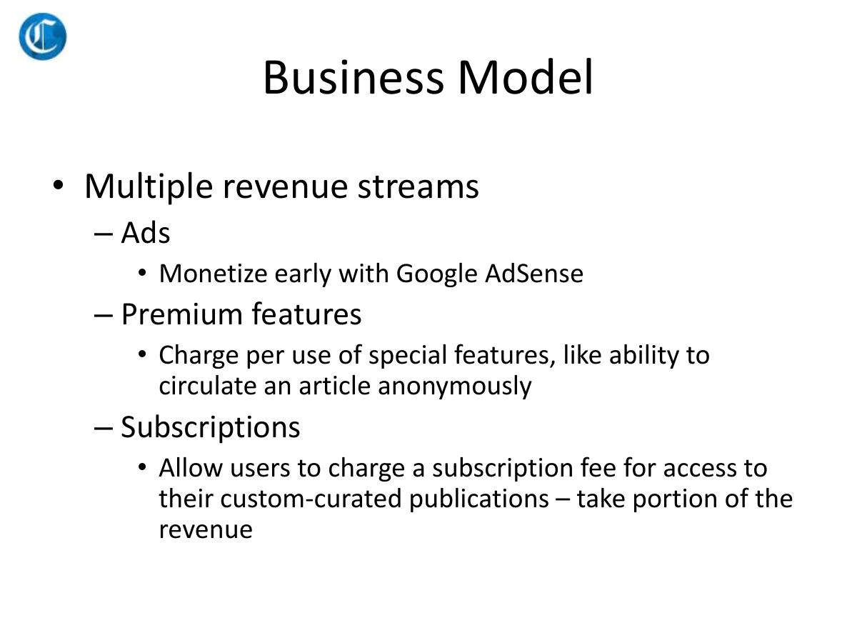
"Multiple revenue streams", then three: ads, monetised early with Google AdSense; premium features, charged per use, with the example being the ability to circulate an article anonymously; and subscriptions, where users charge for access to their custom-curated publications and Circulate takes a portion.
The subscription stream is genuinely ahead of its time. Paid, curator-run publications with a platform revenue share is exactly the model Substack proved at scale from 2017 onwards, and seeing it written down in August 2013 by a pre-launch team is the strongest signal in the file. It should have been the whole slide.
Instead it is the third bullet, behind AdSense. Leading a consumer social pitch with AdSense tells an investor the plan is display advertising at low CPMs against unknown traffic — the monetisation of last resort, and the one that requires the most users to produce the least revenue. "Multiple revenue streams" pre-launch is also read as a negative, not a positive: three unproven models means no conviction about which one is the business.
Not a single number appears on the revenue slide. No price for premium features, no expected subscription price point, no take rate on the revenue share, no CPM assumption, no revenue per user, no forecast for any year. The deck names three ways money could arrive and never estimates how much.
The anonymity example is also a strange choice on a platform whose stated value to users is "strengthen your online footprint" two slides later. Selling anonymity as a premium feature on a network built around personal reputation is a product contradiction the deck does not notice.
Slide 6 — Vast Utility
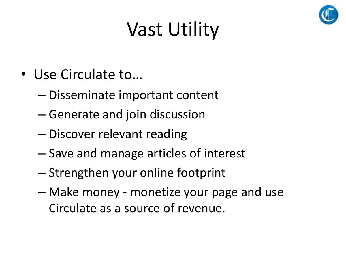
Six bullets: use Circulate to disseminate important content, generate and join discussion, discover relevant reading, save and manage articles of interest, strengthen your online footprint, and make money by monetising your page.
Every one of those is a real user benefit and the list is well phrased. But six benefits with no hierarchy is the same thing as no benefit. A reader cannot tell which one gets someone to sign up on day one, which is the only thing that matters pre-launch. Sharing, discussing, discovering, saving, personal branding and earning are the value propositions of six different products — Twitter, Reddit, a recommendation engine, Pocket, LinkedIn and Patreon — and claiming all six is a claim to beat all six.
The slide title is also doing damage. "Vast Utility" is a self-assessment, not evidence. Titles that grade your own product ("Vast", "Massive", "Revolutionary") read as filler to anyone who reads decks for a living, and the space would have been better spent on the one use case that pulls the first thousand users in.
Slide 7 — Competitive Distinctions
A nine-column matrix. Circulate against Facebook, Flipboard, Google Plus, Instapaper, LinkedIn, Pocket, Tumblr and Twitter, scored across five rows: personal soapbox, forum for discussion, save/manage content, home to articles of substance, and users earn money. Circulate has a green tick in all five. Every competitor has at least two crosses, and the last row — users earn money — is a cross for all eight.
The competitor set is well chosen and honestly assembled in one respect: the crosses in Circulate's own column are absent, but the ticks awarded to rivals are not stingy. Facebook gets a tick for soapbox and discussion; Flipboard and Pocket get ticks for saving; LinkedIn gets ticks for discussion and substance. A founder who lets competitors win rows is a founder who has actually looked at them.
The problem is the shape of the result, and it is the single most recognisable anti-pattern in venture: the column that is all green. Every experienced investor has seen a thousand of these, and the response is not "Circulate wins", it is "who drew the rows?". The rows were drawn by the company, chosen because Circulate satisfies them, and the fifth row exists so that one row is unanimous. That is a self-fulfilling matrix, and it converts the slide from evidence into decoration.
There are two specific factual holes. Tumblr, in 2013, plainly allowed users to earn — sponsored posts and creator monetisation were live conversations at the moment Yahoo bought the company for $1.1 billion three months before this deck. And the most important competitor is not on the chart at all: Medium, launched publicly in 2012, was the direct competitor for "home to articles of substance with a beautiful layout", and it is absent from a competition slide written in August 2013. Leaving the obvious rival off the matrix is the fastest way to make an investor assume you have not looked, or that you have and did not like the answer.
Note also what the matrix does not contain: a single number. No user counts, no traffic, no funding raised by competitors, no growth rates. It compares features, not businesses.
Slide 8 — Milestones, Path Forward
Six items on a timeline. Beta launch, September 2013. Subscription payments tool for content curators, October 2013. AdSense approval, October/November 2013. Native app for Android, December 2013. Native app for iOS, February 2014. Launch API, April 2014.
This slide is genuinely useful, and it is the one most decks skip. It is specific, it is dated, it is sequenced, and the sequence has internal logic — get the product live, then turn on the revenue stream that matters most, then the ad fallback, then reach, then the platform layer. A reader can hold the company accountable against it, which is exactly what a milestone slide is for.
Two things undercut it. The first is that the deck is dated August 2013 and the beta launches in September, which means the entire ten-page pitch is being made without a live product. Everything on the previous seven slides is a plan, and nothing in the file acknowledges that.
The second is that milestones without money are half a slide. Every roadmap item has a cost and a headcount attached, and this is where a deck normally answers "what does the round buy?" — beta by September, payments by October, two native apps by February, and here is the eighteen-month burn that funds it. Circulate lists the outputs and never mentions the input. Shipping two native apps and a payments product in six months with the team on the next slide is also an aggressive plan that no one on the page defends.
Slide 9 — Team, Core Members
Four names with logos on the right: Bain & Company, Teach For America, the Department of Defense seal, T5 Capital, and the SEC seal. Danny Sklar, co-founder and CEO, formerly of Teach for America, Bain & Co and Suffolk Capital. Eli Zuckerman, co-founder and VP of Tech, "previously developed the Department of Defense's first Android app". Mark Ghermazian, angel investor, Managing Director at T5 Capital and CEO of Appboy. Henry Lichtenberger, attorney, specialises in securities, previously practised at the SEC.
Two of these credentials are strong and specific. "Developed the Department of Defense's first Android app" is the kind of concrete, verifiable, hard-to-fake line a technical founder should lead with — it says he shipped something real, under constraints most engineers never face. And having a named angel already on the page, particularly one running a company as visible as Appboy was in 2013, is meaningful third-party belief.
The slide has three structural weaknesses. Only two of the four people are actually building the company; an angel investor and an outside securities lawyer are supporters, and padding a four-person team slide with two non-operators makes the operating team look thinner, not deeper. Neither co-founder gets a photo, a LinkedIn, a years-of-experience figure or a full-time/part-time status. And nothing connects the team to the problem — nobody on this page has a media, publishing, content or consumer-network background, which is the domain the company is entering. Consulting, teaching, defence software and securities law is a capable group with no stated reason to be the ones who win long-form social.
The logo wall is also carrying more weight than it should. Bain, TFA, the DoD and the SEC are impressive institutions and none of them is a startup outcome. A team slide that leans on employer brands rather than things the people built is a team slide that has not found its own evidence yet.
Slide 10 — Contact
"Email: danny@circulate.me. Cell: (310) 279-7812." Nothing else.
A named human and a direct line beats an info@ mailbox, and the founder is clearly signalling accessibility. But this is the last impression of an investor deck and it contains no ask, no next step, no meeting request, no data room, no website, and no reason to reply. The reader who reaches page ten and is interested has nothing to say yes to.
And a personal mobile number sits on a document that was uploaded to a public slide-sharing site, where it has been indexed and crawlable for over a decade. Founders should assume every deck they send is one forward away from being public, and put contact details behind a scheduling link rather than in the file.
What this deck does better than most startup pitch decks
It dates itself. "August 2013" on the cover, and dated milestones throughout. A shocking number of decks are undated, which makes them impossible to version and easy to misjudge months later. · It names the incumbents. Facebook, Twitter and Reddit by name on the problem slide, and eight named competitors on the matrix. Vague problem slides are far more common and far weaker. · "Its form instructs its function." A genuine, compressible product insight — the bet that a structural constraint produces a culture — expressed in five words. · It inverts a known mechanic. A character minimum where every competitor had a maximum is a clean, non-obvious idea, and it is the reason the pitch is memorable at all. · It has a sequenced roadmap. Six dated milestones in a defensible order, with the revenue tool ahead of the mobile apps. Most seed decks offer a vague "next 12 months" paragraph. · The subscription model was early and right. Curator-run paid publications with a platform revenue share, written down in 2013, four years before Substack made it obvious. · One specific, verifiable engineering credential. "Developed the Department of Defense's first Android app" is exactly the register a technical co-founder bio should be written in. · Ten slides. Restraint is a real virtue and the deck never rambles. The problem is what is absent, not what is padded.
Where this deck would fail in an investor meeting
There is no ask. A file named investordeck with no amount, no instrument, no valuation, no use of funds and no runway target. The single most important number in a fundraise is not in the document. · There is no traction, because there is no product. Beta is a milestone dated the month after the deck. No users, no waitlist, no beta signups, no pilot curators, no letters of intent. · There is no market size. Not one figure. The entire market case is an uncited quotation from a Greylock partner. · There is no financial model. No pricing, no take rate, no CPM, no cost base, no burn, no forecast for any period. Three named revenue streams and zero numbers attached to them. · There is no product screenshot. On a deck whose central thesis is that newspaper layout changes user behaviour, the layout is never shown. · There is no go-to-market. Nothing on how the first thousand users arrive, which is the only hard question in consumer social and the one the deck is silent on. · The moat is a patent claim on a character minimum. The sole defensibility argument in the file is a UI validation rule described as patent pending. · The competition matrix is all-green. Five self-selected rows, a clean sweep for Circulate, and Medium — the most direct competitor in 2013 — omitted entirely. · The problem slide insults the users. "Baby photos and bikini pics" is written into a permanent public document, and it makes the market it dismisses harder to serve later. · The problem statement is factually loose. Claiming the web "lacks" a space for substantive articles in 2013, with Medium, Longreads, Instapaper, Pocket and Reddit's long-form communities all live. · Half the team slide is not the team. Two operators, one angel, one outside lawyer, presented as four "core members". · No domain fit. Nobody on the page has a publishing, media or consumer-network background for a publishing consumer network. · "Multiple revenue streams" pre-launch. Reads as three guesses, not three businesses, and AdSense is listed first. · Six co-equal value propositions. No primary use case, so no way to guess the first user's first session. · The roadmap is unfunded and aggressive. Two native apps, a payments product and an API in eight months, with no headcount, cost or hiring plan anywhere. · A personal mobile number in a public file. Indexed and crawlable for over a decade.
Circulate's deck vs what a 2013 seed deck needed
One-line positioning on the cover Logo and date only Reader arrives at the problem unoriented
Market size with a source An uncited VC quotation No TAM, SAM or spend figure in the file
Problem with user evidence Three dismissive one-liners about incumbents No survey, interview or behavioural data
Product demo or screenshots Three bullets describing a layout The core thesis is visual and never shown
Traction Beta launch listed as a future milestone No users, waitlist or pilot at all
Business model with numbers Ads, premium, subscriptions — no figures No price, take rate, CPM or forecast
Go-to-market Absent No answer to consumer social's hardest question
Competition with a real position All-green nine-column matrix, Medium omitted Self-selected rows read as decoration
Defensibility "Patent pending" on a 350-character minimum No network-effect or data moat argued
Team with domain fit Two operators plus an angel and a lawyer No media, publishing or consumer-network experience
The ask and use of funds Absent Nothing for an interested reader to accept
Close with a next step Email and a personal cell number No meeting request, data room or link
How you would rebuild this deck in ten slides
The constraint is worth keeping. Ten slides was the right length; six of the ten were spent on things that do not move a decision.
Cover, with the sentence. "Circulate — the social network for long-form reading." Logo, date, founder name, round. Eight extra words, and the whole deck is oriented. · Problem, with evidence not attitude. Cut "baby photos and bikini pics" entirely. Replace it with one behavioural number — average article completion rate, share-to-read ratio, anything measured — and one real reader quote. Concede that Medium, Reddit and Pocket each solve part of it, then say what none of them solves. Conceding makes the rest of the deck credible. · Market, with a source. Keep the Elman quote if you like, but as a footnote under an actual figure: long-form readers, digital ad spend against editorial content, or paid-newsletter revenue. A cited number and a famous quote is a market slide; a famous quote alone is a poster. · Product, shown not described. A full-bleed screenshot of the newspaper layout with a real curated publication in it. The whole thesis is that form drives function — prove it with a picture. Overlay the 350-character rule on the composer where a reader can see it working. · The insight, on its own page. "Every platform set a ceiling. We set a floor." One line, one page. Drop "patent pending" — it subtracts credibility and defends nothing. If the IP is real, put the application number in the appendix and never say it out loud. · One use case, not six. Pick the wedge that gets the first thousand users. On this deck's own evidence that is the paid curator: someone with an audience who wants to charge for a reading list. Build the page around that person's first week. · Business model with three numbers. Lead with subscriptions, not AdSense. Price point, take rate, revenue per active curator per month. Then the arithmetic: how many paying curators are needed to reach $1M ARR. Drop the premium-anonymity feature, which contradicts the personal-footprint pitch. · Go-to-market. The missing slide, and the one a consumer investor actually buys. Which hundred writers do you recruit by name, how, and what does the first cohort's retention need to look like for the model to work? · Team, with fit and focus. Two founders, photos, full-time status, and the DoD Android line kept exactly as written. Move the angel and the attorney to a small "advisors" strip. Add the sentence that explains why these two people, in this category. · The ask. Amount, instrument, valuation cap, runway in months, and the three milestones the money buys — beta live, first fifty paid curators, first $10K of subscription revenue. Then a scheduling link, not a mobile number.
Every one of those ten pages already had a home in the original file. Circulate spent slide two on someone else's opinion, slide six on an unranked benefit list, and slide seven on an all-green table, and had no room left for the market, the product, the plan or the ask.
The transferable lesson
Circulate's deck fails in the most common way a seed deck fails: it is a description of a product delivered to people whose job is to price a company. The founders clearly knew their idea. What the file never does is convert that idea into the four things a decision requires — evidence that someone wants it, a number that says how big it gets, a plan for how the first users arrive, and an amount of money with a reason attached.
The tell is that the deck's own best asset is buried. A curator-run subscription business with a platform revenue share, written down in August 2013, is a genuinely prescient call. It sits as the third sub-bullet of the fifth slide, behind AdSense, with no price on it. The founders had the insight and did not know it was the insight — which is what happens when a deck is organised around what the product does instead of what the investor has to believe.
Read your own deck the way a partner does: not slide by slide, but by asking what claim each page is making and what would have to be true for the reader to accept it. If a page makes no claim — a benefits list, a quote, an all-green table — it is costing you one of the ten pages you get. And if you reach the last page without naming an amount, the meeting ends with nothing to say yes to.
Frequently asked questions
- What was Circulate?
- Circulate was a pre-launch social platform pitched in August 2013 as a user-curated space exclusively for long-form articles. It required a minimum of 350 characters per post, accepted articles only, and laid content out in a newspaper-style format on the theory that the form would raise the quality of what people shared. The plan was to monetise through Google AdSense, per-use premium features and curator-run paid subscriptions with a platform revenue share.
- Is the Circulate deck a real investor pitch deck?
- Yes. The PDF is literally named 'investordeck', was created in PowerPoint 2007 and exported on 21 August 2013, and follows the standard seed sequence of problem, solution, business model, competition, milestones, team and contact. What makes it unusual is that despite being explicitly an investor deck, it contains no funding ask - no amount, instrument, valuation or use of funds appears on any of the ten slides.
- What is the biggest problem with the Circulate pitch deck?
- It describes a product instead of making an investment case. There is no ask, no traction, no market size, no financial projection, no pricing, no go-to-market plan and no product screenshot. An investor finishing the deck knows exactly what Circulate would do and has no way to judge how big it gets, who wants it, how it reaches them, or how much money is being raised against it.
- Which slides should founders copy from this deck?
- Two. The milestones slide is genuinely good - six dated, sequenced deliverables from beta launch through to API, in an order with commercial logic, which most seed decks replace with a vague twelve-month paragraph. And the solution slide's line 'its form instructs its function' is a compressed, non-obvious product insight; inverting a character limit into a character minimum is the kind of mechanic a reader remembers a week later.
- Why is an all-green competition matrix a problem?
- Because the company drew the rows. Circulate's matrix scores nine platforms across five criteria and Circulate wins all five, including one row - 'users earn money' - that every competitor fails. Experienced investors read that shape as self-selection rather than analysis. A credible competition slide concedes at least one row to a rival and includes the most dangerous competitor, which here would have been Medium, absent from the chart entirely.
- What can founders learn from Circulate's business model slide?
- That ordering signals conviction. Circulate listed Google AdSense first and curator-run paid subscriptions with a revenue share third - and the third one was the prescient call, essentially the Substack model four years early. Leading with ad monetisation on a pre-launch consumer product tells an investor you expect low revenue per user and need enormous scale. Put the model you actually believe in first, and attach a price, a take rate and an arithmetic path to your first million in revenue.