The Queuesquare pitch deck, originating from Startup Weekend Hong Kong in 2011, addresses the specific retail pain point of customer churn due to long physical lines. By leveraging QR codes and a mobile application, the startup proposed a system where customers could join a virtual queue, freeing them to continue shopping while receiving targeted discounts. The deck is a product of its time, heavily featuring early smartphone UI and QR-centric workflows. While it lacks traditional venture capital metrics like CAC, LTV, or a formal financial ask, it provides a clear narrative on the 'dead time…
Key takeaways
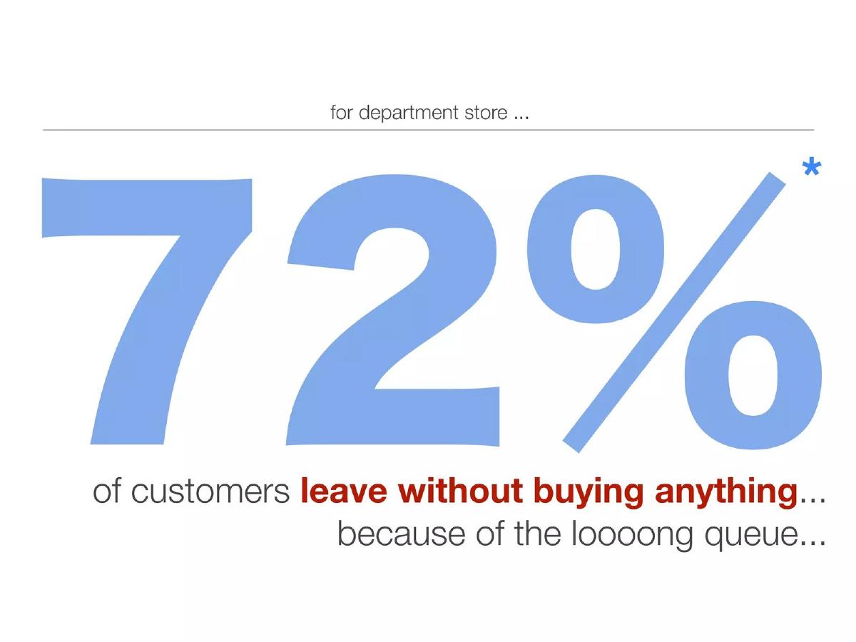
- The core problem identified is that 72% of department store customers leave without purchasing due to long queues (Slide 2).
- The solution utilizes QR code scanning to transition customers from physical lines to a digital waitlist (Slide 5).
- The product includes a merchant-facing dashboard for managing queues and creating targeted 'Campaign Promotions' based on gender and spending (Slide 8).
- The consumer app provides real-time updates, such as an estimated wait time of 10 minutes for a Sogo department store queue (Slide 5).
- Retailers can push targeted offers, such as '10% off for high heels', to users while they wait in the virtual line (Slide 5).
- The team slide uses nicknames like 'The Webmind' and 'The Red Bull' rather than professional titles or backgrounds (Slide 7).
- The deck omits critical business information including market size (TAM), revenue model, and a specific funding request.
- The 'Check-in Special' feature suggests a gamified approach to retail, requiring users to 'finish this queue' to unlock offers (Slide 5).
Introduction: The Hackathon Narrative
The Queuesquare pitch deck is a classic example of a 2011-era mobile startup concept. Produced for Startup Weekend Hong Kong, the deck focuses heavily on a singular friction point: the physical queue. In the early 2010s, QR codes were viewed as the primary bridge between the physical and digital worlds, and Queuesquare leans into this technology to solve retail churn. While the deck lacks the rigor of a Series A pitch, it excels at identifying a relatable pain point and proposing a clear, visual solution.
Slide 1: Title and Tagline
The cover slide introduces the brand name 'Queuesquare' with the tagline 'we make queuing fun & rewarding :)'. The branding is playful, using a hand-drawn font style that was popular in the early mobile app era. The use of a smiley face in the tagline sets a friendly, consumer-centric tone, though it lacks the professional polish expected in a high-stakes fundraising environment.
Slide 2: The Hook
Slide 2 presents the core problem with a bold statistic: 72% of customers leave without buying anything because of the loooong queue. This slide is the strongest in the deck because it quantifies the pain for the merchant. By framing the problem as lost revenue for department stores, the founders immediately establish why a business would pay for their solution. The asterisk suggests a source, though the source itself is not visible on the slide.
Slide 3: The 'Traditional Way'
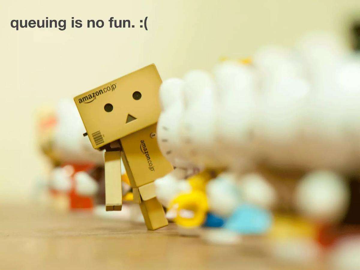
Using popular 'Danbo' cardboard robot photography, Slide 3 illustrates the current state of queuing. It shows a line, a feeling of being trapped (represented by the robot behind bars), and the eventual purchase. The slide is labeled 'traditional way... :(' to emphasize the negative emotional experience of the status quo. This is a common storytelling technique to build empathy for the user before revealing the 'hero' product.
Slide 4: The Conceptual Solution
Slide 4 introduces the Queuesquare workflow. It shows a QR code leading to a '10% off' incentive, which then leads to a 'free time ! :)' represented by a chaotic scribble. The implication is that instead of standing in a straight, boring line, the customer is free to wander the store (the scribble) while still being 'in line' for their desired item (the high heel icon). This slide effectively communicates the shift from a physical constraint to a digital freedom.
Slide 5: Product Mockups and UX
This slide provides the first look at the mobile interface. The process is broken down into three steps: scanning a QR code at a physical location (like Sogo), viewing the queue details (Position 12, Wait Time 15 mins), and receiving a notification when the user is near the front (Position 2, Wait Time 10 mins). Crucially, the middle screen shows 'Promotions' like '10% off for high heels!', demonstrating how the app serves as an advertising platform during the wait. The 'Check-in Special' at the top suggests a Foursquare-like gamification element where rewards are unlocked by completing the wait.
Slide 6: The Transition
Slide 6 features another Danbo image with the text 'Hey, but why stop here? (keep going man!)'. This acts as a transition slide, likely leading into the merchant-side features or the broader vision of the company. In a short pitch, these types of 'breather' slides can help pace the presentation, though they provide no new data.
Slide 7: The Team
The team slide is highly informal. It features six members with nicknames: 'The Webmind', 'The Red Bull', 'The Data', 'The iBrain', 'The Queue Hater', and 'The Teller'. There is also a 'special thanks to Siri'. While this fits the culture of a Startup Weekend, it is a significant red flag for actual investors. There is no indication of who is the CEO, who has retail experience, or if the team has the technical capacity to build a scalable backend for thousands of concurrent users.
Slide 8: Merchant Dashboard and Targeted Ads
The final slide in this set shows the 'Queue Square' backend. The 'Manage Queues' screen lists various high-end brands like LV, Prada, and Apple, showing average wait times and the number of people in the queue. The 'Campaign Promotion' window is the most important part of this slide; it shows how a merchant can target ads based on gender, frequency of visits, and accumulated spend (e.g., targeting females who spent $3000 or more with a necklace offer). This slide attempts to prove the business value: Queuesquare is not just a utility for shoppers, but a CRM and targeted ad tool for retailers.
What Works in This Deck
Clear Problem Identification: The 72% churn statistic on Slide 2 is a compelling reason for the product to exist. · Visual Workflow: The transition from Slide 4 to Slide 5 makes it very easy to understand how a customer actually uses the product. · Dual-Sided Value: The deck successfully addresses both the shopper (free time, discounts) and the merchant (data, reduced churn, targeted ads).
What is Missing
Market Size (TAM): There is no mention of how many department stores or high-traffic retail outlets exist in Hong Kong or globally. · Business Model: It is unclear if Queuesquare takes a cut of the 'Campaign Promotion' sales, charges a SaaS fee to the merchant, or is free for users. · Competition: In 2011, several 'virtual queue' and 'check-in' apps existed. The deck does not explain why Queuesquare is superior to a simple SMS-based buzzer system. · Financials and Ask: The deck ends without a request for capital or a projection of growth. · Professional Backgrounds: The team slide provides zero evidence of the founders' ability to execute.
Founder's Guide: What to Copy and What to Avoid
Copy the 'Lost Revenue' Frame: If you are building a B2B2C tool, always start with how the current problem is costing the business money. Slide 2 is a perfect example of this. It doesn't just say 'queues are annoying'; it says 'queues are killing your sales.'
Avoid the 'Nickname' Team Slide: While it might seem 'startup-y' to use funny titles, investors need to know your pedigree. Use your team slide to highlight past exits, relevant degrees, or years of industry experience. 'The Red Bull' does not inspire confidence in a lead investor.
Copy the 'In-App' Monetization Hint: Slide 8's campaign criteria (targeting by spend and frequency) is a great way to show that you are thinking about the data layer of your business, not just the utility layer. It shows that your app is a source of valuable first-party data.
Avoid Over-Reliance on QR Codes: While relevant in 2011, modern decks should show multiple entry points (NFC, Geofencing, App Clips). This deck is a reminder that your 'bridge' technology should be as frictionless as possible.
Conclusion
The Queuesquare deck is a time capsule of the early mobile-local-social (SoLoMo) trend. It identifies a massive, evergreen problem in the retail sector and proposes a solution that leverages the hardware of the time. However, as a fundraising document, it is incomplete. It functions well as a 'demo day' presentation to show a concept but falls short of the data requirements for a professional seed round. Founders today should take the clear problem-solution narrative from these slides but ensure they back it up with a robust business model and a team slide that proves they are the right people to solve the problem.
Frequently asked questions
- What is the primary value proposition of Queuesquare?
- Queuesquare aims to eliminate the 'lost sale' problem in retail. By allowing customers to join a virtual queue via a QR code, the startup converts wait time into 'free time' for the shopper and an additional marketing window for the retailer. The goal is to keep the customer in the store environment, browsing other sections, rather than leaving the premises due to frustration.
- How does the merchant dashboard work according to the slides?
- Slide 8 shows a 'Manage Queues' interface for retailers. It tracks average wait times (e.g., 30 minutes for LV Christmas Sales) and the number of people currently in line. It also features a 'Campaign Promotion' tool where merchants can set criteria for ads, such as targeting females who have spent $2000 or more with shoe discounts.
- What stage of development was Queuesquare in during this pitch?
- Based on the source listing and the content, this was a Startup Weekend project. The deck consists primarily of high-fidelity mockups and conceptual workflows rather than data from a live pilot. The absence of financial projections or a formal 'Ask' slide confirms its status as an early-stage hackathon-style pitch.
- What are the biggest weaknesses in this pitch deck?
- The deck is missing almost all standard investment metrics. There is no mention of the business model (how they charge retailers), no competitive analysis of existing pager systems or apps, and no roadmap. Furthermore, the team slide lacks professional credibility, opting for humorous nicknames over industry experience or technical credentials.
- How does the app handle user notifications?
- Slide 5 illustrates a push notification system. When a user's position in the queue reaches a threshold (e.g., 'Your position: 2'), the app sends an alert with the estimated remaining wait time. This allows the user to return to the specific counter or store just in time to complete their transaction.