Slidebean raised $96,250 in 2013 for their automated presentation design tool. The 28-slide deck (14 of which are analyzed here) is notable for being built entirely within the Slidebean platform, serving as a live product demo. The deck highlights a significant market opportunity, citing Microsoft's figure of 35,000,000 presentations delivered daily (Slide 5). While the revenue figures were modest, peaking at just over $4,000 in monthly revenue by January (Slide 4), the growth trajectory showed a +50% Month-over-Month increase (Slide 14). The deck effectively uses visual contrast to highlight…
Key takeaways
- The deck serves as a functional demo, explicitly stating on Slide 1 that the software was used to create the presentation.
- Slide 4 shows a clear revenue ramp from June to January, ending at approximately $4,100 in monthly revenue.
- Market size is validated by a Microsoft quote on Slide 5 stating 35,000,000 presentations are delivered every day.
- The 'Problem' is visually communicated on Slide 6 using a screenshot of a legacy, 1990s-era presentation interface.
- Technical simplicity is a core selling point, with Slide 8 emphasizing 'No Flash, No Plugins.'
- The business model is a standard SaaS tiered structure: Free(mium), Advanced at $119/yr, and PRO at $159/yr (Slide 11).
- Traction metrics on Slide 14 include +50% MoM revenue growth and over 15,000 decks created.
- The team slide (Slide 12) highlights specific founder achievements, such as 'Intel @ 17' for the CEO and '2x Mozilla Expand the Web Winner' for the CTO.
The 'Eat Your Own Dog Food' Pitch
Slidebean’s 2013 seed deck is one of the most famous examples of a startup using its own product to pitch its product. In the world of fundraising, this is the ultimate form of proof. If your software claims to make beautiful presentations effortlessly, and your pitch deck is beautiful, you have already won half the battle. This teardown looks at the 14 slides provided from their original 28-slide deck to see how they balanced product demonstration with business fundamentals.
The Hook and the Proof (Slides 1-3)
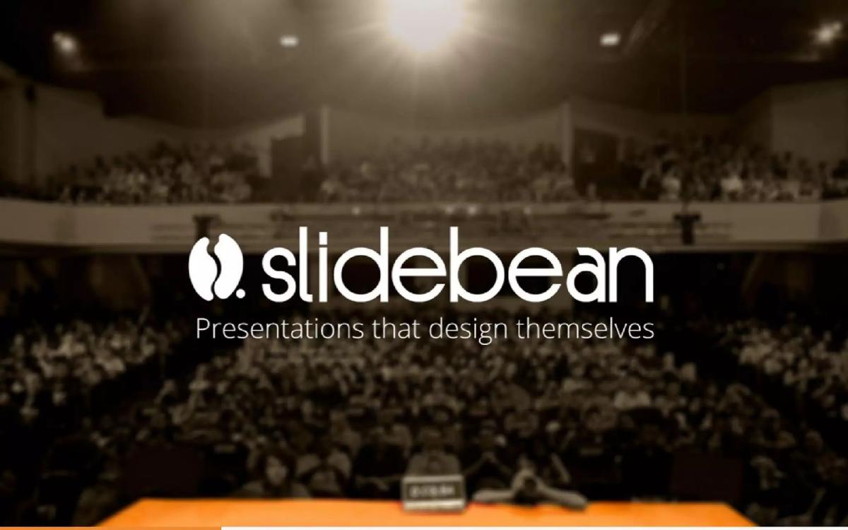
Slide 1: Title Slide The title slide is minimalist, featuring the logo and the tagline: "Presentations that design themselves." Crucially, it includes a parenthetical note: "(Yes, we used it to create this presentation)." This immediately sets the stage for the investor. The deck isn't just a document; it is a case study.
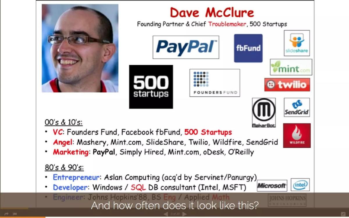
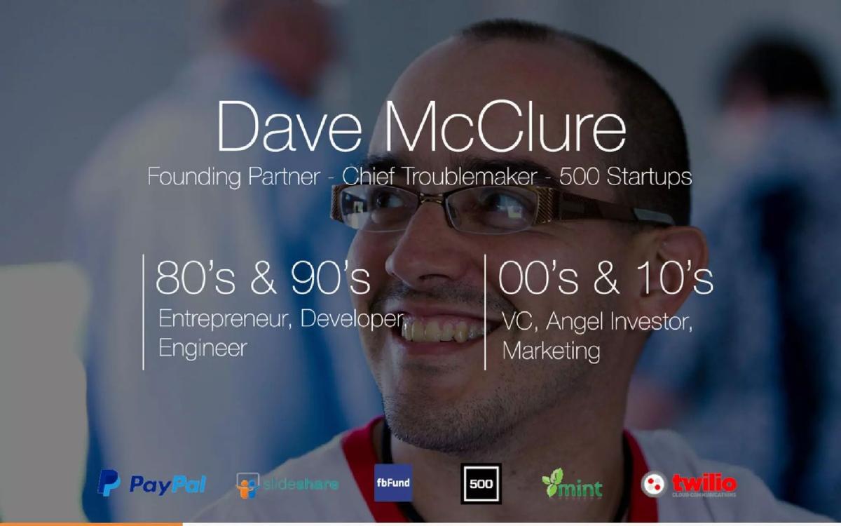
Slide 2 & 3: The 'Dave McClure' Contrast These slides are fascinating from a tactical perspective. Slide 2 shows a cluttered, poorly designed slide about 500 Startups founder Dave McClure, using a variety of fonts (including Comic Sans) and mismatched logos. The text at the bottom asks, "And how often does it look like this?" Slide 3 then shows the exact same information redesigned using Slidebean’s automated engine. The contrast is stark. It moves from a '90s-era eyesore to a modern, professional layout. This is a classic 'Before and After' marketing tactic applied to a pitch deck, and it works because it addresses a universal pain point: the difficulty of making information look good.
Market Opportunity and Traction (Slides 4-5)
Slide 4: Monthly Revenue ($) Slidebean doesn't hide behind percentages initially; they show a raw revenue graph. The Y-axis scales from 0 to 5000. We see a steady climb starting in June, with a slight dip in August, followed by an aggressive ramp-up. By January, the revenue is plotted just above the $4,000 mark. While $4k MRR is small, the shape of the curve—specifically the acceleration from October to January—is what attracts seed investors.
Slide 5: The Market Stat To prove the scale of the problem, Slidebean quotes Microsoft: "35,000,000 presentations are delivered every day." This is a massive 'Total Addressable Market' (TAM) indicator. It suggests that even capturing a fraction of a percent of this daily volume would result in a significant business. By using a Microsoft quote, they also subtly point to the competitor they intend to disrupt.
The Problem and Technical Solution (Slides 6-8)
Slide 6: The Legacy Problem This slide features a screenshot of a very old version of what appears to be PowerPoint or a similar legacy tool on an early Mac OS. The interface is crowded with buttons, toolbars, and complex menus. It visually represents the 'complexity' problem. The implication is that presentation software hasn't evolved in decades.
Slide 7: Visual Metaphor Slide 7 is a bit of an enigma in the provided set, showing a jumble of letters that seem to spell out a word, possibly related to design or content. In the context of the deck, it likely represents the 'mess' of traditional design before Slidebean organizes it.
Slide 8: Technical Advantage "NO FLASH, NO PLUGINS." In 2013, this was a major selling point. Many web-based design tools were still struggling with the transition away from Adobe Flash. By highlighting a plugin-free, browser-native experience, Slidebean was signaling that their tech stack was modern, mobile-friendly, and accessible.
Targeting and Business Model (Slides 9-11)
Slide 9: Target Audience The deck identifies "Marketing Teams" as a key user persona. This is a smart choice for an early-stage startup. Marketing teams have a high volume of presentation needs and usually have the budget to pay for tools that increase efficiency.
Slide 10 & 11: The Business Model Slide 10 introduces the concept of "Free(mium)," and Slide 11 breaks down the pricing tiers. They offer a Free tier, an "Advanced" tier at $119/yr, and a "PRO" tier at $159/yr. The pricing is aggressive for 2013, suggesting they were targeting professional users rather than casual students. The use of annual pricing also suggests a focus on reducing churn and securing upfront cash flow.
Team and Final Traction (Slides 12-14)
Slide 12: The Team The deck highlights two founders: Caya (CEO) and Jose E. Bolaños (CTO). The credentials listed are impressive for a seed round. Caya is noted as a "TEDx Speaker" and having worked with "Intel @ 17." Bolaños is credited as a "2x Mozilla Expand the Web Winner." This establishes a balance of visionary leadership and technical execution capability.
Slide 13: The Reiteration A simple slide repeating the core value prop: "Presentations that design themselves." It serves as a transition to the final traction summary.
Slide 14: Traction Summary This slide consolidates the 'why now' for investors. It claims "+50% MoM Revenue Growth" and "+15,000 Decks Created." These two metrics prove both commercial viability and product-market fit (usage). Seeing 15,000 decks created on a relatively new platform is a strong indicator of user engagement.
What Works in this Deck
The Product is the Deck: The most effective part of this pitch is that the deck itself is the demo. Every slide transition and layout choice reinforces the claim that the software works. For a design tool, this is non-negotiable.
Clear Revenue Growth: Even though the absolute numbers were low ($4k MRR), the growth was consistent and accelerating. Investors at the seed stage are looking for the 'hockey stick' shape, and Slide 4 delivers that visually.
Founder-Market Fit: The team slide doesn't just list titles; it lists specific achievements that suggest they are over-performers. Being a Mozilla winner or an Intel collaborator at a young age suggests a high ceiling for the founders.
What is Missing
The 'Ask' Slide: In the 14 slides provided, there is no mention of how much money they are raising or what they plan to do with the funds. While this may have been in the latter 14 slides of the full 28-slide deck, its absence here leaves the narrative unfinished.
Unit Economics: While we see revenue, we don't see Customer Acquisition Cost (CAC) or Lifetime Value (LTV). For a SaaS company, these are critical for understanding if the +50% growth is sustainable or if they are buying growth at a loss.
Competitive Landscape: Aside from the visual jab at legacy software, there is no slide addressing other modern competitors like Prezi or Canva, which were already gaining traction in 2013. Investors would want to know how Slidebean defends its niche.
What a Founder Should Copy
The 'Before and After' Slide: If you are disrupting a legacy process, show the legacy process at its worst and your solution at its best side-by-side. It removes the need for long-winded explanations.
Minimalist Design: Slidebean follows the 'one idea per slide' rule perfectly. There are no walls of text. This keeps the investor focused on the founder's pitch rather than reading the slides.
Specific Traction Metrics: Don't just say you are growing; give a specific MoM percentage. Don't just say people use the tool; give the total number of 'units' (in this case, decks) created. Specificity creates credibility.
Final Thoughts
Slidebean’s deck is a textbook example of how to pitch a product-led growth company. By focusing on the output of the tool and the resulting revenue growth, they made a compelling case for a $96k seed investment. They didn't need a massive amount of capital to prove the concept; they just needed to show that the 'design engine' worked and that people were willing to pay for it.
Frequently asked questions
- How much did Slidebean raise with this deck?
- According to the catalogue data, Slidebean raised $96,250 in 2013 during their Seed stage. This was a relatively small round, typical for an early-stage startup participating in accelerators like Startup Chile and DreamIt Ventures, both of which the company is an alumnus of.
- What was Slidebean's primary value proposition in 2013?
- The core value proposition, as stated on Slide 1 and Slide 13, is 'Presentations that design themselves.' The tool aimed to separate content creation from design, allowing users to input text while the software automatically handled the layout and aesthetics, solving the 'design' bottleneck for non-designers.
- Who was the target audience for Slidebean at the time of this raise?
- Slide 9 identifies 'Marketing Teams' as a primary target segment. The deck positions the tool as a way for these teams to create professional decks quickly without needing specialized design skills or dealing with the complexities of traditional software like PowerPoint.
- What were the key traction metrics shown in the deck?
- Slide 14 highlights two main traction points: a +50% Month-over-Month revenue growth rate and the fact that users had already created over 15,000 decks using the platform. Slide 4 provides the raw data for this growth, showing revenue climbing from near zero in June to over $4,000 by January.
- How did Slidebean differentiate itself from PowerPoint or Keynote?
- The deck uses Slide 6 to show an old, cluttered Mac OS interface for presentation software, contrasting it with Slidebean's clean, web-based approach. Slide 8 further differentiates the product by highlighting that it requires 'No Flash, No Plugins,' which was a significant technical advantage for web tools in 2013.