The 2013 Babylist pitch deck is a quintessential example of early-stage storytelling. Spanning 17 slides, the presentation eschews complex financial modeling in favor of a clear, relatable problem: the fragmentation of baby registries across big-box retailers like Walmart and Target. Founder Natalie Gordon leveraged her 'hacker' background to build a solution that consolidated these disparate sources into a single, mobile-friendly list. The deck’s strength lies in its transparency regarding unit economics, citing a 4% transaction fee and $13 in revenue per sign-up. With $2.3 million in gifts…
Key takeaways
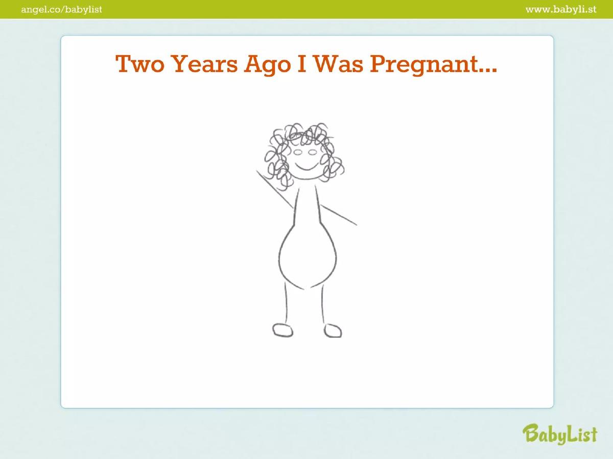
- The deck uses a personal narrative, starting with the founder's own pregnancy experience on slide 2.
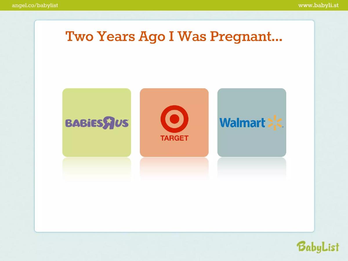
- It identifies a specific market gap by showing the logos of Babies 'R' Us, Target, and Walmart as fragmented competitors on slide 3.
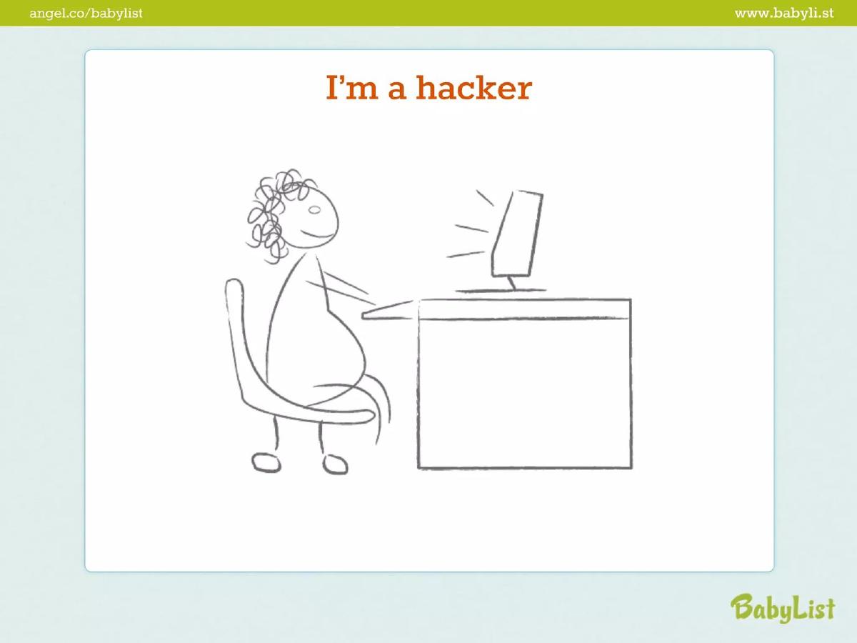
- The product is positioned as a 'hacker' solution, emphasizing the founder's technical ability to build the tool herself on slide 4.
- Market size is clearly defined as a $43 billion industry on slide 12.
- The company demonstrated significant early traction with $2.3 million in gifts processed in 2012, as shown on slide 14.
- Unit economics are explicitly stated, with the company earning approximately 4% per transaction on slide 14.
- Growth is highlighted by an 11k sign-up figure and a 300% growth rate on slide 15.
- The final ask was for a $500k seed round, with $110k already committed at the time of the pitch on slide 17.
The Power of Personal Narrative in E-Commerce
The 2013 Babylist pitch deck is a relic of a specific era in Silicon Valley, yet its core logic remains incredibly sound for early-stage founders today. At 17 slides, it follows a classic storytelling arc: the personal struggle, the technical solution, the massive market, and the undeniable traction. By raising $650,000—surpassing their initial $500,000 goal—Babylist proved that a simple, well-executed idea in a traditional niche can be a venture-scale opportunity.
Slides 1-4: The Origin Story and Founder-Market Fit
Slide 1 introduces the brand with its signature green logo and identifies Natalie Gordon as the CEO and Founder. The deck immediately pivots to a personal narrative on Slide 2, featuring a hand-drawn illustration with the caption, "Two Years Ago I Was Pregnant..." . This is a deliberate move to establish empathy and authenticity.
Slide 3 identifies the friction point. By displaying the logos of Babies 'R' Us, Target, and Walmart , Gordon illustrates the fragmented nature of the baby registry market. The problem isn't that these stores don't exist; it's that a parent-to-be is forced to manage three separate lists. Slide 4, titled "I'm a hacker," introduces the solution. It positions the founder as someone with the technical agency to solve her own problem, a key trait investors look for in solo or early-stage founders.
Slides 5-6: Product and Consolidation
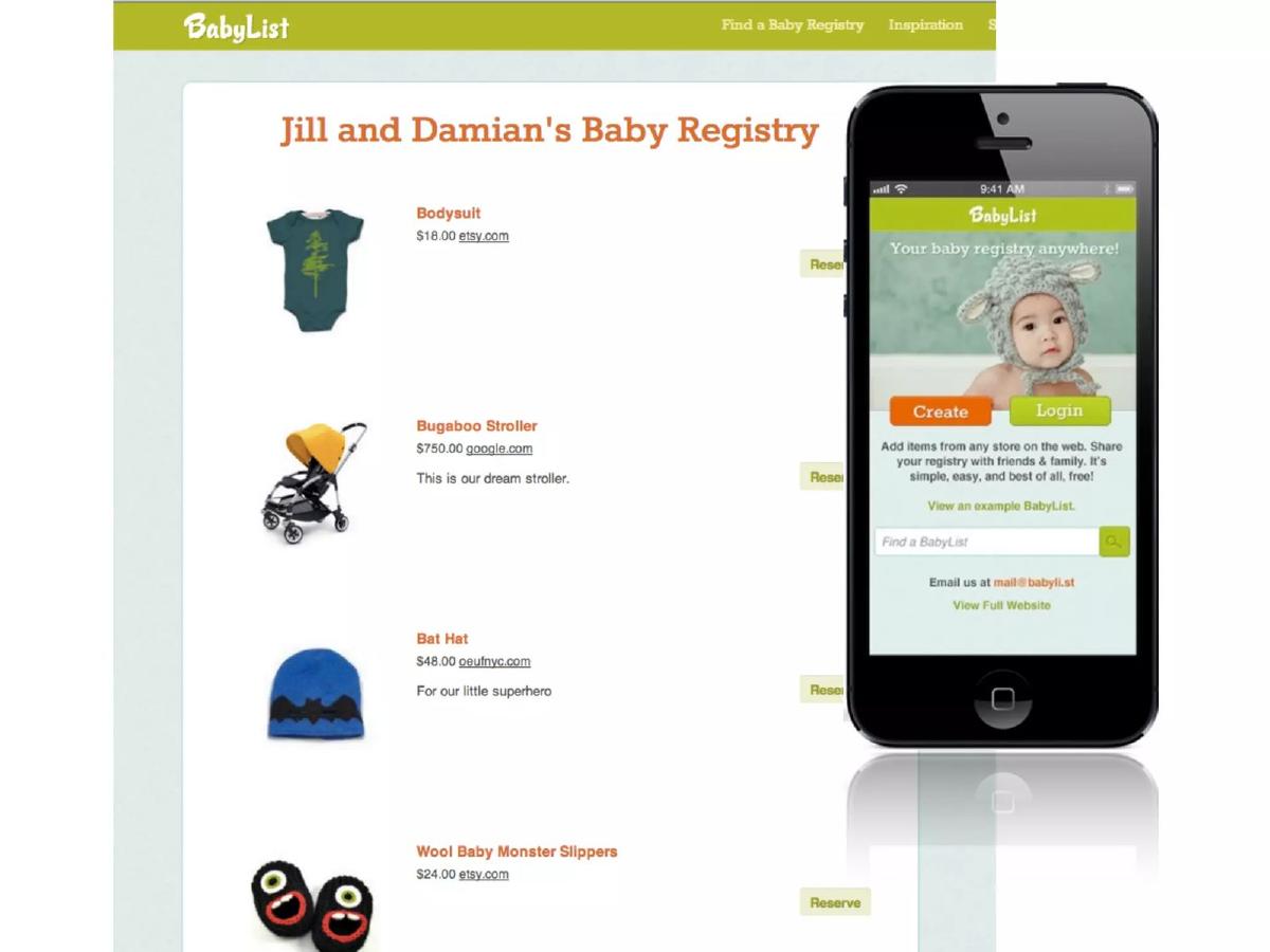
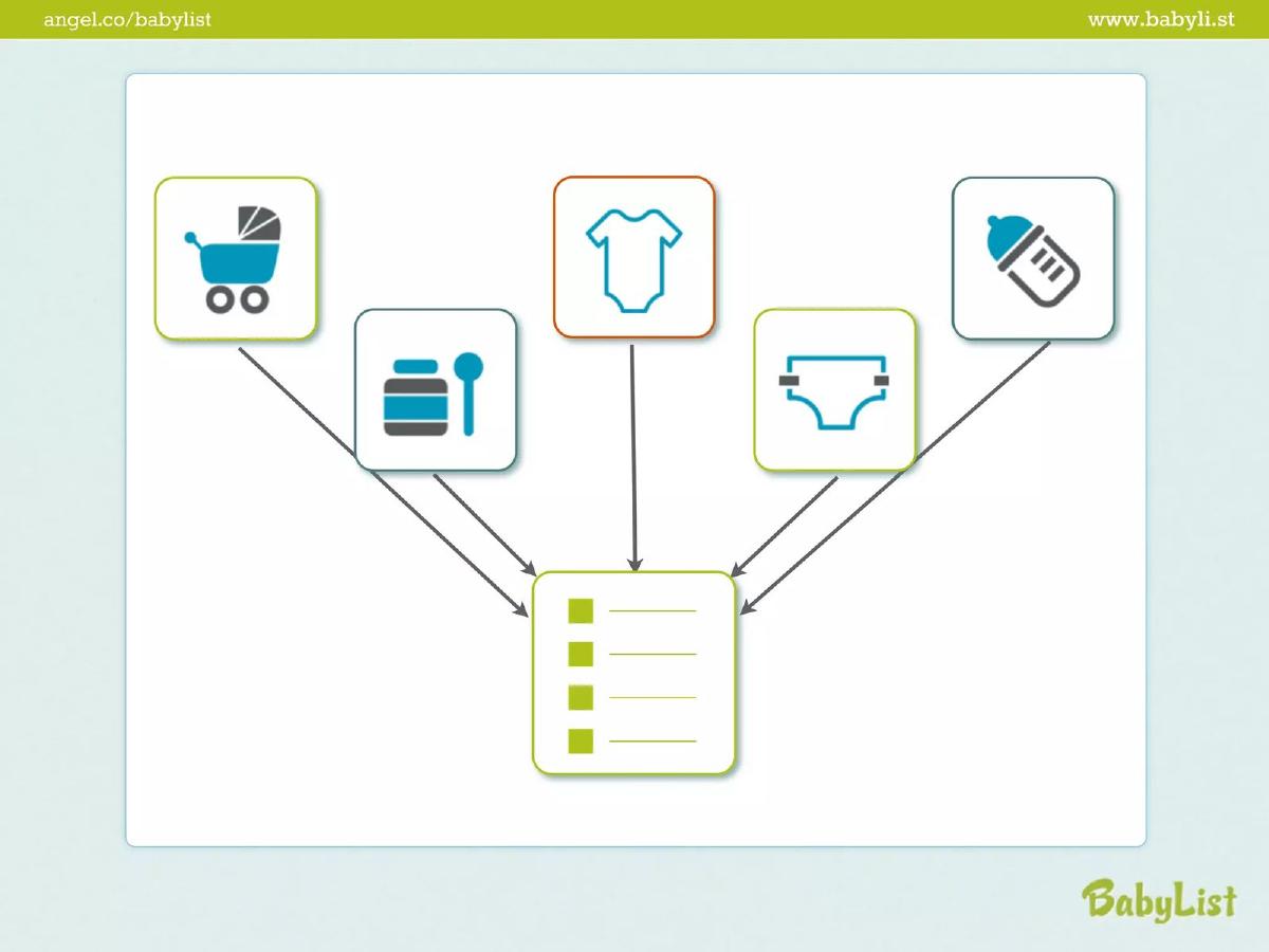
Slide 5 provides a product mockup, showing "Jill and Damian's Baby Registry." The slide highlights the ability to add items from any store on the web, including Etsy and Google. This is the 'aha' moment for the investor: the platform is retailer-agnostic. Slide 6 uses simple icons (strollers, bottles, diapers) pointing to a single list to reinforce this consolidation value proposition visually.
Slides 7-10: The Burden of Choice
Slides 7 through 9 lean into the emotional and logistical weight of pregnancy. Slide 7 states "pregnant women are awesome!" while Slides 8 and 9 show a chaotic collage of "A lot of stuff." This visual clutter represents the overwhelming number of products parents need to research and buy. Slide 10 quantifies this burden with a stark figure: "1st year = $15,500." This establishes the high average spend per customer, which is critical for an e-commerce platform's lifetime value (LTV).
Slides 11-12: Market Size and Opportunity
Slide 11 uses a pictogram to show that there are 16,000 pregnant women every day . This translates the abstract concept of 'market' into a daily, renewable resource of potential users. Slide 12 delivers the 'Big Number': a "$43 billion industry." By this point in the deck, the investor understands the problem, the solution, and the massive scale of the prize.
Slides 13-15: The Business Model and Traction
Slide 13 introduces the team, featuring Natalie Gordon (CEO), Patty Wu Benson (Marketing & PR), and Lindsey Grande (Designer) . This shows a balanced, albeit small, team capable of handling product, growth, and aesthetics.
Slide 14 is the most important slide for a Seed investor. It states, "We are making money," and provides two critical data points: a "~4% per transaction" fee and "$2.3 million in gifts in 2012." This proves the model works at scale. Slide 15 doubles down on this with "11K sign-ups" and a "$13 per sign-up" revenue metric, alongside a "300%" growth arrow. These figures remove the guesswork for investors regarding how the company will eventually reach profitability.
Slides 16-17: The Vision and The Ask
Slide 16 summarizes the mission: to "revolutionize baby e-commerce." It’s a bold claim that connects the registry tool to the broader $43 billion market mentioned earlier. Finally, Slide 17 presents the ask: "Raising: $500K seed round" with "Committed: $110K." Showing that 22% of the round was already committed creates a sense of urgency and social proof for new investors.
What Works in the Babylist Deck
The primary strength of this deck is its clarity of unit economics . Many Seed-stage decks hide behind vague 'engagement' metrics. Babylist was upfront about their 4% take rate and the $13 revenue-per-user figure. This transparency makes the business feel 'real' rather than theoretical.
Additionally, the narrative flow is excellent. It moves logically from a personal pain point to a massive market opportunity without any jarring transitions. The use of simple, high-contrast slides ensures that the key numbers—$2.3 million, 300%, $43 billion—are impossible to miss.
What Is Missing from the Babylist Deck
The deck is notably thin on competitive analysis beyond the big-box retailers. While it mentions Target and Walmart, it doesn't address other 'universal registry' startups that were emerging at the time. An investor might wonder what prevents Amazon or a well-funded competitor from building a browser extension that does the exact same thing.
There is also no product roadmap . The deck focuses heavily on what Babylist is (a registry) but doesn't explicitly detail what it will become . Given the 'revolutionize e-commerce' claim on slide 16, a slide detailing future features—such as editorial content, community features, or direct sales—would have strengthened the long-term vision.
What a Founder Should Copy
The 'Committed' Figure: Always state how much of your round is already spoken for. It changes the conversation from 'Should I invest?' to 'Can I get in before it's full?' · Simplified Market Math: Slide 11's '16,000 women per day' is much more relatable and grounded than a generic TAM/SAM/SOM slide. It shows a constant flow of new customers. · Founder-Market Fit: If you are building for a demographic you belong to, highlight it. The 'hacker mom' narrative is a powerful way to demonstrate that the product is built with deep empathy for the user. · Revenue Transparency: Even if your revenue is small, showing the mechanics of how you make money (like the 4% transaction fee) builds immense trust with investors.
Frequently asked questions
- How did Babylist demonstrate founder-market fit?
- Babylist established founder-market fit by opening with a personal story. Slide 2 and 4 show the founder, Natalie Gordon, as both the target customer (a pregnant woman) and the solution provider (a 'hacker'). This dual identity proved she understood the pain points of existing registries and possessed the technical skills to build a superior alternative without relying on outside agencies.
- What was the primary revenue model presented in the deck?
- The revenue model was based on affiliate or transaction fees. Slide 14 explicitly states that the company makes approximately 4% per transaction. By aggregating products from various retailers into one registry, Babylist earns a commission on the gifts purchased through their platform, which resulted in $2.3 million in gift volume in 2012.
- How did the deck address competition?
- Rather than a standard competitive matrix, Babylist used slide 3 to show the logos of major retailers like Target and Walmart. The implication was that these giants were the problem—forcing parents to create multiple, disconnected registries. Babylist positioned itself not as a retailer, but as the layer that sits on top of all retailers to simplify the user experience.
- What metrics were most important to their seed round success?
- The most compelling metrics were the gift volume and the growth rate. Slide 14 and 15 highlight $2.3 million in gifts processed and a 300% increase in sign-ups. Additionally, stating a specific revenue figure of $13 per sign-up gave investors a clear way to model future earnings based on user acquisition costs.
- Is the visual style of this deck still effective today?
- While the hand-drawn 'stick figure' aesthetic on slides 2 and 4 feels dated, the underlying principle of 'one idea per slide' remains best practice. The deck is uncluttered and uses large fonts for key figures, ensuring that the data (like the $43 billion market size) is the focal point, which is still highly effective for modern seed pitches.