Baby 2 Body’s pitch deck is a masterclass in leading with traction. By placing their 400,000 email subscriber milestone on slide 2, they bypass the need for lengthy market validation and move straight into product utility. The deck positions the company as a lifestyle brand rather than a medical utility, targeting the 'nearly and new mom' demographic through four pillars: food, wellbeing, look, and fitness. While the deck is visually cohesive and highlights a strong advisory board including medical professionals, it notably lacks a specific financial 'Ask' slide, detailed unit economics, or a…
Key takeaways
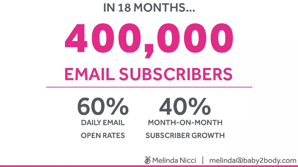
- The company achieved 400,000 email subscribers within its first 18 months of operation, as stated on slide 2.
- Engagement is exceptionally high for the sector, with a reported 60% daily email open rate on slide 2.
- The business is growing at a rate of 40% month-on-month in terms of subscriber acquisition, according to slide 2.
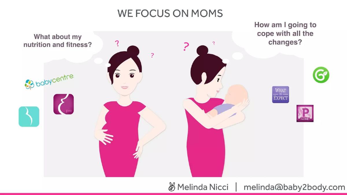
- Baby 2 Body differentiates itself by focusing on the mother's nutrition and fitness rather than just baby tracking, shown on slide 4.
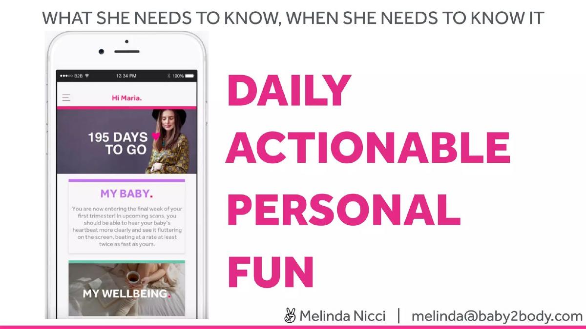
- The product strategy relies on 'Daily Actionable Personal Fun' content delivered via a mobile interface, as illustrated on slide 6.
- Monetization is driven by a 'Paid For Premium Experience' featuring videos, podcasts, and infographics, detailed on slide 8.
- The team includes a dedicated Head of Tech and Head of Product, supported by an OBGYN advisor, as listed on slide 9.
- The deck completely omits a financial ask, use of funds, or exit strategy across all 10 slides.
Slide-by-Slide Analysis
Slide 1: Title Slide
The deck opens with a clean, minimalist title slide. The logo, BABY 2 BODY , is presented in a bold sans-serif font with a pink period, establishing the brand's primary color palette. The tagline, "Happy Mom. Healthy Baby," immediately defines the target audience and the dual benefit of the service. Contact information for Melinda Nicci is prominently displayed at the bottom, which is a standard and effective practice for accessibility.
Slide 2: Traction and Growth
This is the strongest slide in the deck. Instead of starting with a problem statement, the founders lead with evidence of product-market fit. They highlight 400,000 email subscribers achieved in just 18 months. Even more impressive are the engagement metrics: a 60% daily email open rate and 40% month-on-month subscriber growth . By leading with these figures, the company establishes that they have a highly engaged audience that values their content, which significantly de-risks the investment for a potential backer.
Slide 3: The User Context
Slide 3 is a full-bleed lifestyle photograph of a young couple with a newborn in a kitchen setting. The mother is looking at her smartphone while holding the baby. This slide serves as a visual transition, grounding the data from the previous slide in a real-world scenario. It emphasizes the mobile-first nature of the product and the specific life stage of the user.
Slide 4: The Problem (We Focus on Moms)
This slide uses simple illustrations to contrast Baby 2 Body with existing competitors. It shows a pregnant woman and a new mother surrounded by logos of traditional pregnancy apps like BabyCenter and What to Expect. The thought bubbles—"What about my nutrition and fitness?" and "How am I going to cope with all the changes?"—identify a gap in the market. Most competitors focus on the baby's growth; Baby 2 Body focuses on the mother's physical and mental health.
Slide 5: Brand Heritage and Inspiration
Slide 5 features the company logo alongside two images: a graphic of a human head with gears (representing the psychological/fitness aspect) and a book titled "Pregnancy Day by Day." This suggests that the digital product is rooted in established expertise or perhaps a physical publication that preceded the app. It reinforces the idea that the content is authoritative and well-researched.
Slide 6: The Product Experience
This slide introduces the mobile app interface. The headline, "What she needs to know, when she needs to know it," highlights the personalized, time-sensitive nature of the content. The text identifies the four pillars of the user experience: DAILY, ACTIONABLE, PERSONAL, FUN . The mockup shows a countdown ("195 days to go") and sections for "My Baby" and "My Wellbeing," demonstrating how the app balances baby tracking with maternal self-care.
Slide 7: Lifestyle Pillars
Slide 7 breaks down the content strategy into four categories: MY FOOD, MY WELLBEING, MY LOOK, and MY FITNESS . Each category is accompanied by high-quality lifestyle imagery. This slide effectively communicates that Baby 2 Body is a holistic lifestyle brand, not just a workout app. By including "My Look," they acknowledge the aesthetic changes of pregnancy, which is a common concern for their demographic but often ignored by medical-focused apps.
Slide 8: Monetization Strategy
Titled "The Paid For Premium Experience... aka how we make $$$$$$$", this slide is refreshingly blunt about the business model. It showcases three app screens representing the premium content types: Videos (makeup and fitness tutorials), Podcasts (audio-guided exercises), and Infographics (safety rules for stretching). This clearly outlines the value proposition for the paid tier and shows that the company has multiple content formats to keep users engaged.
Slide 9: The Team and Advisors
The "Dream Team" slide features six core team members and four advisors. Melinda Nicci is identified as Founder & CEO, and Paula White as COO & CFO. The inclusion of a Head of Tech and Head of Product suggests a balanced internal structure. The advisor section is particularly strong, featuring a Chairman/Angel Investor, two medical doctors (including an OBGYN), and a brand/product specialist. This provides the necessary medical and business credibility for a health-focused startup.
Slide 10: The Vision
The deck concludes with a high-impact image and the statement: "THE GO-TO DESTINATION FOR HEALTH & FITNESS FOR NEARLY AND NEW MOMS." This slide reiterates the company's ambition to own the maternal wellness category. It leaves the investor with a clear understanding of the company's market positioning.
What Works Well
Traction-First Narrative: By putting the 400,000 subscriber count on the second slide, the deck immediately commands attention. In a crowded FemTech market, showing that you can acquire and retain users at scale is the most important proof point.
Visual Consistency: The deck uses a consistent color palette (pink, white, and charcoal) and high-quality imagery. It looks like a premium lifestyle brand, which aligns perfectly with the product they are selling.
Clear Differentiation: Slide 4 does an excellent job of showing how they differ from the "baby-centric" giants of the industry. They aren't trying to be another BabyCenter; they are building something for the woman behind the baby.
Monetization Clarity: Many early-stage decks are vague about how they will actually make money. Slide 8 explicitly shows the premium features, making the path to revenue easy to visualize.
What Is Missing
The Ask: This is the most significant omission. There is no slide stating how much capital the company is looking to raise, the terms of the round, or what milestones that capital will help them achieve. Without an "Ask," this is a company presentation, not a pitch deck.
Unit Economics: While the growth and open rates are impressive, the deck does not mention the cost to acquire those 400,000 subscribers (CAC) or the conversion rate from free to premium. Investors need to know if the growth is sustainable and profitable.
Market Size: The deck assumes the investor understands the scale of the pregnancy and postpartum market. Including a slide on the Total Addressable Market (TAM) would help quantify the upside potential.
Competitive Landscape: While they mention a few apps on slide 4, a dedicated competitive matrix would help define their moat against both legacy players and newer fitness-tech entrants.
Founder Takeaways
Lead with your 'unfair advantage': If you have 400,000 users, don't wait until slide 12 to mention it. Put your most impressive metric at the very beginning to set the tone for the rest of the presentation. · Focus on the 'Who', not just the 'What': Baby 2 Body succeeds by focusing on a specific persona (the health-conscious mother) rather than just a life event (pregnancy). Defining your user clearly makes your product decisions feel more logical. · Use advisors to fill credibility gaps: If you are building a health app but aren't a doctor, your advisor slide needs to feature medical professionals prominently. Baby 2 Body does this well by including an OBGYN. · Don't forget the business of the business: While lifestyle imagery and user growth are great, a pitch deck eventually needs to talk about money. Always include a slide that details how much you need and exactly how you will spend it to reach the next level of scale.
Frequently asked questions
- What is the primary value proposition of Baby 2 Body?
- Baby 2 Body positions itself as the 'go-to destination' for health and fitness for pregnant women and new mothers. Unlike traditional pregnancy apps that focus on the baby's development, this platform focuses on the mother's lifestyle, covering nutrition, mental wellbeing, physical fitness, and personal appearance to help women cope with the changes of motherhood.
- How does the company generate revenue?
- According to slide 8, the company utilizes a freemium model. While the basic lifestyle tracking and daily tips may be free, they monetize through a 'Paid For Premium Experience.' This premium tier includes specialized content formats such as workout videos, wellness podcasts, and educational infographics designed to provide deeper value to the user base.
- What stage of growth is indicated by the deck?
- The deck suggests an early-growth stage. With 400,000 subscribers and 40% month-on-month growth, the company has clearly moved past the MVP (Minimum Viable Product) phase and is focused on scaling its user base and converting free subscribers into premium paying members.
- Who are the key people behind Baby 2 Body?
- The company is led by Founder & CEO Melinda Nicci and COO/CFO Paula White. The technical and product leads are Tine Postuvan and Marion Dancoing, respectively. Notably, the team is supported by a robust advisory board that includes an OBGYN (Dr. Zahra Ameen) and a Health & Tech specialist (Dr. Jack Kreindler).
- What critical information is missing from this pitch deck?
- The deck is missing several standard venture capital requirements: a specific funding 'Ask' (how much money they want), a 'Use of Funds' breakdown, a competitive analysis slide, and detailed financial projections. It also lacks unit economics like Customer Acquisition Cost (CAC) or Lifetime Value (LTV), which are vital for a subscription-based business.