The Swipes pitch deck is a study in extreme minimalism, prioritizing brand identity and product UI over traditional data-heavy slides. With only 11 slides, the deck focuses on the core value proposition of planning a day at 'lightning speed' (Slide 1) and uses social proof from major tech publications like The Next Web and Lifehacker to establish credibility (Slide 4). While it successfully communicates the app's aesthetic and global footprint across 56 countries (Slide 5), it is notably absent of critical investor information, including team bios, business model details, and a specific finan…
Key takeaways
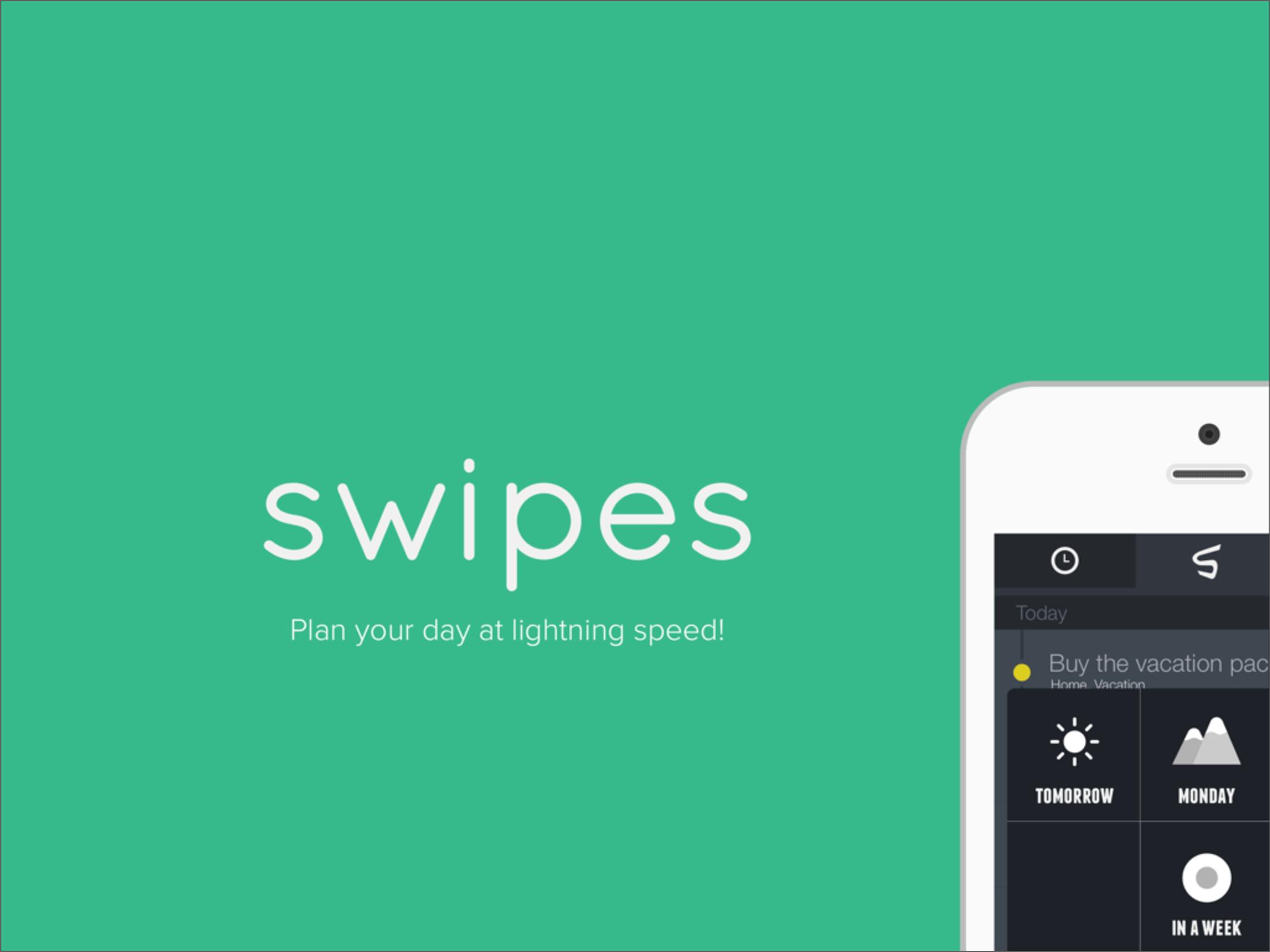
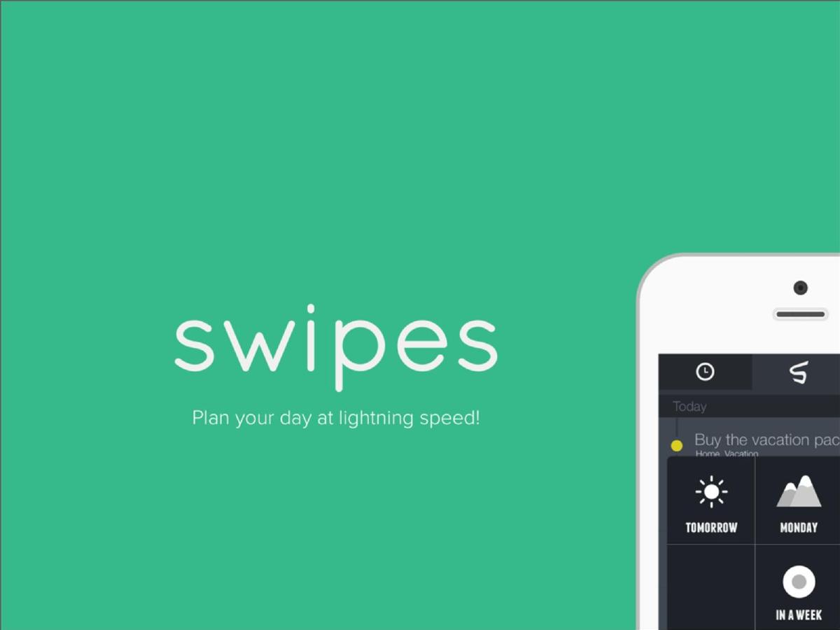
- The deck leads with a clear, punchy value proposition: 'Plan your day at lightning speed!' on Slide 1.
- Slide 2 uses a rhetorical question, 'LOOSING FOCUS?', to identify the core user pain point, though it contains a spelling error.
- Product UI is given center stage on Slide 3, showing a hand-held device to emphasize the mobile-first nature of the tool.
- Third-party validation is a core pillar of the pitch, featuring quotes from The Next Web and Lifehacker on Slide 4.
- Global traction is demonstrated visually through a world map highlighting presence in 56 countries on Slide 5.
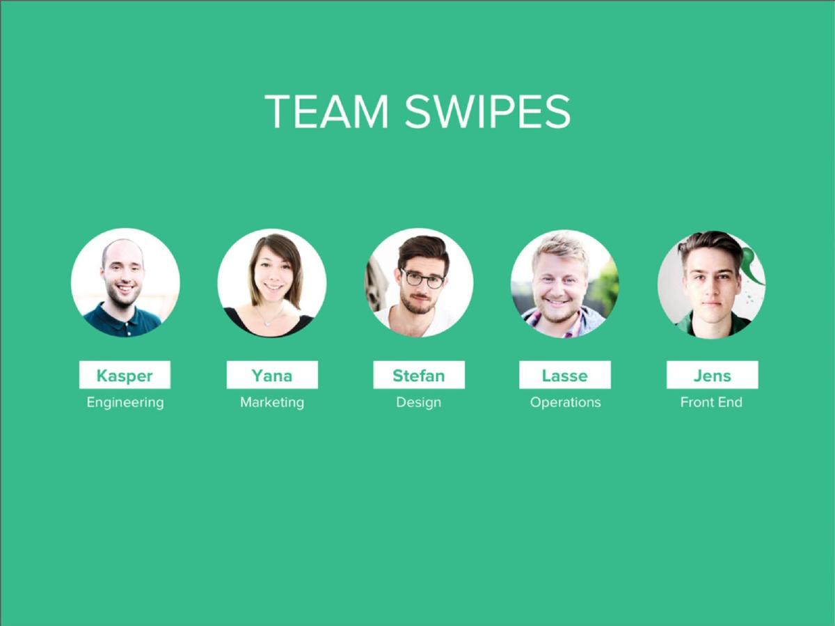
- The deck lacks a dedicated team slide with names or backgrounds, which is unusual for a Seed round pitch.
- There is no mention of revenue, unit economics, or the total addressable market (TAM) in the provided slides.
- The final slide (Slide 6) serves as a call to action, providing the website and App Store link rather than a fundraising ask.
The Minimalist Pitch: Swipes Teardown
Swipes presents a pitch deck that is as streamlined as the productivity app it describes. In an era where pitch decks often suffer from information density, Swipes takes the opposite approach, utilizing a 11-slide deck that relies on high-quality visuals, minimal text, and strong brand colors. While this approach helps in maintaining a consistent brand identity, it leaves several critical questions unanswered for potential investors. This teardown examines how the company balances product-led growth storytelling with the functional requirements of a Seed round pitch.
Slide 1: The Hook
The cover slide is a masterclass in simplicity. It features the company logo in white against a vibrant teal background, accompanied by the tagline: "Plan your day at lightning speed!" To the right, a partial view of an iPhone shows the app's interface. This slide immediately establishes the product category (mobile productivity) and the core benefit (speed). By showing the UI immediately, the founders signal that design and user experience are their primary competitive advantages.
Slide 2: The Problem Statement
Slide 2 attempts to define the problem with two words: "LOOSING FOCUS?" The text is centered, with the word "FOCUS" highlighted by a soft white glow. While the intent is to tap into the universal pain point of digital distraction, the slide suffers from a significant typo ("LOOSING" instead of "LOSING"). In a fundraising context, such errors can be detrimental as they suggest a lack of attention to detail—a trait that is ironically central to a productivity tool. Despite the error, the minimalist aesthetic remains consistent.
Slide 3: Product in Action
This slide serves as the primary product demonstration. It features a high-resolution photograph of a hand holding an iPhone running the Swipes app. The UI is clean, showing a list of tasks like "Buy pizza snails" and "Prepare the building model." The use of checkmarks and color-coded tags suggests a gesture-based interface. The text "plan your day in lightning speed" is repeated here, signed by "The Swipes Team." This slide successfully communicates the "look and feel" of the product without needing a feature list.
Slide 4: Social Proof and Press Validation
To build credibility, Swipes leans on external validation. Slide 4 is split between the brand's teal and a white sidebar. It features two powerful quotes. The Next Web (TNW) states, "Swipes brings in a host of new features that really should be imperative to any to-do app." Lifehacker follows with, "Swipes ends up being something like the popular Clear app for power users." By comparing themselves to Clear—a well-known success in the space—they anchor their value proposition in a context investors already understand.
Slide 5: Global Traction
Rather than showing a bar chart of monthly active users (MAU) or downloads, Swipes uses a geographic visualization. Slide 5 displays a world map with various regions highlighted in a lighter shade of teal. A dark circular callout in the bottom right simply states "56 countries." This slide aims to prove that the product has universal appeal and has achieved organic international growth. However, it lacks the depth of data (such as retention rates or specific user counts) that most Seed investors would expect to see alongside a map.
Slide 6: The Call to Action
The final slide in the sequence is a closing contact page. It provides the URL (www.swipesapp.com), a "Download on the App Store" badge, and the social handle @swipesapp. Like the rest of the deck, it is signed by "The Swipes Team." Notably, there is no specific fundraising ask, no mention of how the funds will be used, and no direct contact information for a founder. This suggests the deck may have been designed as a "teaser" to generate interest rather than a full presentation for a partner meeting.
What Swipes Does Well
The Swipes deck excels at brand consistency. Every slide uses the same color palette, typography, and minimalist layout, which creates a sense of a polished, professional product. By focusing on the UI, they demonstrate a high level of design craft, which is a prerequisite for success in the crowded productivity app market. The use of press quotes is also strategic; for a Seed-stage company, having the endorsement of major tech publications acts as a proxy for market validation when hard revenue numbers might still be low.
What is Missing
The most glaring omission is the lack of a Team slide. Investors at the Seed stage are primarily investing in the founders' ability to execute. Without names, backgrounds, or previous successes, the deck feels anonymous. Additionally, there is no mention of the business model. How does Swipes make money? Is it a subscription, a one-time purchase, or a freemium model? Furthermore, the deck lacks a "Market" slide. The productivity space is notoriously difficult to monetize and highly competitive (competing with giants like Apple, Google, and Microsoft); failing to address the competitive landscape or the size of the opportunity is a missed chance to de-risk the investment.
Founder Lessons
Founders can learn two distinct lessons from this deck. First, the power of a "less is more" visual style. If your product is design-led, your deck must reflect that. Swipes succeeds in making the viewer feel that the app is fast and clean just by the way the slides are constructed. Second, the danger of typos. A single misspelled word on a slide with only two words can overshadow the rest of the pitch. Finally, while minimalism is a virtue in design, it can be a vice in information architecture. Ensure that your deck, even if minimalist, answers the fundamental questions: Who are you? How do you make money? And what do you want from the investor?
Frequently asked questions
- What is the primary value proposition of Swipes?
- According to Slide 1, the primary value proposition is the ability to 'Plan your day at lightning speed!' The app focuses on efficiency and rapid task management, positioning itself as a high-speed alternative to traditional to-do lists.
- How does Swipes demonstrate market validation?
- Swipes uses two main forms of validation: press coverage and geographic reach. Slide 4 features endorsements from The Next Web and Lifehacker, while Slide 5 shows a map indicating the app is used in 56 countries.
- Is there a business model included in the deck?
- No, the 11-slide deck does not include information regarding monetization, pricing tiers, or revenue projections. It focuses entirely on the product experience and user adoption metrics.
- What stage of funding is this deck for?
- As reported by OpenVC, this deck was used for a Seed round. However, the slides themselves do not explicitly state the round or the amount of capital being raised.
- Does the deck introduce the founders?
- The deck does not include a traditional team slide with names, photos, or professional histories. It only references 'The Swipes Team' via a stylized signature on Slide 3 and Slide 6.