FalaFreud’s 13-slide deck is an extreme example of the 'Takahashi Method' or high-visual storytelling. Eschewing bullet points, charts, and even a formal team slide, the deck relies on a sequence of evocative images to communicate the problem of mental health accessibility in Brazil. It identifies a massive target market of '20M Brazilians' (Slide 8) and presents a mobile-first solution featuring text, audio, and video therapy (Slides 6-7). While the deck successfully establishes a brand identity and a clear value proposition of 'Easy' (Slide 9) access, it leaves significant gaps regarding un…
Key takeaways
- The deck uses a minimalist aesthetic with almost no text, forcing the audience to focus on the presenter's narrative.
- Market size is defined simply as '20M Brazilians' on Slide 8, providing a clear, if unsophisticated, TAM.
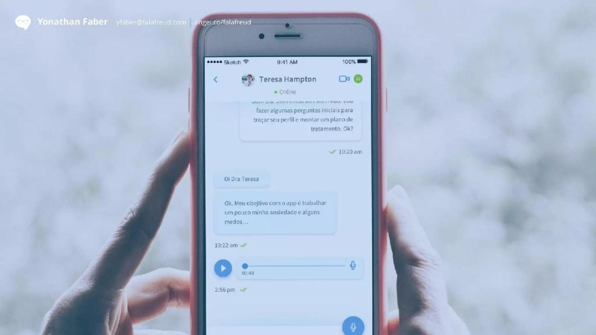
- Product functionality is demonstrated through two clean mobile mockups showing chat and video interfaces (Slides 6 and 7).
- The 'Problem' is communicated through metaphors: an outdated rotary phone (Slide 2), emotional distress (Slide 3), and financial burden (Slide 4).
- The deck highlights a frequency of '3x day' on Slide 11, likely referring to user engagement or therapist availability.
- A '15 min' metric on Slide 12 suggests a speed-to-service or session-length advantage.
- The figure '$500k' appears on Slide 10, though it is unclear if this is the amount raised, a revenue target, or a market stat.
- There is no dedicated team slide, though founder Yonathan Faber’s contact info appears on nearly every slide.
The Minimalist Narrative of FalaFreud
The FalaFreud pitch deck from 2016 is a fascinating artifact of the 'visual-first' era of startup pitching. At only 13 slides, it contains fewer than 50 words in total. This is not a deck designed to be sent as a PDF and read in isolation; it is a visual aid for a live performance. The company, which operates in the teletherapy space in Brazil, uses this deck to strip away the noise of typical business metrics and focus on a singular narrative: therapy is currently hard and expensive, but we make it easy and accessible.
Slides 1-5: Establishing the Emotional Hook
Slide 1: Title Slide The deck opens with the FalaFreud logo—a speech bubble containing a pair of glasses (a nod to Sigmund Freud)—set against a solid blue background. It is clean, professional, and sets the brand's color palette immediately.
Slide 2: The Antiquated System An image of an old-fashioned rotary telephone with a tangled cord. This is a classic metaphor for an outdated, clunky industry. In the context of therapy, it suggests that the way people currently find and communicate with therapists is stuck in the past. Yonathan Faber's contact information and AngelList link appear in the top left corner, a placement that remains consistent throughout the deck.
Slide 3: The Human Element A close-up, desaturated photo of a young woman looking distressed. This slide identifies the 'User.' It puts a face to the problem of mental health, aiming to trigger an empathetic response from the investor. There is no text, allowing the presenter to talk about the prevalence of depression or anxiety without the distraction of bullet points.
Slide 4: The Financial Barrier A broken piggy bank with dollar bills and coins spilling out. This is the 'Cost' slide. Traditional therapy is notoriously expensive, often out of reach for the middle class. The image effectively communicates that the current system is financially 'broken' for the average person.
Slide 5: The Founders/Team (Implicit) An image of two young men in military-style clothing, one carrying the other. While not explicitly labeled, this likely represents the founders, Yonathan Faber and his partner, perhaps during their time in national service. It suggests a bond of trust and 'brotherhood,' though it provides zero professional context or credentials.
Slides 6-9: The Solution and Market
Slide 6: Product Interface (Chat) We see a hand holding a smartphone. The screen shows a chat interface with 'Teresa Hampton.' The messages are in Portuguese, mentioning an initial plan of treatment. The interface includes a play button for an audio message. This slide proves the product exists and demonstrates its core functionality: asynchronous communication.
Slide 7: Product Interface (Video) The same hand and phone, but now showing a full-screen video call with the therapist. This confirms that FalaFreud is a multi-modal platform, offering the intimacy of face-to-face sessions alongside the convenience of text.
Slide 8: The Market Size Over an aerial view of a Brazilian city, the text reads '20M Brazilians.' This is the deck's only mention of market scale. It is a bold, simple number that suggests a massive TAM (Total Addressable Market) without getting bogged down in demographic segments.
Slide 9: The Value Proposition A white slide with the word 'Easy' in large blue text. This is the 'So What?' of the entire deck. The solution to the outdated, expensive, and emotionally taxing system shown in the first four slides is simplicity.
Slides 10-13: The Metrics and Conclusion
Slide 10: The Number The figure '$500k' appears against a blue brick wall. In a standard deck, this would be the 'Ask.' Here, it is left open to interpretation. Given the 2016 date and Seed stage, it is highly likely the fundraising target for the round.
Slide 11: Engagement The text '3x day' appears over an image of a woman walking. This likely refers to the frequency with which users interact with the app or the availability of therapists. It implies high engagement and a service that fits into the daily flow of life, unlike weekly office visits.
Slide 12: Speed The text '15 min' appears against the blue brick background. This could represent the time it takes to get matched with a therapist or the length of a 'micro-session.' Regardless of the specific definition, it reinforces the 'Easy' value proposition by highlighting speed.
Slide 13: Closing A repeat of the logo and contact information. The deck ends as it began—minimalist and focused on the brand.
What Works in This Deck
Visual Consistency: The use of a consistent blue overlay and clean typography makes the deck feel like a cohesive brand experience rather than a collection of slides. · Emotional Resonance: By leading with the 'Problem' through imagery (the distressed woman, the broken piggy bank), the founders build a narrative case before showing a single line of code. · Clarity of Purpose: You don't need to speak Portuguese or be an expert in the Brazilian medical system to understand what this company does. It’s 'Uber for Therapy' in a specific geographic market. · Presentation-Ready: This deck is a perfect 'prop.' It doesn't compete with the speaker for the audience's attention; it enhances what the speaker is saying.
What is Missing
The Team: Aside from the photo on Slide 5, there is no information about why these specific founders are qualified to build a health-tech company. No mention of medical advisors, previous exits, or technical expertise. · Business Model: How does FalaFreud make money? Is it a subscription? A per-session fee? A marketplace commission? The deck is silent on the economics of the business. · Competition: The deck assumes a vacuum. It doesn't acknowledge other teletherapy players or traditional clinics, which is a red flag for most institutional investors. · Unit Economics: There is no mention of Customer Acquisition Cost (CAC) or Lifetime Value (LTV), which are critical for a B2C mobile app. · The Ask: While '$500k' is mentioned, there is no breakdown of how that money will be spent (e.g., 40% engineering, 40% marketing, 20% ops).
What a Founder Should Copy
The 'One Idea Per Slide' Rule: FalaFreud executes this perfectly. Each slide has a singular focus, which prevents 'slide fatigue' during a pitch. · High-Quality Mockups: Slides 6 and 7 show the product in a 'lifestyle' context (a hand holding the phone). This is much more effective than a raw screenshot. · Geographic Focus: By explicitly stating 'Brazilians' on Slide 8, the company stakes a claim to a specific territory, which can be a powerful strategy for startups in emerging markets where local nuances matter. · Minimalist Contact Info: Putting the founder's email and a link to a social proof platform (AngelList) on every slide ensures that if a single slide is screenshotted or shared, the contact info travels with it.
Frequently asked questions
- What is the primary goal of this deck?
- The primary goal appears to be emotional engagement and high-level problem identification. By using large, evocative images (like the broken piggy bank on Slide 4), the deck seeks to build empathy for the user's struggle with traditional therapy costs and logistics before introducing the mobile solution.
- How does FalaFreud define its market?
- The deck defines its market geographically and numerically on Slide 8 with the text '20M Brazilians' over an aerial shot of Rio de Janeiro. It does not provide a breakdown of SAM (Serviceable Addressable Market) or SOM (Serviceable Obtainable Market), focusing instead on the broad potential scale.
- What are the core features of the product shown?
- Based on Slides 6 and 7, the product is a mobile application that facilitates therapy through three mediums: asynchronous text messaging, audio clips, and live video calls. The interface mimics popular messaging apps to emphasize the 'Easy' (Slide 9) nature of the service.
- Is there a clear investment 'Ask' in the deck?
- No. Slide 10 features the figure '$500k' in large white text against a blue brick background, but it does not explicitly state that this is the fundraising goal, the valuation, or the use of proceeds. This ambiguity is a common trait of minimalist 'teaser' decks.
- What is missing from this pitch deck?
- This deck is missing almost all standard 'hard' data. There are no slides for unit economics (CAC/LTV), no competitive matrix, no detailed financial projections, no roadmap, and no team biographies. It relies entirely on the strength of the problem-solution fit and the market size.