The We Are Onyx pitch deck is a masterclass in brevity, using just eight slides to communicate a clear value proposition in the beauty subscription space. By focusing on a specific, underserved demographic—Black women—the company highlights a $17.5 billion annual market spend. The deck is particularly strong on traction, showing a jump to $54,000 MRR by January 2017 and impressive unit economics, including a 68% margin. While it lacks a formal 'Ask' slide or a detailed roadmap, the inclusion of high-tier logos from the team's past (J.P. Morgan, Facebook, HBO) builds immediate credibility. It…
Key takeaways
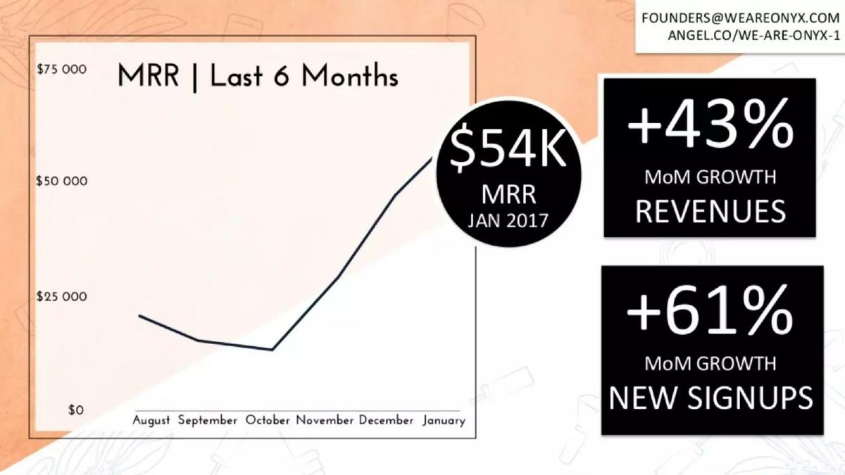
- The company reported $54,000 in Monthly Recurring Revenue (MRR) as of January 2017 on slide 2.
- New signups grew at a rate of +61% month-over-month according to the traction data on slide 2.
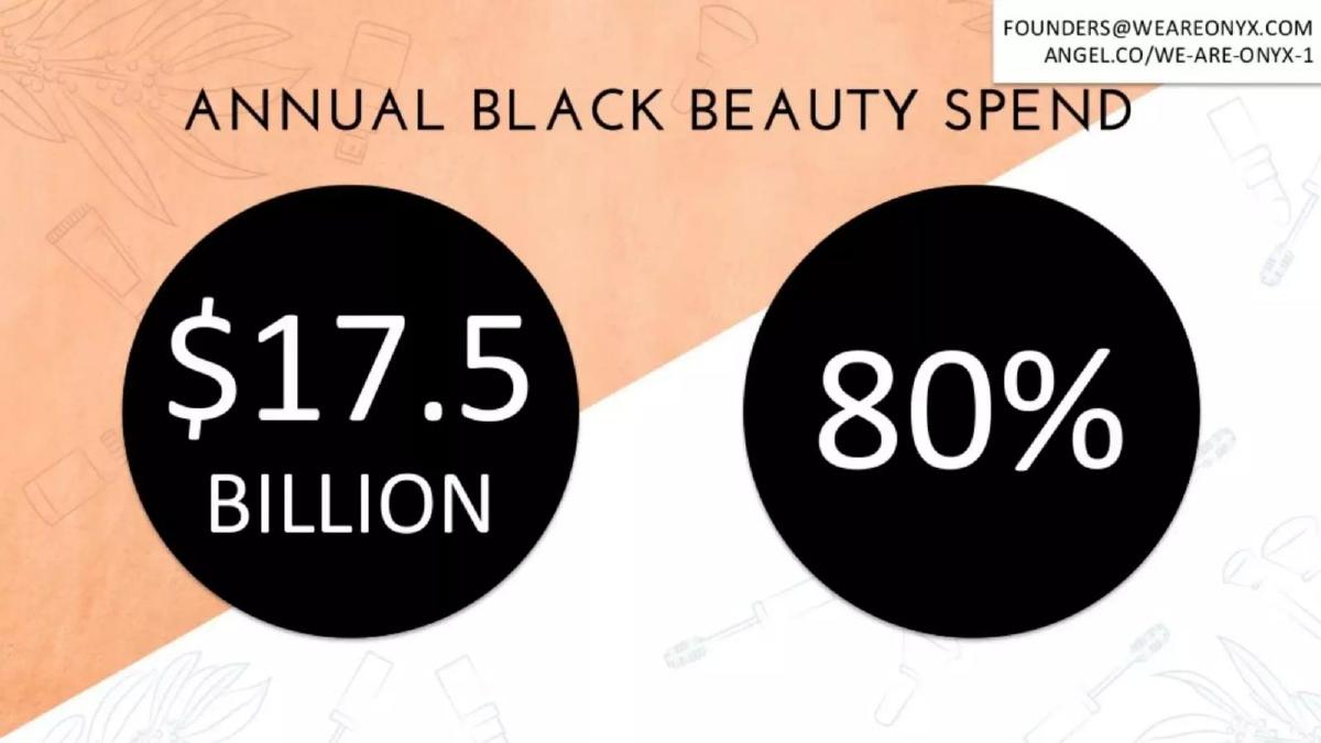
- The deck identifies a $17.5 billion annual Black beauty spend on slide 4, positioning it as a massive underserved market.
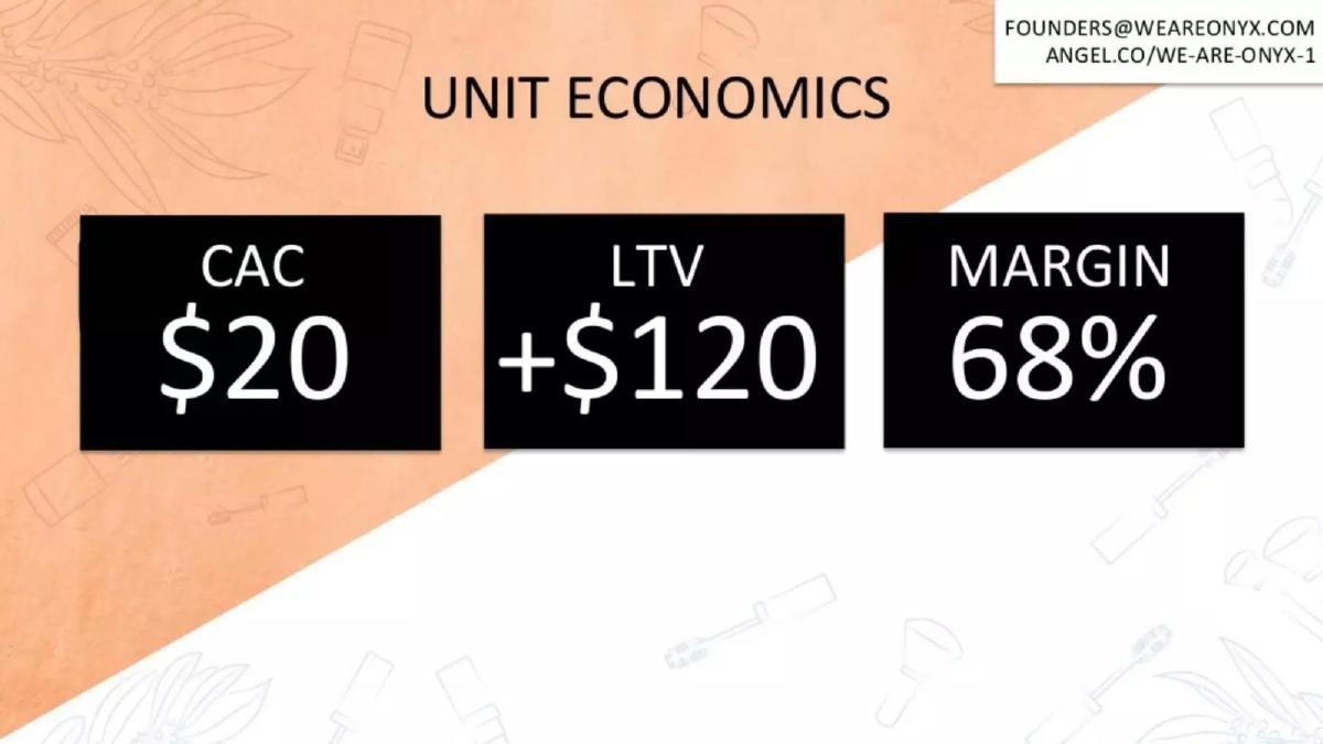
- Unit economics are highly favorable, with a Customer Acquisition Cost (CAC) of $20 and a Lifetime Value (LTV) of over $120 on slide 6.
- The business model maintains a 68% margin, which is significant for a physical goods subscription box (slide 6).
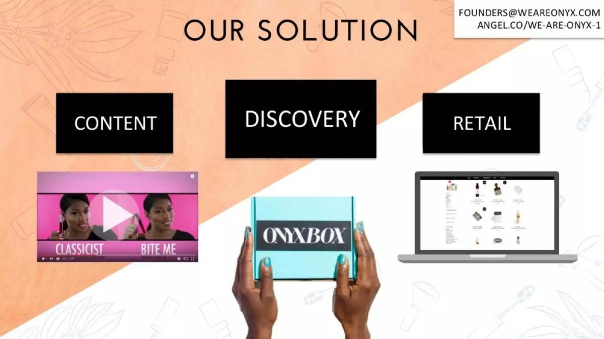
- The solution is three-pronged, covering Content, Discovery (the box), and Retail (e-commerce) as shown on slide 5.
- The team slide features experience from major corporations including Intel, J.P. Morgan, and Facebook (slide 7).
- The deck completely omits a slide regarding the specific funding amount being raised or the intended use of funds.
Introduction: The Power of Niche Subscription
We Are Onyx entered the market during the height of the subscription box craze, but with a distinct advantage: a laser focus on an underserved demographic. The beauty industry has historically overlooked the specific needs of Black women, creating a vacuum that We Are Onyx sought to fill. This 8-slide deck is a lean, metric-focused presentation that prioritizes traction and unit economics over long-winded explanations of the product.
Slide 1: The Visual Hook
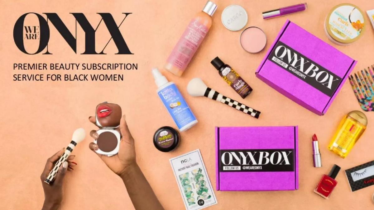
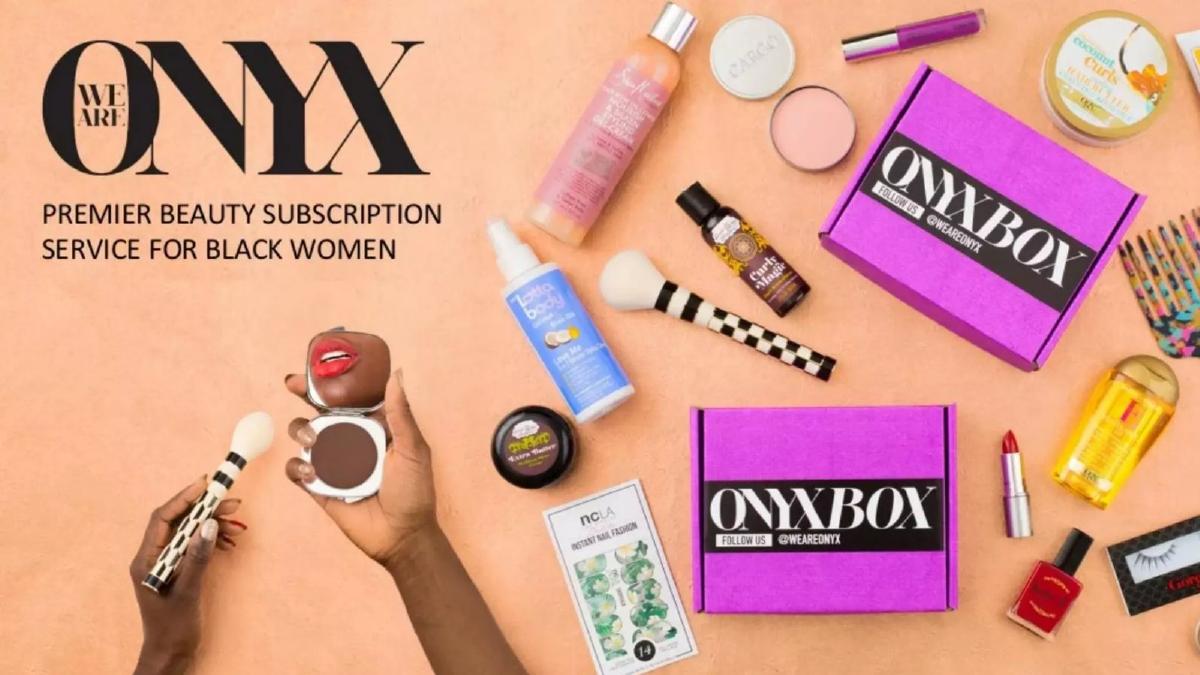
The cover slide does exactly what a cover slide should: it shows the product. By displaying the 'Onyx Box' alongside various beauty products (lipsticks, brushes, hair care), the company immediately establishes its category. The tagline, "Premier beauty subscription service for Black women," is a clear, unambiguous value proposition. It defines the 'what' and the 'who' in seven words.
Slide 2: Traction and Momentum
Moving straight to traction is a bold move that works well when the numbers are trending upward. Slide 2 shows an MRR graph for the last six months, culminating in $54K MRR for January 2017 . The graph shows a slight dip in October before a sharp hockey-stick growth curve through December and January. The slide also highlights two key growth metrics: +43% MoM growth in revenues and +61% MoM growth in new signups . This establishes that the company has found a repeatable way to acquire customers.
Slide 3 & 4: The Problem and Market Size
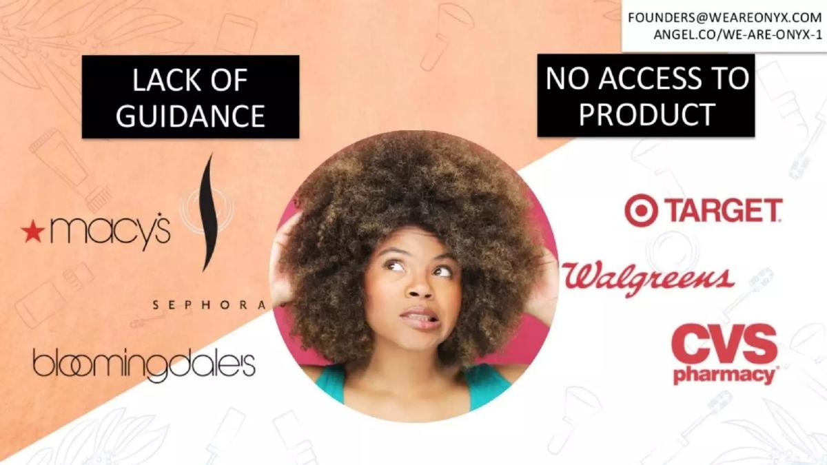
Slide 3 uses a collage of major retail logos—Macy's, Sephora, Target, Walgreens—to illustrate a "Lack of Guidance" and "No Access to Product." The central image of a frustrated consumer emphasizes the emotional pain point. Slide 4 then quantifies this pain point with a massive figure: $17.5 Billion in annual Black beauty spend. The 80% figure in the adjacent circle is not explicitly defined by a caption, which is a rare moment of ambiguity in the deck, but it likely refers to a market share or consumer behavior statistic related to the demographic's spending habits.
Slide 5: The Three-Pillar Solution
The solution is presented as an ecosystem rather than just a box. Slide 5 breaks the business down into Content, Discovery, and Retail . 'Content' is represented by a video screenshot, 'Discovery' by the physical Onyx Box, and 'Retail' by a laptop showing an e-commerce interface. This suggests the company isn't just selling a monthly mystery; they are building a platform where discovery leads to direct sales, increasing the total share of wallet per customer.
Slide 6: The Efficiency of the Model
For many investors, slide 6 is the most important in the deck. It outlines the unit economics: a $20 CAC (Customer Acquisition Cost), an LTV (Lifetime Value) of +$120 , and a 68% Margin . A 6x LTV/CAC ratio is excellent for consumer e-commerce. The 68% margin is particularly high for a subscription box, which usually involves significant shipping and fulfillment costs, suggesting the company has secured favorable wholesale pricing or has a very efficient logistics operation.
Slide 7: The Team
The 'Beauty & Brains' slide introduces the leadership. Delali is listed as Co-Founder and Head of Product, and Myriam is listed as Co-Founder and CEO. While the other four individuals are not named or titled, the collection of logos at the bottom is impressive. Featuring J.P. Morgan, Facebook, HBO, Intel, and Harvard , the slide signals that the team has experience at top-tier institutions, which reduces perceived execution risk.
Slide 8: The Summary and Contact
The final slide functions as a summary, repeating the most impressive stats: the $17.5B market size , the +61% signup growth , and the $54K MRR . It provides a clear email address and an AngelList link. By ending on these numbers, the founders ensure the last thing an investor sees is the proof of their success.
What Works in This Deck
The deck is exceptionally disciplined. It avoids the 'fluff' often found in early-stage pitches. By putting the MRR and growth rates on the second slide, the founders immediately qualify themselves to the investor. The visual design is consistent, using a peach and white diagonal split that mirrors the brand's aesthetic. Furthermore, the unit economics slide provides the exact data points a Series A or Seed investor needs to calculate the potential return on investment.
What Is Missing
The most glaring omission is the 'Ask.' The deck does not state how much money the company is looking to raise, nor does it explain what that money will be used for (e.g., hiring, marketing, inventory). There is also no competitive landscape slide. While the 'Problem' slide implies that big-box retailers are the competition, it doesn't address other niche subscription boxes or direct-to-consumer brands that might be vying for the same customer base. Finally, there is no forward-looking roadmap or vision for where the company goes after reaching $1M or $10M in ARR.
What a Founder Should Copy
Founders should emulate the metric-first approach of this deck. If you have strong growth numbers, don't hide them on slide 12; put them upfront to grab attention. The 'Solution' slide is also a great example of how to show a multi-faceted business model without using too much text. Using icons (a video, a box, a laptop) to represent different revenue streams is much more effective than a bulleted list. Lastly, the use of high-authority logos on the team slide is a classic and effective way to build 'borrowed credibility' when the startup itself is still in its early stages.
Conclusion
We Are Onyx produced a deck that is short, punchy, and data-driven. It successfully identifies a massive market gap and provides empirical evidence that their solution is gaining traction. While it functions more as a teaser than a full investment memorandum, it provides more than enough 'signal' to encourage an interested investor to reach out for a deeper dive into the financials and strategy.
Frequently asked questions
- What is the primary revenue model for We Are Onyx?
- Based on slide 5, the company utilizes a multi-channel approach. The core is 'Discovery,' represented by the Onyx Box subscription. This is supplemented by 'Content' to drive engagement and a 'Retail' component, which appears to be a traditional e-commerce storefront where users can purchase full-sized products discovered in their boxes.
- How does the company justify the market opportunity?
- Slide 3 and 4 frame the problem as a 'Lack of Guidance' and 'No Access to Product' at major retailers like Target, Walgreens, and CVS for this specific demographic. They quantify this by citing a $17.5 billion annual spend by Black consumers in the beauty category, suggesting that current retail options fail to capture this demand effectively.
- Is the team qualified to execute this business model?
- Slide 7, titled 'Beauty & Brains,' lists two co-founders: Delali (Head of Product) and Myriam (CEO). While specific roles for the other four team members aren't labeled, the slide displays logos from high-prestige institutions like Harvard, J.P. Morgan, Facebook, and WME, implying a high level of professional and technical competence.
- What are the most impressive metrics in the deck?
- The most compelling data points are the unit economics on slide 6. A 6:1 LTV to CAC ratio ($120 LTV vs $20 CAC) combined with a 68% margin suggests a very efficient and scalable customer acquisition engine, which is often the primary concern for investors in the subscription box space.
- What is missing from this pitch deck?
- This is a 'teaser' deck. It lacks a competition slide, a financial forecast beyond the current MRR, a product roadmap, and most importantly, a 'The Ask' slide. There is no mention of how much capital the founders are seeking or what milestones that capital will help them achieve.