The Avocode pitch deck is a 10-slide presentation from 2014 that successfully raised $1.5 million by focusing on a specific, painful friction point in the software development lifecycle: the handoff from designers to developers. Instead of relying on dense text, the deck uses minimalist icons and bold typography to communicate its value proposition. The narrative is anchored by impressive financial health indicators, specifically $56K in MRR and negative monthly churn. By showcasing a blue-chip customer list including Wix, Red Bull, and Intelcom early on, Avocode establishes immediate credibi…
Key takeaways
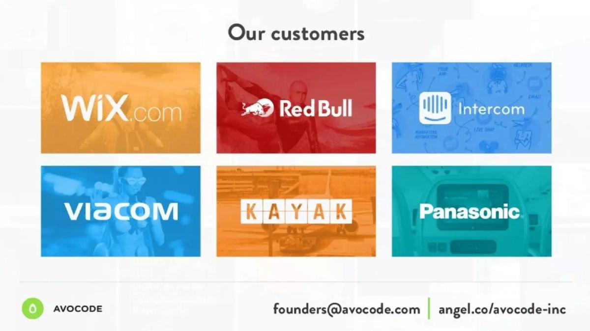
- The deck leads with social proof, showcasing logos from Wix.com, Red Bull, and Intercom on slide 2.
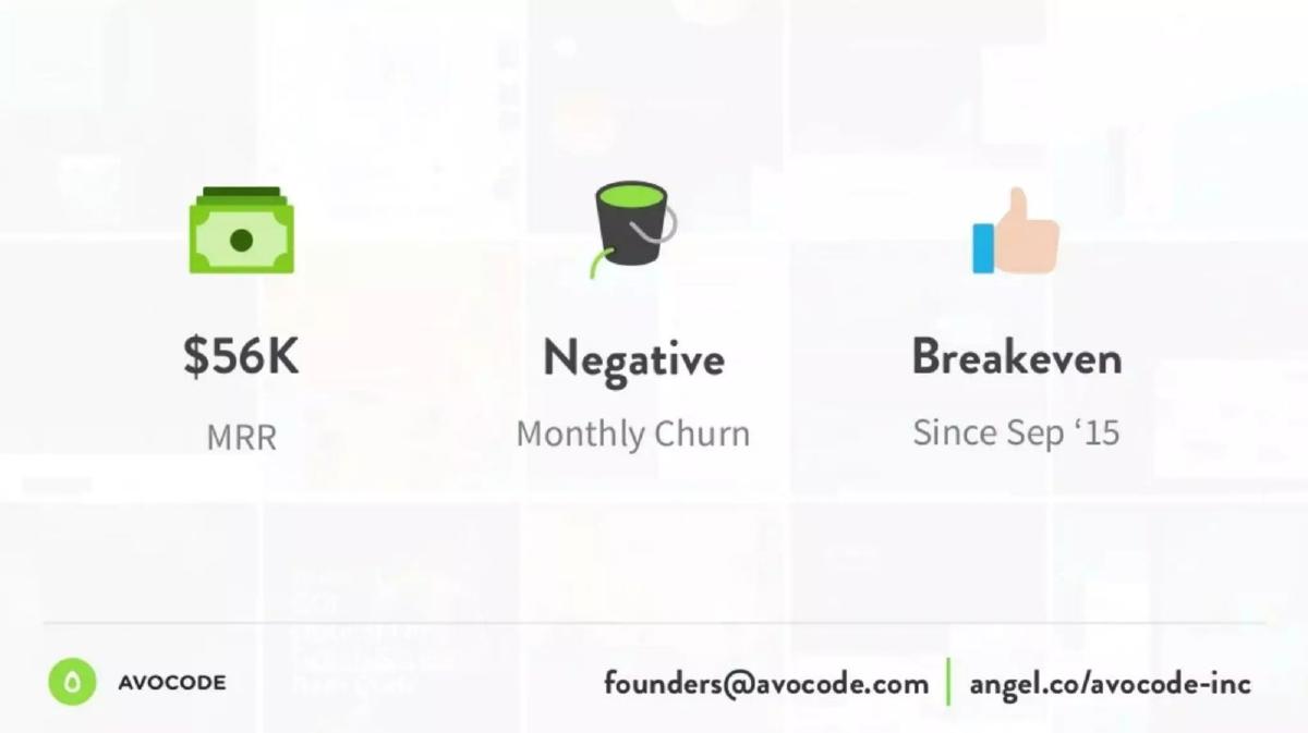
- Financial transparency is a core strength, with slide 3 explicitly stating a $56K MRR and negative monthly churn.
- The company reached breakeven in September 2015, as noted on slide 3 and slide 10.
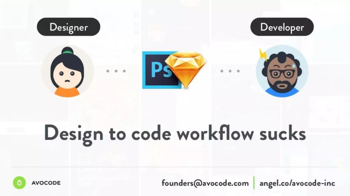
- The problem is summarized in just four words: 'Design to code workflow sucks' on slide 5.
- Product functionality is explained through a visual diagram on slide 8, showing the conversion of .psd and .sketch files into CSS, dimensions, and sliced images.
- The team slide (slide 9) emphasizes experience over education, citing 13 products built and $1M earned from previous ventures.
- Scale is indicated on slide 4 with the claim of '1 Million+ Websites & mobile apps everyday.'
- The deck completely omits a formal 'Ask' slide, market size (TAM/SAM/SOM), and a competitor matrix.
The Power of Minimalist Traction
The Avocode pitch deck is a refreshing departure from the text-heavy, 20-slide behemoths often seen in the SaaS world. At just 10 slides, it is designed for speed and impact. The deck operates on a simple premise: if you have great customers and great revenue, you don't need to over-explain the market. By 2014, the 'design-to-code' gap was a well-recognized pain point for digital agencies and product teams. Avocode positioned itself not just as a tool, but as the 'bridge' that makes this transition seamless. This teardown examines how they used transparency and visual storytelling to secure $1.5M in funding.
Slide 1: Title Slide
The deck opens with a clean, branded title slide. The Avocode logo—a stylized green avocado/drop shape—is centered against a faint, tiled background of various design interfaces. This subtle background choice immediately signals the industry they operate in (UI/UX design) without cluttering the frame. The inclusion of the URL, avocode.com , ensures the primary call to action is clear from the first second.
Slide 2: Social Proof and Customer Validation
Avocode makes a bold move by placing their 'Our customers' slide second. Usually, this appears toward the end of a deck. By leading with Wix.com, Red Bull, Intercom, Viacom, Kayak, and Panasonic , they immediately eliminate any doubt about the product's enterprise readiness. The use of high-contrast, colorful blocks for each logo makes the slide visually striking and memorable. This is a 'credibility first' strategy that forces the investor to take the subsequent metrics seriously.
Slide 3: The Traction Triple-Threat
Slide 3 is arguably the most important slide in the deck. It presents three key metrics with zero fluff: $56K MRR , Negative Monthly Churn , and the fact that they have been Breakeven Since Sep ‘15 . For a startup in the 'Other' stage in 2014, $56K in Monthly Recurring Revenue is a significant milestone, representing over $670K in ARR. Negative churn is the 'holy grail' of SaaS, indicating that the product is so sticky that existing customers are spending more over time. Mentioning they are breakeven reduces the perceived risk for an investor, as the company isn't in a 'burn or die' situation.
Slide 4: Scale and Usage
To follow up on the financial metrics, slide 4 focuses on volume. It claims 1 Million+ Websites & mobile apps everyday . While the phrasing is slightly ambiguous (it likely refers to the number of assets or projects touched by the software), the '1 Million+' figure serves to demonstrate the scale at which their 'bridge' is operating. The icon of a browser window with a paintbrush reinforces the creative-technical intersection.
Slide 5: The Problem Statement
Avocode identifies the problem with blunt honesty: 'Design to code workflow sucks.' The slide uses two avatars—a frustrated designer and a stressed developer—separated by Photoshop and Sketch icons. This identifies the specific silos the product intends to break. By using the word 'sucks,' the founders lean into the genuine frustration felt by their target users, creating an emotional hook for the solution that follows.
Slides 6-8: The Visual Solution
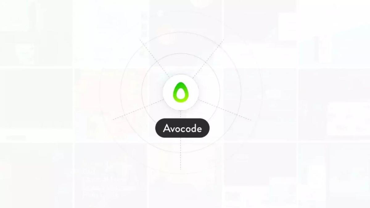
These three slides function as a progressive build to explain the product. Slide 6 shows the Avocode logo at the center of a radar-like diagram. Slide 7 adds the input: .psd and .sketch files. Slide 8 completes the picture by showing the outputs: CSS, Dimensions (30 px), and Sliced images . This is a highly effective way to explain a technical process without using a single bullet point. It tells the investor: 'Files go in, developer-ready code and assets come out.'
Slide 9: The Team
The team slide features Vu Hoang Anh (CEO) , Petr Brzek (Head of Product) , and Martin Duris (Head of Marketing) . Rather than listing logos of former employers, they list their collective achievements: 13 products , 5 years of experience , and $1M from previous products . This tells a story of a 'mafia' or a tight-knit group of builders who know how to monetize software. It emphasizes execution capability over pedigree.
Slide 10: The Conclusion (Traction Reprise)
The deck ends by repeating the traction slide (Slide 3). This is a tactical choice to ensure the final image left in the investor's mind is the $56K MRR and Negative Monthly Churn . It reinforces the message that this is a healthy, growing business that has already solved the hardest part of a startup: finding people willing to pay for the solution.
What Works in the Avocode Deck
Extreme Brevity: The deck can be read and understood in under 60 seconds. In a world where VCs see hundreds of decks, this efficiency is a competitive advantage. · Traction-Led Narrative: By putting revenue and churn metrics at the front and back, they frame the entire conversation around business success rather than just 'cool tech.' · Visual Clarity: The use of icons and diagrams to explain the product (Slides 6-8) is far more effective than a list of features. It clearly communicates the 'Bridge' concept mentioned in their company description. · Social Proof: The customer list on Slide 2 is diverse, covering tech (Wix), consumer brands (Red Bull), and enterprise (Panasonic), proving broad market appeal.
What is Missing from the Avocode Deck
The Ask: There is no slide indicating how much money they are raising or what they plan to do with it. While this information might be in a cover email, its absence in the deck is a missed opportunity to set the terms of the round. · Market Size (TAM): There is no mention of how many designers or developers exist globally. Investors usually want to see that a company can grow into a billion-dollar valuation; Avocode relies on the investor already knowing the market is large. · Competition: The deck ignores competitors like Zeplin or InVision, which were active during this period. Acknowledging the landscape helps define the company's unique 'moat.' · Roadmap: The deck shows what the product does today, but not where it is going. There is no mention of future integrations or features.
What a Founder Should Copy
The 'Traction Sandwich': If you have strong revenue, put it at the beginning and the end. It makes the middle of the deck (the problem/solution) feel like a proven fact rather than a hypothesis. · The 'Experience' Metric: If your team hasn't worked at Google or Facebook, follow Avocode's lead and quantify your experience in terms of 'products shipped' and 'revenue generated.' It proves you are a builder. · Minimalist Problem Statements: Don't use three paragraphs to describe a problem. If it's a real problem, you should be able to describe it in five words or less, just as Avocode did on Slide 5. · Consistent Branding: The use of the green avocado theme and clean typography throughout the deck makes the company look professional and polished, which is vital for a tool sold to designers.
Frequently asked questions
- How much did Avocode raise with this deck?
- According to the catalogue facts from pitchdeckhunt.com, Avocode raised $1,500,000 in 2014. While the deck itself does not state the amount being sought, the traction metrics provided—specifically the $56K MRR and breakeven status—likely served as the primary justification for the valuation and investment round.
- What is the 'Negative Monthly Churn' mentioned on slide 3?
- Negative monthly churn is a highly desirable SaaS metric where the additional revenue gained from existing customers (through upgrades or expansions) exceeds the revenue lost from customers who cancel. On slide 3, Avocode highlights this to prove that their existing user base is growing in value over time, which is a strong indicator of product-market fit.
- Does the deck explain how the technology works?
- The deck uses a high-level visual approach rather than technical documentation. Slides 6, 7, and 8 use a concentric circle diagram to show Avocode at the center, ingesting Photoshop (.psd) and Sketch (.sketch) files and outputting developer-ready assets like CSS, dimensions, and sliced images. It focuses on the 'what' and 'output' rather than the underlying code.
- Who are the founders and what is their background?
- Slide 9 introduces Vu Hoang Anh (CEO), Petr Brzek (Head of Product), and Martin Duris (Head of Marketing). Instead of listing previous employers or universities, they highlight their collective experience: 5 years of working together, 13 products launched, and $1M in revenue generated from those previous products.
- What major components are missing from this pitch deck?
- This deck is notably minimalist. It lacks a Market Size slide (TAM), a Competitor Analysis slide, a Roadmap slide, and a specific 'Use of Funds' or 'The Ask' slide. It relies almost entirely on current traction and the simplicity of the problem/solution statement to generate investor interest.