Bind's 2019 Series A deck is a masterclass in narrative-driven healthcare disruption. By framing traditional insurance as a rigid system designed for traffic rather than people, Bind introduces an 'on-demand' model that separates core coverage from condition-specific 'add-ins.' The deck relies heavily on product walkthroughs and early engagement data to prove that transparency leads to better consumer choices. With a $70M raise, the company successfully argued that giving members a 'price tag' for every procedure—and the ability to buy coverage when they actually need it—could lower employer…
Key takeaways
- The deck uses a city planning metaphor on slide 2 to contrast rigid legacy systems with human-centric design.
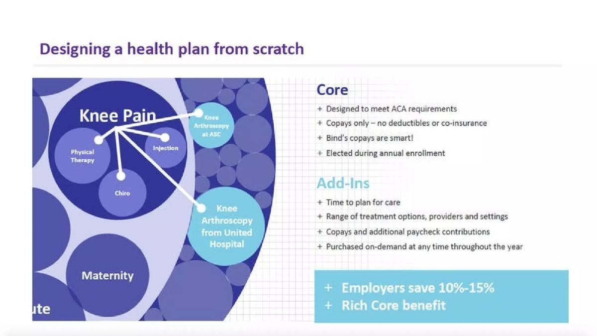
- Bind claims to save employers 10-15% by utilizing a 'Core' plan for routine care and 'Add-ins' for specific procedures (slide 5).
- Product transparency is central, with slide 7 showing that 'Everything has a price tag' within the mobile app interface.
- Member engagement is high, with 54% of the population activating their account within the first three months (slide 16).
- The pharmacy benefit model achieved a 46% lower PMPM cost than the industry average, despite higher utilization (slide 18).
- Consumer behavior shift is evidenced by 92% of members choosing the most cost-effective treatment option (slide 22).
- The deck omits a team slide, a competition slide, and a specific funding request or use-of-funds breakdown.
- Cost variance is highlighted on slide 13, showing how member cost share for a knee arthroscopy can range from $1,200 to over $4,000 depending on the hospital.
The Vision: Designing for People, Not Traffic
Bind's pitch deck begins not with healthcare data, but with a philosophical metaphor about urban planning. This sets the stage for a 'from scratch' redesign of a legacy industry. The opening slides establish a narrative that the current healthcare system is a byproduct of poor design rather than necessity.
Slides 1-3: The Metaphor and the Problem
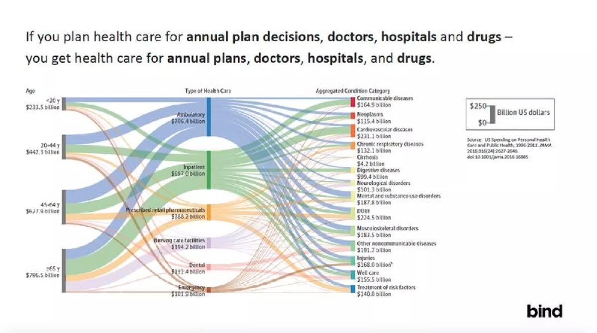
Slide 1 introduces the brand: bind on-demand health insurance . The lowercase, minimalist branding suggests a modern, tech-first approach. Slide 2 uses a quote from Fred Kent: "If you plan cities for cars and traffic – you get cars and traffic. If you plan cities for people and places – you get people and places." This visual contrast between a congested highway and a vibrant park is a powerful emotional hook. Slide 3 translates this to healthcare, arguing that planning for 'annual plan decisions' and 'hospitals' results in the current fragmented system. It features a complex Sankey diagram showing US spending on personal health care, totaling hundreds of billions across age groups and conditions, sourced from JAMA 2016.
Slides 4-5: The Structural Solution
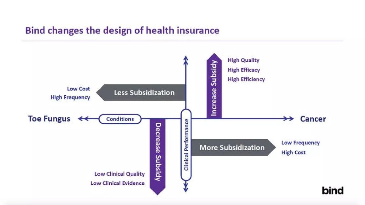
Slide 4 introduces the 'Bind design' using a quadrant chart. It plots 'Conditions' (from Toe Fungus to Cancer) against 'Clinical Performance.' The strategy is to increase subsidies for high-quality, high-efficacy treatments while decreasing subsidies for low-clinical-quality options. Slide 5 is the most critical slide in the deck, titled Designing a health plan from scratch . It introduces the two-tier model: Core (ACA compliant, copays only, no deductibles) and Add-Ins (purchased on-demand for specific treatments). The slide explicitly states that Employers save 10%-15% through this model.
Product Walkthrough: Transparency as a Feature
A significant portion of the deck is dedicated to mobile app mockups. This serves to prove that the complex 'on-demand' model is intuitive for the end-user.
Slides 6-8: The User Experience
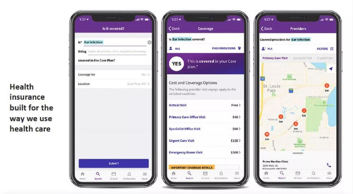
Slide 6 shows the 'Is it covered?' interface for an ear infection, displaying clear copays for virtual visits ($Free), primary care ($40), and the ER ($300). Slide 7 reinforces the mantra that Everything has a price tag! by showing MRI costs ranging from $50 to $200. Slide 8 demonstrates the pharmacy benefit, showing how the app steers users toward generic versions of drugs (e.g., Clopidogrel Bisulfate instead of Plavix) by clearly marking the brand name as 'NOT covered' while providing a map of pharmacies where the generic is available for $5 to $20.
Slides 9-11: Combining Coverage and Care Decisions
These slides walk through a 'Knee Arthroscopy' scenario. Slide 9 shows how the app handles a 'NO' coverage response for a specific provider by offering 'Add-In' options ranging from $800 to $1,100. Slide 10 shows the comparison screen where 'Core Plan Options' ($30 to $100) are listed alongside 'Add-Ins.' Slide 11 emphasizes that coverage and care decisions are combined , allowing users to see the total cost (Provider Copay + Payroll Deduction) for different facilities.
The Data: Proving the Economic Model
After establishing how the product works, the deck moves into the 'Why it works' phase, using claims data and cost breakouts to justify the savings promised to employers.
Slides 12-13: Cost Variance and Bundled Pricing
Slide 12 displays a bar chart of Average Risk Adjusted Episode Allowed Cost - Knee Arthroscopy . It highlights the variance between providers, using 'South Metro' as a high-cost example compared to the average. Slide 13, Average Knee Arthroscopy Cost Breakout by Location , shows that member cost share can vary wildly. At 'Hospital A,' the cost is over $4,000, while at 'Hospital D,' it is roughly $1,200. This data supports Bind's argument that transparency can drive members to lower-cost, high-value facilities.
Slides 14-17: Traction and Engagement
Slide 14 serves as a transition to Results to date . Slide 15 presents a case study where Employees selected Bind 65% of the time over PPO and ACO alternatives. Slide 16 focuses on engagement: 54% of the population activates their account within three months, and 83% use the app or website in active populations. Slide 17 uses a visual of pill bottles to show that Bind members utilize lower-cost pharmacies 64% of the time, compared to 20% for other plans.
Slides 18-22: Efficiency and Satisfaction
Slide 18 highlights the pharmacy benefit efficiency: a $37.74 PMPM Average for Bind versus $69.83 for a National PBM, representing a 46% lower cost. Slide 19 claims a 4.5/5 member satisfaction rating. Slide 20 uses piggy bank icons to show that four different clients (A, B, C, and D) are all trending UNDER budget , with actuals ranging from 66% to 98% of the Bind Plan Budget. Slide 21 shows out-of-pocket (OOP) savings, stating 79% of members pay less than $500 per year . Finally, slide 22 concludes with the behavioral impact: members choose cost-effective treatments 40% more often , with 92% choosing the most cost-effective option.
What Works in the Bind Deck
The deck excels at visualizing a complex product . Health insurance is notoriously difficult to explain, but by using a mobile-first walkthrough, Bind makes the 'on-demand' concept feel tangible. The consistency of the 'Knee Arthroscopy' example throughout the deck allows the investor to follow a single thread from the problem (high cost variance) to the solution (transparent add-ins) to the result (lower employer spend). The metaphorical opening is also highly effective; it reframes the conversation from 'improving insurance' to 'redesigning for humans,' which justifies a Series A valuation for what could otherwise be seen as just a new TPA (Third Party Administrator).
What is Missing from the Bind Deck
The most glaring omission is the Team Slide . In a $70M Series A, the pedigree of the founders and their ability to navigate healthcare regulation is paramount. There is also no Competition Slide . While Bind's model is unique, they are competing for employer contracts against giants like UnitedHealthcare, Cigna, and Aetna, as well as other 'insurtech' startups like Oscar or Clover Health. The deck also lacks a Financial Ask and a Roadmap . We see 'Results to date,' but we don't see the projected growth, the target number of members, or how the $70M will be deployed to scale the network or sales team.
What a Founder Should Copy
The 'Price Tag' Narrative: If your product relies on transparency, show exactly what that looks like for the user. Bind's screenshots of specific copays for specific procedures are more convincing than a thousand words of copy. · Comparative Metrics: Slide 18's PMPM comparison is a 'gold standard' metric in healthcare. Comparing your performance directly against a 'National Average' or 'Industry Standard' provides immediate context for your value proposition. · Behavioral Proof: Don't just say your product is better; show that people use it differently. Slide 22, which shows that 92% of users choose the cheapest option when given the choice, is the ultimate proof of the business model's viability. · Clean, Minimalist Design: The use of a single accent color (purple) and plenty of white space makes the data-heavy slides (like the Sankey diagram on slide 3) feel less overwhelming.
Frequently asked questions
- What is Bind's core product innovation?
- Bind introduces 'on-demand' health insurance. Unlike traditional plans with fixed annual deductibles, Bind offers a 'Core' plan for primary care and chronic conditions, while allowing members to purchase 'Add-ins' for specific planned procedures like knee surgery or maternity care at any time during the year. This model, shown on slide 5, eliminates deductibles and co-insurance in favor of transparent, upfront copays.
- How does Bind claim to save money for employers?
- According to slide 5, Bind saves employers between 10% and 15%. It achieves this by steering members toward high-value providers and cost-effective treatments. Slide 22 notes that Bind members select cost-effective treatments 40% more often than those in traditional plans, with 92% of members choosing the most affordable option when presented with transparent pricing.
- What metrics does the deck use to prove product-market fit?
- The deck focuses on engagement and satisfaction. Slide 16 shows an 83% app/website usage rate among their most active client population, and slide 19 reports a member satisfaction rating of 4.5/5. Additionally, slide 15 shows a case study where 65% of employees chose Bind over other available options like PPOs or ACOs during active enrollment.
- How does the deck handle the complexity of healthcare pricing?
- Bind uses specific procedure examples, primarily knee arthroscopy, to illustrate price variance. Slide 13 breaks down how the same procedure can cost significantly different amounts across four hospitals, and slide 12 shows a chart of 'Average Risk Adjusted Episode Allowed Cost' to demonstrate how their bundled pricing leverages fee-for-service (FFS) data to find savings.
- What are the most significant omissions in this pitch deck?
- The deck is purely focused on product and early results. It completely lacks a 'Team' slide, which is unusual for a Series A. It also omits a competitive landscape analysis, a detailed roadmap, and a slide detailing the 'Ask' (how much they are raising and what the milestones are). It functions more as a product vision and traction proof-of-concept than a full business plan.