CareLuLu’s 2013 seed deck is a masterclass in minimalist, visual storytelling. Spanning 14 slides, the presentation avoids the common pitfall of over-explaining the problem, instead using high-impact photography and clean UI mockups to demonstrate value. By highlighting a $20,000 annual cost per child (Slide 3) and a $1.3 billion TAM (Slide 12), the founders established the high stakes of the childcare industry. The deck’s strength lies in its product walkthrough, which showcases specific features like 'Verified' badges and 'Book a Tour' buttons (Slide 7), proving the platform was more than j…
Key takeaways
- The deck uses a $1 billion figure on Slide 2 to immediately establish the scale of the opportunity before defining the specific niche.
- Slide 3 anchors the problem in reality by citing a $20k/year cost for childcare, making the friction of finding a provider a high-value problem to solve.
- A map of Washington D.C. on Slide 4 visualizes the 'search fatigue' parents face when using traditional tools like Google and phone calls.
- Product slides (6 and 7) demonstrate a high level of feature density, including tuition filters, facility checklists, and staff experience levels.
- The 'Verified' badge and teacher profiles on Slide 7 address the trust deficit inherent in the childcare industry.
- The team slide (Slide 12) leverages high-profile logos including Microsoft, Groupon, and Renault to build institutional credibility.
- Slide 13 provides a single, powerful traction metric: 40% Month-over-Month growth.
- The deck completely omits a financial 'Ask' slide, a roadmap, or a detailed breakdown of the business model.
The Minimalist Marketplace: CareLuLu’s $1.7M Seed Deck
CareLuLu’s pitch deck is a product of its time, yet it remains a relevant example of how to pitch a marketplace. In 2013, the 'Uber for X' or 'Airbnb for Y' trend was in full swing, and CareLuLu positioned itself as the definitive marketplace for daycare. The deck is notably short on text and heavy on imagery, a strategy that works well when the problem is universally understood by the target audience (in this case, parents and the investors who are often parents themselves).
The Hook and the Problem (Slides 1-4)
Slide 1 is a standard title slide featuring the logo and the tagline: "finds the best child care for you." It includes contact info and an AngelList link, which was a common practice for startups in the early 2010s to signal they were part of the burgeoning tech ecosystem.
Slide 2 is a bold 'big number' slide. It simply states "$1 Billion." This is a classic narrative technique to grab attention immediately. It doesn't define what the billion represents yet, creating a curiosity gap that the following slides fill.
Slide 3 provides the context for that scale. It features a photo of two smiling children with the text "Child Care $20k / year." This is a critical anchor. By establishing that childcare is a massive annual expense for families—often rivaling or exceeding mortgage payments—the founders justify why a dedicated search and discovery platform is necessary. If a service costs $20,000, the friction of finding it is a high-value problem to solve.
Slide 4 visualizes the current 'messy' solution. It shows a Google Map of Washington D.C. saturated with red dots representing daycares. Overlaid are icons for Google, a telephone, and a car. The message is clear: the current process is a manual, exhausting loop of searching, calling, and driving. This slide successfully identifies the 'status quo' that CareLuLu intends to disrupt.
The Solution and Product Walkthrough (Slides 5-7)
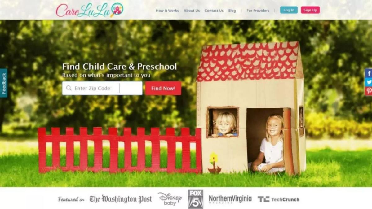
Slide 5 introduces the CareLuLu interface. It’s a clean landing page with a simple zip code search. Notably, the bottom of the slide features a 'Featured In' bar with high-authority logos: The Washington Post, Disney Baby, Fox 5, Northern Virginia Magazine, and TechCrunch. This provides immediate social proof before the investor even sees how the product works.
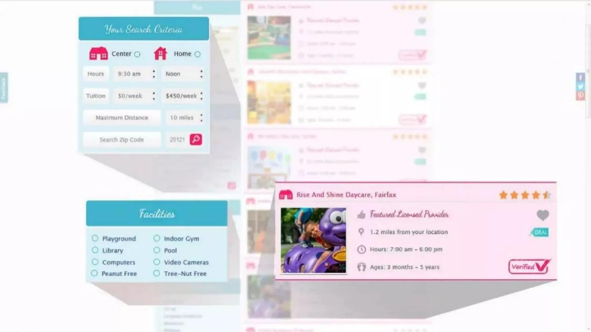
Slide 6 dives into the search functionality. It highlights specific 'Search Criteria' that parents care about: Center vs. Home-based care, specific hours (e.g., 9:30 am to Noon), and tuition ranges ($0 to $450/week). It also shows a 'Facilities' checklist including 'Peanut Free' and 'Video Cameras.' This demonstrates that the team understands the nuanced requirements of their users.
Slide 7 is perhaps the most important slide in the deck. It shows a detailed provider profile for 'Lifeskills Montessori.' Key features shown include:
Verified Badge: A checkmark icon that builds trust. · Social Proof: A 5-star rating based on 4 reviews. · Direct Action: A prominent 'Book a Tour' button. · Transparency: A 'Meet The Staff' section featuring the lead teacher’s photo, years of experience, and the fact that she is a 'mom of 3.'
This slide proves that CareLuLu isn't just a directory; it's a trust-building platform that facilitates the transaction (the tour booking).
The Supply Side and Market Size (Slides 8-11)
Slides 8, 9, and 10 are full-bleed photographs of daycare environments and children at play. While these slides contain no text, they serve a psychological purpose. They reinforce the 'quality' aspect of the marketplace. In a childcare marketplace, the 'inventory' is the most sensitive component. These images suggest that the platform hosts high-quality, vibrant, and safe environments.
Slide 11 returns to the macro opportunity. It defines the 'Daycare Marketplace' as a "$1.3 Billion TAM." This clarifies the $1 billion figure from Slide 2. It’s a focused, achievable Total Addressable Market for a niche marketplace, which is often more credible to investors than a vague '$500 billion education market' claim.
The Team and Traction (Slides 12-14)
Slide 12 introduces the founders. Patrick Matos (CEO), Jen Usmanova (COO), and Gabriel Marques (CTO). The slide is well-structured, using a grid to show their education (Berkeley, Georgetown, Penn State) and their roles. The 'bottom line' of the grid adds personal credibility: Patrick has 11 patents and managed $100M/year for Renault; Jen is a 'Mom of 2' who knows the pain point; Gabriel is on his 3rd startup. The inclusion of logos like Microsoft, Groupon, and Credit Suisse at the bottom further validates their professional pedigree.
Slide 13 is the 'Traction' slide. It is incredibly sparse, showing only the logo and "40% MoM." While investors usually prefer to see what that 40% applies to (revenue, users, or providers), the sheer strength of a 40% month-over-month growth rate is usually enough to trigger a follow-up meeting in a seed round.
Slide 14 is the closing slide, featuring a photo of the three founders in matching CareLuLu t-shirts. The tagline "created by Parents for Parents" appears here, reinforcing the founder-market fit narrative one last time.
What Works in the CareLuLu Deck
1. Emotional Resonance: The deck uses high-quality photography of children and daycare centers to remind investors of the human element of the business. This is a 'high-trust' industry, and the visual language reflects that.
2. Feature-Specific Validation: Instead of just saying they have a 'search' function, Slide 6 shows the exact filters parents need (tuition, allergies, hours). This proves the founders have done their homework on user personas.
3. Trust as a Product: By highlighting the 'Verified' badge and teacher bios, the deck addresses the primary barrier to entry in childcare: safety and trust. They aren't just selling a list; they are selling peace of mind.
What is Missing from the CareLuLu Deck
1. The Business Model: There is no mention of how CareLuLu makes money. Do they charge daycares a subscription? Do they take a commission on bookings? Do they sell featured listings? This is a significant omission for a seed deck.
2. Unit Economics: There is no data on Customer Acquisition Cost (CAC) or Lifetime Value (LTV). While this is common in very early seed decks, providing even an estimate of the 'take rate' from a $20,000/year service would have strengthened the financial argument.
3. The Ask: The deck does not state how much money they are looking for or what they plan to do with the funds. Usually, a 'Use of Funds' slide is standard to show how the investment will scale the current 40% MoM growth.
4. Competition: There is no competitive landscape slide. Investors would want to know how CareLuLu differentiates itself from incumbents like Care.com or local listing sites.
What a Founder Should Copy
1. The 'Anchor' Problem Slide: Use Slide 3 as a template. Find the single most painful cost or data point in your industry and put it next to a relatable image. It justifies the existence of your startup in five words.
2. The Social Proof Bar: If you have press coverage, put it on your first product slide (like Slide 5). It makes the product feel 'real' and vetted before the investor even sees the features.
3. Founder-Market Fit: If you are building for a demographic you belong to (like 'Parents for Parents' on Slide 14), make that a central part of your identity. It suggests you have an unfair advantage in understanding the customer's psychology.
4. Minimalist Design: This deck proves you don't need 50 slides or dense paragraphs. If your product is visual, let the screenshots do the heavy lifting. Slide 7 is a perfect example of how to show a complex feature set without using a single bullet point.
Frequently asked questions
- How much did CareLuLu raise with this deck?
- According to the catalogue facts, CareLuLu raised $1,700,000 in a Seed round in 2013. The deck itself does not state the amount being raised or the valuation, focusing instead on the market size and the product's growth trajectory.
- What is the primary problem CareLuLu solves?
- The problem is framed visually on Slide 4. It highlights the inefficiency of the current search process, which requires parents to navigate a dense map of options using only Google, phone calls, and physical visits. The deck suggests that finding a $20,000/year service (Slide 3) shouldn't be this difficult.
- What traction does the company show?
- The deck is very lean on data until the end. Slide 13 reports a 40% Month-over-Month (MoM) growth rate. While it doesn't specify if this refers to revenue, users, or listings, it provides the 'up and to the right' momentum investors look for in a seed round.
- Who are the founders and what is their background?
- As shown on Slide 12, the team consists of Patrick Matos (CEO), Jen Usmanova (COO), and Gabriel Marques (CTO). Their backgrounds include experience at Microsoft, Groupon, and Renault, with academic credentials from Berkeley, Georgetown, and Penn State. They also emphasize 'founder-market fit' by noting they are parents themselves.
- Is there a business model explained in the deck?
- No. The deck does not contain a slide dedicated to revenue streams or unit economics. However, Slide 7 shows a 'Deal' tag and a 'Book a Tour' button, which implies a lead-generation or transaction-based marketplace model common in the EdTech and childcare sectors.