Chronicle’s 9-slide Seed deck is a masterclass in brevity and social proof. By leading with a high-pedigree team and a heavy-hitting lead investor (Accel), the company establishes immediate credibility in a crowded SaaS category. The deck identifies three core frictions in modern presentations: pixel-level design choices, design burden on users, and an archaic 80s-era format. It counters these with a '50x faster' efficiency promise and a product-led growth (PLG) model that claims to add 4-6 users per acquisition cycle. While the deck lacks a formal 'Ask' slide or detailed financial projection…
Key takeaways
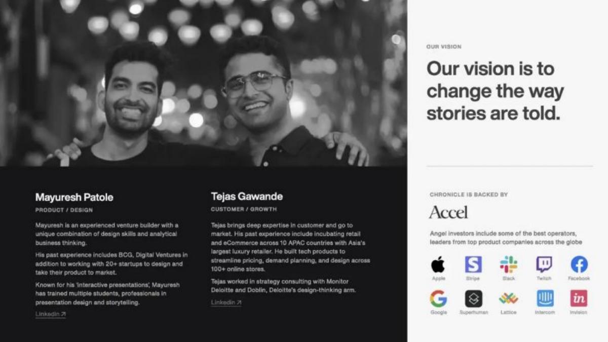
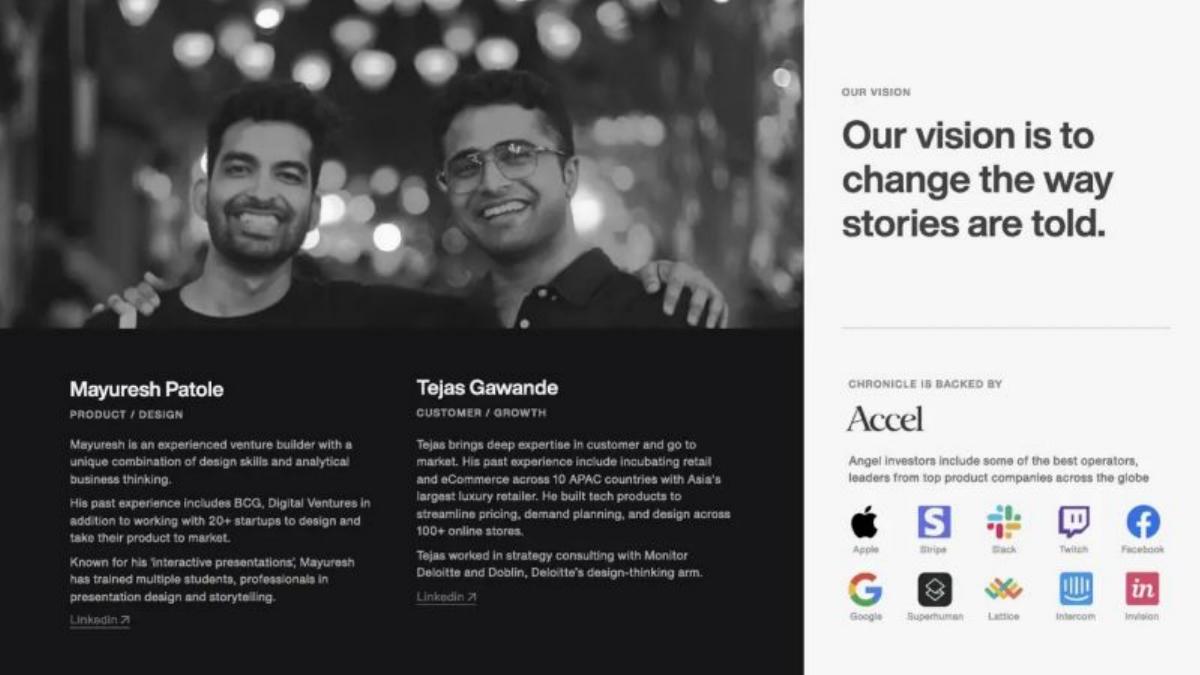
- The deck leads with the team and existing backing from Accel, prioritizing social proof over problem statements (Slide 1).
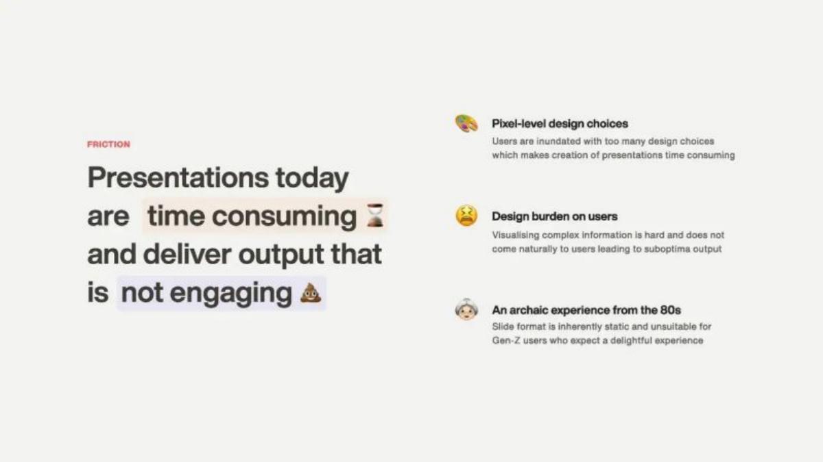
- Chronicle identifies the 'design burden' and 'archaic experience' of 1980s-style slides as the primary market friction (Slide 2).
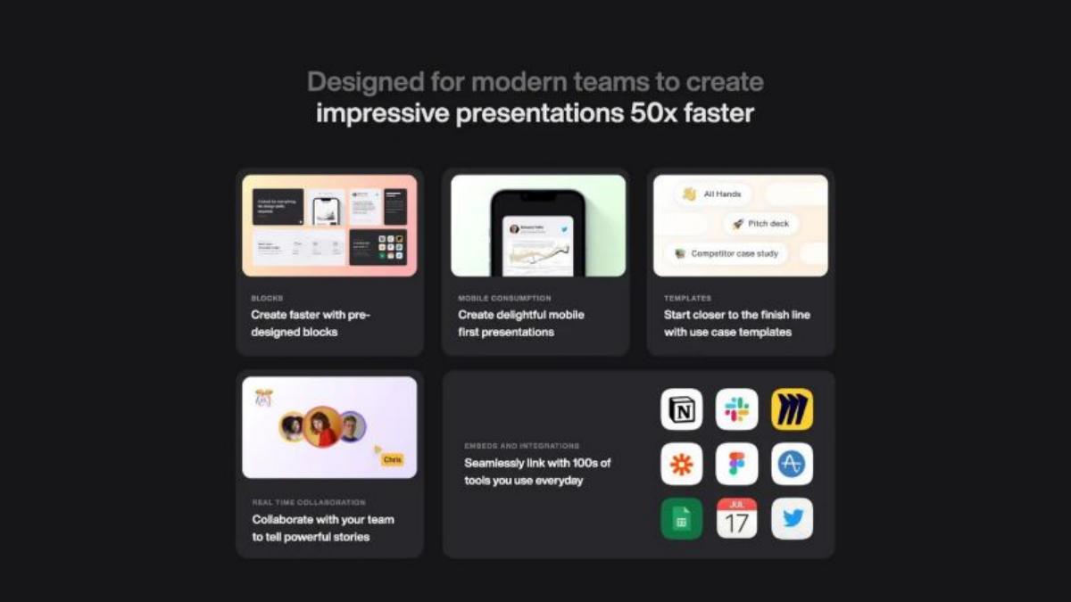
- The product claims to enable the creation of impressive presentations 50x faster than traditional tools (Slide 4).
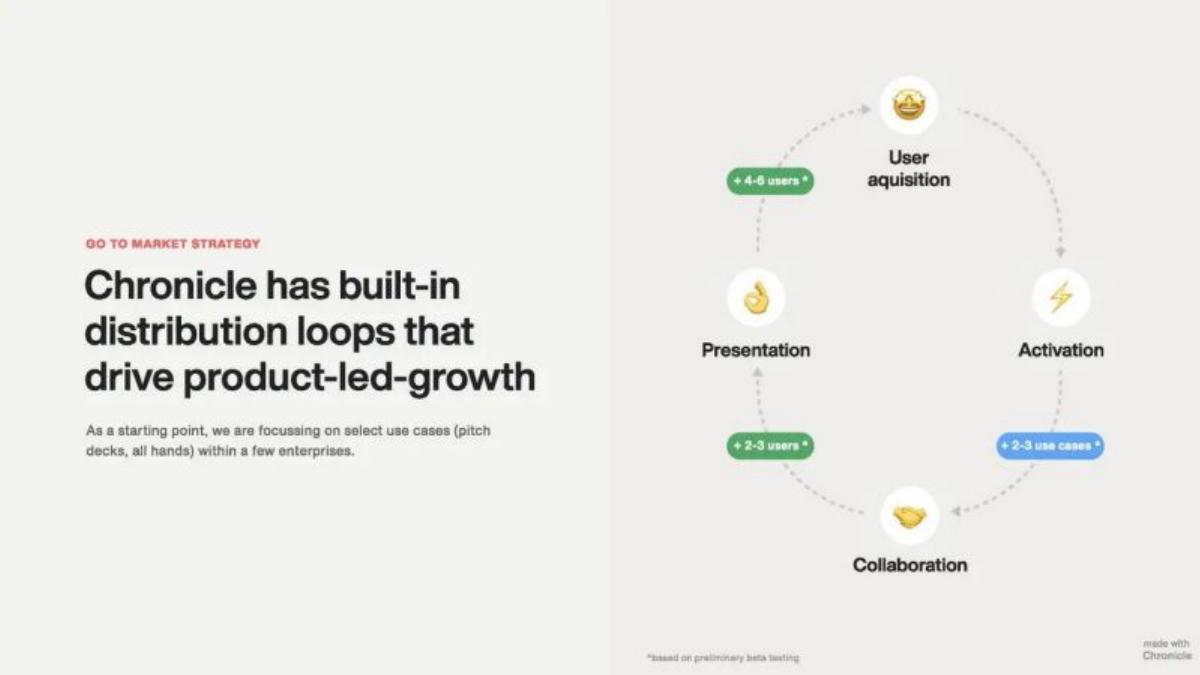
- Product-led growth is central to the strategy, with a distribution loop adding 4-6 users per acquisition (Slide 5).
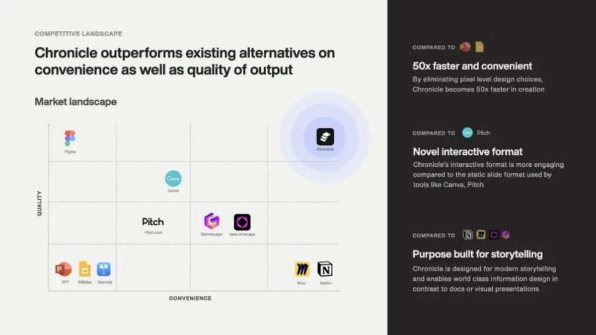
- The competitive landscape positions Chronicle as the only tool high in both quality and convenience, outperforming Pitch and Canva (Slide 6).
- Early validation includes testimonials from Product Marketing Managers at Google and founders at Cecil (Slide 7).
- The deck omits a specific fundraising ask, valuation, or use-of-funds breakdown (Slides 1-9).
- The presentation itself was 'Made with Chronicle,' serving as a live product demonstration (Slide 9).
The Power of Pedigree: Chronicle’s 9-Slide Seed Deck
Chronicle’s pitch deck is a lean, 9-slide document that relies heavily on the 'who' and the 'what' rather than the 'how much.' In a venture landscape where presentation tools are often viewed as a commodity, Chronicle successfully raised $7.5M by positioning their product as a fundamental shift in storytelling rather than just another slide editor. The deck is notable for what it excludes—there are no spreadsheets, no TAM calculations, and no exit strategies. Instead, it focuses on the friction of modern work and the pedigree of the people solving it.
Slide 1: Team and Backing
Chronicle breaks the traditional deck order by putting the Team slide first. This is a strategic move for founders with high-tier backgrounds. Mayuresh Patole (Product/Design) is highlighted for his experience at BCG and Digital Ventures, while Tejas Gawande (Customer/Growth) is noted for his work at Deloitte and managing retail across 10 APAC countries. The right side of the slide is dedicated to social proof: the Accel logo is prominent, followed by a grid of logos from Apple, Stripe, Slack, Twitch, Facebook, Google, Superhuman, Lattice, Intercom, and InVision, representing the origins of their angel investors. This slide establishes that the 'smart money' has already vetted the founders.
Slide 2: The Friction
The problem slide, titled 'Friction,' uses emojis and bold typography to categorize the pain points of existing presentation software. It identifies three specific issues: 'Pixel-level design choices' (which make creation time-consuming), 'Design burden on users' (leading to suboptimal output), and 'An archaic experience from the 80s.' By calling the slide format 'inherently static,' they set the stage for a solution that is dynamic and block-based.
Slide 3: Introducing Chronicle
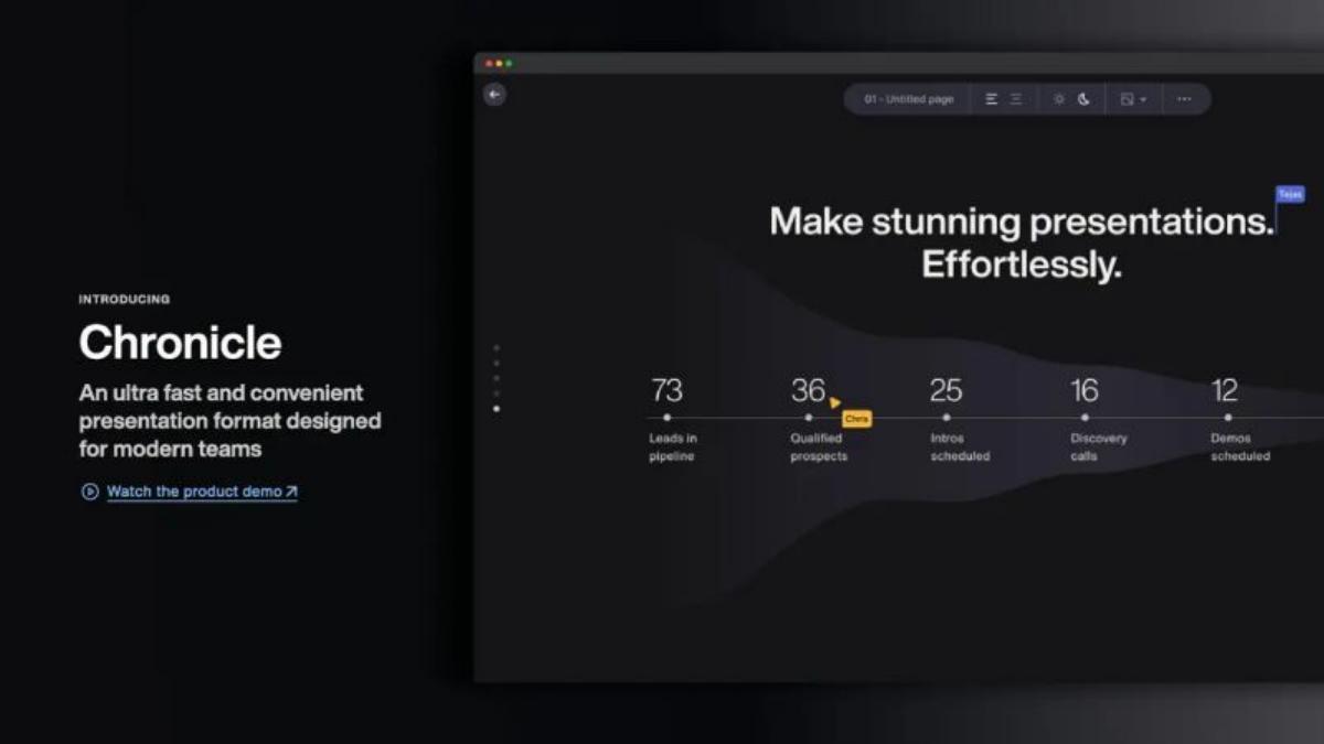
Slide 3 provides the first glimpse of the product interface. It describes Chronicle as an 'ultra fast and convenient presentation format designed for modern teams.' The visual shows a dark-mode interface with a funnel graphic and a 'Chris' cursor, hinting at real-time collaboration. A call to action to 'Watch the product demo' is included, which is a critical bridge for a product-centric pitch.
Slide 4: The 50x Efficiency Claim
This slide is the meat of the value proposition. It claims Chronicle allows teams to create presentations '50x faster.' It breaks down the features into five categories: Blocks (pre-designed elements), Mobile Consumption (mobile-first viewing), Templates (use-case specific starts), Real-time Collaboration, and Embeds/Integrations. The integrations grid shows logos for Notion, Slack, Miro, Figma, and Google Sheets, positioning Chronicle as a hub for existing work tools.
Slide 5: Go-To-Market Strategy
Chronicle describes its GTM as 'built-in distribution loops.' The slide features a circular diagram showing how user acquisition leads to activation, which leads to collaboration (+2-3 users), which leads to presentation (+2-3 users), creating a self-sustaining growth cycle. A small footnote mentions these figures are 'based on preliminary beta testing,' providing a data-backed foundation for their growth claims.
Slide 6: Competitive Landscape
The market landscape slide uses a standard 2x2 grid with 'Quality' on the Y-axis and 'Convenience' on the X-axis. Chronicle places itself in the top-right quadrant (high quality, high convenience). Interestingly, it places Figma as high quality but low convenience, and tools like PowerPoint and Google Slides as low quality and low convenience. It specifically calls out that Chronicle is '50x faster' than PowerPoint and more 'engaging' than Canva or Pitch.
Slide 7: Early Validation
Validation is shown through three testimonials from high-profile users: a PMM at Google, a founder at Cecil, and a PM at Chefprep. The metrics accompanying these quotes reiterate the '50x faster' claim and add a new data point: 'Output quality among top 5% across all the decks produced.' This suggests the company is already tracking qualitative performance metrics in their beta.
Slide 8: The Close
The penultimate slide is a simple 'Thank you' with a contact email for Mayuresh Patole. It is clean and maintains the minimalist aesthetic of the rest of the deck.
Slide 9: Product Proof
The final slide is a meta-commentary on the product itself, stating 'Made with Chronicle.' This is a common tactic for design-tool startups (similar to how early Figma or Notion decks were shared), proving that the tool is stable enough to produce the very document used to raise millions.
What Chronicle Does Well
Extreme Focus on Speed: The '50x faster' metric appears on Slides 4, 6, and 7. By anchoring the entire pitch on a single, quantifiable improvement (time saved), they make the investment thesis simple: if you save 98% of the time spent on a universal business task, you win the market.
Social Proof as a Shield: By leading with Accel and a list of top-tier tech companies, Chronicle bypasses the need to prove the market exists. The implication is that if operators at Stripe and Google are complaining about slides and backing this solution, the problem is real and the market is ready.
What is Missing from the Chronicle Deck
The Financials: There is no mention of the business model beyond a 'B2B SaaS' tag in the catalogue. The deck does not explain pricing tiers, projected revenue, or burn rate. While common in early Seed rounds, it leaves the 'business' side of the startup entirely to the imagination.
The Ask: The deck never specifies how much money they are looking for or what the milestones for the next 18 months are. This suggests the deck was likely used as a visual aid for a conversation where the terms were already being discussed, rather than a cold-outreach document.
Market Size (TAM): There is no slide explaining how big the presentation market is. The founders assume the investor already knows that 'everyone uses slides,' which is a risky but often successful bet in high-pedigree Seed rounds.
Founder Lessons
Show, Don't Just Tell: If you are building a design tool, your deck must be a masterpiece of that tool's capabilities. Chronicle’s deck is visually consistent, uses high-quality dark-mode aesthetics, and ends with the 'Made with Chronicle' badge. It turns the pitch into a live trial.
Leverage Your Loops: If your product has a viral component, map it out. Slide 5 is the most important slide for a VC because it explains how $1 of marketing spend might turn into 5 users through the product's natural usage. This 'distribution loop' is often more attractive to investors than the product features themselves.
Pedigree Matters in Crowded Spaces: If you are entering a market with established giants (Microsoft, Google) and well-funded challengers (Canva, Pitch), you must lead with your team's unique ability to execute. Chronicle’s decision to put the team on Slide 1 is the correct move for this specific competitive context.
Frequently asked questions
- How much did Chronicle raise with this deck?
- According to the catalogue facts, Chronicle raised $7.5M in a Seed round in 2023. The deck itself does not state the amount raised or the specific terms of the round, which is common for decks used to secure lead interest rather than finalize a syndicate.
- Who are the lead investors in Chronicle?
- The deck prominently features Accel as the lead investor on Slide 1. The catalogue listing also notes participation from Square Peg, iSeed, and several angel investors, including Ben Grabiner and Kashish Sharma.
- What is the core value proposition of the product?
- Chronicle positions itself as a 'Notion-like' presentation format. The core value prop, as stated on Slide 4, is the ability to create 'impressive presentations 50x faster' by using pre-designed blocks and eliminating pixel-level design choices that typically burden users.
- What is missing from the Chronicle pitch deck?
- The deck is missing several standard components: a market size (TAM) slide, a detailed business model/pricing slide, a financial roadmap, and a specific 'Ask' slide detailing how the $7.5M will be spent. It relies almost entirely on team pedigree and product vision.
- How does Chronicle plan to acquire customers?
- Chronicle utilizes a product-led growth (PLG) model. Slide 5 illustrates a distribution loop where one user acquisition leads to 4-6 new users through collaboration and presentation sharing, effectively turning the output of the tool into a marketing channel.