The Diagram pitch deck from 2022 is a highly visual, 57-slide presentation (19 slides analyzed here) that successfully argued for the inevitability of AI in the design process. Eschewing traditional text-heavy slides, Diagram used high-fidelity UI mockups and simple Venn diagrams to illustrate the convergence of design, code, and artificial intelligence. The deck highlights the company's early traction with Figma plugins like 'Automator' and 'Magician,' positioning them not just as tools, but as the foundation for a new era of generative design. By citing a $35 billion design tech spend and A…
Key takeaways
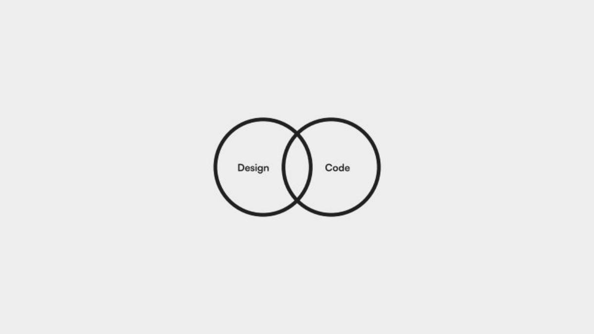
- The deck uses a minimalist aesthetic with central Venn diagrams to define the company's mission at the intersection of Design, Code, and AI (Slides 2, 14).
- Product capability is demonstrated through specific UI components and automated layout examples, showing how AI can manipulate design layers (Slides 3, 5, 6).
- Diagram leverages social proof by displaying logos of major tech companies like Netflix, Meta, and Robinhood, presumably representing the user base of their early plugins (Slide 12).
- The technical foundation is hinted at with a slide showing raw Figma API code, emphasizing the deep integration required for their automation tools (Slide 13).
- Market size is quantified using third-party data, citing a $35 billion current spend on design tech and a $31 billion TAM for Adobe Creative Cloud in 2022 (Slide 18).
- Strategic focus is explicitly stated as building on Figma first, while 'keeping options open' for other design tools in the future (Slide 19).
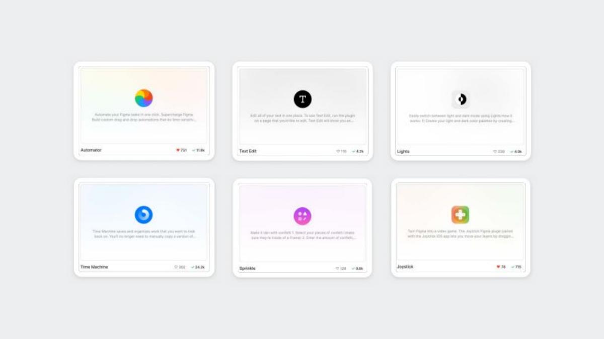
- The deck highlights early product success through a suite of plugins including Text Edit, Lights, Time Machine, and Sprinkle, showing a diversified approach to design utility (Slide 11).
- The 'AI automation is eating everything' slide positions Diagram alongside category leaders like Copy.ai, Runway, and GitHub Copilot (Slide 17).
The Minimalist Path to a Major Acquisition
The Diagram pitch deck is a masterclass in 'show, don't tell.' In an industry often bogged down by complex technical explanations of machine learning, Diagram chose to present a vision of the future that was immediately legible to designers and investors alike. The deck's structure moves from the abstract (Venn diagrams of design and code) to the concrete (actual UI components being manipulated by AI), creating a compelling argument for the automation of the design workflow.
Slides 1-4: Setting the Visual Standard
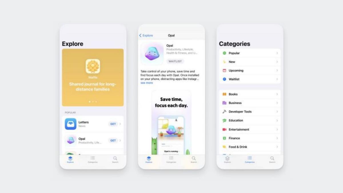
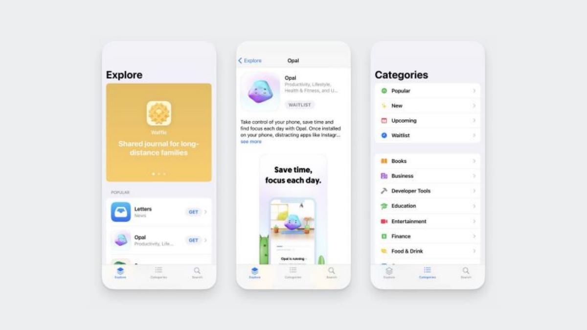
The deck opens with a series of high-fidelity mobile UI screens (Slide 1). These aren't just placeholders; they represent the 'Explore' and 'Category' views of a sophisticated app, signaling that the founders understand the nuances of modern product design. Slide 2 introduces the first of two critical Venn diagrams, placing the company at the intersection of Design and Code . This is a foundational concept for the deck: the idea that design is no longer just about pixels, but about the underlying structures that allow those pixels to be manipulated programmatically.
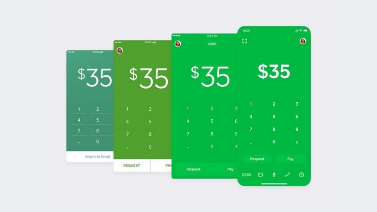
Slides 3 and 4 reinforce this by showcasing a library of UI components—buttons, title bars, and payment cards. Slide 4, in particular, shows a collage of screens from a 'Cash App' style interface, emphasizing that Diagram's tools are intended for real-world, high-stakes product design rather than just artistic experimentation.
Slides 5-7: The Power of Structure
Slide 5 and 6 demonstrate the 'Auto Layout' capabilities that were becoming central to the Figma ecosystem at the time. By showing a headline component with specific pixel dimensions (375 x 240) and a 'Verify Your Account' screen, Diagram illustrates how their tools interact with the structural logic of a design file. The text on Slide 7 provides the 'Why': 'We’re in a unique place with product design where there’s more structure and patterns than ever.' This is the core insight of the company—because design has become more structured, it has become ripe for AI automation.
Slides 8-11: Product in Action
Slides 8, 9, and 10 show a specific use case: converting a flat image into an interactive UI element. Slide 9 highlights an 'Open Button' with specific coordinates and dimensions, while Slide 10 shows the 'Automator' interface, where actions like 'Create rectangle' and 'Create text' are scripted. This transition from a static image to a scripted action is the 'magic' moment of the pitch. Slide 11 introduces the broader product suite: Text Edit , Lights , Time Machine , and Sprinkle . Each card shows a download count and a 'heart' count, providing a subtle nod to early community traction (e.g., Time Machine showing 24.2k downloads).
Slides 12-14: Validation and Technical Depth
Slide 12 is a classic 'Logo Slide,' featuring heavy hitters like Twitter, Netflix, Snapchat, Robinhood, Meta, DoorDash, Instacart, and Reddit . For a seed or Series A stage company, this level of organic adoption by top-tier design teams is a massive signal of product-market fit. Slide 13 pivots to the technical, showing a snippet of JSON code from the Figma API. This serves to remind the investor that Diagram isn't just a UI wrapper; they are doing the hard work of deep integration with design tool infrastructure. Slide 14 then updates the Venn diagram from Slide 2, replacing 'Code' with 'AI' , effectively redefining the company's mission for the next phase of growth.
Slides 15-17: The AI Inevitability
Slide 15 features a tweet from founder Jordan Singer, showing a video of a 'Flat image -> interactive layers' plugin. This uses social proof and 'build in public' momentum to validate the tech. Slide 16 is a blank Figma canvas, perhaps representing the 'tabula rasa' that AI will soon fill. Slide 17 delivers the macro-thesis: 'AI automation is eating everything from copy, to video, to code.' By placing their logo alongside Copy.ai, Runway, and GitHub Copilot , Diagram claims the 'AI for Design' category before anyone else can.
Slides 18-19: The Market and the Strategy
The deck concludes its narrative arc with hard numbers. Slide 18 cites Forrester and Adobe , noting a $35 billion spend on design tech and a $31 billion TAM for Creative Cloud. This justifies the scale of the opportunity. Finally, Slide 19 addresses the 'Platform Risk' of being a Figma-first company: 'We’re keeping our options open to explore building on other design tools, but Figma is the starting point.' This statement was likely the final nudge Figma needed to realize that Diagram was either a future competitor or a necessary acquisition.
What Works in the Diagram Deck
Extreme Focus: The deck doesn't try to solve every problem in design. It focuses entirely on the transition from manual pixel-pushing to AI-assisted automation. · Visual Authority: As a design tool company, the deck itself is a product demo. The spacing, typography, and image quality are flawless, which builds immediate trust with the audience. · Category Positioning: Slide 17 is a masterclass in positioning. By associating with GitHub Copilot, they skip the 'what is this?' phase and go straight to 'we are the Copilot for designers.'
What is Missing
Team Slide: In the 19 slides provided, there is no mention of the founding team's pedigree. While Jordan Singer was well-known in the Figma community, a traditional deck usually requires a dedicated team slide. · Unit Economics: There is no mention of pricing, CAC, LTV, or revenue. This suggests the deck was either for a very early round where vision trumped metrics, or it was specifically tailored for a strategic acquisition where the 'tech and talent' were the primary assets. · The 'Ask': There is no slide detailing how much money is being raised or what the milestones for the next 18 months are.
What Founders Should Copy
The 'Venn Diagram' Evolution: Using a simple visual to show how your company's identity is shifting (from Design/Code to Design/AI) is a powerful way to communicate a pivot or an expansion of scope. · Micro-Demos: Instead of long videos, use static slides that show the 'Before' and 'After' of a product action (Slides 8-10). It allows the investor to process the value proposition at their own pace. · Strategic Honesty: Acknowledging your platform dependency (Slide 19) while framing it as a 'starting point' shows strategic maturity and can actually trigger acquisition interest from the platform holder.
Frequently asked questions
- What was the primary goal of the Diagram pitch deck?
- The deck aimed to position Diagram as the leader in AI-driven design automation. By showing how their tools could convert flat images into interactive layers and automate repetitive UI tasks, they demonstrated a future where design is generative rather than purely manual. This narrative was clearly effective, as it eventually led to an acquisition by Figma.
- How does the deck handle market competition?
- Rather than a traditional competitor grid, Diagram uses a 'rising tide' approach. Slide 17 lists AI leaders in other verticals (copy, video, code) like Copy.ai and GitHub Copilot, suggesting that Diagram is the equivalent leader for the design vertical. This frames the company as part of a broader, inevitable technological shift.
- What metrics are included in the presentation?
- The 19 slides provided are light on internal growth metrics like MRR or user retention. Instead, they focus on external market validation, such as the $35 billion design tech spend (Slide 18), and social proof through the logos of high-profile companies using their tools (Slide 12). The full 57-slide deck likely contained more granular data.
- Why did Diagram focus so heavily on Figma?
- Slide 19 explicitly states that Figma is the 'starting point.' By building deeply within the Figma ecosystem first, Diagram was able to access a concentrated market of professional designers and prove their value proposition in a high-growth environment. This focus ultimately made them an indispensable asset for Figma to acquire.
- What is the visual style of the deck?
- The deck is extremely minimalist, often featuring a single sentence or a single image per slide. This 'Steve Jobs style' approach forces the audience to focus on the speaker's narrative while the slides provide high-impact visual punctuation. It reflects the company's core competency: high-quality UI/UX design.