HappySignals addresses a specific pain point in enterprise IT: the disconnect between green-lit technical metrics and dissatisfied end-users, a phenomenon they label the 'Watermelon Effect.' The deck is built on a foundation of strong social proof, featuring a high volume of enterprise logos and a compelling CIO testimonial that likens experience data to CRM data for sales. By claiming a specific 26% increase in productivity for their customers, the company moves beyond 'soft' happiness metrics into hard business value. While the deck lacks traditional financial projections and a specific 'As…
Key takeaways
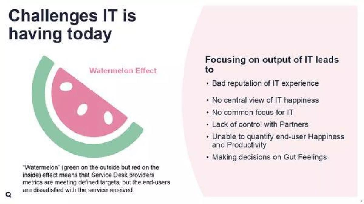
- The 'Watermelon Effect' on slide 4 provides a powerful visual metaphor for IT services that look 'green' on the outside but are 'red' (failing) on the inside.
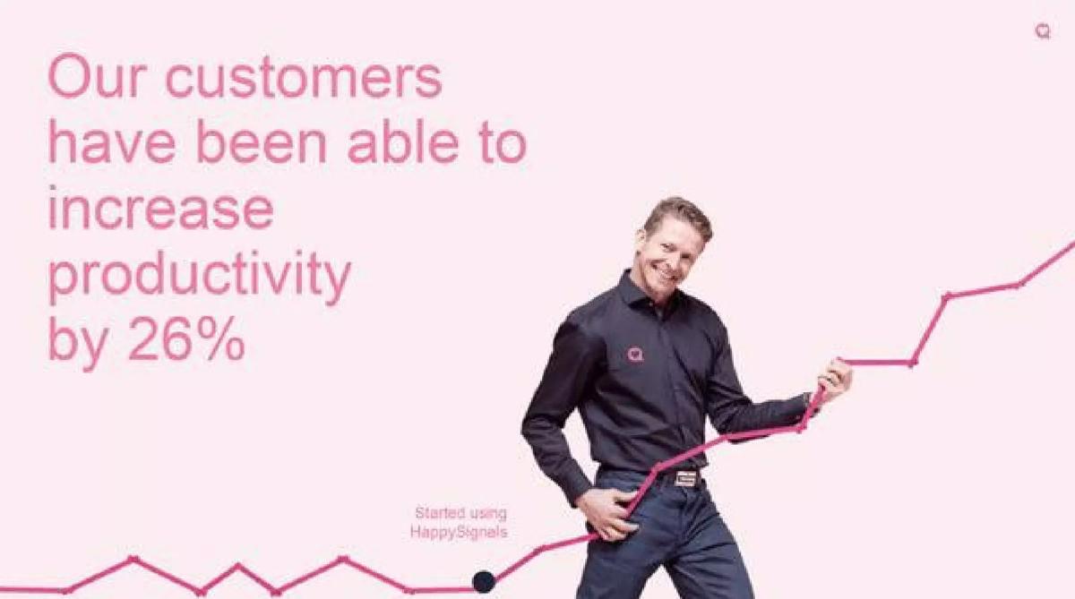
- HappySignals claims their customers have increased productivity by exactly 26% (slide 2 and slide 6).
- The deck leverages a massive database of over 2 million end-user responses across 130 countries to power its benchmarking (slide 7).
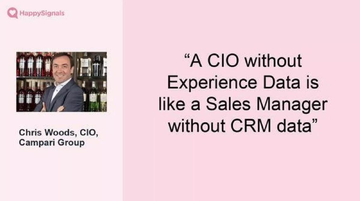
- A high-impact quote from the CIO of Campari Group compares experience data to CRM data, establishing the platform's necessity (slide 5).
- The product strategy focuses on moving enterprises from traditional SLAs to 'XLAs' or Experience Level Agreements (slide 8).
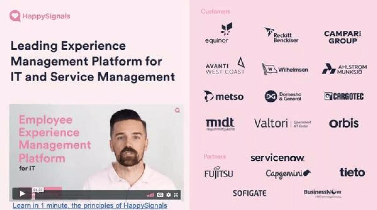
- The company lists major enterprise customers including Equinor, Campari Group, and Reckitt Benckiser on slide 3.
- The deck emphasizes deep integration with existing IT ecosystems, specifically highlighting ServiceNow, Cherwell, and Freshservice (slide 12).
- The team slide (slide 14) identifies three founders and three VPs but omits their professional backgrounds or previous company exits.
Introduction: The Quantified Employee Experience
HappySignals entered the market with a specific mission: to make the 'human' side of IT as measurable as the 'server' side. In an era where enterprise software was dominated by technical uptime metrics, HappySignals pitched a platform that focused on the end-user. This teardown examines their 15-slide Series A deck, which helped secure $5.7 million in funding in 2014. The deck is a masterclass in using social proof and clear metaphors to explain a complex enterprise problem.
Slides 1-3: Vision, Mission, and Immediate Social Proof
The deck opens with a minimalist title slide (Slide 1) that defines the category: 'Employee Experience Management Platform.' It is clean, using a soft pink palette that the company later lists as one of its 'Uniques' on slide 15. This branding choice is intentional, signaling a departure from the 'cold' blue and grey tones typical of enterprise IT software.
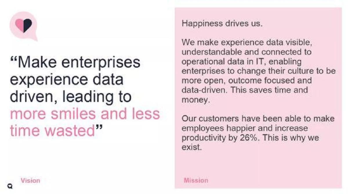
Slide 2 establishes the 'Why.' It introduces the company's vision to make enterprises experience data-driven, leading to 'more smiles and less time wasted.' Crucially, it introduces the first hard metric: a 26% increase in productivity for their customers. This is a bold claim to make on the second slide, but it immediately anchors the 'happiness' concept in financial reality.
Slide 3 is a 'Traction' slide moved to the front of the deck. It features a video link ('Learn in 1 minute') alongside a dense wall of logos. The customer list includes heavyweights like Equinor, Campari Group, and Reckitt Benckiser. Below the customers, they list partners like ServiceNow and Capgemini. By placing this on slide 3, HappySignals is telling investors: 'This isn't a theory; these massive organizations are already paying us.'
Slides 4-6: The Problem and the CIO Perspective
Slide 4 introduces the 'Watermelon Effect.' This is the core problem statement. The slide explains that Service Desk providers often meet their targets (Green), but end-users are still unhappy (Red). It lists the consequences of this disconnect: bad reputation, lack of control with partners, and decisions made on 'Gut Feelings.' This slide effectively creates a 'gap' in the market that only HappySignals can fill.
Slide 5 reinforces the problem through the eyes of the buyer. A quote from Chris Woods, CIO of Campari Group, states: 'A CIO without Experience Data is like a Sales Manager without CRM data.' This is perhaps the most important slide in the deck. It elevates 'Experience Data' from a 'nice-to-have' HR metric to a 'must-have' operational tool, comparable to the most essential software in the enterprise stack.
Slide 6 doubles down on the productivity claim. It features a large graphic of a man standing in front of a rising line chart with the text 'Our customers have been able to increase productivity by 26%.' The chart shows a clear inflection point labeled 'Started using HappySignals.' While the chart lacks a Y-axis with specific units, the repetition of the 26% figure serves as a powerful mnemonic for the deck's value proposition.
Slides 7-9: The Methodology and the 'Happiness Score'
Slide 7 introduces the 'Happiness Score.' It explains that their benchmark data is compiled from over 2 million end-user responses across 130 countries. This scale is impressive for a Series A company and suggests a significant data moat. The slide shows the various touchpoints they measure: Office Environment, Remote Work, Laptops, and Mobile Devices.
Slides 8 and 9 outline the 'Measure, Share, Identify, and Improve' cycle. This is the 'How it Works' section. Slide 8 is particularly important because it introduces the transition 'From SLAs to XLAs.' By co-opting the language of IT (SLAs) and proposing a new standard (XLAs), HappySignals positions itself as a thought leader in the space, not just a tool provider.
Slides 10-13: The Product Offering and Integrations
Slide 10 provides a high-level overview of the 'Offering,' divided into IT Experience, Service Experience, and Portal Experience, all sitting on top of the 'XMP' (Experience Management Platform). This slide helps the investor understand the different modules they can sell.
Slide 11 and 12 dive deeper into these modules. Slide 11 focuses on 'IT Experience,' showing a mobile dashboard and listing benefits like 'Understand where end-users struggle' and 'Continuous Measurement.' Slide 12 focuses on 'Service Experience' and explicitly mentions 'Experience Level Management for ITSM.' The logos for ServiceNow, Cherwell, and Freshservice appear in the bottom right, signaling that HappySignals is an additive layer to these existing systems, not a replacement. This reduces the perceived risk of 'rip and replace' for potential customers.
Slide 13 is a 'Thank You' slide that oddly appears before the Team and Uniques slides, suggesting this deck might have been rearranged or intended for different presentation formats.
Slides 14-15: The Team and Differentiators
Slide 14 introduces the 'Experienced Management Team.' It lists three founders (Sami Kallio, Pasi Nikkanen, Sami Aarnio) and three VPs. While the photos are professional, the slide is missing the 'pedigree' often found in Series A decks—there are no logos of previous employers (e.g., 'Ex-Google' or 'Ex-SAP'). However, it does list their current investors: Nauta Capital and Vendep Capital, which provides institutional validation.
Slide 15, titled 'Uniques,' is a summary of their competitive advantages. It lists items like 'Benchmarking,' 'Productivity Measurement,' and 'ServiceNow Certified.' Interestingly, the final unique listed is 'It's pink.' This is a rare moment of personality in an enterprise deck, reinforcing the idea that they are bringing a 'human' touch to a sterile IT world.
What Works in the HappySignals Deck
The Metaphor: The 'Watermelon Effect' is a brilliant way to explain a technical problem to a non-technical audience. It is memorable and immediately understandable. · The CRM Analogy: Comparing experience data to CRM data (Slide 5) is a high-level framing that justifies enterprise-level pricing and urgency. · Data Scale: Citing 2 million responses across 130 countries (Slide 7) gives the company immediate credibility and suggests a significant data advantage over new entrants. · Outcome-Focused: The deck repeatedly focuses on '26% productivity increase' rather than just 'better surveys.' This speaks the language of the CFO, not just the IT manager.
What is Missing from the HappySignals Deck
Financials: There is no mention of current Revenue, ARR, or growth rates. For a Series A deck, this is a significant omission. · The Ask: The deck does not state how much money they are looking to raise or what the specific milestones for the next 18-24 months are. · Competition: There is no competitive landscape slide. While they define a new category (XLAs), investors would want to know how they compare to traditional survey tools like Qualtrics or Medallia. · Unit Economics: There is no information on Customer Acquisition Cost (CAC), Lifetime Value (LTV), or sales cycle length, which are critical for evaluating the scalability of an enterprise SaaS business.
What a Founder Should Copy
Early Social Proof: Don't wait until the end of the deck to show your customers. If you have big names, put them on slide 3 to build immediate trust. · The 'Why Now' Quote: Find a quote from a respected industry leader (like a CIO) that compares your product to an existing 'must-have' category. It does the heavy lifting of market education for you. · Visual Consistency: The use of the pink color palette throughout the deck is a bold branding choice that makes the deck stand out from the typical 'enterprise blue' presentations. · Category Creation: If you are solving a new problem, give it a name (like XLAs). It allows you to set the criteria by which you are judged, rather than being compared to existing, unrelated tools.
Frequently asked questions
- What is the 'Watermelon Effect' mentioned in the deck?
- The Watermelon Effect, described on slide 4, refers to a situation where IT Service Desk metrics meet all defined technical targets (appearing 'green' on the outside), but end-users remain dissatisfied with the service (making it 'red' on the inside). HappySignals uses this to illustrate why traditional technical monitoring is insufficient for modern enterprise management.
- How does HappySignals quantify 'Happiness' into a business metric?
- HappySignals converts qualitative feedback into a 'Happiness Score' and links it to 'lost worktime.' On slide 2 and slide 6, they claim this approach allows customers to increase productivity by 26%. By measuring the time lost due to IT issues, they turn employee satisfaction into a quantifiable financial and operational metric.
- Who are the primary customers and partners for HappySignals?
- According to slide 3, HappySignals serves large enterprises such as Equinor, Campari Group, Metso, and Cargotec. Their partner ecosystem is heavily focused on IT Service Management (ITSM) giants, specifically listing ServiceNow, Fujitsu, Capgemini, and Tieto as key partners.
- What is an XLA and why does it matter in this pitch?
- An XLA stands for Experience Level Agreement. As shown on slide 8 and slide 12, HappySignals aims to shift the industry from SLAs (Service Level Agreements), which track technical uptime, to XLAs, which track the actual outcome and experience of the human user. This positioning helps them define a new category of software.
- What critical fundraising information is missing from this deck?
- The deck is notably missing a financial slide (revenue, ARR, or growth rates), a competition slide, and a clear 'Ask' slide detailing how much capital is being raised and how it will be spent. While it establishes a strong product-market fit through logos and testimonials, it lacks the 'deal terms' typical of a Series A pitch.