Hoorah’s pitch deck focuses on the modern workplace challenge of staff engagement, specifically targeting the needs of millennials through a mobile-first feedback platform. The deck is characterized by a high-contrast, minimalist design that emphasizes the product's interface and its ability to 'make collaboration visible.' While it successfully articulates the pain points of traditional interim reviews and the lack of visibility into daily staff interactions, it is notably light on business fundamentals. The deck lacks a team slide, market sizing, competitive analysis, and any financial proj…
Key takeaways
- The deck identifies four primary challenges: Staff Engagement, Interim Reviews, Limited Visibility, and Team Work (Slide 3).
- It specifically targets the difficulty of keeping millennials engaged in the modern workforce (Slide 3).
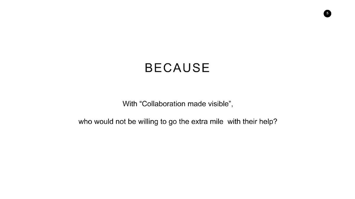
- The solution is framed around the concept of 'Collaboration made visible' to encourage staff to go the extra mile (Slide 5).
- The product interface allows users to capture 'bite-sized feedback' through three categories: Hoorah!, Suggest, and Grumble (Slide 7).
- The platform supports both internal and external feedback with an option for anonymity (Slide 7).
- A dashboard feature provides managers with word clouds and daily trend charts to track development and coaching (Slide 9).
- The deck includes a testimonial from a Partner at a 'Big 4 Audit Firm' claiming the tool allows them to 'measure soft KPIs' (Slide 11).
- There is no mention of market size, business model, revenue, or a specific fundraising target in the provided slides.
Executive Summary
The Hoorah pitch deck is a study in minimalist design and focused problem-solving. It avoids the clutter of many early-stage decks, opting instead for a clean, black-and-white aesthetic that mirrors the 'simple' nature of the product it describes. The company positions itself at the intersection of HR tech and employee productivity, specifically addressing the friction points of performance management in the modern, millennial-heavy workplace. However, the deck functions more as a product overview than a complete investment memorandum, as it omits nearly all financial and market-related data.
Slide 1: Title Slide
The deck opens with the Hoorah logo: a stylized, square-faced character with a smile, enclosed in a hexagonal frame. The branding is friendly and approachable, signaling a consumer-grade experience for an enterprise tool. There is no tagline or mission statement on this slide, leaving the brand name to stand on its own. The slide number '1' is visible in the top right corner.
Slide 3: Familiar With These Challenges?
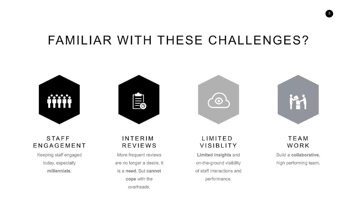
Slide 3 establishes the 'Why' of the company by listing four distinct pain points. Under STAFF ENGAGEMENT , the deck notes the difficulty of 'Keeping staff engaged today, especially millennials.' The INTERIM REVIEWS section argues that frequent reviews are now a 'need' but that organizations 'cannot cope with the overheads' of traditional methods. LIMITED VISIBILITY points to a lack of 'on-the-ground visibility of staff interactions,' and TEAM WORK focuses on the goal of building 'collaborative, high performing' teams. This slide effectively bridges the gap between cultural shifts (millennials) and operational inefficiencies (overheads).
Slide 5: The Philosophy of Visibility
This slide serves as a transition, using the word 'BECAUSE' in large type. It introduces the core philosophy of the product: 'With "Collaboration made visible", who would not be willing to go the extra mile with their help?' This suggests that the mere act of making positive interactions trackable and visible acts as a psychological incentive for employees to perform better. It frames the software not just as a tool, but as a behavioral intervention.
Slide 7: Our Solution - Capture
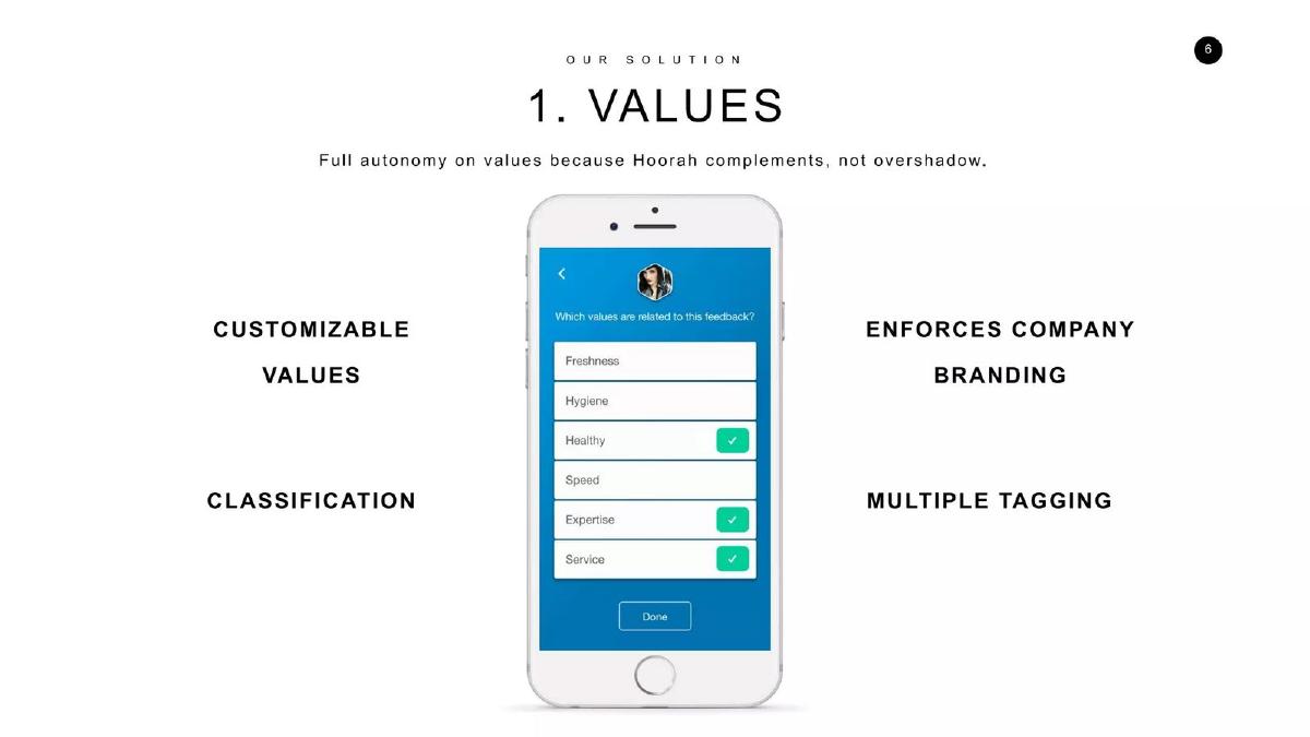
Slide 7 introduces the second step of the solution (labeled '2. CAPTURE'). It shows a mobile interface on an iPhone. The app allows users to 'Send Sally feedback' by selecting one of three options: Hoorah! (represented by a heart icon), Suggest (a lightbulb), or Grumble (a storm cloud). The slide highlights four key product attributes: SIMPLE , RECOGNITION & CONSTRUCTIVE , INTERNAL & EXTERNAL , and ANONYMITY . The inclusion of 'External' feedback suggests the tool could be used for client-to-employee feedback, though this isn't detailed further. The interface also shows a field for 'Values' (Freshness, Hygiene, Healthy, Serv...) and a text box for specific examples.
Slide 9: Our Solution - Remind
Slide 9 moves to the managerial side of the platform, labeled '4. REMIND.' The goal is 'Making sure that development and coaching does not drop off the radar.' A laptop mockup displays a dashboard for a user named Elisa Ang. The dashboard includes a word cloud titled 'Thank comments' featuring words like 'attitude,' 'mobile development,' and 'gesture.' Below this are two charts: 'Hoorahs received over time' (a line graph showing a 14-day trend) and 'Hoorahs received breakdown' (a bar chart). The slide lists four benefits: FEEDBACK RECEIVED , DETAILS IN DASHBOARD , UPDATE ON MENTEES , and STRAIGHT TO YOUR INBOX .
Slide 11: Validation via Testimonial
Rather than providing a slide on traction metrics or user growth, Hoorah uses Slide 11 to present a single, powerful testimonial. A 'Partner, Big 4 Audit Firm' states: 'We would not have been able to do our interim reviews without Hoorah!. I’ve gained insights into staff that I don’t normally know about, and can act on them to shape behaviours. We can now even measure soft KPIs such as coaching and other people skills.' This quote is intended to validate the enterprise utility of the tool and its ability to quantify previously 'unmeasurable' traits.
Slide 13: Contact Information
The final slide returns to the hexagonal logo and provides a direct contact email: elisa.ang@hoorah.io . The slide is functional and maintains the minimalist aesthetic of the rest of the deck. There is no final call to action or summary of the investment opportunity.
What Hoorah Does Well
The deck excels at defining a specific, relatable problem. By highlighting the 'overheads' of interim reviews, it speaks directly to the frustrations of HR departments and managers who find traditional performance cycles too slow and cumbersome. The product screenshots are clear and suggest a high level of UI/UX polish, which is a significant selling point for tools aimed at millennial employees who expect workplace software to look like the consumer apps they use daily. The use of a 'Big 4' testimonial provides a level of institutional credibility that helps offset the lack of hard data.
What is Missing from the Deck
From a fundraising perspective, this deck is incomplete. The most glaring omissions include:
The Team: There is no information about the founders' backgrounds, their previous exits, or their expertise in HR tech. · Market Size: The deck does not address the Total Addressable Market (TAM) or why now is the right time to enter this specific space. · Business Model: It is unclear if this is a SaaS model, a per-user-per-month fee, or an enterprise license. · Competition: There is no mention of how Hoorah differentiates itself from established players like Lattice, 15Five, or Culture Amp. · The Ask: The deck does not state how much money the company is looking to raise or what milestones that capital will help them achieve. · Financials: There are no mentions of current revenue, burn rate, or growth projections.
Founder Takeaways
Founders can learn from Hoorah’s ability to distill a complex value proposition into a simple, three-word concept: 'Collaboration made visible.' This is a powerful hook that is easy for an investor to remember. The high-contrast design and consistent use of iconography also make the deck very readable. However, founders should be careful not to mistake a product walkthrough for a pitch deck. While the product looks compelling, an investor needs to see the 'business' behind the 'button.' If you use a minimalist style, ensure that the few words you do include cover the essential pillars of a startup: team, market, and traction.
Frequently asked questions
- What is the primary problem Hoorah aims to solve?
- Hoorah targets the inefficiency of traditional annual or semi-annual performance reviews. Slide 3 notes that frequent reviews are a 'need' but companies 'cannot cope with the overheads.' It also addresses the lack of 'on-the-ground visibility' regarding daily staff interactions and the specific challenge of engaging millennial employees.
- How does the Hoorah app actually function for the end-user?
- Based on Slide 7, the app uses a simple mobile interface where employees can send feedback to colleagues. Users choose from three icons (Hoorah, Suggest, or Grumble) and can add specific examples or photos. The slide emphasizes that this feedback is 'bite-sized' and can be submitted anonymously, facilitating both recognition and constructive criticism.
- What kind of data does the platform provide to management?
- Slide 9 shows a 'Remind' dashboard for managers. It includes a word cloud of feedback comments (e.g., 'attitude,' 'mobile development,' 'gesture'), a daily trend line chart covering a two-week period, and a breakdown of feedback types. This data is intended to ensure that 'development and coaching does not drop off the radar.'
- Who is the intended customer for this platform?
- While the deck doesn't explicitly name a target vertical, Slide 11 features a testimonial from a 'Partner, Big 4 Audit Firm.' This suggests the product is suited for professional services firms where 'soft KPIs' like coaching and people skills are critical but difficult to quantify through traditional metrics.
- What critical information is missing from this pitch deck?
- The deck is missing several standard venture components. There is no slide introducing the founding team, no analysis of the Total Addressable Market (TAM), no mention of the business model or pricing, and no financial history or projections. Crucially, the deck ends without a specific 'Ask' regarding funding or milestones.