The Kahoot deck is a rare example of a 'product-as-pitch' strategy. Rather than leading with TAM (Total Addressable Market) or revenue projections, the presentation spends nearly 80% of its real estate on a step-by-step tutorial of the platform. By emphasizing the 'free online assessment tool' nature (Slide 2) and the ease of creating quizzes (Slide 4), the deck aims to prove product-market fit through utility rather than financial speculation. While it lacks a team slide, business model, or competitive landscape analysis, it successfully communicates the core value proposition: engaging stud…
Key takeaways
- The deck positions Kahoot as a direct competitor to Socrative but with a 'stronger element of gaming' (Slide 2).
- Product simplicity is the primary selling point, with 17 slides dedicated to the user interface and game flow (Slides 4-21).
- The platform leverages the ubiquity of student smartphones to facilitate real-time classroom engagement (Slide 2).
- A 'Public Kahoots' library is highlighted, showing an early repository of 1,140.1k existing games to reduce user friction (Slide 4).
- The gamification engine is built on two specific pillars: accuracy and speed (Slide 2).
- The deck explicitly acknowledges technical limitations, such as the requirement for internet-capable devices and occasional lag in game pins (Slide 22).
- There is a total absence of financial data, team bios, or an investment 'ask' within the 23 slides.
- The presentation was likely created for an 'N3 ICT symposium,' suggesting a grassroots marketing approach to fundraising (Slide 23).
The Product-First Approach to EdTech Fundraising
The Kahoot pitch deck is a departure from the standard Silicon Valley formula. Instead of starting with a massive problem statement or a vision of the future, it starts with a URL. This 23-slide presentation is less of a financial argument and more of a functional demonstration. In 2012, the concept of 'Bring Your Own Device' (BYOD) in classrooms was still emerging, and Kahoot’s deck focuses entirely on proving that their software could handle that transition seamlessly.
Slides 1-3: The Value Proposition
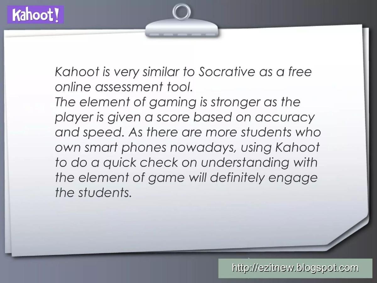
Slide 1 introduces the brand with the tagline 'For a Better Education.' It is simple and lacks the corporate polish of modern decks. Slide 2 provides the most 'pitch-like' content in the entire deck, defining Kahoot as a free online assessment tool . It makes a strategic comparison to Socrative but claims a competitive advantage through gaming elements . The slide explicitly mentions that scores are based on accuracy and speed , and it identifies the proliferation of smart phones as the primary market driver. Slide 3 is a call to action, directing the viewer to 'kahoot.it' to try the product immediately. This 'show, don't tell' philosophy is the backbone of the entire presentation.
Slides 4-10: The Creator Experience
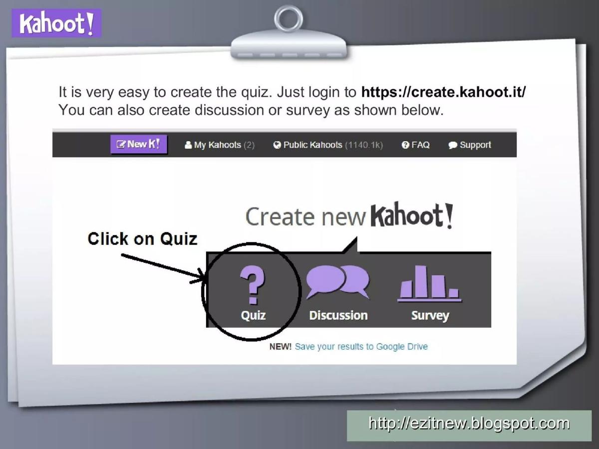
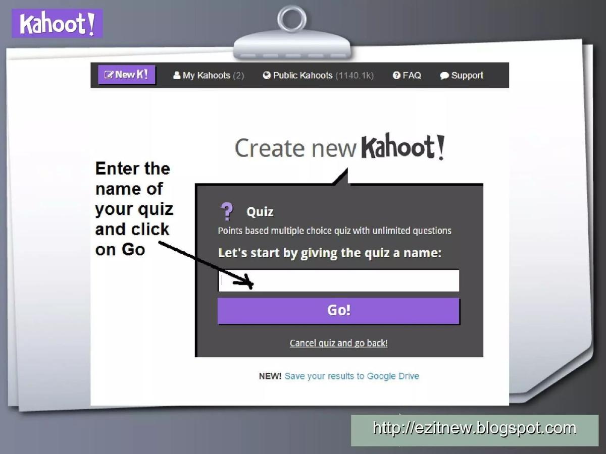
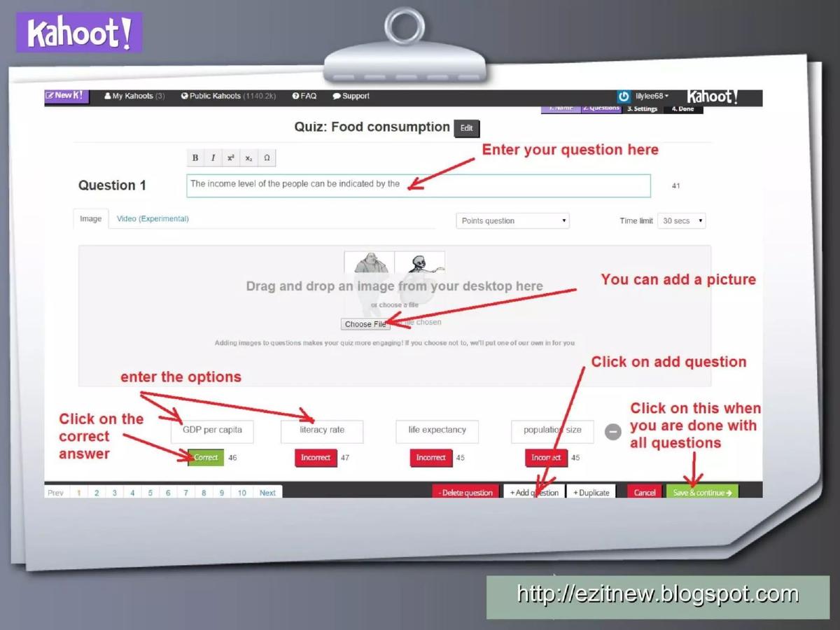
This section walks through the teacher's workflow. Slide 4 shows the login screen at 'create.kahoot.it' and highlights three core functions: Quiz, Discussion, and Survey . It also notes a 'Public Kahoots' count of 1140.1k , which serves as a massive validation of the platform's existing scale. Slides 5 through 8 provide a granular, step-by-step guide to building a quiz. We see the interface for entering questions, adding images, and setting time limits (defaulting to 30 seconds as shown on Slide 6). Slide 8 shows the metadata fields: Language, Privacy settings, Primary audience (School), and Difficulty level . By Slide 9 and 10, the deck demonstrates the 'Play now' and 'Launch' buttons, emphasizing how little friction exists between creation and execution.
Slides 11-15: The Student Experience and Gamification
The deck shifts focus to the classroom environment. Slide 11 shows the Game-pin (84703) that students use to join. Slide 12 is particularly interesting as it features a physical photograph of a Samsung smartphone displaying the Kahoot interface, proving the cross-device functionality in a real-world setting. Slides 13 and 14 show the lobby and the Scoreboard , which updates after every question. Slide 15 displays the winner screen, where a user named 'Amasy' wins with 950 kahoots . This sequence illustrates the 'heart, hand, and mind' engagement mentioned in the company's self-description, showing the social and competitive nature of the platform.
Slides 16-21: Platform Depth and Previews
These slides return to the dashboard to show how users manage their content. Slide 16 shows the 'My Kahoots' tab, while Slide 17 demonstrates the Duplicate feature for public quizzes, highlighting the collaborative nature of the community. Slide 18 introduces a Preview mode, which allows teachers to see a split-screen view of how the quiz looks on a laptop versus a student's phone. Slides 19 through 21 repeat the joining process with a different pin ( 93375 ), reinforcing the simplicity of the 'Join game' flow and the requirement for students to enter their name .
Slide 22: The Honest Assessment
Slide 22 is a rare 'Pros and Cons' list. The Pros include Real time results and the ability to download results for analysis . The Cons are surprisingly candid: Only MCQ (Multiple Choice Questions), the requirement for internet-capable devices , and the fact that the Game pin shows up late at times . For an investor, this slide shows a team that understands their technical debt and the limitations of their current MVP (Minimum Viable Product). For a user, it sets realistic expectations.
Slide 23: The Context
The final slide reveals the likely origin of this specific deck: an N3 ICT symposium . It includes a QR code and a shortened URL (goo.gl/t44SYL) for feedback. This confirms that the deck was designed for a live demonstration to a room full of educators, which explains the heavy emphasis on 'how-to' rather than 'how-much-money.'
What Works in This Deck
The primary strength of this deck is its unwavering focus on the product . By 2012, many EdTech companies were over-promising on AI and personalized learning paths; Kahoot focused on the immediate problem of classroom boredom. The inclusion of the 1.1 million public kahoots metric is a masterstroke of social proof that requires no further explanation. Furthermore, the step-by-step UI walkthrough removes the 'mystery' of the technology, making it feel accessible to even the least tech-savvy educator or investor.
What is Missing
Business Model: There is no mention of how Kahoot plans to make money. The deck repeatedly calls it a 'free' tool, leaving the path to its eventual $500M+ funding rounds entirely to the imagination. · Team: The founders (Alf Inge Wang, Asmund Furuseth, Jamie Brooker, Johan Brand, and Morten Versvik) are not mentioned. In a standard pitch, the team's pedagogical and technical background would be a central pillar. · Market Size: There is no TAM/SAM/SOM analysis. The deck assumes the viewer understands that 'education' is a large market. · Competition: While Socrative is mentioned in passing on Slide 2, there is no formal competitive matrix or 'X/Y' axis chart. · Roadmap: The 'Cons' slide mentions that the tool is 'Only MCQ,' but there is no slide explaining how they will expand into other question types or subjects.
What a Founder Should Copy
Founders should emulate the transparency found on Slide 22. Acknowledging the limitations of your current product builds trust with sophisticated investors who know that no early-stage software is perfect. Additionally, the split-screen preview shown on Slide 18 is an excellent way to demonstrate a multi-user experience in a static slide format. Finally, if you have a product that is highly visual and interactive, leading with the product rather than a 10-slide preamble about 'the problem' can be a highly effective way to capture attention immediately.
Frequently asked questions
- Is this a standard venture capital pitch deck?
- No. This deck lacks almost all the traditional components of a VC pitch, such as a business model, market size, team background, and financial roadmap. It is structured as a product walkthrough or a training manual for educators. Its inclusion in fundraising archives suggests that for early-stage EdTech, demonstrating a frictionless user experience was considered more vital than showing a complex monetization strategy.
- How does Kahoot differentiate itself from competitors in this deck?
- The deck identifies Socrative as a primary comparison point on Slide 2. Kahoot differentiates itself by emphasizing 'gaming' mechanics—specifically scoring based on speed and accuracy. While other tools focused on pure assessment, Kahoot’s pitch is centered on engagement and the 'fun' aspect of learning, which is reinforced by the scoreboard and winner announcement slides (Slides 14-15).
- What is the significance of the 'Public Kahoots' metric?
- On Slide 4, the interface shows 'Public Kahoots (1140.1k)'. This is a critical piece of social proof. It demonstrates that the platform already has a massive library of user-generated content, meaning new teachers don't have to start from scratch. This 'content moat' is a key driver for viral growth in EdTech platforms.
- Why does the deck include a 'Cons' slide?
- Slide 22 lists drawbacks like 'Only MCQ' and 'Requires each student to have an internet-capable device.' In a product-led pitch, this transparency builds credibility with the audience (likely educators). It sets realistic expectations for the technology's performance in a 2012 classroom environment where hardware and connectivity were significant hurdles.
- What is the 'N3 ICT symposium' mentioned at the end?
- Slide 23 indicates this deck was used at an ICT (Information and Communication Technology) symposium. This suggests that Kahoot's early 'fundraising' was as much about winning the hearts of educators as it was about winning over investors. By securing a massive user base of teachers first, the company created the traction necessary to eventually raise over $500 million.