Piquor's 16-slide deck, built in PowerPoint 2007 and exported on 9 January 2015, pitches a user-generated-content platform that captures branded photos, videos and reviews from customers in hotels, retail stores and festivals and publishes them to the brand's social and listing profiles. Its text layer opens with 'Investor Presentation', yet the file contains no ask, no valuation, no business model, no pricing, no revenue, no forecast, no problem slide and no competition slide. Two full slides are given to unqualified logo walls - 23 client brands including Google, Pepsi and Ford, plus agency…
Key takeaways
- Piquor's 16-slide January 2015 deck is labelled an Investor Presentation but contains no ask, no valuation, no business model, no pricing, no revenue, no forecast and no competition slide.
- The company's only real traction sits inside an unlabelled thumbnail on the 'How it works' slide: 2,208 shared photographs and 1,790 registered users, never mentioned in any text in the deck.
- That same hidden dashboard undercuts the pitch - 1,777 of 2,208 shares went by email, Facebook took 426, Twitter took 5 and WhatsApp took 0, for a product sold entirely on social amplification.
- Slide 2 says the customer is an SME; slide 12 shows 23 logos including Google, Pepsi, Ford, Samsung, Vodafone and Johnson & Johnson, with no dates, campaigns, venues, spend or repeat business attached.
- The agency logos on slide 13 - Dentsu, GroupM, Wunderman, Hansa - are almost certainly the real go-to-market channel, and the deck presents them as a second logo wall instead of a distribution strategy.
- The product lets customers publish video directly to a brand's own YouTube channel and Twitter handle, and the deck never mentions moderation, approval or content rights - the first question any enterprise buyer asks.
- The road map proposes a consumer discovery platform for hotels, places and events, which would compete directly with TripAdvisor and Zomato, the two platforms the current product depends on for distribution.
- The team slide - three technical co-founders plus three operating-founder angels including the CEO of Unicommerce - is the deck's strongest credibility signal and appears fifteenth of sixteen slides.
What this deck actually is
Sixteen slides, built in PowerPoint 2007 and exported to PDF on 9 January 2015. The file's own text layer opens with the words "Investor Presentation", so there is no ambiguity about the audience. Piquor is an Indian user-generated-content startup: it puts a touchscreen kiosk or tablet app inside a hotel, restaurant, retail store or festival, prompts the customer to take a branded photo or record a video or leave a rating, and pushes that content out to the brand's Facebook page, YouTube channel, Twitter handle, TripAdvisor listing and Zomato page.
The slide dimensions are the first oddity: 1843 × 864 points, an ultra-wide 2.13:1 canvas that is neither 4:3 nor 16:9. Opened on a normal laptop or printed, it letterboxes into a thin strip with enormous white margins above and below. Several slides use less than a third of the vertical space available. This is a deck built to look good full-screen on one specific monitor.
The second oddity is more interesting. The company has real usage data — a product dashboard appears as a thumbnail on the process slide showing 2,208 shared photographs and 1,790 registered users, broken down by channel — and that dashboard is never enlarged, never quoted, and never referenced in any text anywhere in the deck. The single most persuasive artefact in the file is a screenshot roughly two centimetres wide, sitting fifth in a row of six pictures.
What is absent is everything a January 2015 seed investor would open the file to find: no problem slide, no market size in currency, no business model, no pricing, no revenue, no cost of a kiosk, no competition slide, no financial projection, no use of funds and no ask. Sixteen slides, and the word "revenue" does not appear once.
Slide-by-slide walkthrough
Slide 1 — Cover
The Piquor wordmark with a photographic fill, and along the bottom edge three programme logos: BITS Pilani Centre for Technology Business Incubator, 10,000 Startups (a NASSCOM initiative), and the Canada Technology Accelerator.
The three badges are the strongest thing on the page and they are set at about a tenth of the size of the logo. Selection into 10,000 Startups and a Canadian government accelerator, out of India, in 2014, is real third-party validation and a credible route into the North American market the deck later claims to target.
What the cover lacks is a sentence. There is no tagline, no date, no round, and no explanation of what Piquor is. An investor forwarded this PDF sees a word they have never heard, a name that reads at a glance as "liquor", and three incubator logos. The cover of a circulated deck is the most-viewed slide in the document and this one conveys no information at all.
Slide 2 — Brand advocacy platform
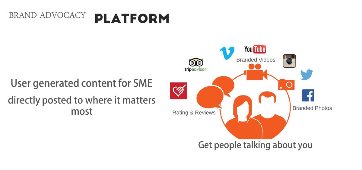
The positioning slide. "Brand advocacy platform… directly posted to where it matters most", surrounded by three labelled clusters — Branded Videos with the YouTube mark, Branded Photos with Facebook and Instagram, Rating & Reviews with TripAdvisor and Zomato — plus the line "User generated content for SME" and the promise "Get people talking about you".
The three-cluster diagram does its job: within five seconds you understand that Piquor captures three content types and distributes them to platforms you recognise. That is a good visual definition of a product.
But it introduces a contradiction the deck never resolves. This slide says the customer is an SME. Ten slides later, the client wall is Google, Pepsi, Ford, Samsung, Johnson & Johnson and Vodafone. Selling a kiosk to a neighbourhood restaurant and selling an activation to a global brand's agency are different products at different prices through different channels with different sales cycles. The deck asserts the first and evidences the second, and never says which one the money is for.
Slide 3 — User-generated branded photos
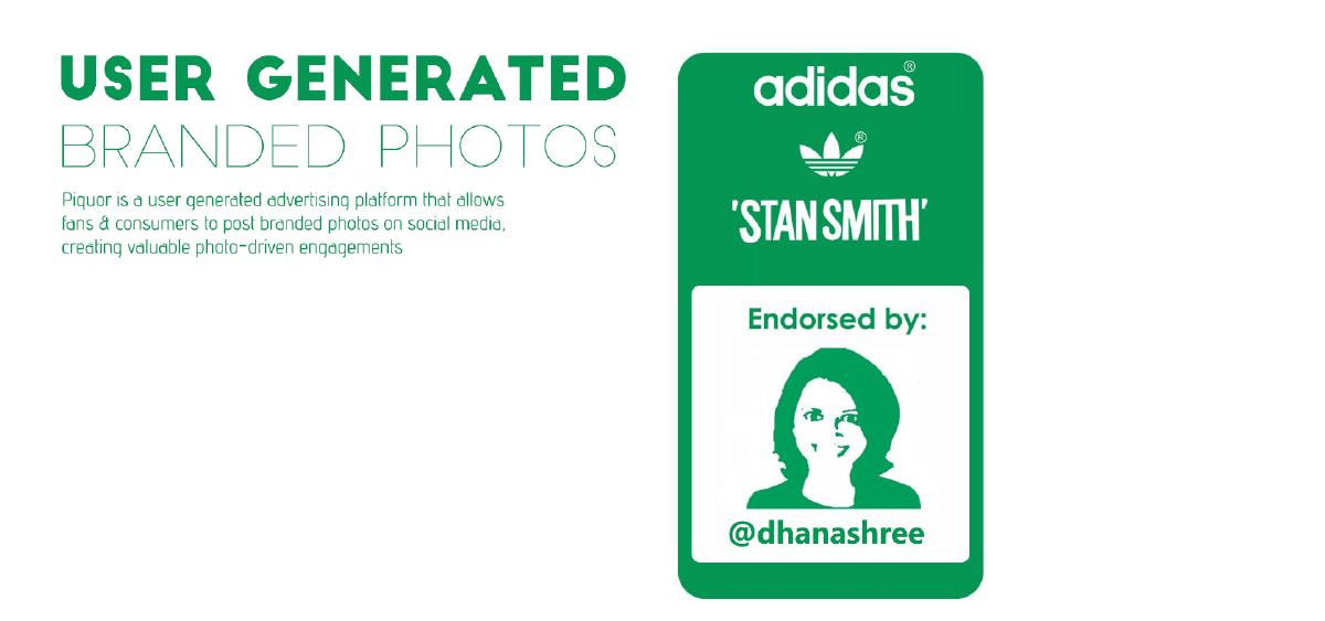
"Piquor is a user generated advertising platform that allows fans & consumers to post branded photos on social media, creating valuable photo-driven engagements." Below it, "Endorsed by:" with a handle and what appears to be a celebrity endorsement panel.
"User generated advertising" is a genuinely good phrase — it captures why a customer photo outperforms a paid impression, in three words. The failure is the "endorsed by" line, which offers a name and no mechanism. Endorsed how? Did the person use the kiosk once at an event, or do they promote the product? An unexplained endorsement makes a reader suspicious of the claims either side of it, which is a bad trade for a logo.
There is also no number on this slide. "Valuable photo-driven engagements" is exactly the claim the dashboard four slides later could substantiate — 2,208 shares — and the two are never connected.
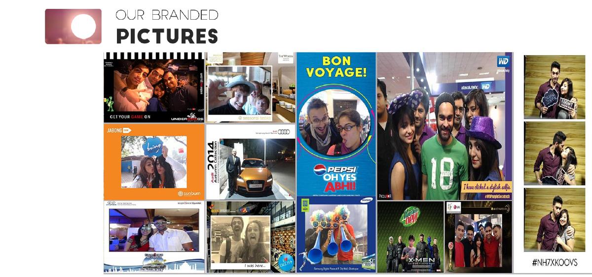
Slide 4 — "Our branded pictures"
A full-bleed collage of real event photographs with a campaign hashtag overlaid — content captured at what looks like a music festival activation.
This is the right instinct: show the actual output rather than describe it. Real photographs of real people using the product beat any mockup.
What is missing is the campaign frame around them. Which brand, which event, how many photos captured over how many hours, how many shares, what reach, and what the brand paid. A case study is a photograph plus five numbers; this slide has the photograph.
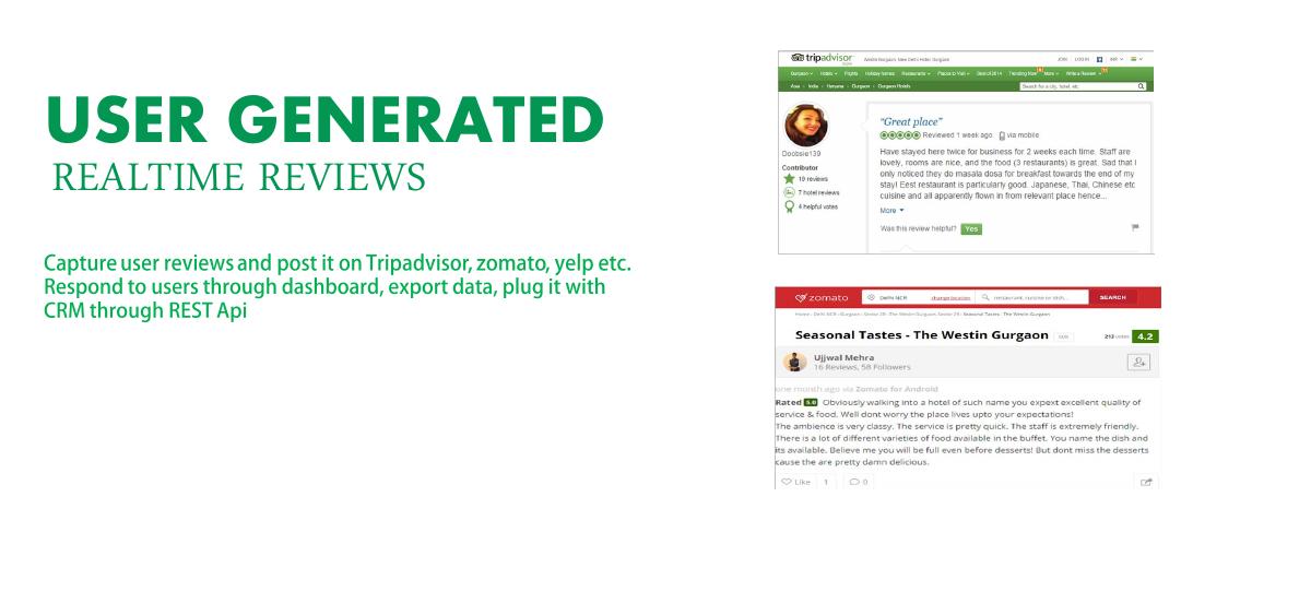
Slide 5 — User-generated real-time reviews
Two real screenshots — a TripAdvisor review of a Gurgaon hotel and a Zomato review of the Westin's restaurant — with the body text: capture user reviews and post them to TripAdvisor, Zomato, Yelp; respond to users through the dashboard, export data, plug it into a CRM through a REST API.
The REST API and CRM line is the most commercially serious sentence in the deck, and it is buried in a caption. An operator who can pipe verified on-premise feedback into their CRM is buying an integration, not a photo booth, and integrations renew.
The screenshots, though, are unattributed. There is nothing to indicate whether these two reviews came through Piquor's kiosk or were simply copied off the public web as an illustration of what a review looks like. If they were generated by the product, that is proof and it needs a label saying so. If they were not, they are decoration on the evidence slide — the worst place to put decoration.
There is also a compliance question the slide steps straight past. TripAdvisor's policies restrict soliciting reviews on-premises through incentivised or managed collection, and a kiosk that captures a rating from a guest standing in the lobby and posts it to a listing sits close to that line. Any hospitality buyer's marketing team will ask. The deck does not raise it.
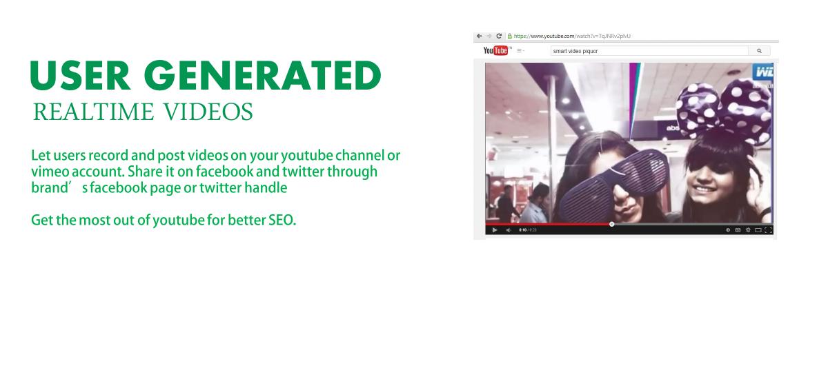
Slide 6 — User-generated real-time videos
A YouTube screenshot with the search "smart video piquor", above the copy: let users record and post videos on your YouTube channel or Vimeo account, share to the brand's Facebook page or Twitter handle, "Get the most out of youtube for better SEO."
The SEO argument is a real one and rarely made — customer video on a brand's own channel is a durable, indexable asset in a way a Facebook post is not. It deserves more than a closing line.
What no operator will skip past, however, is the sentence before it: users record videos that post to your YouTube channel and your Twitter handle. That is handing a stranger publishing rights on a brand-owned property. Moderation, approval queues, profanity filtering and takedown — none of it appears anywhere in sixteen slides. For an enterprise buyer this is the first question and probably the deal-breaker, and the deck does not acknowledge that the risk exists.
Slide 7 — How it works
Six photographs in a horizontal strip with no captions, no numbering and no arrows: a restaurant interior; a woman using a floor-standing kiosk; a printed "How was your visit?" TripAdvisor card beside a customer photo; a tile of social and review platform logos; a screenshot of the Piquor analytics dashboard; and a cloud-of-icons graphic.
This is the pivotal slide, and it is a mood board. A process slide with six unlabelled images asks the reader to infer the sequence, which they will do wrongly or not at all.
It is also where the deck's only hard numbers are hiding. Enlarge the dashboard thumbnail and it reads: Total Shared Photographs 2,208; Total Registered Users 1,790; and a channel table — Email 1,777, Facebook 426, Twitter 5, SMS 0, MMS 0, WhatsApp 0.
Those figures are the deck. Nearly eighteen hundred registered users and over two thousand shares is real, verifiable traction for a seed-stage company, and it should be a full slide with a date range and a customer count attached. But the breakdown also carries the deck's most awkward fact, and the company left the reader to find it under a magnifying glass: roughly 80% of all shares went out by email. Facebook took 426. Twitter took five. WhatsApp — in India, in 2015 — took zero.
Piquor's entire pitch is social amplification: brand advocacy, page likes, get people talking about you. Its own dashboard says users overwhelmingly emailed the photo to themselves. That is not a fatal finding — it means the product's real job may be first-party data capture rather than social reach, which is arguably a better business — but a deck that shows the number without noticing it looks careless, and one that reframes the pitch around it looks honest and observant. The company chose to shrink the evidence instead.
Slide 8 — Hardware
Three form factors: large-format social kiosk, tablet, and phone app, with the line "Operating System independent application works with your choice of hardware".
Hardware-agnostic software is the right strategic answer, because it turns a capital-heavy kiosk business into a licence, and the slide states it plainly.
Then it stops. Who buys and owns the kiosk, and at what cost? Who installs it, who services it when the touchscreen fails during a Friday dinner service, and who staffs it at a festival? A hardware slide without a unit cost, an ownership model or a support model is a picture of three screens. And because the deck has no business-model slide either, this is the last chance to answer the question and it goes unanswered.
Slide 9 — Benefits
Three benefits: page likes, described as "organic social media marketing at zero cost"; improved rank on TripAdvisor/Zomato; and a single platform to manage UGC and other user data.
The third benefit is the durable one — owning a first-party stream of on-premise customer data — and it is listed last and smallest.
"At zero cost" is the phrase to worry about. The deck is selling a paid product; describing the marketing it produces as free invites the buyer to ask what they are paying for, and invites the investor to ask how the company captures value from something it just called costless. And "improved rank on TripAdvisor" is a claim about a third party's ranking algorithm that Piquor does not control and cannot guarantee — the kind of promise that becomes a churn problem the moment a client's rank does not move.
All three benefits are also unquantified. This slide sits two pages after a dashboard containing exact figures for shares and users, and borrows none of them.
Slide 10 — Market landscape: industries
Three target industries in a graphic: theme parks, hotels and resorts, and fast fashion, under the line "the industries which could exhaust huge promotional benefits from Piquor kiosks and app".
Choosing three verticals is discipline, and the choice is coherent: all three have footfall, a photogenic environment and a reason to want customer content.
But a market slide with no money on it is not a market slide. There is no count of hotels or theme parks in the target geographies, no spend per venue, no addressable total, and no bottom-up build. And the three named verticals do not match the deck's own evidence: the client wall is dominated by consumer electronics, automotive and beverage brands running event activations, and events are not on this list at all despite the festival photographs on slide 4.
Slide 11 — Market landscape: geographies
A world map with five countries starred: the USA, Canada, India, Singapore and Australia.
Five countries on three continents for a pre-revenue Indian startup with a physical-installation product is not a plan, it is a wish. Each of those markets needs local sales, local installation and local support for a device that lives in someone's lobby.
Canada is the exception and the deck does not exploit it. The cover shows the Canada Technology Accelerator badge — a specific, funded, government-run route into that market — and this slide gives Canada the same anonymous star as Australia. Connecting the two would turn a wish list into a sequenced plan with one credible beachhead.
Slide 12 — Notable clients
Twenty-three logos: Google, Pepsi, Audi, adidas, Westin, SABMiller, Samsung, Hyundai, Jack & Jones, TOEFL, Vodafone, Hard Rock Cafe, Ford, Royal Enfield, Suzuki, Philips, Dell, Johnson & Johnson, Gionee, Bacardi and others, closing with "And many more..".
This is the most impressive and least informative slide in the deck. Twenty-three of the world's largest advertisers is an extraordinary logo wall for a company at this stage — and every one of them is unqualified. No dates, no campaign names, no venues, no spend, no repeat business, no named contact.
Any investor who has seen a dozen decks knows what usually sits behind a wall like this: one activation booked through an agency, once, for one event. That is a perfectly respectable achievement, and stated plainly — "Pepsi, at this festival, in this month, 2,208 photos captured" — it is far more valuable than twenty-three grey logos, because it is checkable. As presented, the slide is the deck's strongest asset and its biggest diligence risk simultaneously, and "And many more.." makes it worse rather than better.
It also collides with slide 2. A company whose clients are Google and Ford is not, in any ordinary sense, selling "user generated content for SME".
Slide 13 — Notable partners
Agency and event-company logos: Dentsu, Wunderman, GroupM, Hansa, Wind Chimes and others, again ending with "And many more..".
This is the slide that quietly explains the previous one, and the deck never says so. Dentsu, GroupM and Wunderman are media and activation agencies; if Piquor reaches Pepsi and Ford through them, then the agencies are the channel and that is a real, defensible go-to-market — one agency relationship yields many brand campaigns.
Say it out loud and this becomes a distribution strategy: how many agencies, how many campaigns each, what the revenue share is, how many repeat bookings. Left as a second logo wall, it reads as more name-dropping and the reader discounts it at the same rate as the slide before.
Slide 14 — Road map ahead
Two future propositions beside device mockups: a "single authentic source of user generated content" that will be the single point of UGC collection powering OTAs and listing websites, and a "user contributed discovery platform" for finding hotels, places, events and happenings through real-time user photos, videos, ratings and reviews.
Curiously, the PDF's underlying text layer contains a third roadmap item — "Exchange to Trade User Generated Content" — that does not appear on the rendered slide. Someone wrote it and hid or moved it rather than deleting it, which is a small production detail that matters only because it shows the file was not proofed after its last edit.
Strategically, both visible items are enormous, unbudgeted pivots. Becoming the authoritative UGC source powering online travel agencies is a data-licensing business requiring deals with Booking, Expedia and TripAdvisor. Building a consumer discovery platform for hotels, places and events means competing head-on with TripAdvisor and Zomato — the two companies this same deck relies on as distribution partners for its current product. The road map turns Piquor's channel into its competitor and does not mention the conflict.
A road map also needs a time axis and a cost. This one has neither: no quarters, no milestones, no hiring plan, no capital required. It is two paragraphs of ambition where a sequence should be.
Slide 15 — Team
Six people. Three co-founders: Pranjal Prashar (B.Tech & MBA, IIIT-Gwalior, ex-Aujas Networks), Arpit Gupta (B.Tech, IIT-Delhi, ex-KPMG India) and Vineet Chauhan (B.Tech & MBA, IIIT-Gwalior, ex-IDBI Bank). Three backers: Pallav Sinha, advisor and investor, CEO of Mera Job India and ex-CEO of Fullerton Securities; Nikunj Jain, investor, founder and CEO of InoxApps, IIT-Delhi; and Ankit Pruthi, investor, CEO of Unicommerce, IIT Delhi and IIM Ahmedabad.
This is a strong slide and it is fifteenth of sixteen. Three technical co-founders and three named angel investors who are themselves operating founders — including the chief executive of Unicommerce, a substantial Indian e-commerce infrastructure company — is exactly the signal a seed investor wants, and it is checkable in minutes.
The slide gives credentials but not roles: three co-founders and no indication of who runs product, who runs engineering and who sells. There is also nobody with hospitality, retail or agency experience, in a company whose product is installed in hotels and sold through agencies.
The larger miss is that three angels are already in and the deck does not say so in words. How much did they invest, at what valuation, and when? An "Investor Presentation" with three investors on the team slide and no mention of the round they participated in has left its best credibility signal implicit.
Slide 16 — Thank you
"Thank you", plus a co-founder's name, email address and phone number.
No ask. In sixteen slides labelled "Investor Presentation" there is no amount, no instrument, no valuation, no use of funds and no milestone the money buys. The reader who is persuaded has nothing to respond to except a phone number, and the reader who is not persuaded never learns what was being requested.
What this deck does better than most startup pitch decks
It shows the real product, repeatedly. Real kiosks, real event photographs, real TripAdvisor and Zomato screenshots, a real dashboard. No wireframes, no stock illustration of an app that does not exist. · "User generated advertising" is a sharp, ownable phrase. It explains the whole category in three words. · The product definition on slide 2 is visually excellent. Three content types, three destinations, understood in five seconds. · It has genuine third-party validation on the cover. BITS Pilani's incubator, NASSCOM's 10,000 Startups and the Canada Technology Accelerator are all verifiable. · The verticals are chosen, not listed. Three industries rather than "everyone with a storefront". · The hardware-agnostic positioning is strategically right, turning a capex product into a licence. · The team slide names three operating-founder angels, which is stronger social proof than any client logo on the wall. · The API and CRM line hints at a real enterprise product underneath the photo booth. · The company actually has usage data. 2,208 shares and 1,790 registered users is real, even though the deck hides it.
Where this deck would fail in an investor meeting
There is no ask — no amount, no instrument, no valuation, no round name, anywhere in sixteen slides. · There is no business model. Nothing in the file says how Piquor charges: licence, per venue, per campaign, per photo, hardware sale, or agency revenue share. · There is no pricing and no unit economics — no kiosk cost, no gross margin, no payback period. · There is no revenue figure, no forecast, no burn and no runway. · There is no problem slide. The deck opens on a solution and never states the pain it removes. · The market slides contain no money: no venue counts, no spend per client, no addressable total. · There is no competition slide at all, in a 2015 category crowded with photo-booth and social-kiosk vendors. · The only real traction — 2,208 shares, 1,790 users — appears solely inside a thumbnail on an unlabelled process slide. · That same thumbnail undercuts the pitch: 1,777 of 2,208 shares were email, Facebook 426, Twitter 5, WhatsApp 0, for a product sold on social amplification. · Twenty-three client logos carry no dates, campaigns, venues, spend or repeat business, and close with "And many more..". · The customer is described as "SME" on slide 2 and evidenced as Google, Ford and Pepsi on slide 12. · The agency partners are presented as a logo wall rather than as the go-to-market channel they evidently are. · Letting customers publish to a brand's own YouTube channel and Twitter handle is proposed with no moderation or approval workflow mentioned. · Review solicitation on-premises raises platform-policy questions the deck never addresses. · The road map competes with TripAdvisor and Zomato, the same platforms the current product depends on. · Five target geographies on three continents, with no sequencing, for a physical-installation product. · No timeline anywhere: no milestones, no quarters, no hiring plan. · The "how it works" slide is six uncaptioned photographs. · The 2.13:1 slide canvas letterboxes on any normal screen and leaves most slides two-thirds empty. · The closing slide offers a phone number instead of a next step.
What this deck has vs what a 2015 seed deck needed
Problem Absent One slide: why brands cannot get customer content
Traction A thumbnail on slide 7 Own slide: shares, users, venues, dates, growth
Customer "SME" and Google, simultaneously One buyer, named, with a price
Channel A second logo wall Agency motion, campaigns per agency, economics
Market Three industries, five countries, no money Bottom-up TAM in currency, one beachhead
Competition Absent Named vendors on price, reach and integration
How you would rebuild this deck
Put the dashboard on slide 3, full size. 1,790 registered users and 2,208 shared photographs, with the date range and the number of venues that produced them. · Own the email finding rather than hiding it. "80% of shares are email captures" reframes Piquor as a first-party customer-data product with a social side-effect — a better business, and a claim the data supports. · Add a problem slide. Brands pay for impressions nobody trusts while their customers photograph their venue for free and the brand never sees it. · Turn one logo into a case study. One brand, one venue, one date, photos captured, shares, reach, fee. Then keep the logo wall as a footer strip beneath it. · Name the buyer and the price. Per venue per month, or per campaign — one line, one number. · Promote the agency channel to a strategy slide. Dentsu, GroupM and Wunderman as a route to hundreds of brands, with campaigns booked to date. · Add moderation and rights. Approval queue, brand controls, content licence — one slide that removes the enterprise buyer's first objection. · Cut the geography map to one beachhead and connect it to the Canada Technology Accelerator badge already on the cover. · Give the road map a time axis and a cost, and drop the discovery-platform ambition that competes with the distribution partners. · Say the angels are already in — amount, terms, date — and then state the ask, the use of funds and the milestones it buys, on the final slide. · Re-export at 16:9 so the deck does not letterbox on the screen of the person reading it.
The transferable lesson
Piquor's deck fails in a way that is almost painful to watch, because the fix costs nothing. The company had traction. It was measured, dated and rendered into a clean dashboard, and the founders put it in the file — as a two-centimetre thumbnail, fifth in a row of six uncaptioned photographs, on a slide with no words. Meanwhile the two largest slides in the deck are logo walls carrying no verifiable information at all.
That inversion is the most common structural error in seed decks: borrowed credibility is given the most space, and owned evidence is given the least. Logos are easy to assemble and impossible to check, so experienced readers discount them almost to zero. Your own numbers — small, unflattering, specific — are the only thing in the document a reader cannot dismiss, and the smaller and odder they are, the more they read as true. Nobody invents "Twitter: 5".
There is a second lesson underneath it. When your own data contradicts your pitch, the data is the more interesting story. Piquor's dashboard says its users email photos to themselves rather than broadcasting them, which quietly means the product is a first-party data capture tool wearing a social-marketing costume. A founder who noticed that in January 2015 would have had a sharper company, not a weaker one.
So go through your own deck and rank the slides by the physical area given to each claim. If any slide made of other people's logos is bigger than the slide made of your own measurements, swap them. Then find the number in your product analytics that embarrasses you slightly, and put it on the slide — with the denominator, the date, and one sentence saying what you concluded from it.
Frequently asked questions
- What is Piquor?
- Piquor was an Indian user-generated-content startup pitching in January 2015. It installed a touchscreen kiosk, tablet or phone app in venues such as hotels, restaurants, retail stores and festivals, prompted customers to take branded photos, record videos or leave ratings, and then published that content to the brand's Facebook page, YouTube channel, Twitter handle, TripAdvisor listing and Zomato page, with a dashboard for responding to users and exporting data via a REST API.
- What is the biggest problem with the Piquor pitch deck?
- It hides its only evidence and enlarges its weakest. The company's real usage data - 2,208 shared photographs and 1,790 registered users - appears solely as a two-centimetre screenshot inside a strip of six uncaptioned photographs, while two full slides are given to unqualified logo walls. Experienced investors discount borrowed logos almost entirely and weight owned numbers heavily, so the deck's layout inverts its own persuasive power.
- Does the Piquor deck have a funding ask?
- No. The file's text layer opens with the words 'Investor Presentation', but across sixteen slides there is no amount, no instrument, no valuation, no use of funds and no milestone the money would buy. The deck also has no business model, no pricing and no revenue figure - the word revenue does not appear once. It closes with a co-founder's email address and phone number and nothing else.
- Why does the email share breakdown matter?
- Because it contradicts the pitch. Piquor sells social amplification - brand advocacy, page likes, 'get people talking about you' - but its own dashboard shows 1,777 of 2,208 shares went out by email, with Facebook at 426, Twitter at 5 and WhatsApp at 0. That pattern suggests the product's real value is first-party customer data capture rather than social reach, which is arguably a better business. A deck that noticed and reframed around it would have been far stronger than one that shrank the screenshot.
- Which slides should founders copy from this deck?
- Three. Slide 2's product definition, which shows three content types flowing to three named destinations and is understood in five seconds. Slide 4's use of real event photographs instead of mockups - showing the actual output always beats describing it. And the team slide, which names three technical co-founders and three operating-founder angel investors, all verifiable in minutes. The mistake is that the team slide is fifteenth of sixteen.
- What would make this deck fundable?
- Put the dashboard on slide 3 at full size with dates and venue count; own the email finding by repositioning Piquor as first-party customer-data capture; turn one client logo into a case study with photos captured, shares and fee; state a price per venue or per campaign; promote the agency partners to a distribution-strategy slide; add moderation and content rights; cut five geographies to one beachhead tied to the Canada accelerator already on the cover; and end with an amount, an instrument and the milestones it buys.