Vessel’s seed deck is an exercise in narrative efficiency. In just 15 slides, the company identifies a massive bottleneck in mobile development—the weeks-long cycle of design, coding, and app store approval—and positions itself as the 'minutes, not weeks' alternative. The deck relies on high-quality visual mockups rather than dense text, effectively demonstrating its WYSIWYG editor and real-time deployment capabilities. While it lacks traditional financial projections, market sizing, or a specific 'ask' slide, it compensates with a powerful case study featuring RunKeeper, which saw a 235% inc…
Key takeaways
- The deck uses a 'minutes, not weeks' hook to highlight the inefficiency of traditional app updates (Slide 10).
- A three-step solution—Connect, Design, Deploy—simplifies a complex technical integration (Slides 7-9).
- The 'Design' slide provides a clear look at the platform's UI, proving the product is functional and user-friendly (Slide 8).
- Vessel uses a real-world success story from RunKeeper to show a 235% engagement lift, providing immediate social proof (Slide 13).
- The team slide highlights relevant experience from TuneIn, Pulse, and Amdocs, building founder credibility (Slide 14).
- The presentation completely omits market size (TAM/SAM/SOM), business model, and financial projections.
- There is no 'Ask' slide detailing how much capital is being raised or how it will be spent (Slide 15).
- The deck focuses on the 'Product Manager/Marketer' persona by emphasizing a 'no coding required' workflow (Slide 5).
The Vessel Teardown: Selling Speed in the Early Mobile Era
In 2012, the mobile app ecosystem was booming, but developers faced a massive hurdle: the App Store approval process. Any small change to a user interface required a full code deployment and a multi-day (or multi-week) wait for Apple or Google to approve the update. Vessel entered the market with a promise to bypass this friction. This teardown examines the 15-slide deck used to secure their seed funding.
The Hook: Defining a Painful Status Quo
Slide 1: Title Slide The deck opens with a clean, dark aesthetic. The logo is prominent, and the tagline is clear: "A mobile-first platform for marketers to engage, optimize, and monetize users." It immediately identifies the target audience (marketers) and the value (engagement and monetization).
Slide 2: The Problem Vessel uses a minimalist approach here. The slide simply states, "(The Problem) Mobile optimization is hard." This is a classic setup, though perhaps a bit too broad. However, the following slides quickly add the necessary context.
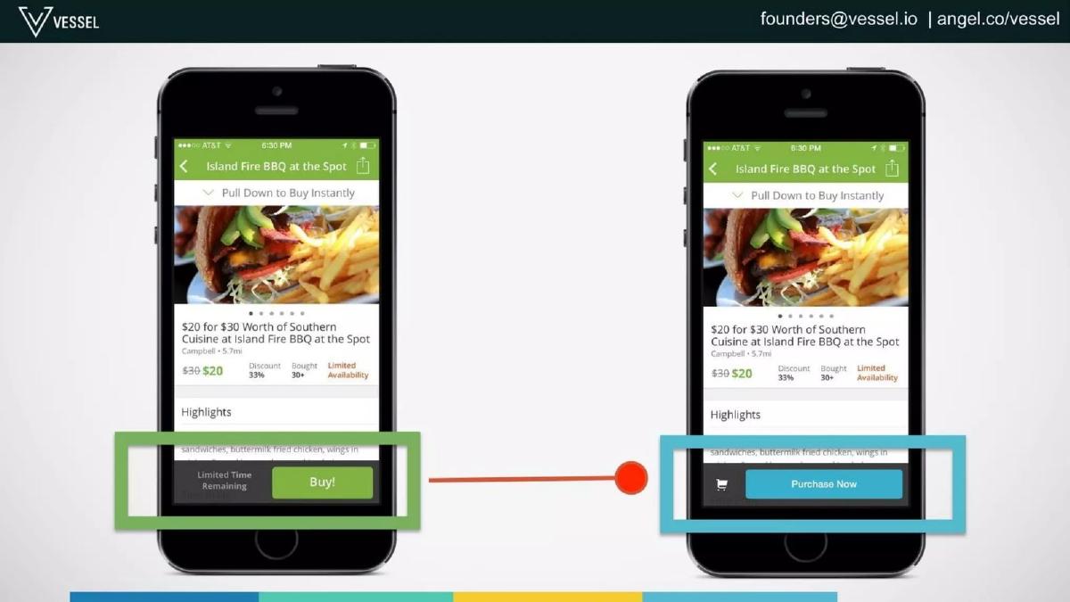
Slide 3: Visualizing the Problem Instead of bullet points, Slide 3 shows two versions of a mobile app interface (an e-commerce screen for "Island Fire BBQ"). One has a green "Buy!" button; the other has a blue "Purchase Now" button. This is a perfect visual shorthand for A/B testing, showing the exact type of small change that usually requires a massive effort to implement.
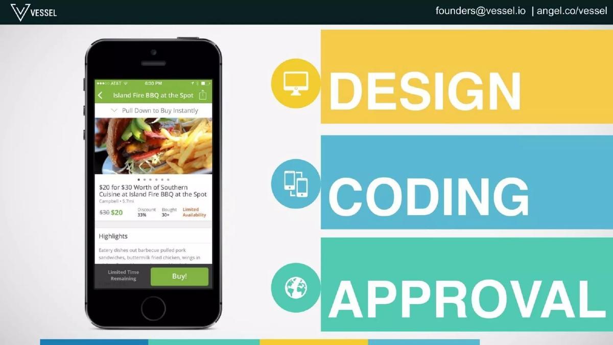
Slide 4 & 5: The Bottleneck Slide 4 uses large, bold text: "TAKE WEEKS (involves..)". Slide 5 breaks down those weeks into three pillars: Design, Coding, and Approval. By highlighting "Approval" with a globe icon, Vessel is specifically targeting the frustration of the App Store gatekeepers, a pain point every mobile developer in 2012 understood intimately.
The Solution: A Three-Step Workflow
Slide 6: The Solution Transitioning from the problem, Slide 6 introduces "THE SOLUTION (3 simple steps)." This sets expectations for a product that is easy to use, contrasting with the 'hard' problem described earlier.
Slide 7: Step 1 - Connect This slide shows a mobile device connecting to a desktop monitor. It implies a simple SDK integration or a cloud connection. It’s a conceptual slide that avoids technical jargon, keeping the focus on the ease of setup.
Slide 8: Step 2 - Design This is one of the most important slides in the deck. It shows the actual Vessel dashboard. We see a WYSIWYG (What You See Is What You Get) editor where a user can change button text, font sizes, colors, and images via a sidebar. This proves the product exists and validates the "no coding required" claim made in the company's self-description.
Slide 9: Step 3 - Deploy Slide 9 shows three different variations of the app UI being pushed out simultaneously. This illustrates the 'multivariate' aspect of their testing platform, showing that a marketer can test three different button styles at once.
The Value Proposition: Minutes, Not Weeks
Slide 10: The Contrast Slide 10 is the 'money slide.' It features the text "IN MINUTES," with "NOT WEEKS" crossed out in red. This is the core ROI of the platform. It’s not just about better data; it’s about the velocity of experimentation.
Slide 11 & 12: Analyze and Optimize These slides walk through the backend logic. Slide 11 shows conversion rates for the three variations (20%, 60%, and 40%). Slide 12 shows the 'Optimize' phase, where the winning 60% variation is deployed to the entire user base. This completes the narrative arc of a standard A/B test, making the abstract concept of 'optimization' concrete for the investor.
Validation and Team
Slide 13: Success Story Vessel brings in heavy-hitting social proof with RunKeeper. The slide shows a 'Before' and 'After' of the app's activity selection screen. The headline metric is "235% Engagement." For a seed-stage company, having a well-known brand like RunKeeper as a case study is a massive de-risking factor.
Slide 14: The Team The team slide features four members: Koustubha Deshpande (CEO), Devendra Laulkar (CTO), Diego Guemes (Engineer), and Michael Pollack (Business Dev). The logos below their names—TuneIn, Pulse, Amdocs, Big Astronaut, and OpenMile—suggest a team with deep experience in mobile scaling and enterprise software. This builds confidence that the team can actually build the 'real-time' infrastructure promised.
Slide 15: Closing The final slide repeats the logo and the core message: "Optimize apps in minutes." It also includes a 'logo wall' of other early users: RunKeeper, Agnitus, TextNow, Jifiti, and Frankly. This reinforces that the RunKeeper success wasn't a fluke.
What Works in This Deck
Visual Storytelling: Vessel avoids the 'wall of text' trap. They use high-fidelity mockups to explain a technical process, making it accessible to any investor, regardless of their engineering background. · Clear Contrast: The 'Minutes vs. Weeks' framing is a powerful way to define a category. It identifies a specific enemy (time/app store approval) and positions Vessel as the only escape. · The RunKeeper Case Study: A 235% lift is a staggering number. By putting this near the end, they leave the investor with a sense of the platform's potential power.
What is Missing
The Ask: There is no slide indicating how much money Vessel is raising or what they plan to do with the $100,000 mentioned in the catalogue facts. This is a critical omission for a fundraising deck. · Market Size: There is no mention of the Total Addressable Market (TAM). Investors want to know if this is a tool for a few thousand developers or a multi-billion dollar opportunity in the marketing tech stack. · Business Model: How does Vessel make money? Is it a SaaS subscription based on seats, or is it based on the number of monthly active users (MAUs) being optimized? The deck is silent on revenue. · Competition: In 2012, companies like Optimizely were already moving into mobile. Vessel doesn't address how they differ from existing web-based A/B testing giants or other mobile-first competitors.
What a Founder Should Copy
The 'Three Simple Steps' Framework: If your product is complex, boil it down to a three-step workflow. It makes the implementation feel manageable and the product feel finished. · The Use of Mockups: If you have a UI, show it. Don't just talk about a 'powerful platform'; show the buttons and the toggles. It builds immediate credibility. · The 'Before and After' Slide: Slide 13 is the strongest in the deck. Showing the literal change in the app alongside the resulting metric is the most persuasive way to prove product-market fit.
Frequently asked questions
- How much did Vessel raise with this deck?
- According to the catalogue facts, Vessel raised $100,000 in 2012 during their Seed round. The deck itself does not specify the amount raised or the terms of the round, which is common for decks shared publicly after the fact.
- What is the core value proposition of Vessel?
- The core value proposition is the speed of mobile app optimization. As shown on Slide 10, they promise to move from a process that 'takes weeks' (due to design, coding, and app store approval) to one that happens 'in minutes' by allowing real-time A/B testing without app store updates.
- Does the deck include a competitive analysis?
- No. The 15-slide deck focuses entirely on Vessel's own workflow and results. It does not mention competitors in the mobile A/B testing or analytics space, choosing instead to frame the 'status quo' of slow development cycles as the primary enemy.
- Who is the target user for Vessel's platform?
- The deck identifies 'marketers' and product managers as the primary users. Slide 1 describes it as a 'mobile-first platform for marketers,' and the workflow emphasizes 'no coding required' to empower non-technical staff to run experiments.
- What metrics are used to prove the product works?
- Vessel relies on a single, high-impact metric: a 235% increase in engagement for the app RunKeeper (Slide 13). They also show hypothetical conversion rate improvements (20% to 60%) to illustrate the 'Analyze' and 'Optimize' phases of their platform (Slides 11-12).