The easy ten pitch deck, used in 2012-2015 for their Seed round, is a lean, 10-slide presentation that prioritizes financial and market performance over product mechanics. With a bold claim of $1.7M in sales over the last 12 months (Slide 2) and #1 grossing status in the Russian and Brazilian App Stores (Slide 3), the deck establishes immediate credibility. It positions the company against giants like Duolingo by contrasting 'teaching' with 'entertainment' (Slides 5-6). While it lacks a formal 'Ask' slide or detailed unit economics, the high percentage of recurrent payments (70% on Slide 7) s…
Key takeaways
- The deck leads with a massive traction figure of $1.7M in sales over the last 12 months (Slide 2).
- It highlights localized dominance, citing #1 Grossing Education status in both Russia and Brazil (Slide 3).
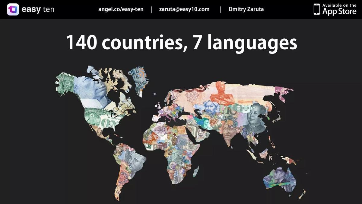
- Global scalability is proven through presence in 140 countries and support for 7 languages (Slide 4).
- The competitive positioning is simplified to a binary: competitors 'teach' while easy ten 'entertains' (Slides 5-6).
- Revenue quality is addressed via a pie chart showing 70% of income comes from recurrent payments (Slide 7).
- The team slide uses logos from Zeptolab, Mail.ru, and MIT to establish pedigree without individual bios (Slide 8).
- Market size is stated as a $16B opportunity for mobile learning (Slide 9).
- The deck completely omits a specific funding 'Ask' or a roadmap for the use of funds (Slide 10).
The Traction-First Strategy
The easy ten pitch deck is a fascinating example of a startup that has already found product-market fit and is using its deck to prove it. In an industry as crowded as language learning, many founders spend ten slides explaining why their 'new method' is better than Rosetta Stone. Easy ten takes the opposite approach: they barely explain the method at all, choosing instead to show the money. With $1.7M in sales and #1 rankings , the deck argues that the 'why' matters less than the 'result.'
Slide 1: Title and Contact
The cover slide is minimal. It features the company logo, the tagline 'Play your way to foreign languages,' and contact information for Dmitry Zaruta. Notably, it includes a link to their AngelList profile and an 'Available on the App Store' badge. This immediately signals that the product is live and public-facing.
Slide 2: The Hook - $1.7M in Sales
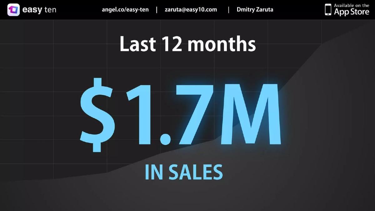
Most decks put traction at the end. Easy ten puts it on Slide 2. The slide contains only three words and one number: "Last 12 months $1.7M IN SALES." The background features a subtle upward-trending graph. This is a power move designed to stop any skepticism about the viability of the business model before the presentation even begins.
Slide 3: Validation and Awards
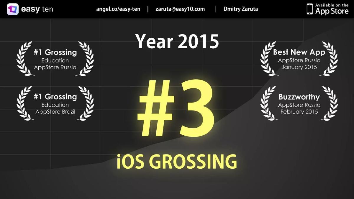
Slide 3 reinforces the traction with external validation. It lists four major accolades from 2015: "#1 Grossing Education AppStore Russia," "#1 Grossing Education AppStore Brazil," "Best New App AppStore Russia January 2015," and "Buzzworthy AppStore Russia February 2015." The center of the slide features a large "#3 iOS GROSSING" badge. This tells investors that the app isn't just making money; it is a top-tier performer in its category across multiple geographies.
Slide 4: Global Footprint
To address concerns about being a 'local' Russian success story, Slide 4 shows a world map filled with currency textures. The headline is "140 countries, 7 languages." This demonstrates that the product has universal appeal and that the team knows how to manage international distribution and localization.
Slides 5 & 6: Competitive Positioning
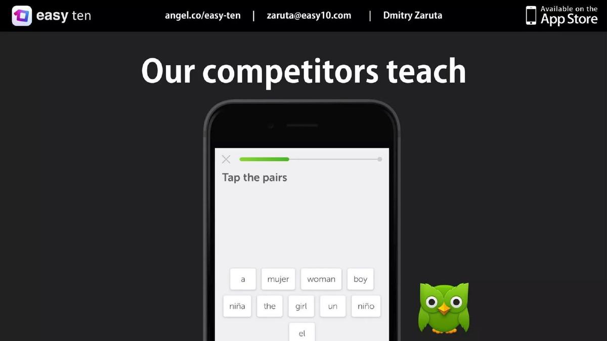
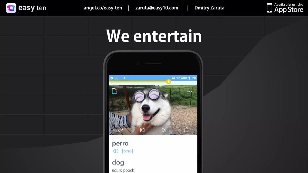
The 'Competition' and 'Product' slides are handled as a pair. Slide 5 shows a Duolingo screenshot with the text "Our competitors teach." Slide 6 shows an easy ten screenshot featuring a husky dog and the word 'perro' (dog) with the text "We entertain." This is a classic 'Blue Ocean' strategy—positioning the product away from the 'boring' work of education and toward the high-retention world of entertainment.
Slide 7: Revenue Quality
For an app-based business, the source of revenue is as important as the amount. Slide 7 uses a pie chart to show "70% Recurrent payments" and "30% First-time payments." This is the most important slide for a sophisticated investor. It proves that the $1.7M mentioned earlier isn't a fluke of one-time marketing spend; it is a sustainable, repeating revenue stream.
Slide 8: The Team
The team slide is a single group photo of 12 people. Instead of bios, the right side of the slide features logos for Zeptolab, OK.ru, Mail.ru, MIPT, Skoltech, Startup Leadership Program, and MIT. This 'logo soup' is intended to convey that the team comes from top-tier technical and academic backgrounds without cluttering the slide with text.
Slide 9: Market Size
The deck finally addresses the TAM (Total Addressable Market) on Slide 9. It states "Mobile learning is huge $16B MARKET SIZE." This is a standard 'big number' slide to show that there is plenty of room for the company to grow from its current $1.7M run rate.
Slide 10: The Conclusion
The final slide is a simple "Come join us" with the CEO's email address. There is no mention of how much they are raising, the valuation, or the specific milestones they intend to hit with the new capital.
What Works
Leading with Revenue: By putting the $1.7M figure on Slide 2, they eliminate the 'is this a real business?' question immediately. · Visual Simplicity: The deck is extremely low on text. It relies on big numbers and clear icons, making it easy to digest in a 2-minute skim. · Proof of Retention: The 70% recurrent payment metric is a high-signal data point that suggests strong product-market fit. · Geographic Diversity: Proving success in both Russia and Brazil shows the app isn't tied to a single culture or economy.
What is Missing
The Ask: There is no mention of how much money is being raised. This is a major omission for a pitch deck. · Unit Economics: While we see total revenue, we don't see CAC (Customer Acquisition Cost) or LTV (Lifetime Value) in dollars. We don't know if that $1.7M was profitable or if they spent $2M to get it. · The Problem: The deck assumes the investor already knows that language learning is hard or boring. A slide defining the specific pain point they solve would add emotional weight. · Roadmap: There is no indication of what the company will do next. Will they add more languages? Move into B2B? Launch on Android?
What a Founder Should Copy
The 'Traction First' Slide Order: If you have impressive revenue or user growth, don't hide it at the end. Put it on Slide 2 to set the tone for the rest of the meeting. · The Competitive Binary: Instead of a complex feature-comparison grid, try to find a single word that differentiates you from the market leader (e.g., 'Teach' vs. 'Entertain'). · Logo-Based Pedigree: If your team has worked at famous companies or attended top schools, use the logos. They are recognized faster than text. · Focus on Revenue Quality: Don't just show a growth chart; show where the money is coming from. High recurring revenue is the 'holy grail' for VCs.
Frequently asked questions
- What is the primary strength of the easy ten deck?
- The primary strength is its undeniable traction. By placing the $1.7M sales figure on the second slide, the founders immediately move the conversation from 'will this work?' to 'how big can this get?' This is a high-confidence move that forces investors to take the business seriously regardless of their personal opinion on the app's interface or teaching method.
- How does easy ten differentiate itself from Duolingo?
- On slides 5 and 6, easy ten uses a visual contrast. They show a screenshot of Duolingo's 'tap the pairs' mechanic under the heading 'Our competitors teach,' then show their own app with a photo of a dog under the heading 'We entertain.' This suggests they are targeting the 'edutainment' space rather than the formal education space, aiming for higher engagement through fun.
- What critical information is missing from this pitch deck?
- The deck is missing several standard venture capital slides: a clear 'Problem' slide, a 'Solution' slide explaining the tech, a 'Use of Funds' slide, and a detailed 'Financial Projections' slide. It also lacks an 'Ask'—the specific amount of money they are looking to raise is never mentioned in the presentation.
- Is the team slide effective despite the lack of text?
- It is effective for a Seed round because it relies on 'social proof' through logos. By showing a group photo alongside logos for MIT, Mail.ru, and Zeptolab, they imply a high level of technical and academic competence. However, it fails to specify who holds which role, which might be a red flag for more institutional investors.
- What does the revenue distribution slide tell us about their business model?
- Slide 7 shows that 70% of revenue is recurrent. This is a vital metric for mobile apps, as it proves the company isn't just good at one-time user acquisition, but is actually providing enough value to retain paying customers over time. It suggests a subscription-based LTV (Lifetime Value) that is likely much higher than a standard pay-per-download app.