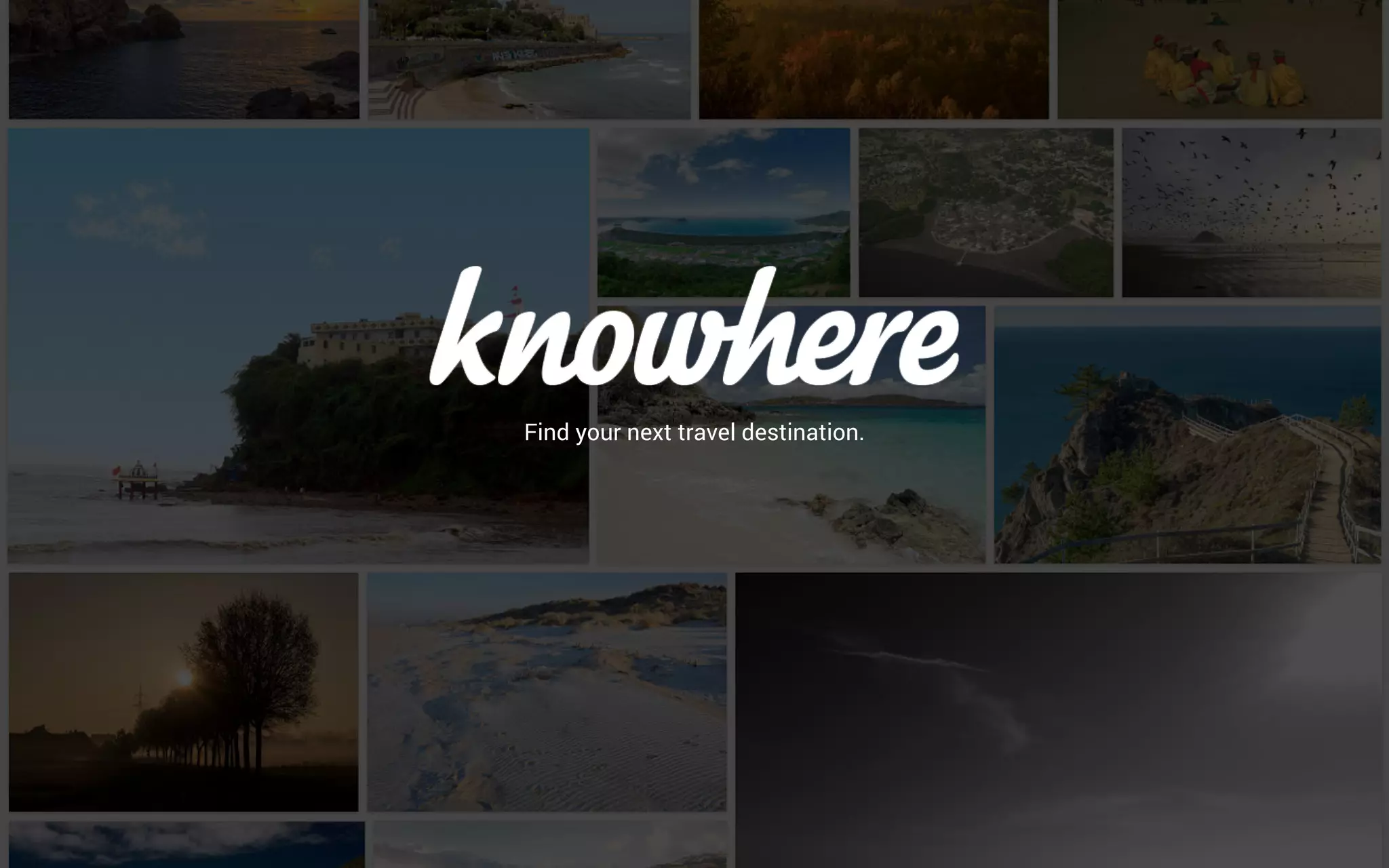
Knowhere is a travel discovery platform that prioritizes visual inspiration over traditional search filters. The deck centers on the premise that three out of four people are influenced by images from fellow travelers, a statistic attributed to the World Tourism Organization. The product aims to combine this visual appeal with a machine learning layer that processes user behavior to recommend 'trending places' and 'personal likes.' While the deck provides a clear aesthetic vision and a historical timeline ranging from team establishment in May 2014 to a planned launch in Q4 2015, it lacks cri…
Key takeaways
- The platform relies on a visual-first interface, citing that 75% of people are influenced by peer travel photos (Slide 2).
- Product features include localized pricing for items like beer ($3) and meals for two ($50), alongside weather and mapping data (Slide 3).
- The technical core is described as a machine learning algorithm that filters user behavior into personalized recommendations (Slide 4).
- The company timeline shows a long development cycle, with 'Team Established' in May 2014 and 'Launch' targeted for Q4 2015 (Slide 5).
- The team consists of five members, though the deck omits their names, specific roles, or professional backgrounds (Slide 6).
- The startup is based in Hamburg, Germany, as indicated by the closing call to action (Slide 6).
- The deck completely omits financial projections, business models, and competitor comparisons.
- The 'Pricing Information' feature suggests a focus on budget transparency for travelers (Slide 3).
Knowhere Pitch Deck Analysis
The Knowhere pitch deck is a lean, visually-driven presentation that focuses heavily on product interface and the psychological triggers of travel planning. It operates on the thesis that travel discovery should start with an image and end with actionable data. However, as a fundraising tool, it is notably incomplete, focusing almost exclusively on the 'what' and 'how' of the product while ignoring the 'how much' and 'who else' of the business landscape.
Slide 1: Title Slide
The opening slide features a collage of travel photography—beaches, cliffs, and coastal towns—with the brand name knowhere in a white script font. The tagline is simple: "Find your next travel destination." This slide establishes the brand's aesthetic immediately. It signals that the platform is about inspiration and discovery rather than utility-heavy booking. The use of lowercase branding and high-quality imagery suggests a target demographic of younger, digitally native travelers.
Slide 2: The Value Proposition
Slide 2 moves into the core justification for the product's existence. It shows a laptop screen displaying a grid of travel photos. A large yellow circle contains the text: "EXPLORE THE WORLD: Three out of four people are influenced by images taken by fellow travellers." The slide cites the World Tourism Organization (UNWTO) as the source for this statistic. This is a strong start for a pitch because it anchors the product in a verified human behavior. It tells the investor that the founders aren't just guessing that people like photos; they are building for a documented market reality.
Slide 3: Product Interface and Data Integration
This slide showcases three mobile mockups to demonstrate how the app functions. The first screen shows a full-page photo of a city skyline. The second screen shows the 'Nearby Pictures' and 'Photographers Location' on a map (specifically showing Austin, Texas). The third screen is the most informative, showing 'Pricing Information' and 'Weather.' The pricing list includes: Beer: 3$ , Meal for Two: 50$ , One-Way Ticket: 1$ , and 3 Star Hotel: 126$ . This indicates that Knowhere isn't just a photo gallery; it is a utility tool that provides cost-of-living data for travelers. The inclusion of weather charts (temperature and rainfall) further reinforces the idea that this is a one-stop-shop for destination research.
Slide 4: The Technology Stack
Titled "knowhere is smart," this slide uses a simple flow chart to explain their backend logic. The flow starts with USER BEHAVIOR , which feeds into MACHINE LEARNING . This then branches into TRENDING PLACES and PERSONAL LIKES . The conclusion at the bottom states: "THE KNOWHERE ALGORITHM SHOWS THE PLACES THAT YOU WILL LIKE." While this explains the intent, it lacks technical depth. In a modern pitch, investors would expect to know what kind of data is being tracked and how the recommendation engine differs from existing social media algorithms.
Slide 5: Milestones and Roadmap
The milestones slide provides a clear timeline of the company's early history. Mai 2014 (using the German spelling for May) marks the 'Team Established.' November 2014 was the 'Concept' phase. April 2015 saw the 'Launch Closed Beta.' The final milestone is a large rocket icon for 4th Quarter 2015 labeled 'LAUNCH.' This timeline shows a relatively slow development pace—18 months from team formation to full launch—which might raise questions about execution speed, though it suggests a focus on product refinement.
Slide 6: Team and Location
The final slide shows a group photo of five men, presumably the founders and early employees. The text reads: "Let’s create another gateway to the world in Hamburg." This identifies the company's headquarters as Hamburg, Germany. Below the photo is a URL: KNOWHERE.TO/GO . Critically, this slide lacks names, titles, or bios. Investors invest in people first at the seed stage, and failing to highlight the team's specific expertise (e.g., who is the ML expert, who has travel industry experience) is a missed opportunity.
What Works in This Deck
Visual Consistency: The deck practices what it preaches. Since the product is about visual inspiration, the deck uses high-quality imagery and a clean layout to maintain that feeling. · Clear User Journey: By showing the transition from a photo to a pricing list, the deck clearly explains the user experience without needing excessive text. · Data-Backed Premise: Using a UNWTO statistic to justify the visual-first approach gives the concept immediate credibility.
What Is Missing from This Deck
Business Model: There is no explanation of how Knowhere makes money. Without a revenue strategy, this looks like a hobby project rather than a scalable startup. · Market Size: The deck does not address the Total Addressable Market (TAM). Travel is a massive industry, but Knowhere doesn't define which slice they are targeting. · Competition: In 2014-2015, Instagram, Pinterest, and TripAdvisor were already dominant. The deck fails to explain why a user would choose Knowhere over these established giants. · The Ask: There is no slide detailing how much money is being raised, what the valuation is, or how the funds will be allocated. · Unit Economics: There is no mention of Customer Acquisition Cost (CAC) or Lifetime Value (LTV), which are vital for a consumer app pitch.
Lessons for Founders
Founders can learn two distinct lessons from the Knowhere deck. First, the power of visual storytelling . If your product is consumer-facing and aesthetic, your deck should reflect that quality. The mockups in Slide 3 are excellent because they show, rather than tell, the app's utility. Second, the danger of omission . A pitch deck is not just a product demo; it is a business proposal. By leaving out the team's credentials, the competitive landscape, and the financial model, the founders forced potential investors to do too much legwork to understand if the business was viable. Always ensure that for every 'feature' slide, there is a corresponding 'business' slide to balance the narrative.
Frequently asked questions
- What is the primary problem Knowhere is trying to solve?
- While not explicitly stated in a 'Problem' slide, the deck implies that traditional travel discovery is disconnected from the visual inspiration that actually drives traveler behavior. By citing that 75% of travelers are influenced by peer photos, Knowhere positions itself as a solution that bridges the gap between seeing an inspiring image and accessing the practical data (price, location, weather) needed to visit that destination.
- How does Knowhere plan to personalize the user experience?
- Knowhere claims to use a machine learning algorithm. According to Slide 4, the system tracks 'User Behavior' and processes it through 'Machine Learning' to generate two outputs: 'Trending Places' and 'Personal Likes.' The goal is to show users specific destinations they are statistically likely to enjoy based on their past interactions with the platform's visual content.
- What kind of data does the app provide for each destination?
- Slide 3 shows a comprehensive data overlay for locations. This includes 'Pricing Information' (e.g., $3 beer, $126 3-star hotel), 'Photographers Location' via an integrated map, and 'Weather' data including current temperature and monthly precipitation/temperature charts. It appears to aggregate logistical data to support the visual discovery.
- Is there a clear business model presented in the deck?
- No. The provided slides do not mention how the company intends to generate revenue. There is no discussion of affiliate commissions from hotels, advertising, premium features, or data licensing. This is a significant omission for a fundraising deck, as it leaves the sustainability of the platform entirely to the imagination of the investor.
- What is the current status of the company based on the deck?
- The deck is a historical artifact from late 2014 or early 2015. Slide 5 indicates the team was established in May 2014 and a closed beta was launched in April 2015. The 'Launch' was scheduled for the fourth quarter of 2015. Without more recent slides, the deck represents a pre-revenue, early-launch stage startup.