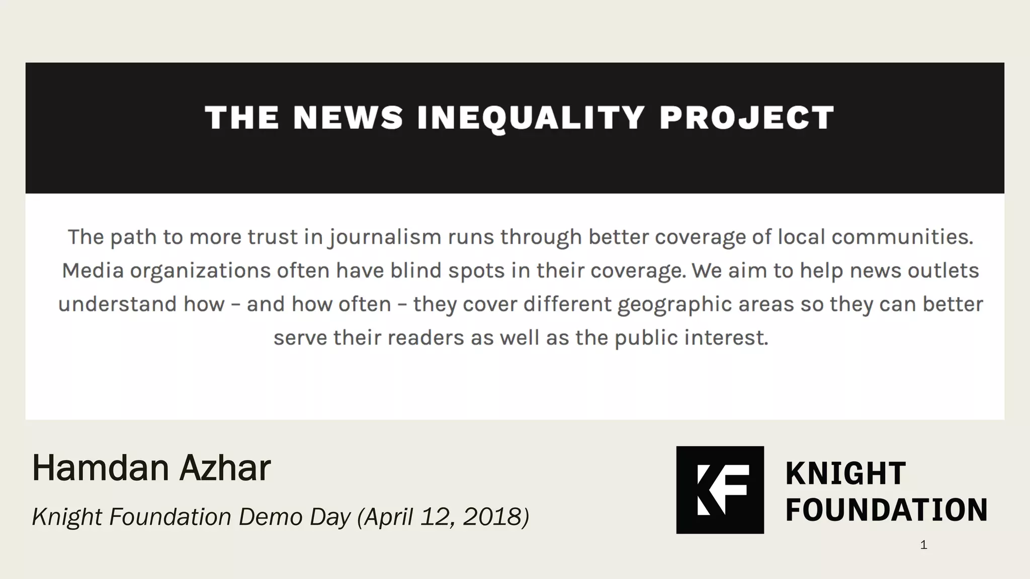
The News Inequality Project, presented by Hamdan Azhar at the Knight Foundation Demo Day in 2018, addresses the 'blind spots' in local journalism through automated content analysis. By scraping RSS feeds and indexing articles by neighborhood, the project quantifies the disparity in coverage volume and sentiment. For example, the deck highlights that Williamsburg received 114,000 search results compared to just 9,330 for Marine Park, with the latter's coverage dominated by crime-related keywords. While the deck effectively demonstrates a functional prototype and a clear problem statement, it l…
Key takeaways
- The project aims to help news outlets understand geographic coverage gaps to improve public trust (Slide 1).
- A significant volume disparity exists between neighborhoods, with Williamsburg showing over 12x the search results of Marine Park (Slide 3).
- Qualitative analysis of 'Marine Park' headlines from Gothamist (2015-2017) shows a heavy bias toward crime, featuring words like 'arrested,' 'dead,' and 'kills' (Slide 4).
- The technical stack utilizes Node.js for RSS parsing, Python for the API query tool, and PostgreSQL for the database (Slide 7).
- Data visualization reveals that the New York Times published 5,126 articles on SoHo/TriBeCa compared to 1,572 for East New York (Slide 9).
- Top subjects for affluent areas like SoHo include 'Restaurants' and 'Art,' while East New York's top subject is 'Murders and Attempted Murders' (Slide 9).
- Future plans include partnering with 2-3 newsrooms to create custom editor dashboards (Slide 11).
- The deck omits a business model, competitive landscape, and a formal funding ask (Slide 11).
The News Inequality Project: A Data-Driven Audit of Journalism
The News Inequality Project deck, presented by Hamdan Azhar at the Knight Foundation Demo Day on April 12, 2018, serves as a compelling case study in using data science for social good. Rather than pitching a high-growth SaaS product, this deck pitches a methodology for holding the fourth estate accountable. It focuses on the geographic disparities in news coverage, specifically within New York City, and proposes a technical framework for quantifying these biases.
Slide 1: Title and Mission
The opening slide establishes the project's core thesis: "The path to more trust in journalism runs through better coverage of local communities." It identifies "blind spots" in media coverage as the primary problem. The project aims to help news outlets understand their geographic coverage patterns to better serve the public interest. The presence of the Knight Foundation logo immediately signals that this is a grant-backed initiative focused on the intersection of technology and journalism.
Slide 3: Quantifying the Volume Gap
Slide 3 provides a stark visual representation of coverage disparity using Google News search results as a proxy. The slide compares two Brooklyn neighborhoods: Williamsburg and Marine Park . Williamsburg, a high-profile, gentrified area, shows "About 114,000 results," while Marine Park shows only "About 9,330 results." This 12x difference in volume serves as the quantitative foundation for the project's argument that news attention is not distributed equally across the urban landscape.
Slide 4: The Sentiment and Subject Bias
Moving beyond simple volume, Slide 4 examines the nature of the coverage for under-represented areas. Using an analysis of Gothamist headlines from 2015-2017, the slide presents a word cloud and a list of articles for Marine Park. The word cloud is dominated by negative descriptors: "dead," "burned," "arrested," "kills," "shot," and "cops." The article snippets confirm this trend, featuring stories about hate crimes, fatal accidents, and arrests. This slide effectively argues that when neglected neighborhoods do make the news, it is almost exclusively in a negative or criminal context, further distorting public perception.
Slide 7: Technical Architecture
Slide 7, titled "What did we build?", outlines the project's prototype infrastructure. The workflow is divided into two main components:
RSS Feed Parser: Built with Node.js , this component scrapes and searches articles from news feeds, extracting results and context. · API Query Tool: Built with Python , this allows for structured queries against the data.
Both components interact with an Index of topics (NYC neighborhoods) and store data in a PostgreSQL database. This slide demonstrates that the project has moved beyond manual search queries into an automated, scalable data pipeline.
Slide 9: Comparative Analysis of The New York Times
Slide 9 presents the project's most powerful data visualization, comparing New York Times coverage of two distinct areas. The left map shows SoHo-TriBeCa-Civic Center-Little Italy with a total of 5,126 articles . The top subjects listed are Restaurants (667), Housing (636), and Art (332) . The right map shows East New York with significantly lower volume: 1,572 articles . Crucially, the top subject for East New York is "Murders and Attempted Murders" (398) , which accounts for a much larger percentage of its total coverage than any single topic in SoHo. This slide visualizes the "inequality" mentioned in the project's title, showing that affluent areas get lifestyle coverage while lower-income areas get crime coverage.
Slide 11: Future Roadmap and Next Steps
The final slide in the provided sequence outlines the project's trajectory. The goals are research-oriented rather than commercial:
Partner with 2-3 newsrooms to produce custom dashboards for editors. · Extend the database to more cities and produce case studies on whether focused coverage increases subscriptions. · Use machine learning for semantic analysis to see if reporters use different language for different neighborhoods. · Improve code documentation.
What Works in This Deck
Clear Problem Identification: The deck does an excellent job of taking an abstract concept—media bias—and making it concrete through data. By comparing specific neighborhoods (Williamsburg vs. Marine Park, SoHo vs. East New York), the founders make the problem undeniable.
Functional Prototype: The inclusion of a technical architecture slide (Slide 7) proves that this is not just a theoretical study but a working tool. Showing the stack (Node, Python, Postgres) lends credibility to the project's ability to handle large-scale media audits.
Visual Impact: The use of heatmaps and word clouds allows the viewer to grasp the data disparities instantly without needing to read deep into the spreadsheets. The contrast between "Restaurants" in SoHo and "Murders" in East New York is a powerful emotional and logical hook.
What Is Missing
Team Slide: While Hamdan Azhar is listed on the cover, there is no slide detailing the expertise of the team. For a data science project, knowing the background of the analysts and developers is crucial for assessing the validity of the methodology.
Sustainability/Business Model: As a Knight Prototype Fund project, the focus is on impact, but the deck lacks a plan for long-term sustainability. Will newsrooms pay for these dashboards? Is this intended to be an open-source tool or a non-profit service?
Competitive Landscape: There are other organizations (like the Coral Project or various academic media labs) working on newsroom tools. The deck does not position the News Inequality Project relative to existing efforts in media criticism or data journalism.
The "Ask": The deck ends with "Next Steps" but does not include a specific request for funding, introductions, or resources. Even in a demo day setting, a clear call to action is necessary to convert interest into support.
Founder's Takeaway
Founders building data-heavy or social-impact products should study how this deck uses comparative data to create a narrative. By showing the "Current State" (inequality) vs. the "Potential State" (informed newsrooms), the project creates a compelling reason to exist. However, founders should ensure they transition from "here is a cool thing we built" to "here is how this becomes a permanent, sustainable entity" by including team and model slides that were omitted here.
Frequently asked questions
- What is the primary problem the News Inequality Project is solving?
- The project addresses 'blind spots' in media coverage where certain geographic areas are either ignored or covered only through a narrow, often negative, lens. By providing data on how often and in what context neighborhoods are mentioned, the project helps newsrooms identify these inequities to better serve the public interest and rebuild reader trust.
- How does the project's technology work?
- As shown on slide 7, the system uses a Node.js-based RSS feed parser to scrape and search articles. These are indexed against a list of NYC neighborhoods and stored in a PostgreSQL database. A Python-based API query tool then allows users to extract results and context, which are visualized as geospatial heatmaps and subject lists.
- What specific data points are used to prove news inequality?
- The deck uses two main metrics: volume and sentiment/subject matter. Slide 9 shows that the New York Times wrote over three times as many articles about SoHo/TriBeCa as it did about East New York. Furthermore, the subjects for SoHo were lifestyle-oriented (Restaurants, Art), whereas East New York was dominated by crime reporting.
- Is this a commercial startup or a non-profit project?
- Based on the branding and the venue (Knight Foundation Demo Day), this is a grant-funded prototype. The deck focuses on social impact and journalistic integrity rather than revenue models, customer acquisition costs, or market size. The 'Next Steps' on slide 11 focus on partnerships and research rather than scaling a business.
- What is missing from this pitch deck compared to a standard VC deck?
- This deck lacks several critical commercial components: a Team slide (though Hamdan Azhar is named on the cover), a Business Model slide, a Market Size (TAM/SAM/SOM) analysis, a Competitor slide, and a specific financial Ask. It functions more as a proof-of-concept presentation for a research fellowship than a seed round pitch.