Piccsy’s 2010 seed deck is an exercise in extreme brevity, consisting of only four slides: Title, Problem, Solution, and Team. At a time when the visual web was exploding, Piccsy aimed to solve the 'fragmentation' of image discovery. The deck relies almost entirely on a complex bubble map to illustrate a crowded market and a simple schematic to explain their personalization engine. While it successfully raised $40,000, the deck is notable for what it lacks: there are no slides for market size, business model, traction, or a specific financial ask. It functions more as a high-level executive s…
Key takeaways
- The deck defines the core problem as image discovery being 'fragmented and distributed across a web of sources' on Slide 2.
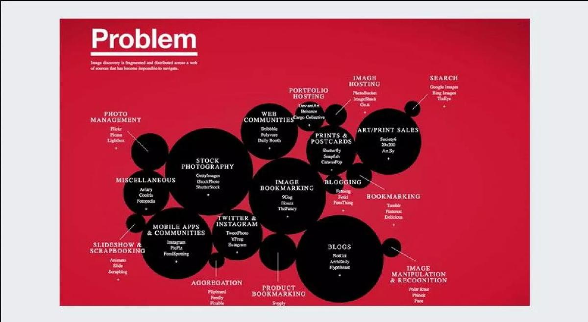
- Slide 2 features a visual competitive landscape mapping 17 different categories including Stock Photography, Blogging, and Search.
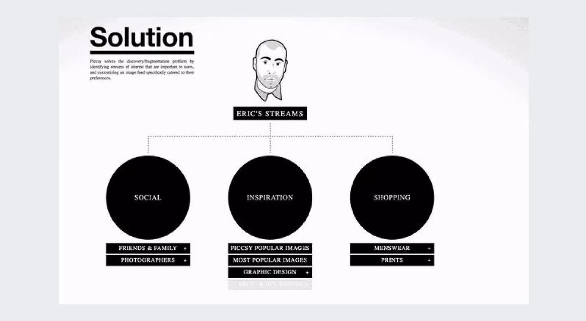
- The solution is presented as a personalized feed called 'Eric's Streams,' divided into Social, Inspiration, and Shopping categories on Slide 3.
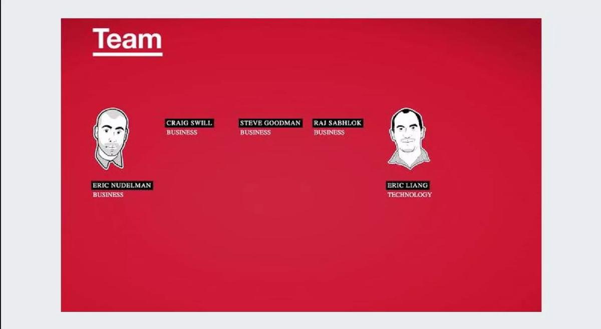
- The team consists of five members, with four focused on 'Business' and only one on 'Technology' as shown on Slide 4.
- The deck completely omits a business model, revenue projections, or any mention of unit economics.
- There is no 'Ask' slide detailing how much capital is being raised or how it will be deployed.
- The company raised $40,000 in 2010 following this presentation, according to catalogue data.
- The deck uses a consistent red, black, and white visual language that mirrors the product's branding.
The Four-Slide Seed Deck: Piccsy’s 2010 Pitch
The Piccsy pitch deck is a relic of the early 2010s 'curation' era. At just four slides, it is one of the shortest successful decks in the startup archives. According to catalogue data, this deck helped secure $40,000 in seed funding. It does not follow the traditional 10-12 slide Sequoia model; instead, it functions as a visual executive summary. The deck relies on a high-contrast red and white aesthetic to communicate a sense of urgency regarding the state of the visual web.
Slide 1: Title and Vision
The cover slide is minimalist, featuring the Piccsy logo—a clean sans-serif font accompanied by a red pixelated heart. Below the logo is the company’s mission statement: "Revolutionizing the way people discover, share, and interact with images online." In the top right corner, a black ribbon label reads "Executive Summary." This suggests that this specific document may have been intended as a teaser or a leave-behind rather than the full presentation used in partner meetings. The branding is consistent and professional, establishing the company as a design-centric entity from the first second.
Slide 2: The Problem of Fragmentation
Slide 2 is the most content-dense page in the deck. Titled "Problem," it features a sub-headline stating: "Image discovery is fragmented and distributed across a web of sources that has become impossible to navigate." To illustrate this, the slide uses a large red field populated by black bubbles of varying sizes, representing different sectors of the image economy. The categories identified include:
Stock Photography: GettyImages, iStockPhoto, Shutterstock. · Web Communities: Dribbble, Polyvore, Daily Booth. · Blogging: Fotolog, Pocki, FotoThing. · Search: Google Images, Bing Images, TinEye. · Mobile Apps & Communities: Instagram, PicPlz, FoodSpotting.
By visualizing the market this way, Piccsy avoids the standard 'competitor grid' and instead creates a narrative of chaos. The sheer number of logos and categories supports their claim that the web is 'impossible to navigate.' However, the slide does not explain why these platforms are failing the user, only that there are many of them.
Slide 3: The Solution and Personalization
Slide 3, titled "Solution," explains how Piccsy intends to fix the chaos shown on the previous slide. The text states: "Piccsy solves the discovery/fragmentation problem by identifying streams of interest that are important to users, and customizing an image feed specifically catered to their preferences."
The visual on this slide uses a flowchart centered around a user avatar labeled "Eric's Streams." This central node branches into three primary categories:
Social: Sub-categorized into 'Friends & Family' and 'Photographers.' · Inspiration: Sub-categorized into 'Piccsy Popular Images,' 'Most Popular Images,' and 'Graphic Design.' · Shopping: Sub-categorized into 'Menswear' and 'Prints.'
This slide is critical because it introduces the concept of 'Streams,' which was a popular UI pattern in 2010. It also hints at a potential business model through the 'Shopping' category, though it never explicitly describes how transactions or affiliate fees would work. The use of a specific persona ('Eric') helps make the abstract concept of an 'image feed' feel more tangible to the investor.
Slide 4: The Team
The final slide, "Team," is remarkably sparse. It features two illustrated avatars and five names. The team is divided as follows:
Eric Nudelman: Business · Craig Swill: Business · Steve Goodman: Business · Raj Sabhlok: Business · Eric Liang: Technology
There are no titles (CEO, CTO, etc.), no mention of previous company experience, and no educational background. The most striking aspect of this slide is the ratio of business to technology staff; with four 'Business' members and only one 'Technology' member, an investor might question the company's ability to build the complex aggregation and personalization engine described on Slide 3. The lack of bios is a significant omission that would not pass muster in a modern seed round where the 'founder-market fit' is a primary investment thesis.
What Works in This Deck
The strongest element of the Piccsy deck is its visual storytelling . Slide 2 successfully creates a feeling of overwhelming choice, which makes the 'Solution' on Slide 3 feel like a relief. The deck is also highly focused . It doesn't get bogged down in technical specifications or complex market sizing; it identifies a trend (the explosion of images) and proposes a filter. The consistent branding also works in its favor, suggesting that the founders have a strong grasp of UI/UX, which is vital for a consumer-facing discovery platform.
What is Missing
The list of omissions is longer than the list of slides. Specifically, the deck lacks:
Market Size (TAM/SAM/SOM): There is no indication of how many people are looking for images or how large the digital photography market is. · Business Model: While 'Shopping' is mentioned, there is no explanation of how Piccsy makes money. · Traction: There are no user numbers, growth rates, or engagement metrics. Even if the product was in beta, some indication of early interest is usually required. · The Ask: The deck ends without telling the investor how much money the company needs or what they will do with it. · Technology/IP: For a platform promising 'customized feeds,' there is no mention of the algorithms or data science behind the personalization.
What a Founder Should Copy
Founders should copy the Problem Map style from Slide 2. Instead of a standard X/Y axis chart where the startup is conveniently in the top-right corner, Piccsy’s bubble map shows a deep understanding of the ecosystem. It categorizes competitors by their utility to the user, which is a much more sophisticated way to demonstrate market awareness. Additionally, the persona-based solution (Eric's Streams) is a great way to explain a product without using confusing technical jargon. It allows the investor to visualize the end-user experience immediately.
Final Analysis
The Piccsy deck is a product of its time. In 2010, a $40,000 seed check was often based on a 'vibe' and a clear vision of where the web was heading. Today, a 4-slide deck would likely be rejected by most institutional investors for lack of data. However, as a masterclass in minimalist communication , it remains relevant. It proves that if you can define a problem clearly enough, you don't need fifty slides to explain why your solution matters. The deck's failure to address the 'Business' side—despite having four 'Business' team members—is its greatest irony, but its visual clarity is what likely got the founders in the room to close the deal.
Frequently asked questions
- How did Piccsy raise money with only four slides?
- In 2010, the 'curation' and 'discovery' trend was at its peak with the rise of Pinterest and Tumblr. Piccsy’s deck likely served as a visual aid for a verbal pitch rather than a standalone document. By focusing purely on the 'fragmentation' problem, they positioned themselves as a necessary aggregator in a chaotic market, which was a compelling narrative for early seed investors at the time.
- What is missing from the Piccsy business model slide?
- Everything. The deck contains no business model slide at all. There is no mention of advertising, subscriptions, affiliate revenue from the 'Shopping' stream, or data licensing. For a seed round, investors often prioritize vision and product-market fit over immediate monetization, but the total absence of a path to revenue is a significant risk in modern fundraising.
- Is the competitive landscape on Slide 2 effective?
- It is effective at showing 'noise' but less effective at showing 'advantage.' By listing dozens of competitors like Flickr, Photobucket, and Google Images in a cluttered bubble map, Piccsy proves the market is fragmented. However, it doesn't explicitly state why Piccsy's technology is superior to these established players, only that it intends to aggregate them.
- Why is the team slide so sparse?
- Slide 4 lists five names but provides no professional history, past exits, or specific roles beyond 'Business' or 'Technology.' In a seed deck, the team's pedigree is usually the most important factor. By omitting bios, the founders relied entirely on the investor's existing knowledge of them or their ability to impress during the live presentation.
- What can modern founders learn from this minimalist approach?
- The primary lesson is clarity of vision. Piccsy identified a single, relatable pain point—too many images in too many places—and proposed a single, clean solution. While modern decks require more data (traction, TAM, etc.), the ability to distill a complex market into a single 'Problem' visual is a powerful communication tool.