Warhoo's 16-slide deck, built in PowerPoint 2013 and dated 28 May 2015, pitches a 'social store' that learns a shopper's style and sells partner-brand products for a 7% commission plus a monthly brand fee. The product is real and shown working across desktop, mobile and push notifications — but the business is never presented. There is no problem slide, no market model, no financial projection, no use of funds and no ask. The four opening statistics are all borrowed category numbers, one credited to a magazine rather than a study and one dated 2011, none converted into revenue Warhoo could ea…
Key takeaways
- Warhoo's 16-slide May 2015 deck pitches a 'social store' that learns a shopper's style and sells partner-brand products, taking 7% of each sale plus an unstated monthly fee — but the product is not described in words until slide 8 of 16.
- There is no ask anywhere in the deck: no amount, no valuation, no instrument, no use of funds and no close date, and no financial projection of any kind.
- Slide 3's four market statistics are all borrowed category numbers — one attributed to 'Wired magazine (UK)' rather than a study, one dated 2011, and a Booz & Company forecast of 2015 published in 2011 — and none is converted into revenue Warhoo could earn.
- The '$30 bi' and '150 mi' labels are untranslated Portuguese abbreviations left in an English-language deck, a tell that nobody proofread the file before it was sent.
- The screenshots on slides 6 and 7 were never cropped: sixteen browser tabs and a Windows taskbar are in frame, and two tabs read 'What should I send investors' and 'Rules of Productivity'.
- The only traction claim, '101 BRANDS BEFORE THE RELEASE', sits on a logo wall blurred to illegibility and never defines whether 'brands' means signed partnership agreements or catalogued products.
- Half the business model is blank — the monthly brand fee 'varies according to the chosen services', with no tier, range or example given anywhere — while the 7% take rate on the deck's own ~$70 prices implies roughly $7.1M of GMV is needed for $500k of commission revenue, arithmetic the deck never…
- The competition slide is four logos with no analysis, and one of them is Shopify — store infrastructure and the obvious distribution channel for the brands Warhoo needed to sign, listed as an enemy.
What this deck actually is
Sixteen slides, 960 x 540 points, built in Microsoft PowerPoint 2013 and printed to PDF on 28 May 2015 . The file is 1.1 MB. It is an early-stage investor deck for Warhoo , described on its cover as a "SOCIAL STORE" and on slide 2 as " THE NEXT STEP OF SOCIAL COMMERCE " — a web marketplace that learns a shopper's style from their behaviour, surfaces products from partner brands, and takes 7% of every sale plus a monthly fee from the brand.
The product is real. Five of the sixteen slides are screenshots of a working site at www.warhoo.com, plus a responsive mobile build and push notifications. Two founders are named. There is a contact email, an AngelList page and a Microsoft BizSpark membership. For a two-person team in 2015, shipping this much is not nothing.
But as an investment document, the deck has a hole in the middle of it. There is no problem slide, no market model, no traction number that resolves into a customer, no financials, no use of funds, and no ask. The first sentence that describes what Warhoo does arrives on slide 8 of 16 . The business model arrives on slide 11 and is one sentence long. And the four statistics that open the deck are all about somebody else's market, none newer than the deck's fourth birthday, and none of them connected by any arithmetic to Warhoo's own revenue.
This is the single most common shape of failure in seed decks: a founder who built the product presenting the product, and mistaking that for presenting the business.
Four borrowed statistics, zero of them about Warhoo
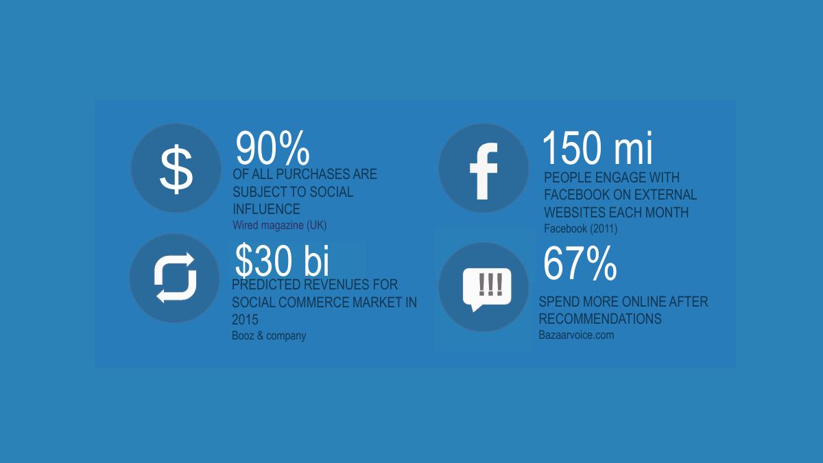
Slide 3 is the deck's only market page. It is a 2x2 grid of headline numbers:
90% of all purchases are subject to social influence — Wired magazine (UK) · 150 mi people engage with Facebook on external websites each month — Facebook (2011) · $30 bi predicted revenues for the social commerce market in 2015 — Booz & Company · 67% spend more online after recommendations — Bazaarvoice.com
Every one of these is a category statistic. Not one of them is converted into a number Warhoo could earn. There is no line that says: if the social commerce market is $30 billion and we take 7% of the transactions we intermediate, then capturing X% of it produces $Y of revenue. The deck states the size of a pool and then never gets in it.
The sourcing is worse than the framing. "Wired magazine (UK)" is a publication, not a study — a reader cannot check a claim attributed to a magazine with no issue, date, article or underlying research. The Facebook engagement figure is explicitly dated 2011 , four years stale in a May 2015 deck, and drawn from an era of Facebook social plugins that had already been substantially wound down by the time the deck was written. The Booz & Company $30 billion figure is a forecast for 2015 that was published in 2011 — the deck was presented in the very year the prediction covered, and it makes no attempt to check the prediction against what actually happened. Only Bazaarvoice is attributable to an organisation that publishes the research, and even that is cited as a bare domain name.
There is also a tell in the typography. " $30 bi " and " 150 mi " are Portuguese abbreviations — bilhões and milhões — left untranslated in an English-language deck. It is a small thing, and it is exactly the kind of small thing an investor notices on slide 3, because it means nobody read the deck cold before it was sent.
Slide 4 is somebody else's infographic
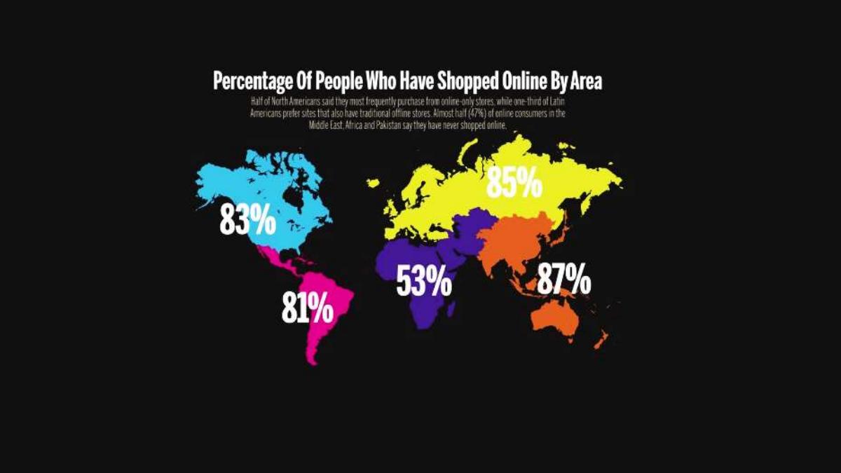
Slide 4 is a full-bleed, black-background world map titled "Percentage Of People Who Have Shopped Online By Area": 83% North America, 81% Latin America, 53% Middle East/Africa, 85% Europe/Russia, 87% Asia-Pacific . The typeface, palette and layout match nothing else in the deck. It is a downloaded graphic, dropped in whole.
Three problems, in ascending order of seriousness. It carries no source and no year . Its own caption contradicts its own headline — the subtext says "almost half (47%) of online consumers in the Middle East, Africa and Pakistan say they have never shopped online" while the map labels that same region 53% , so the reader is being shown the inverse of the same statistic twice and asked to treat it as two facts. And most importantly: the slide is never used. No conclusion is drawn from it, no market is sized off it, no geography is chosen because of it. Warhoo does not say which of these regions it sells in. The map is decoration wearing the costume of evidence.
An investor reading slides 3 and 4 back to back has now seen six numbers, all about e-commerce in general, and still does not know what Warhoo is.
The product is described for the first time on slide 8
Slide 5 is a solid blue page reading " BUY WITH A SPECIAL RECOMMENDATION " and nothing else. Slides 6 and 7 are laptop-and-phone mockups of the site. Then slide 8, finally, states the proposition:
"A platform that tracks the user's style through the consumer behavior offering products and attracting the interest of Publishers."
That is the whole description, and it is doing badly on three fronts. It is ungrammatical — a missing comma and a dangling participle in the one sentence the entire raise depends on. It uses " Publishers ", capitalised, without ever defining the term; the reader has to infer whether that means media sites, bloggers, brands or affiliates, and the deck never returns to it. And "tracks the user's style through the consumer behavior" is a description of an output , not of a mechanism: there is no signal listed, no data source, no model, no cold-start answer, nothing that separates this from a product grid with a recommendation widget.
For a company whose entire differentiation claim is personalisation, zero slides explain how the personalisation works. The screenshots show a homepage of Quiksilver jackets, Sony smartwatches and New Era caps in a fixed grid — the visual evidence in the deck is of an unpersonalised catalogue, presented in support of a personalisation pitch.
The screenshots were never cropped
This is the detail that will decide the meeting, and the founders almost certainly never saw it.
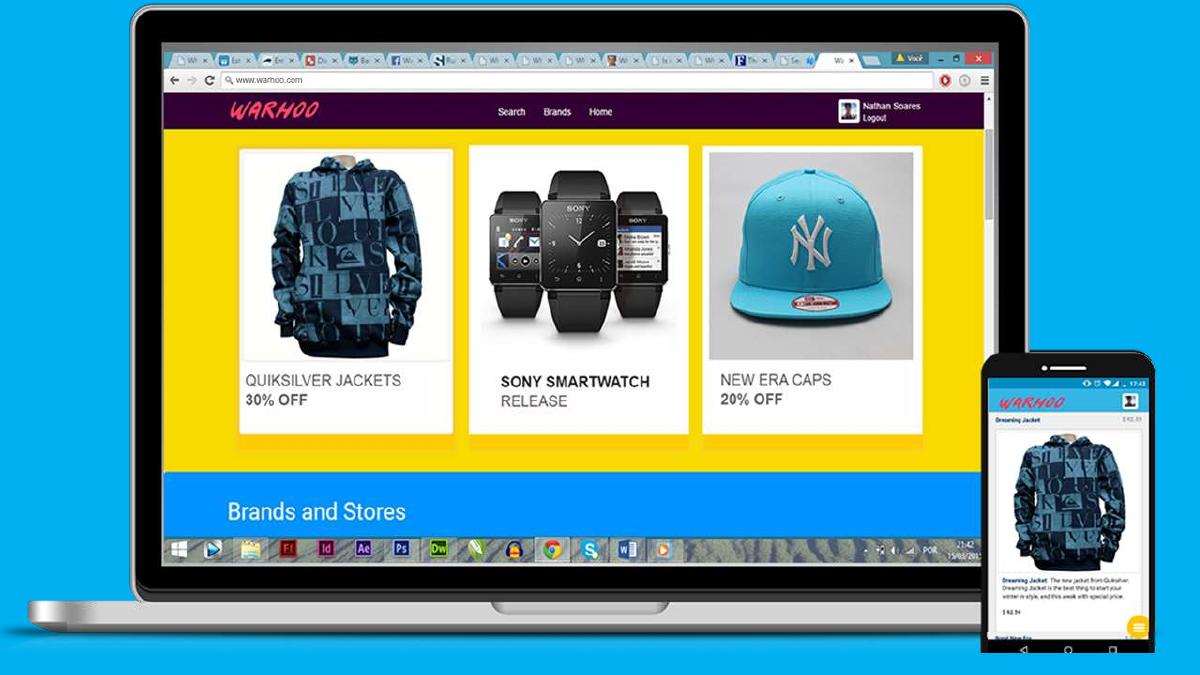
Slides 6 and 7 are photographs of a laptop screen showing warhoo.com, with the entire browser chrome and Windows desktop left in frame. On slide 6 the reader can count roughly sixteen open browser tabs and read a Windows taskbar full of Adobe applications with the system clock showing 21:42, 15/03/2015 .
On slide 7 , the tabs are legible. Two of them read " What should I send investors " and " Rules of Productivity ".
An investor who spots that has been handed, unprompted, a picture of a founder googling how to fundraise while assembling the deck they are now reading. It is disarming, and it is entirely avoidable: a crop tool would have removed it in ten seconds. The deeper signal is not inexperience — every founder is inexperienced once — it is that nobody proofed the file . If the screenshots were not checked, the reader assumes the numbers were not checked either, and the deck has no numbers robust enough to survive that assumption.
The same slides date-stamp the product build to mid-March 2015, ten weeks before the deck. That is genuinely useful evidence of shipping velocity — and it is accidental, not argued.
A business model with a blank in it
Slide 11 is the entire commercial model, one sentence over a blurred screenshot:
"Products come from brands and stores in partnership. 7% for each sale made through the platform and a monthly fee that varies according to the chosen services."
The 7% take rate is a real, specific, checkable number — the best commercial fact in the deck. Everything around it is missing:
The monthly fee is never stated. Not a range, not a floor, not a single tier, not an example. "Varies according to the chosen services" is a placeholder where recurring revenue should be, and the services are never listed. · No average order value. The product screenshots price items at $40.59, $80.00 and $92.59, so a rough AOV of $70 is visible — but the deck never uses its own prices to build anything. · No unit economics. No payment processing cost, no fulfilment model, no returns assumption, no statement of who holds inventory or who ships. If brands drop-ship, that is a critical advantage and it is unstated. · No customer acquisition cost , no channel, no conversion rate, no repeat rate.
Do the arithmetic the deck declines to do. At a 7% take rate on a $70 order, Warhoo earns $4.90 per transaction . To reach a modest $500,000 of annual commission revenue, the platform must intermediate roughly $7.1 million of GMV — about 102,000 orders a year, or 280 a day, every day. That number is the pitch. It tells an investor exactly what has to be true, and it makes the unstated monthly fee suddenly load-bearing, because subscription revenue from 101 brands is what carries the business while order volume is still in the hundreds per month. The deck contains all the inputs for this calculation and performs none of it.
"101 brands before the release" — the traction claim that blurs itself
Slide 12 is the only traction claim in the deck: " 101 BRANDS BEFORE THE RELEASE ", printed in a blue box over a logo wall. Converse, Vans, Nike, Firetrap and others are recognisable in the background.
The logo wall is blurred to illegibility as a design effect. The single strongest asset on the page — the names — has been deliberately made unreadable so that a text box could sit on top of it. If 101 brands really are on board, the correct slide is a clean grid of 101 legible marks and nothing else.
Then the word "brands" is left undefined, and the ambiguity is enormous. Does 101 mean 101 signed partnership agreements, or 101 brands whose products have been catalogued? These are completely different businesses. The first is a sales achievement by a two-person engineering team and the core of the pitch. The second is a scraping exercise. The deck gives the reader no way to tell, and an investor confronted with an ambiguous traction number always assumes the weaker reading.
There is a legal edge here too. Displaying Nike, Converse and Vans marks under a headline implying pre-launch partnership is a claim those companies' counsel would want substantiated. Either the agreements exist, in which case name them and date them, or they do not, in which case the slide is a liability.
And notice what "before the release" quietly concedes: Warhoo had not launched. There is no user count, no order count, no GMV, no waitlist, no beta cohort, no pilot brand result anywhere in sixteen slides.
Four logos labelled COMPETITORS
Slide 13 is the word "COMPETITORS" and four logos: Wish, Shopify, likestore and facileme . No axes, no matrix, no feature comparison, no sentence, no positioning statement. Nothing tells the reader why Warhoo wins.
The selection itself is an unforced error. Shopify is not a competitor — it is store infrastructure, and in 2015 it was the obvious distribution channel for exactly the brands Warhoo needed to sign. Listing your best potential partner as your enemy tells an investor you have not thought about how you get to market. Wish is a genuine competitor and by May 2015 had already raised very large rounds on a personalised mobile discovery feed — the closest thing to Warhoo's thesis in the world, and the deck spends zero words on the difference. likestore and facileme are the two social-commerce tools most similar to Warhoo's own positioning, and again: no comparison.
Four logos is not a competition slide. It is a list of things the founder has heard of.
Slide-by-slide walkthrough
Slide 1 — Cover
The Warhoo brushstroke wordmark on navy with "SOCIAL STORE" beneath it. Clean, and it is the deck's strongest piece of design. No date, no round, no tagline, no contact.
Slide 2 — "The next step of social commerce"
A full-bleed cyan slide with one line of text. It is a category claim, not a problem statement, and it is the closest thing to a problem slide the deck contains. Nobody's pain is described anywhere in the file.
Slide 3 — Four market statistics
Analysed above. Four borrowed numbers, one sourced to a magazine, one four years old, one a 2011 forecast of the deck's own year, none converted into Warhoo revenue.
Slide 4 — World map of online shopping
A downloaded infographic in a different visual language, unsourced, undated, self-contradicting, and never referenced again.
Slide 5 — "Buy with a special recommendation"
A slogan on a blue field. This is slide 5 of 16 and the reader still has no definition of the product.
Slide 6 — Desktop and mobile mockup
Laptop and phone showing the homepage: Quiksilver jackets 30% off, Sony smartwatch release, New Era caps 20% off, a "Brands and Stores" row beneath. The site looks credible. The frame includes sixteen browser tabs and a Windows taskbar timestamped 15/03/2015.
Slide 7 — Product grid, uncropped
A closer photograph of the same screen showing product cards with real prices — Dreaming Jacket $92.59, New Era cap $40.59, RedOne Jacket $80.00 — and legible browser tabs reading "What should I send investors" and "Rules of Productivity". Also visible: the product copy contains a typo, "this weak with special price", repeated across cards and again on slide 10.
Slide 8 — What Warhoo is
The one-sentence description, on slide 8 of 16, over a blurred screenshot. Ungrammatical, and it introduces "Publishers" without definition.
Slide 9 — Mobile product page
A phone showing the Dreaming Jacket detail page at $92.59 with description and price. Good evidence that the mobile build is real; no annotation explaining what the reader should notice.
Slide 10 — Push notifications
Two Warhoo push notifications on a lock screen, one promoting the jacket and one announcing new smartwatches. This is the strongest product screenshot in the deck, because retention and re-engagement is precisely the hard problem in discovery commerce — and it is presented with no caption, no opt-in rate and no argument.
Slide 11 — Business model
Slide 12 — 101 brands
Slide 13 — Competitors
Slide 14 — Platforms
"Warhoo is web and will be available for: Android, Windows Phone, iOS." This is the entire roadmap: three operating systems, no dates, no order of priority defended, no cost attached. Windows Phone is listed second, ahead of iOS — a defensible choice only if it is explained by the Microsoft BizSpark membership on slide 16, and it is not explained anywhere. In May 2015, ranking Windows Phone above iOS without a reason is a decision an investor will ask about, and the deck has no answer prepared.
Slide 15 — Team
Two people. Enoch Cardoso, Web Developer, Co-Founder. Nathan Soares, Developer, CEO & Founder. Casual photographs, no bios, no dates, no previous companies, no education, no links.
Two engineers is a legitimate seed team. But this is a business whose model requires signing and servicing 101 retail brands and running a two-sided marketplace, and the team slide contains no commerce, retail, partnerships or growth experience of any kind — because it contains no experience of any kind. The CEO's title is "Developer". Nothing tells the reader who sells.
Slide 16 — Contact
The wordmark, contact@warhoo.com, angel.co/warhoo, and "Microsoft Bizspark: WARHOO". There is no ask. No amount, no instrument, no valuation, no use of funds, no milestone the money buys, no close date. Sixteen slides end without ever telling the investor what is being requested.
What this deck does better than most startup pitch decks
The product exists and is shown working. Desktop, responsive mobile and push notifications, all screenshotted from a live domain. Most pre-launch decks at this stage show wireframes. · The take rate is specific. "7% for each sale" is a real, checkable commercial term. Plenty of marketplace decks never name one. · The brand identity is strong and consistent. The brushstroke wordmark, the cyan-and-navy palette and the full-bleed statement slides give the deck a coherent look that punches above a two-person team. · It names competitors by brand. Wish, Shopify, likestore and facileme, rather than "existing solutions" — the analysis is missing, but the honesty of naming Wish is worth something. · It is short. Sixteen slides, one idea per slide, no walls of text. The structure is disciplined even where the content is thin. · It attaches sources to its statistics. Wired, Facebook, Booz & Company and Bazaarvoice are all named. Weak sources, but named ones — and one carries an explicit year. · The push-notification slide identifies the right hard problem. Bringing shoppers back is the make-or-break metric in discovery commerce, and the team had already built for it before launch.
Where this deck would fail in an investor meeting
No ask. Sixteen slides, no amount, instrument, valuation, use of funds or close date. · No financials at all. No revenue projection, no cost base, no burn, no runway, no unit economics. · No problem slide. Nobody's pain is described anywhere in the file. · No market sizing of Warhoo's own market — four borrowed category statistics, none converted into addressable revenue. · The product is not defined until slide 8 , and then in one ungrammatical sentence containing an undefined term. · The monthly fee is blank. Half the revenue model is "varies according to the chosen services." · The only traction claim is ambiguous and visually blurred — "101 brands" could mean signed partners or catalogued products, and the logos are unreadable. · No launch, no users, no orders, no GMV, no waitlist. · Competitors are four logos with no analysis , and one of them (Shopify) is infrastructure, not competition. · Uncropped screenshots expose sixteen browser tabs including "What should I send investors". · The personalisation mechanism is never explained in a deck whose entire differentiation is personalisation. · The team slide has no bios , and no commercial or partnerships capability on a business that must sign hundreds of brands. · Windows Phone ranked above iOS with no reason given. · A typo in the live product copy ("this weak with special price") appears on two separate slides.
What the deck claims vs what an investor can verify
Claim in the deck Where it appears What a reader can actually check
101 brands before the release Slide 12 The logo wall is blurred; "brands" is undefined — signed partners and catalogued products are indistinguishable 7% per sale plus a monthly fee Slide 11 The 7% is specific and checkable; the monthly fee is never stated in any amount, range or tier $30 billion social commerce market in 2015 Slide 3 A Booz & Company forecast published in 2011, presented in the year it predicted, with no check against outcome and no share Warhoo could claim 150 million engage with Facebook on external sites monthly Slide 3 Dated 2011 — four years stale, from an era of Facebook social plugins already being wound down by 2015 90% of purchases are socially influenced Slide 3 Attributed to "Wired magazine (UK)" — a publication, not a study; no issue, date or underlying research
Tracks the user's style from behaviour Slide 8 No signal, model, data source or cold-start answer anywhere; the screenshots show an unpersonalised fixed product grid
Working web product Slides 6, 7, 9, 10 Genuinely verifiable — live domain, real prices, responsive build and push notifications, timestamped 15/03/2015
Available for Android, Windows Phone, iOS Slide 14 Future tense with no dates, no priority rationale and no cost; Windows Phone ranked above iOS unexplained
How you would rebuild this deck
Move the product definition to slide 2. One clean sentence: "Warhoo is a social store that learns what you wear and sells it to you — we take 7% of every order from 101 partner brands." The reader should know the business before slide 3, not slide 8. · Replace slide 3 with your own arithmetic. Keep one category statistic if it earns its place, then show the line the deck is missing: orders per month x average order value x 7% = revenue. Use the prices already visible in your own screenshots. · Delete slide 4 entirely. An unsourced map you draw no conclusion from costs you credibility and gains you nothing. · Disambiguate "101 brands" and unblur the logos. State it precisely: "N signed partnership agreements, M brands catalogued, first cohort live on [date]." Then show the names at full contrast with nothing on top of them. · Fill in the monthly fee. Name the tiers, the price of each and how many brands sit on each. Subscription revenue from brands is what funds you before order volume arrives — it is the most investable part of this model and it is currently a blank. · Crop every screenshot. Browser chrome, tabs, taskbars and desktop clocks out; annotate what the reader should notice — the personalised row, the push open rate, the mobile conversion path. · Explain the personalisation in one slide. What signal you collect, how the profile is built, what happens on a new user's first session, and what result it produced in testing. Without this, Warhoo is a catalogue. · Rebuild the competitor slide around Wish. One axis of real difference — brand-partner supply versus long-tail supply, say — and one sentence per competitor. Move Shopify off the slide and into the channel strategy where it belongs. · Add bios to the team slide, and name who sells. Two engineers signing 101 retail brands needs an explanation. Give it, or show the first partnership contract instead. · Add financials and an ask. Twelve to eighteen months of projected orders, revenue and cost; then the amount, the instrument, the milestones it buys and a close date. Every slide before this one exists to make this one credible.
The transferable lesson
Warhoo's founders built a working two-sided commerce product, a responsive mobile experience and a push-notification system before they had raised a dollar. That is the hard part. Then they wrote a deck that spends its first seven slides on other people's statistics and their own screenshots, defines the product on slide 8, states half a business model on slide 11, and ends on slide 16 without asking for money.
A pitch deck is not a product tour with a logo on the front. The screenshots prove you can build; they do not prove anybody wants it, that the unit economics work, or that you know what you would do with a cheque. Warhoo had genuinely investable facts in its possession — a 7% take rate, live prices averaging around $70, 101 brand relationships, a working retention channel — and it printed all of them as isolated decoration instead of multiplying them together into a single sentence about revenue. The reader is left to do the arithmetic, and readers do not do the arithmetic. They stop.
The second lesson is cheaper and more brutal: proof your file. The most memorable thing in this deck is a browser tab reading "What should I send investors", visible because nobody cropped a photograph. Everything else in the file argues that these founders execute quickly; that one uncropped frame argues they do not check their work, and it appears on the same slide as the product they are asking you to fund. Investors form a view of your operating standards from the artefact in front of them, because it is the only artefact they have.
And the third: if a slide does not change the reader's mind, delete it. Slides 2, 4 and 5 of this deck contain a slogan, an unsourced map and another slogan. Cut them and you free three pages for a market model, a financial projection and an ask — the three things whose absence, not whose weakness, is why this deck would not have closed a round.
Frequently asked questions
- Is the Warhoo deck a real investor pitch deck?
- It is an early-stage investor deck in intent — cover, market statistics, product, business model, traction claim, competitors, roadmap, team and contact page — but it is missing the elements that make a deck fundable. There is no problem slide, no financial projection, no use of funds and no ask. Sixteen slides end with a contact email and an AngelList link without ever stating how much money is being requested or what it buys.
- What was Warhoo?
- Warhoo was a Brazilian-built 'social store' launched on the web at warhoo.com in 2015: a marketplace that tracked a shopper's style from their behaviour and surfaced products from partner brands and stores. Its model took 7% of each sale plus a monthly fee from brands. The deck claims 101 brands before release, and screenshots show a live desktop site, a responsive mobile build and push notifications, timestamped March 2015.
- Which Warhoo slides should founders copy?
- Two things, not two slides. First, the product evidence: slides 6, 7, 9 and 10 show a working desktop site, real prices, a responsive mobile product page and live push notifications — for a pre-launch two-person team, that is genuine proof of execution. Second, the specificity of the 7% take rate. Naming an exact commercial term beats the vague 'we will monetise through transaction fees' that most marketplace decks settle for.
- What is the biggest weakness in the Warhoo deck?
- The absence of arithmetic. The deck contains every input needed to model the business — a 7% take rate, product prices of $40.59 to $92.59, and 101 brand relationships — and never multiplies them together. It quotes a $30 billion market but never states what share it would take, shows prices but never an average order value, and offers no revenue projection, cost base or ask. The reader is left to build the model, and readers do not build the model.
- How many slides is the Warhoo pitch deck?
- Sixteen slides, 960 x 540 points, built in Microsoft PowerPoint 2013 and dated 28 May 2015. The file is 1.1 MB. Five slides are product screenshots, two are single-line slogan pages, two are borrowed market graphics, and the product itself is not described in words until slide 8.
- What does the '101 brands before the release' claim actually mean?
- The deck never says. The phrase sits over a logo wall — Converse, Vans, Nike and others are recognisable — that has been blurred to illegibility as a design effect, and 'brands' is left undefined. It could mean 101 signed partnership agreements, which would be a substantial sales achievement for two engineers, or 101 brands whose products were catalogued, which would not. Investors resolve ambiguous traction claims toward the weaker reading.