Flyover presents a concept for a travel platform that aggregates user demand to create custom flight connections. The deck is characterized by an extremely minimalist aesthetic, using large-font section headers and simple iconography to explain a multi-step user journey. While the core value proposition—that more travelers lead to lower individual ticket prices—is clearly stated on slide 5, the provided slides lack the critical data necessary for a professional investment round. There are no specific market size figures, no team biographies, and no competitive landscape details despite having…
Key takeaways
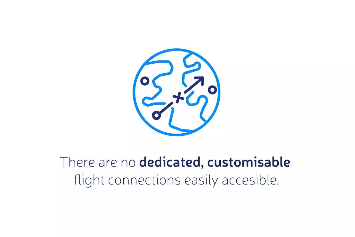
- The problem is defined as a lack of dedicated, customizable flight connections that are easily accessible (Slide 2).
- The product is introduced via a web domain, GetFlyover.com, suggesting a direct-to-consumer platform (Slide 3).
- The platform utilizes a social or collaborative booking model where users can join existing flight requests (Slide 4).
- The economic incentive for the user is based on volume, stating that more people traveling results in lower ticket prices (Slide 5).
- The deck uses a highly structured format with clear breaks for Market Opportunity, Team, and Competition (Slides 6, 7, 8).
- The presentation relies on visual minimalism, often featuring only a single sentence or icon per slide to convey core concepts.
- Critical business information, including founder backgrounds and specific market data, is missing from the section header slides provided.
- The deck emphasizes the user experience and the 'how-it-works' flow over technical or logistical backend details.
The Flyover Pitch Deck Analysis
Flyover presents a vision for a more flexible aviation market driven by consumer demand rather than fixed airline schedules. The deck's design is modern and clean, utilizing a blue-heavy color palette that evokes the sky and travel. However, the effectiveness of a pitch deck lies in its ability to answer the 'why now' and 'how much' questions, which are largely unaddressed in this high-level overview.
Slide 1: Title Slide
The deck opens with a minimalist title slide. The brand name FLYOVER is encased in a white arrow-shaped border, pointing to the right, which suggests forward motion and direction. The background is a blurred blue gradient, maintaining a professional and thematic aesthetic. There is no tagline or sub-header on this slide, which forces the viewer to move quickly to the next slide to understand what the company actually does.
Slide 2: The Problem Statement
Slide 2 identifies the pain point: "There are no dedicated, customisable flight connections easily accesible." The use of a simple globe icon with a flight path and an 'X' marking a spot reinforces the idea of a gap in current travel logistics. Notably, the slide contains a typo in the word "accesible" (missing the second 's'), which is a minor but avoidable distraction in a professional pitch. The problem defined here is one of accessibility and personalization in the aviation sector.
Slide 3: The Product Introduction
This slide serves as a transition to the solution. It features the text "The Product" above a logo that reads "Get FLYOVER .com" . The background image is a blurred airport tarmac with airplanes, grounding the digital product in the physical world of travel. By highlighting the URL, the company emphasizes that this is a web-based platform, likely a marketplace or booking engine.
Slide 4: User Journey - Joining a Request
Slide 4 illustrates a specific step in the user flow, labeled as "2." It states, "If Flyover already has such a request - join it." This is a critical slide because it introduces the social/collaborative aspect of the business model. It implies that the platform isn't just a search engine for existing flights, but a place where users can aggregate demand for specific routes. The icon shows a profile card with a checkmark, symbolizing the ease of joining a group.
Slide 5: The Value Proposition
Labeled as step "5," this slide delivers the core economic argument of the platform: "More people travelling means a lower price for each ticket." This is the classic 'economy of scale' or 'group buying' model applied to flights. The icon shows two figures next to a percentage symbol, clearly communicating that the benefit to the user is financial savings through collective action. This slide is the strongest in the deck for explaining why a user would choose Flyover over a traditional booking site.
Slide 6: Market Opportunity Header
This is a section break slide with the text "Market Opportunity" over a blurred image of a modern glass building. While it signals that the deck will now move into the business case, the actual data—such as the size of the travel market, the specific segment Flyover is targeting, or growth projections—is not present on this slide. In a full pitch, this would be followed by 2-3 slides of dense market research.
Slide 7: Team Header
Similar to the previous slide, this is a placeholder for the "Team" section. The background shows a blurred image of people putting their hands together in a circle, symbolizing unity and collaboration. The absence of specific names, titles, or logos of previous employers (like 'Ex-Google' or 'Ex-Delta') means the 'who' behind the project remains a mystery in this selection of slides.
Slide 8: Competition Header
The final slide in this set is a header for "Competition." The background image appears to be a blurred shot of boxers or athletes, emphasizing the competitive nature of the industry. Without the following slides, we cannot see how Flyover positions itself against traditional airlines, charter services, or travel aggregators like Skyscanner. A successful teardown of this section would usually look for a 2x2 matrix or a feature comparison table.
What Flyover Omissions Tell Us
The most striking aspect of this teardown is what is missing. While the deck has a clear visual style and a simple explanation of the user journey, it lacks the 'hard' slides that investors use to make decisions. There are no Unit Economics , no Traction metrics, and no Financial Projections . The 'Ask'—how much money they are raising and what they will do with it—is also absent from these eight slides.
The deck feels like an early-stage concept pitch. It focuses heavily on the 'What' and the 'How' from a user's perspective but neglects the 'How' from a business operations perspective. For example, how does Flyover actually secure the planes? Are they partnering with existing carriers, or are they a charter broker? The logistics of 'customisable flight connections' are complex and expensive; the deck currently treats this as a simple software problem without addressing the heavy operational lift required in the aviation industry.
What Founders Should Copy
Founders can learn from Flyover's minimalist design . Each slide focuses on a single idea, which prevents the audience from being overwhelmed by text. The use of large, clear headers and consistent iconography makes the deck easy to skim. The step-by-step explanation of the product (Slides 4 and 5) is an effective way to walk an investor through a new or complex user behavior without getting bogged down in technical jargon.
Furthermore, the color consistency is excellent. The use of various shades of blue and white, combined with thematic background imagery, creates a cohesive brand identity throughout the presentation. This level of polish suggests a professional approach to branding, even if the business data is missing from this specific set of slides.
Final Thoughts on the Flyover Deck
Flyover has a compelling hook: crowdsourced flight demand to lower prices. However, the deck provided is more of a 'teaser' than a full investment memorandum. To move from a concept to a funded startup, the founders would need to fill the 'Market,' 'Team,' and 'Competition' sections with rigorous data and clear evidence of their ability to navigate the highly regulated and capital-intensive airline industry. As it stands, the deck successfully communicates a product vision but leaves the business model largely unproven.
Frequently asked questions
- What is the core business model of Flyover?
- Flyover appears to operate on a group-buying or crowdsourced demand model for aviation. According to slide 5, the platform aims to lower ticket prices by aggregating multiple travelers onto the same requested flight path. This suggests a model where demand dictates supply, potentially allowing users to 'charter' or trigger specific routes if enough interest is generated.
- How does the user interact with the Flyover platform?
- The deck outlines a step-by-step process where users can either initiate a new flight request or, as shown on slide 4, join a request that has already been created by another user. This social booking element is central to their value proposition of achieving lower prices through collective volume.
- What market data does the deck provide to support the opportunity?
- The provided slides do not contain any specific market data. While slide 6 is a section header for 'Market Opportunity,' the subsequent data slides are not included in this set. A founder using this template would need to populate this section with TAM/SAM/SOM figures and travel industry trends to satisfy investor scrutiny.
- Who is behind Flyover?
- The deck includes a 'Team' section header on slide 7, but the specific slides detailing the founders' names, experiences, or past successes are absent from this selection. In a fundraising context, the team slide is often considered the most important, so its omission here leaves the company's execution capability unproven.
- What is Flyover's competitive advantage?
- Based on slide 2, Flyover's advantage is providing 'dedicated' and 'customisable' connections that current market players supposedly lack. However, slide 8 is merely a header for 'Competition,' and the actual analysis of how they differ from incumbents like Expedia or private charter brokers is not present in these slides.