The Greenery Palette Pitch Deck is a free Slidesgo presentation template from April 2025, not a real company deck — every number on it is placeholder text. Its typography, palette and big-number layout are genuinely strong, and its running order is close to what investors expect. But six of its 21 usable slides talk about pitching instead of pitching, the team slide is a four-tier org chart, and there is no ask slide anywhere in the file.
Key takeaways
- The Greenery Palette Pitch Deck is a free Slidesgo template published in April 2025, built in LibreOffice Impress, and contains no real company data.
- The file ships as 41 pages, of which 20 are Slidesgo licence terms and resource sheets; only 21 slides are usable in an actual pitch.
- Six of the 21 usable slides are meta content about how to pitch, including a slide that defines what a pitch deck is.
- The template has no ask slide: no funding amount, no use of funds, no runway and no valuation appear anywhere in the deck.
- Section 02 is labelled Problem and solution but never states a problem, offering presentation advice instead.
- The team slide is a four-tier organisational chart with twelve boxes, which signals hierarchy where early-stage investors want founder track record.
- The strongest transferable element is the big-number layout on slides 11 and 12: one large figure, one short caption, nothing else.
- The KPI slide placeholder numbers do not reconcile, which previews the fastest way to lose an investor: financials that do not tie out.
What this deck actually is
The "Greenery Palette Pitch Deck" is not a startup's pitch deck. It is a free presentation template published by Slidesgo and built in LibreOffice Impress, dated April 2025, in a soft sage-and-terracotta palette using Playfair Display for headings and DM Sans for body copy. There is no company behind it, no round, no traction and no ask. Every number on it — 300,000 users, $4,000,000 in revenue, a $100M market — is placeholder text that shipped with the file.
That matters, because thousands of founders download exactly this kind of file, type their company name over the title slide, and take the rest of the structure on faith. So the honest way to tear this down is not to grade it as a pitch. It is to grade it as an instruction set : if a founder filled in every box on these slides faithfully, would they end up with a deck an investor would fund? The answer is no — and the reasons are specific and fixable.
The deck ships as 41 pages. Twenty of those are Slidesgo housekeeping: licence terms, alternative resource links, icon sheets, editable graphic libraries. The 21 pages embedded above are the ones a founder would actually keep. Six of those 21 are dividers, filler or credits. The usable skeleton is roughly a dozen slides — which is, ironically, close to the right length.
Slide-by-slide walkthrough
Slide 1 — Title
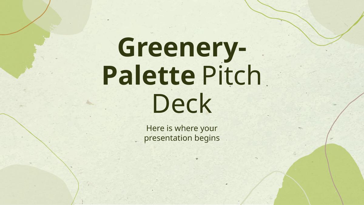
"Greenery-Palette Pitch Deck / Here is where your presentation begins." A clean, quiet cover in sage green with a hand-drawn terracotta texture. Design-wise it is genuinely good: high contrast, one focal line, no logo soup. The trap is what the placeholder teaches. A cover that says "here is where your presentation begins" trains you to write a label. Investor covers do work: company name, one-line category sentence, stage and round, date. "Acme — payroll for construction subcontractors. Raising $2.5M seed. May 2025." That single line is often the only thing an investor remembers after a full day of meetings.
Slide 2 — Content of this template
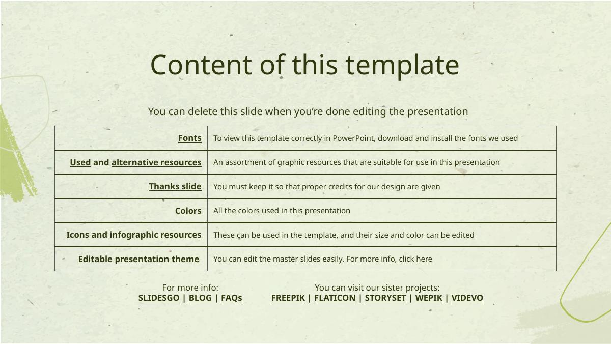
Housekeeping from Slidesgo: fonts to install, resources used, the mandatory "Thanks" attribution slide, the colour list, icon sets, and a note about editing master slides. It is explicitly marked "you can delete this slide when you're done editing." It is worth naming because deleting it is step one, and a surprising number of decks circulating in inboxes still carry template instruction slides. If a template slide survives into your data room, it tells the reader nobody read the deck end to end before sending it.
Slide 3 — Table of contents
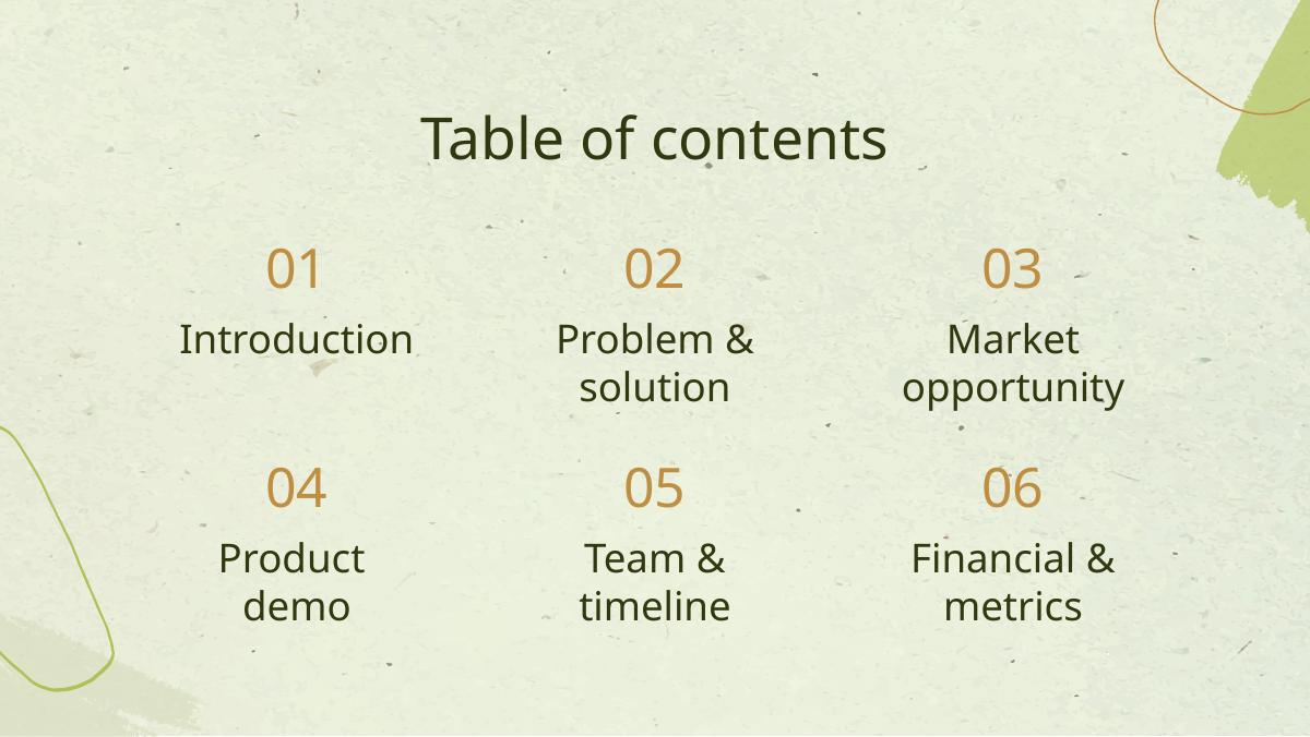
Six numbered sections: Introduction, Problem & solution, Market opportunity, Product demo, Team & timeline, Financial & metrics. As a running order this is defensible and close to the Sequoia sequence. As a slide it is dead weight. In a ten-minute meeting, an agenda slide spends your best attention window telling the investor what you are about to say instead of saying it. Keep the order; delete the page.
Slide 4 — Introduction (section divider)
The placeholder text is the well-travelled Slidesgo filler: "if you want to talk about Mercury, you can say that it's the smallest planet in the entire Solar System." Charming, and completely content-free. The structural point is that this deck opens with an introduction rather than a problem. Decks that raise money almost always open on the reader's side of the table — the customer's pain, the market shift, the thing that is now true that was not true three years ago — before they introduce themselves.
Slide 5 — What is a pitch deck?
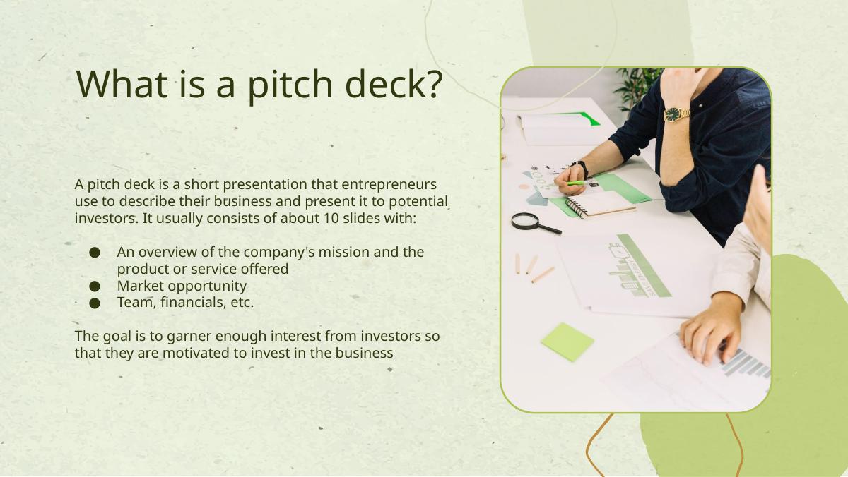
An explainer slide defining what a pitch deck is: about ten slides, an overview of mission and product, market opportunity, team, financials, with the goal of generating enough interest for investors to want to invest. This is a slide about pitch decks living inside a pitch deck. It is the clearest evidence that the file is a teaching artefact rather than a fundraising instrument, and it must be deleted before use. Left in, it reads as if the founder is explaining the format to the person who invented it.
Slide 6 — "02 Problem & solution" divider
A full-bleed section break. Dividers are a presentation convention borrowed from conference talks. In a deck that will mostly be read alone in a browser tab, each divider is a page of nothing between the reader and the next fact. One divider per major act is a reasonable ceiling; this template uses several.
Slide 7 — Introduction: our company / our idea
Two columns. "Our company" asks for who you are, what you do, why the product is unique and the value it provides. "Our idea" asks for the product/service explanation, how it works, customer value and the market opportunity. Read the instructions carefully and you will notice both columns ask for the same three things — value, uniqueness, market. This is the template's core failure mode: it repeats prompts rather than sequencing them. A founder filling this in honestly will write their value proposition three times in the first seven slides and still not have shown a single number.
Slide 8 — Main ideas of a pitch deck
Three columns of advice — Presentation, Investors, Value — telling you to be concise, to research investor preferences, and that value is what customers will pay. Again: advice, not a slide. In a live deck this real estate should hold the problem, stated as a specific, quantified pain for a named buyer.
Slide 9 — Key ideas in market opportunity
Four quadrants: research new markets, innovate solutions, stay ahead of trends, seasonal spikes. This is the market slide reduced to verbs. The quadrant layout is useful furniture, but the prompts push founders toward describing market behaviour rather than market size and access . Investors want to know how big the wedge is, how you reach the first thousand customers, and why now. None of those three questions is asked anywhere on this page.
Slide 10 — Six recommendations
A 3×2 grid: keep it simple, use visuals, keep it short, be memorable, test and iterate, focus on main points. Solid generic advice, and mildly self-refuting inside a 41-page file. Delete.
Slide 11 — Big numbers
Three oversized statistics: "300,000 users bought our product," "9h 55m 23s estimated delivery time per unit," "386,000 km average distance travelled by logistics team." The typographic treatment here is the best conversion asset in the template — one enormous figure, one short caption, nothing else. That is exactly how a traction slide should look. The placeholder metrics are a warning of their own, though: two of the three are operational vanity numbers. Delivery time per unit and kilometres travelled tell an investor nothing about whether the business compounds. Replace them with revenue, growth rate, retention and unit economics, and keep the layout.
Slide 12 — 500,300,000
"Number of users analyzed in our market research." A single huge number on a full page. This is the slide most likely to get a founder into trouble, because it invites a top-down market figure with no path attached. A half-billion-user TAM with no bottom-up build behind it reads as a red flag, not a green one. If you keep this page, use it for the number you personally earned — ARR, paying customers, weekly active users — not the one you found in a report.
Slide 13 — Revenue by quarter
Four bars labelled Q1 80%, Q2 100%, Q3 60%, Q4 80%, with a note to follow a link and paste your own data. Percentages of an unstated base are meaningless, and the placeholder shape — up, down, up — is not even a growth story. Real revenue slides use absolute currency on the y-axis, monthly not quarterly granularity for early-stage companies, and a visible inflection you can explain in one sentence.
Slide 14 — Competition comparison
A seven-row table of Companies A–G with columns for Features, Value, Pricing, Trial, Competence and Share, populated with car-industry filler ($23,000, $45,000, fuel economy, safety features). Two problems. First, seven competitors is too many; three named incumbents plus you is the readable maximum. Second, the columns are descriptive, not comparative — "Features: comfort" tells nobody why you win. Replace the columns with the two or three axes where you are structurally different, and put yourself in the table with your name on it, not as an anonymous letter.
Slide 15 — Product infographic
Six prompts arranged around a central graphic: Visuals, Features, Price, Users, Availability, Updates. This is the closest the template comes to a product slide, and it is organised as a spec sheet. Investors do not buy spec sheets. The strongest product slides show the product — a screenshot, a before/after, a thirty-second workflow — and let the features fall out of the picture.
Slide 16 — Timeline of your presentation
Eight steps describing how to structure the talk: overview, compelling introduction, pain points, how your product solves it, unique value, market analysis, financial needs and funding allocation, clear call to action. Buried in here is the single most valuable instruction in the whole file — "explain your financial needs and briefly outline your funding allocation" — and it is a bullet on a meta-slide rather than a slide of its own. The ask deserves a full page: amount, runway it buys, the three things the money is spent on, and the milestone it gets you to.
Slide 17 — Organizational chart
A four-level hierarchy: CEO, two department heads (Jane Smith, Mark Willson), four managers, five employees. This is the most actively harmful slide in the template. A seed-stage company that presents a four-tier org chart is signalling structure where an investor wants density — who these specific people are, what they built before, and why this founding team is unreasonably well suited to this problem. Replace the chart with four to six faces, one line of relevant credential each.
Slide 18 — Market size overview
Three stacked rectangles — $100M, $20M, $5M — labelled total market, target market and current market size. The pyramid is the right instinct and the numbers are the wrong scale for a venture pitch; a $100M total market is below the threshold most funds can underwrite. More importantly, the template asks for the boxes but never asks for the arithmetic. A credible market slide shows the multiplication: number of target accounts × realistic annual contract value = serviceable market, with a source for each factor.
Slide 19 — Roadmap infographic
A twelve-month Gantt chart with rows for Understanding, Conduct research, Brainstorm ideas, Develop a prototype, Test for usability and Analyze feedback. Notice what the default roadmap contains: research, ideation and prototyping. There is no ship date, no revenue milestone, no hiring plan. A funding-stage roadmap should be milestone-based, not activity-based — what will be true about the business in six, twelve and eighteen months, tied to the money you are raising.
Slide 20 — KPI dashboard
Three headline figures ($4,000,000 revenue, $100,000 general costs, $5,000 profit) plus an eight-row product table of units, revenue and returns. The placeholder data does not reconcile — revenue minus costs does not produce the stated profit, and the item table sums to numbers unrelated to the header. That is a template artefact, but it previews a real failure: the fastest way to lose an investor is a financial slide whose numbers do not tie out. Whatever you put here, check the arithmetic across every slide before you send it.
Slide 21 — Thanks and credits
Contact placeholders (youremail@freepik.com, +34 654 321 432, yourwebsite.com) and the Slidesgo attribution block that free users are required to keep. Two actions before this deck ever reaches an investor: replace the contact details with real ones, and either purchase the licence or accept that a Freepik credit line will sit at the bottom of your final slide. Neither is fatal; both are noticed.
What this deck does better than most startup pitch decks
Restraint in the typography. Playfair Display for headings against DM Sans for body is a genuinely high-quality pairing, and the deck holds two type sizes per slide instead of five. Most founder decks fail on visual noise long before they fail on content. · A calm, non-default palette. Sage, cream, terracotta and deep olive read as considered rather than corporate. It photographs well on a projector and survives being printed in a data room. · The big-number layout on slides 11 and 12. One figure, one caption, nothing else, is the correct treatment for traction and it is the most transferable asset in the file. · A defensible running order. Introduction → problem and solution → market → product → team and timeline → financials is close to the sequence funds expect, even if the execution inside each section is thin. · Consistent grid discipline. Margins, column widths and vertical rhythm hold across all 21 slides — something surprisingly few founder-built decks manage past slide eight.
Where this deck would fail in an investor meeting
There is no ask. No slide states an amount, a valuation, a use of funds or a runway. The only mention of financing is a bullet on the meta-timeline slide. A deck without an ask does not create a decision. · There is no problem slide. Section 02 is titled "Problem & solution" and then spends its pages on advice about presenting, investors and value. The reader never sees a specific pain suffered by a specific person. · Six of 21 slides are meta. Table of contents, "what is a pitch deck", main ideas, six recommendations, timeline of your presentation and the template contents page all talk about pitching instead of pitching. · The team slide is an org chart. Titles instead of track record — the exact inverse of what early-stage investors underwrite. · Vanity metrics are baked into the defaults. Kilometres travelled and users analysed sit where revenue, retention and growth rate belong. · The numbers do not reconcile. Revenue, costs and profit on the KPI slide are mutually inconsistent, and quarterly revenue is expressed in unanchored percentages. · Twenty of the 41 pages are licence and resource boilerplate that must be manually stripped before the file is fit to send.
Template structure vs. an investor deck
Slide job Greenery Palette template What an investor deck does
Cover Deck name + "here is where your presentation begins" Company, one-line category, stage, round size, date
Opening Introduction to your company The problem, quantified, from the customer's point of view
Market Four advice quadrants + a $100M/$20M/$5M pyramid Bottom-up build: accounts × contract value, with sources
Product Six-prompt spec infographic Screenshot or workflow showing the product doing the work
Competition Seven anonymous companies, six descriptive columns Three named incumbents on two axes where you structurally win
Traction Big placeholder numbers: users, delivery time, kilometres Revenue, growth rate, retention, unit economics
Team Four-tier org chart with 12 named boxes Four to six people, one line of earned credential each
Roadmap Gantt of research, ideation and prototyping Milestones tied to the money being raised
Ask Absent Amount, runway, allocation, the milestone it unlocks
Close "Thanks!" + template credits Contact, next step, and the one number you want remembered
How you would rebuild this template into a fundable deck
Delete the six meta slides. Contents page, "what is a pitch deck", main ideas, six recommendations, presentation timeline and the template instructions all go. You are now at fifteen pages. · Rebuild slide 4 as the problem. One sentence naming who hurts, one number sizing the hurt, one line on what they do today instead. Keep the layout; replace the Mercury filler. · Turn slide 7 into the solution in one line. Two columns become one sentence and one image: what you built, who it is for, what changes for them. · Rebuild slide 18 bottom-up. Show the multiplication, cite each factor, and stop at a serviceable market you can defend rather than a total market you found. · Keep slides 11 and 12 and change the metrics. Revenue, growth rate, retention and one efficiency number. Same typography, honest content. · Cut the competition table from seven rows to four, put your own name in it, and reduce the columns to the two axes that decide deals in your category. · Replace the org chart with faces. Founders first, one credential each, and a line on why this team specifically. · Convert the Gantt into milestones. Three columns — next six, twelve, eighteen months — each with the business outcome, not the activity. · Add the slide that is missing entirely: the ask. Amount, use of funds in three buckets, runway in months, and the milestone the round buys. · Reconcile every number twice and make the last slide a next step, not a thank-you.
The transferable lesson
A template can give you a grid, a typeface and a running order. It cannot give you an argument. The Greenery Palette deck is above average on all three of the things design solves and silent on all of the things investors actually decide on — the problem, the evidence, the team's right to win, and the ask. Founders who download files like this one usually end up with a deck that looks finished and says nothing, which is a worse position than an ugly deck with a sharp argument, because nobody tells you why the meeting did not convert.
The useful exercise is to take whichever template you started from and ask, page by page, the question an investor is silently asking: so what? If a slide cannot answer it with a fact, a number or a name, it is furniture. Cut it. Fifteen slides that each answer the question beat twenty-one that look consistent.
If you have already filled in a template like this one, the fastest way to find out whether the argument survived the layout is to score the deck the way an investor reads it — structure, clarity, evidence and ask — before you send it to anyone whose opinion you cannot afford to spend twice.
Frequently asked questions
- Is the Greenery Palette pitch deck a real startup deck?
- No. It is a free presentation template published by Slidesgo in April 2025 and created in LibreOffice Impress. Every figure on it, including 300,000 users, $4,000,000 in revenue and a $100M market, is placeholder content that shipped with the file. There is no company, round or outcome behind it, so it should be read as an instruction set rather than a pitch.
- How many slides are in the Greenery Palette pitch deck template?
- The download is 41 pages, but 20 of those are Slidesgo housekeeping: licence terms for free and premium users, alternative resource links, editable icon sheets and graphic libraries. The 21 remaining slides are the ones a founder would keep, and roughly a dozen of those carry real structural content once dividers and credits are removed.
- Which slides in this template should founders keep?
- Keep the big-number traction layout on slides 11 and 12, the market-size pyramid structure on slide 18, the competition table on slide 14 reduced to four rows, the product page on slide 15 rebuilt around a screenshot, and the roadmap on slide 19 converted from activities to milestones. The typography and palette are worth keeping throughout.
- Which slides should founders delete before pitching?
- Delete the template contents page, the table of contents, the slide titled What is a pitch deck, the Main ideas of a pitch deck slide, the Six recommendations grid and the Timeline of your presentation slide. All six talk about pitching instead of pitching, and leaving any of them in signals that the file was never read end to end.
- What is missing from the Greenery Palette pitch deck template?
- The ask. No slide states an amount raised, a valuation, a use of funds or a runway; the only mention of financing is a bullet on a meta slide about structuring your talk. A problem slide is also missing: the section labelled Problem and solution contains presentation advice rather than a specific, quantified customer pain.
- Can you use Slidesgo pitch deck templates commercially?
- Slidesgo allows free users to modify the template and use it for personal and commercial projects, provided the Thanks attribution slide is kept. Premium users may remove the attribution. Neither tier allows reselling, sublicensing or redistributing the template. For a fundraise, either buy the licence or accept a Freepik credit line on your final slide.