The Paubox deck is an outlier in the world of fundraising, consisting of only seven slides with minimal text. It eschews traditional sections like 'Competition,' 'Business Model,' and 'Product Roadmap' entirely. Instead, it relies on three core pillars: a clear problem statement (HIPAA compliance friction), a massive market opportunity ($4.3B), and undeniable traction (growing to $33K MRR by late 2015). The deck serves as a high-level visual aid for a verbal presentation rather than a standalone document. While it lacks the granular data usually required for due diligence, its simplicity ensu…
Key takeaways
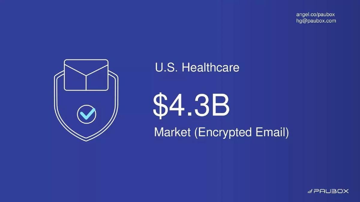
- The deck focuses on a specific niche: the $4.3B U.S. Healthcare encrypted email market as shown on slide 4.
- Traction is the centerpiece, featuring a graph that shows growth from near-zero to $33K MRR between January 2015 and the time of the pitch on slide 3.
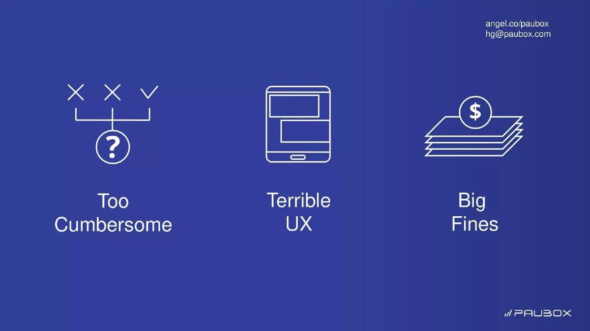
- The problem is framed through three pain points: 'Too Cumbersome,' 'Terrible UX,' and 'Big Fines' on slide 2.
- Social proof is established using a single, large-scale customer logo: Martin Luther King, Jr. Community Hospital on slide 5.
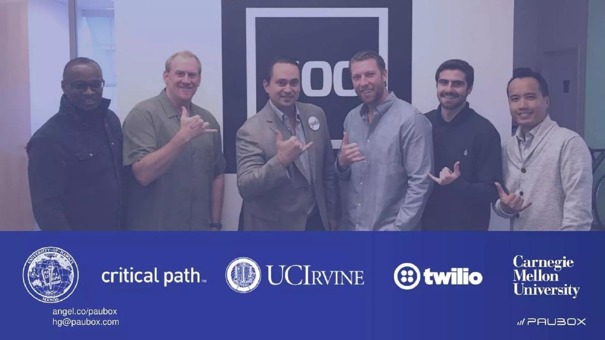
- The team slide (slide 6) uses logos from Twilio, UC Irvine, and Carnegie Mellon to imply pedigree without listing specific roles or bios.
- The deck completely omits a formal 'Ask' slide, leaving the funding requirements to the catalogue facts which state a total raise of $14,800,000.
- There is no mention of competitors or the specific technical mechanism of how the email encryption works.
- The entire deck contains fewer than 100 words, prioritizing visual impact over detailed explanation.
The 7-Slide Strategy: Traction Over Talk
The Paubox pitch deck from 2015 is a study in extreme brevity. At only seven slides, it ignores almost every conventional rule of deck construction. There are no bullet points, no competitive matrices, and no financial projections beyond a single historical revenue chart. According to catalogue facts, the company eventually raised $14,800,000, proving that a clear value proposition and early revenue can overcome a lack of slide volume.
Paubox positions itself as the solution to a very specific, high-stakes problem: HIPAA-compliant email. In the healthcare industry, sending sensitive data via email is traditionally a user-experience nightmare involving portals and passwords, or a legal nightmare involving massive fines. Paubox’s deck focuses entirely on the fact that they have made this process easy and that people are paying for it.
Slides 1-2: The Hook and the Pain
Slide 1: Title Slide The deck opens with a simple logo and the tagline: "The Easiest Way to Send and Receive HIPAA Compliant Email." This is a perfect one-sentence pitch. It identifies the target market (HIPAA/Healthcare), the product (Email), and the primary differentiator (Easiest). Notably, the slide includes contact information and an AngelList URL in the top right corner, a trend common in 2015.
Slide 2: The Problem Rather than listing statistics about data breaches, Paubox uses three icons to represent the status quo: "Too Cumbersome," "Terrible UX," and "Big Fines." This slide addresses both the user (who hates the software) and the administrator (who fears the legal consequences). By keeping the text minimal, the deck forces the audience to listen to the founder's explanation of why existing solutions fail.
Slides 3-4: The Proof and the Potential
Slide 3: Traction (MRR) This is the most important slide in the deck. It shows the Paubox MRR from January 2015 to the "Present" (likely late 2015). The graph shows a steady climb followed by a sharp hockey-stick inflection point, ending at $33K . Highlighting a specific, growing revenue figure is the fastest way to build investor confidence. It proves that the "Terrible UX" mentioned on the previous slide is a problem customers are willing to pay to solve.
Slide 4: Market Size Slide 4 identifies the "U.S. Healthcare $4.3B Market (Encrypted Email)." This is a classic TAM (Total Addressable Market) slide. It is simple and bold. While it lacks a breakdown of how they arrived at that number, it sets the scale of the ambition. In a deck this short, the goal isn't to prove the math, but to show that the ceiling is high enough to justify venture investment.
Slides 5-7: Validation and The Team
Slide 5: The Anchor Customer Instead of a "Customer Logos" slide with twenty tiny icons, Paubox chooses to feature one: "Martin Luther King, Jr. Community Hospital." This is a strategic choice. By highlighting a major hospital system, they demonstrate that their "Easy UX" solution is robust enough for enterprise-level healthcare providers. This single logo acts as a massive piece of social proof.
Slide 6: The Team The team slide features a group photo of six men and a row of logos: University of Hawaii, Critical Path, UC Irvine, Twilio, and Carnegie Mellon. There are no names (other than the founder on the next slide) and no titles. The logos do the talking, implying a mix of technical expertise (Twilio, Carnegie Mellon) and industry experience. It is a minimalist approach to establishing pedigree.
Slide 7: Contact The deck ends as simply as it began. It lists the founder, Hoala Greevy, his email, and the AngelList link. There is no "Ask" slide. There is no mention of how much money they want or what they will do with it. This suggests the deck was used as a teaser or a visual aid for a conversation where the deal terms were discussed separately.
What Works in the Paubox Deck
Clarity of Purpose: Within three slides, you know exactly what they do, who they do it for, and that they are making money. Most decks take 10 slides to achieve this level of clarity.
Visual Consistency: The use of a consistent blue background and white iconography makes the deck feel professional despite its lack of content. It doesn't look like a template; it looks like a brand.
The Traction Curve: The MRR graph on slide 3 is the star of the show. For a seed-stage or early Series A company, showing a move from $5k to $33k MRR in less than a year is a powerful narrative of momentum.
What is Missing
The "How": There is zero technical explanation. Does it require a plugin? Is it a gateway? How does it stay compliant? Investors usually want to see the "secret sauce" or the moat that prevents a competitor from doing the same thing.
Competition: The deck ignores the existence of incumbents like Zix or Cisco. Failing to acknowledge competition can sometimes be seen as a red flag, suggesting the founders don't know the landscape—though in this case, the traction suggests they were winning regardless.
Business Model: While we see MRR, we don't know the pricing structure. Is it per seat? Per message? Is it a SaaS model or a usage-based model? This information is vital for understanding long-term scalability.
The Ask: A pitch deck without an ask is technically just a company overview. To be a true fundraising tool, it should specify the round size and the milestones that capital will help reach.
What a Founder Should Copy
The "One Big Logo" Strategy: If you have one incredible customer, don't hide them in a grid of ten mediocre ones. Give them their own slide. It carries more weight.
Focus on UX as a Differentiator: In regulated industries (like healthcare, legal, or finance), the "problem" is often that the existing compliant tools are unusable. Paubox correctly identified that "Easy" is a feature worth millions.
Minimalist Team Pedigree: If your team has worked at famous companies or attended top schools, use the logos. It is a visual shorthand that investors process instantly, allowing you to spend more time talking about the future and less time reading resumes.
Conclusion
The Paubox deck is a reminder that venture capital is ultimately a bet on momentum and market opportunity. While this deck wouldn't pass a rigorous due diligence process on its own, its 7-slide structure is an incredibly effective way to get an investor to say, "Tell me more." It strips away the noise and focuses on the only three things that matter in an initial pitch: a real problem, a big market, and a product that people are actually buying.
Frequently asked questions
- How did Paubox raise $14.8M with only 7 slides?
- The $14.8M figure represents the total raised over time, but this specific deck was likely used for an early-stage round where traction was the primary selling point. By showing a steep MRR growth curve to $33K (Slide 3) and a major hospital client (Slide 5), the founders proved product-market fit. In early-stage investing, clear momentum often outweighs a 30-page technical breakdown.
- What is missing from the Paubox pitch deck?
- Almost everything standard is missing. There is no slide for unit economics, go-to-market strategy, competitive landscape, or the specific 'Ask' (how much they are raising). It also lacks a product demo or explanation of the technology. This suggests the deck was designed to be presented live, where the founder would fill in these gaps verbally.
- Is the market size of $4.3B realistic for encrypted email?
- Slide 4 claims a $4.3B market for encrypted email in U.S. Healthcare. While this is a specific figure, the deck does not provide a source or a bottom-up calculation (TAM/SAM/SOM). For investors, this number serves to signal that the opportunity is large enough to support a venture-scale return, even if the specific math isn't on the page.
- Why does the team slide only show logos?
- Slide 6 features a photo of six team members and logos for University of Hawaii, Critical Path, UC Irvine, Twilio, and Carnegie Mellon. This is a common 'shorthand' technique. Instead of writing long bios, the founders use recognizable brands to borrow credibility, suggesting the team has experience at high-growth tech companies and prestigious academic institutions.
- Should I copy this minimalist style for my own deck?
- Only if you have the traction to back it up. Paubox's Slide 3 (the MRR graph) does the heavy lifting. If your growth is flat or your product is unproven, a 7-slide deck will look like a lack of effort. This style works best for founders who want to control the narrative during a live meeting rather than sending a deck for asynchronous review.