The Utrust pitch deck is a masterclass in minimalism, perhaps to a fault. Spanning only 11 slides, it relies heavily on iconography and high-fidelity product mockups rather than dense data or financial projections. Raised during the 2017 crypto boom, the deck successfully positioned the company as a bridge between traditional commerce and digital currencies by highlighting a '760k+ total merchants pool' and '20M+ direct access customers' through its partner network. However, the deck is notably missing a team slide, a business model slide, and a specific financial 'ask.' It functions more as…
Key takeaways
- The deck uses a minimalist 11-slide structure that prioritizes visual communication over text-heavy explanations.
- Slide 8 highlights significant reach through partnerships, claiming a pool of 760k+ merchants and 20M+ customers.
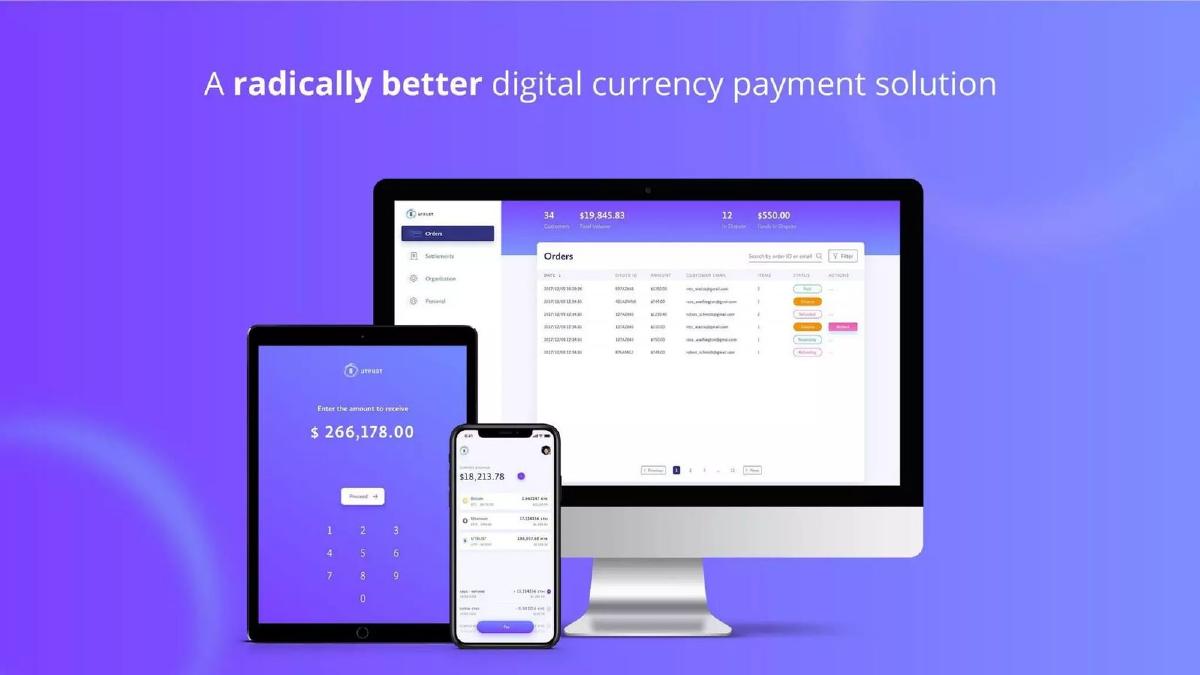
- Product readiness is demonstrated on Slide 4 through high-fidelity mockups across desktop, tablet, and mobile interfaces.
- The roadmap on Slide 7 shows a transition from 'Initial Funding' in 2017 to 'Regulatory compliance' in 2018.
- The deck completely omits a team slide, which is highly unconventional for a $21 million raise.
- There is no mention of the specific amount being raised or the valuation within the slides themselves.
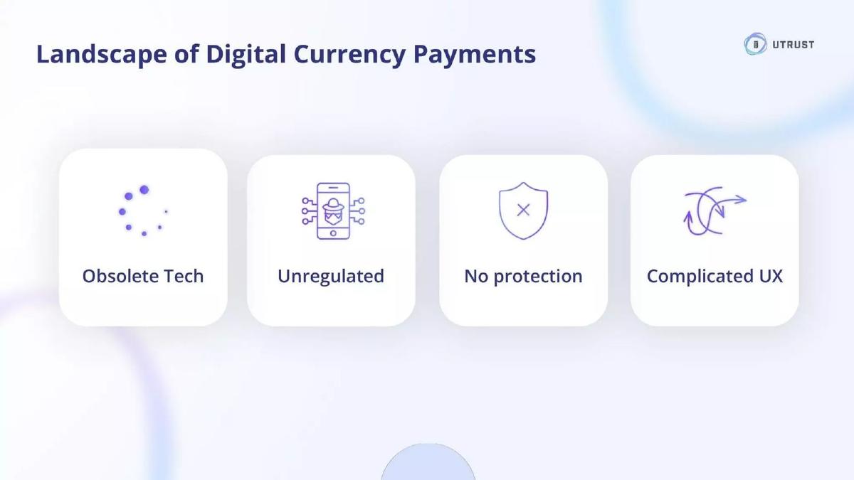
- The 'Landscape' slide (Slide 5) identifies 'Obsolete Tech' and 'No protection' as the primary industry pain points.
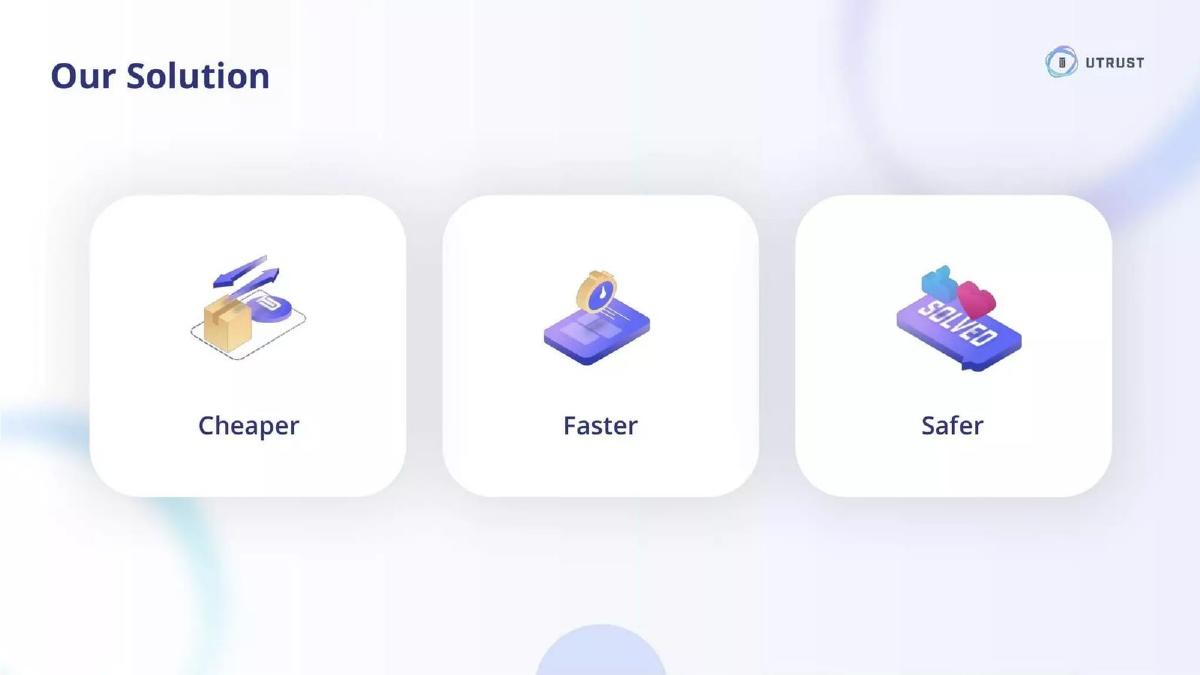
- Slide 6 defines the value proposition in three words: 'Cheaper, Faster, Safer,' without providing specific percentage improvements.
The Minimalist Vision of Utrust
The Utrust pitch deck, used to secure $21,000,000 in 2017, is a striking example of the 'less is more' philosophy. In an era where crypto whitepapers were often 50 pages of dense technical jargon, Utrust opted for an 11-slide visual narrative. This deck doesn't try to prove the math; it tries to sell a future where digital payments are as seamless as traditional ones. By focusing on high-level concepts like a 'Cashless Society' and 'Digital Ownership,' the company positioned itself as a foundational layer for the next generation of commerce.
Slide 1: Title and Branding
The deck opens with a clean, purple-to-blue gradient background featuring the Utrust logo and the tagline: "Digital Payments made Simple." The inclusion of the website URL immediately directs investors to a live environment, which is a subtle way of signaling that the project is more than just a concept. The branding is professional and leans into the 'fintech' aesthetic rather than the 'hacker' aesthetic common in early crypto projects.
Slides 2-3: The Macro Context
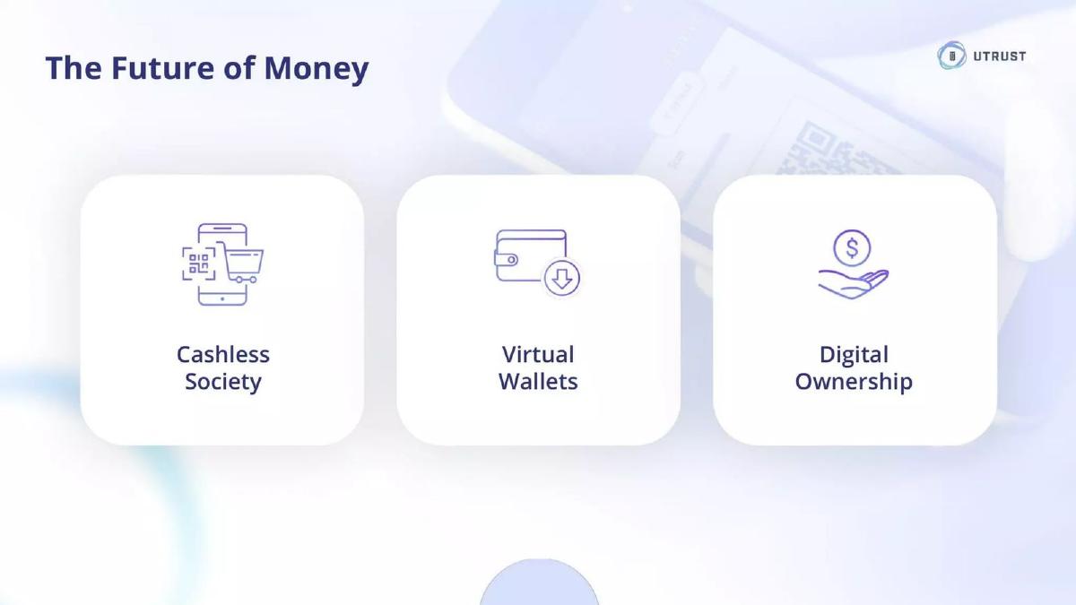
Slide 2, titled "The Future of Money," uses three simple icons to define the market drivers: Cashless Society, Virtual Wallets, and Digital Ownership. This is a classic 'Why Now?' slide, though it lacks specific data points to back up these trends. It assumes the investor already believes in the shift toward digital assets.
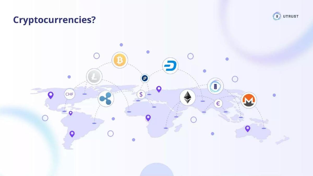
Slide 3 features a world map with various cryptocurrency logos (Bitcoin, Ethereum, Litecoin, Monero, Dash, Ripple) and fiat symbols (CHF, $, €). The title "Cryptocurrencies?" suggests a fragmented market that needs a unifying solution. The map indicates a global problem, setting the stage for a global solution. The visual clutter of the icons connected by dotted lines represents the current complexity Utrust intends to solve.
Slide 4: The Product Reveal
This is arguably the strongest slide in the deck. Under the header "A radically better digital currency payment solution," Utrust displays high-fidelity mockups of their interface on a desktop monitor, a tablet, and a smartphone. The desktop view shows an 'Orders' dashboard with clear status indicators like 'Paid,' 'In Dispute,' and 'Refunded.' The mobile view shows a balance of $18,213.78 and a breakdown of holdings. This slide proves the team has considered the user experience (UX) for both the merchant (dashboard) and the consumer (wallet).
Slides 5-6: Problem and Solution
Slide 5, "Landscape of Digital Currency Payments," identifies four specific pain points: Obsolete Tech, Unregulated, No protection, and Complicated UX. By highlighting 'No protection,' Utrust hints at its unique value proposition: a consumer protection layer for crypto transactions, similar to PayPal.
Slide 6, "Our Solution," responds directly to the previous slide with three icons labeled Cheaper, Faster, and Safer. While these are standard claims in the payments industry, the simplicity of the presentation makes the message unmistakable. However, the deck misses an opportunity here to explain how it is cheaper or how the safety mechanism works technically.
Slide 7: The Roadmap
The roadmap, titled "From Inception to Business," is divided into 2017 and 2018. For 2017, it lists Initial Funding and MVP . For 2018, it targets Tech Development, Regulatory compliance, Business Partnerships, and Marketing. The inclusion of 'Regulatory compliance' is a critical signal to institutional investors that the company is not looking to bypass legal frameworks—a common fear in the 2017 crypto market.
Slide 8: Traction and Ecosystem
This is the 'Big Number' slide. It claims a "760k+ total merchants pool," "20M+ direct access customers," and presence in "180+ countries." Below these figures is a 'wall of logos' including Uphold, Magento, Payrexx, Swisscom Blockchain, and Nexo. This slide is designed to show that Utrust isn't building a silo; it is integrating into the existing e-commerce infrastructure. By partnering with platforms like Magento, they gain theoretical access to every merchant on that platform.
Slides 9-10: Global Scale and Growth Strategy
Slide 9, "Technology Live & Global," features another world map, reinforcing the 'Live with first partners' status. It’s a bit redundant following Slide 8 but serves to emphasize that the product is not vaporware.
Slide 10, "Growth & Scale," identifies the three pillars of their go-to-market strategy: Financial Institutions, Payment Service Providers, and Merchants. This indicates a B2B2C approach, where Utrust acts as the plumbing for larger entities rather than just trying to acquire individual merchants one by one.
Slide 11: The Contact Slide
The deck concludes with the logo, the website, the Twitter handle (@UTRUST), and an investor relations email. Notably, there is no 'Ask' slide. There is no mention of how much money is being raised, what the valuation is, or what the specific use of funds will be. In the context of a 2017 ICO or private sale, these details were often handled in a separate 'Terms' document or on the token sale website.
What Works in the Utrust Deck
The primary strength of this deck is its visual clarity . In a sector (crypto) known for over-complicating simple concepts, Utrust stays remarkably focused. The product mockups on Slide 4 are professional and look 'ready for market,' which builds immediate trust with an investor. The use of a 'merchant pool' metric on Slide 8 is a clever way to show massive potential reach without having to claim 760,000 active direct customers, which would have been unbelievable for a Seed stage startup.
The deck also does a good job of framing the problem . By identifying 'No protection' as a key landscape issue, Utrust carves out a niche. Most crypto payment processors at the time were focused solely on the transaction; Utrust focused on the trust between the buyer and seller, which is a much more relatable problem for traditional commerce.
What is Missing from the Utrust Deck
The omissions in this deck are significant and would be fatal in a traditional VC setting. First and foremost, there is no team slide . Investors invest in people, especially at the Seed stage. Not seeing the faces or backgrounds of the founders is a major red flag. Second, there is no business model . We know they process payments, but we don't know their fee structure, their margins, or their path to profitability.
Furthermore, the deck lacks a competitive analysis . While they mention the 'landscape,' they don't name competitors like BitPay or Coinbase Commerce. Acknowledging competitors and explaining why you are better is a sign of market maturity. Finally, the lack of a clear 'Ask' makes the deck feel more like a marketing brochure than a fundraising tool. An investor should leave a pitch knowing exactly what the company needs and what they will do with it.
What a Founder Should Copy
Founders should emulate Utrust’s commitment to high-quality design . A clean, well-branded deck suggests a clean, well-branded product. The way they grouped their roadmap (Slide 7) into thematic buckets rather than a long list of dates is also a best practice; it shows strategic thinking rather than just a task list.
Another takeaway is the 'Platform Play' strategy shown on Slide 8. If you are a B2B startup, don't just list your five small customers; list the total reach of your integration partners. It paints a picture of the 'ceiling' of your business. However, founders should be careful to label these as 'potential reach' or 'partner pool' to maintain honesty. Lastly, the three-word value proposition ( Cheaper, Faster, Safer ) is a great example of how to distill a complex technical product into a message that a non-technical investor can understand in three seconds.
Final Analysis
The Utrust deck is a product of its time—a high-gloss, high-vision document designed for a fast-moving, hype-driven market. While it lacks the structural rigour required for a 2024 Series A, its ability to communicate a global scale and a 'radically better' user experience through minimal text is something every founder can learn from. It succeeds in making crypto payments look 'simple,' which was exactly what the market was looking for in 2017.
Frequently asked questions
- How did Utrust raise $21 million with such a short deck?
- Utrust raised its capital in 2017, a year defined by the cryptocurrency boom. During this period, many projects raised funds via Initial Coin Offerings (ICOs) or specialized crypto-seed rounds where the community's focus was on the technical vision, the scale of the potential network, and the quality of the product interface. The deck’s focus on a '760k+ merchant pool' (Slide 8) provided the necessary scale narrative to justify a large raise.
- Why is the lack of a team slide significant?
- In traditional venture capital, the team is often considered the most important slide, especially at the Seed stage. Omitting it suggests either that the founders were already well-known in the crypto space or that the deck was intended to be paired with a comprehensive whitepaper or website that detailed the leadership. For a standard startup, omitting the team is generally a disqualifying mistake.
- What does '760k+ total merchants pool' actually mean?
- This figure on Slide 8 likely refers to the aggregate reach of Utrust's integration partners, such as Magento or Payrexx, rather than merchants directly signed to Utrust at that moment. By listing logos like Magento and Uphold, Utrust is demonstrating 'platform play' potential—showing that their technology can be toggled on for an existing massive user base rather than building from zero.
- Is the lack of financial projections a problem?
- For a Seed round in a nascent industry like crypto-payments in 2017, detailed five-year projections were often viewed as speculative fiction. However, the total absence of a business model—explaining how they take a cut of transactions—is a weakness. The deck relies on the assumption that 'Cheaper' and 'Faster' (Slide 6) will inherently lead to a profitable volume-based business.
- How does the deck handle competition?
- It avoids a traditional 'competitor grid.' Instead, Slide 5 ('Landscape of Digital Currency Payments') frames the entire existing market as the competition, characterizing it as 'Obsolete Tech,' 'Unregulated,' and having 'Complicated UX.' This positioning allows Utrust to present itself as the first 'modern' solution rather than fighting for market share against specific named rivals.