Brightbox's 23-slide file, titled 'Target - Mar 2017 v2' and saved in Keynote in May 2017, is an enterprise sales and partnership deck built for one named retail prospect — not an investor pitch. Read as a sales deck it does several things well: it names real institutional customers including NewYork-Presbyterian, Hyatt, American Airlines and the Kennedy Center, pre-answers the certification, PCI and installation objections that kill hardware deals, and mocks the product up inside Target's own REDcard and newsletter campaigns. Its structural failure is ordering: that customer logo wall — the…
Key takeaways
- Brightbox's 23-slide 'Target - Mar 2017 v2' file is an enterprise sales and partnership deck built for a single named retail prospect, not an investor pitch deck — it contains no funding ask, no financials, no team slide, no market size and no competition slide.
- The strongest slide in the deck is the last one: a customer logo wall naming NewYork-Presbyterian, Baystate Health, Orlando Health, Frontier Communications, IMG College, Hyatt, American Airlines, SeaWorld, Cadillac and the Kennedy Center, positioned at slide 23 of 23.
- Not one of those customer logos carries a number — no installed unit counts, no sessions per day, no impressions, no opt-in rates, no renewal rates — in a deck whose entire value proposition is audience measurement.
- The deck's only sourced external statistic, 'smartphone thefts doubled in 2014' from Consumer Reports 2015, is three years stale in a 2017 deck and describes a trend the industry kill-switch rollout had already reversed.
- The '95% of over 2,000 shoppers' claim on slide 4 has no source, date or methodology, and asks self-selected users of a free amenity whether that amenity improved their experience.
- There is no pricing, revenue-share, lease rate, pilot structure or ROI model anywhere in 23 slides, so a reader cannot tell who pays whom for what — the single biggest gap in an otherwise competent B2B sales deck.
- Slides 14 and 15, which mock up the product with the prospect's own REDcard, newsletter and app-download campaigns, are the most persuasive pages in the file and do not appear until two-thirds of the way through.
- The deck promises 'no data connection' as a privacy feature on slide 6, offers to 'capture (opt in or not)' consumer data on slide 7, and deploys an on-unit camera for demographic audience measurement on slide 17 — three positions it never reconciles.
What this deck actually is
Twenty-three slides, 4:3 landscape at 1024 x 768pt, built in Keynote on macOS and saved on 22 May 2017 . The internal document title is "Target - Mar 2017 v2" , and the cover reads: "2017 — HIGHLY SECURE SMARTPHONE RECHARGING & MARKETING PLATFORM FOR TARGET" .
That is the single most important fact about this file, and it is the reason it has to be read differently from every other deck in this series. This is not an investor deck. It is a B2B enterprise sales and partnership deck, version two, built for one named prospect — Target, the US retailer — by Brightbox Inc., a company selling secure smartphone-charging kiosks with an advertising and data-capture layer bolted on top.
You can tell from the structure alone. There is no funding ask, no valuation, no cap table, no financials, no revenue, no unit economics, no team slide, no market size, no competition slide and no use of funds. Instead there is a company overview, a value proposition, hardware specifications, mounting options, cable counts, amperage ratings, certification lists, colour choices, base-plate dimensions ("20" by 30""), portal screenshots, four consecutive slides of deployment photographs and a customer-logo wall. That is a corporate capabilities deck. Its job is not to get a wire; it is to get a pilot in a handful of stores.
Judged as a sales deck, it does several things genuinely well — better than most investor decks manage, in fact. Judged as a document you could put in front of an investor, it is missing almost everything. Both statements are true at once, and the gap between them is the lesson worth extracting, because founders reuse the sales deck as the fundraising deck constantly and it fails for reasons they never diagnose.
The customer-logo wall is the strongest slide, and it is last
Slide 23, titled "PARTNERS / SOME OF OUR GREAT CUSTOMERS", is a grid of real, recognisable institutional logos: NewYork-Presbyterian, Baystate Health, Orlando Health, WMC Health, Frontier Communications, IMG College, Hyatt, American Airlines, SeaWorld, Dream Hotels, Cadillac, the Kennedy Center and more. Slide 4 adds a named testimonial from an Assistant GM at Memorial City Mall . Slide 19 shows a deployment with Citi branding on the unit. Slide 3 quotes a customer at the Statue of Liberty in NYC .
Taken together, that is the proof that the product ships, installs, survives real venues, and has been bought by procurement departments at hospitals, airlines, hotels and arenas. For a hardware company selling into a Fortune 50 retailer, that is the whole argument: we are not a prototype, we are already in your peer set's buildings.
It appears on slide 23 of 23. The reader reaches it — if they reach it at all — after eighteen slides of features and four slides of deployment photography. A named-logo wall of that quality belongs on slide 2 , or in the top-right corner of the cover. In an enterprise sale, existing comparable customers are the risk-reduction argument, and risk reduction is what a corporate buyer is actually shopping for. Burying it behind the spec sheet inverts the order of persuasion.
The related miss: those logos are only logos. There is not one number attached to any of them. No installed unit count, no sessions per unit per day, no dwell-time lift, no impression volume, no opt-in rate, no renewal rate, no length of relationship. A deck that can credibly say "Hyatt" can almost certainly also say "X units across Y properties since 20ZZ, averaging N sessions a day" — and the second version is the one a Target category manager can take into their own internal meeting.
Every quantified claim in the deck is unsourced, undated, or both
The deck makes exactly three numeric claims about the world, and all three have a problem.
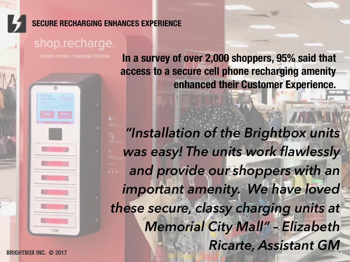
1. "In a survey of over 2,000 shoppers, 95% said that access to a secure cell phone recharging amenity enhanced their Customer Experience." (Slide 4.) No source, no date, no methodology, no venue, and crucially no disclosure of who ran it. A 95% agreement rate on a leading question — did the free thing you just used improve your experience? — asked of people who by definition chose to use the amenity is a satisfaction survey of users, not evidence of demand among non-users. It may well be Brightbox's own data, which would be fine to present, if it said so.
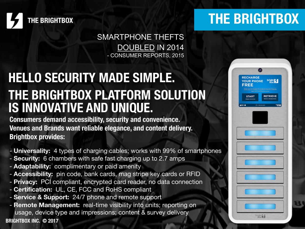
2. "SMARTPHONE THEFTS DOUBLED IN 2014 — Consumer Reports, 2015." (Slide 6.) This one is properly attributed, which is more than the other two manage. But it is being used in a 2017 deck to justify buying a product now, and it describes a change that happened three years earlier. Worse, the underlying trend had already reversed: the industry-wide kill-switch rollout was widely reported to have pushed smartphone thefts down across 2015 and 2016. Using a stale statistic that the buyer's own comms team can disprove in one search is a self-inflicted wound on the credibility of the entire deck.
3. "works with 99% of smartphones" and "safe fast charging up to 2.7 amps" . (Slide 6.) The amperage is a hardware fact and reads fine. The 99% is a compatibility claim resting on "4 types of charging cables" — plausible in 2017, but stated with no basis and no as-of date, in a category where connector standards were actively churning.
Notice what is not quantified anywhere across twenty-three slides: how many units are deployed, how many charging sessions have occurred, how many impressions have been served, what an average opt-in rate looks like, what a survey response rate looks like, what dwell-time lift has been measured at, or what any existing customer paid. A deck built entirely around the promise of measurement contains no measurements.
The pricing slide does not exist
There is no commercial slide in this deck. No price per unit, no lease rate, no revenue share, no ad-inventory pricing, no installation cost, no service contract, no minimum term, no pilot structure and no ROI model.
Slide 6 says the units can be deployed as a "complimentary or paid amenity" and slide 7 says a complimentary amenity will "drive immediate revenue" for the venue — but the deck never explains who pays whom for what. Does Target buy the kiosks? Lease them? Take a cut of paid charging? Does Brightbox monetise the ad screen and pay Target for floor space? Does Target pay for the data? Four completely different business relationships are compatible with the words on these slides.
For a first-meeting capabilities deck, deferring price is a defensible choice — you do not want to anchor before you have scoped. But deferring the shape of the deal is not. A single slide reading "Pilot: N units, M stores, 90 days, we install and operate, you evaluate on these three metrics" would convert this from a brochure into a proposal, and it is the one slide a corporate buyer needs in order to say yes to anything.
Slide-by-slide walkthrough
Slide 1 — Cover
The Brightbox wordmark on a photographic background, with "2017", "HIGHLY SECURE SMARTPHONE RECHARGING & MARKETING PLATFORM" and "FOR TARGET". Naming the prospect on the cover is the right instinct in enterprise sales — it signals the deck was built for them, not forwarded. What is absent is any proof marker: no "trusted by 40+ venues including Hyatt and NewYork-Presbyterian", no unit count, no year founded.
Slide 2 — Company overview
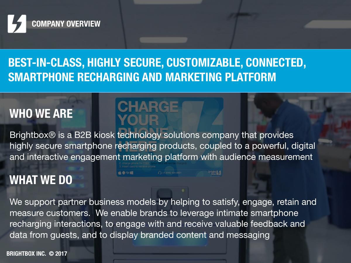
Two blocks: "WHO WE ARE" ("a B2B kiosk technology solutions company that provides highly secure smartphone recharging products, coupled to a powerful, digital and interactive engagement marketing platform with audience measurement") and "WHAT WE DO".
The information is correct and the structure is clean, but the prose is doing the classic corporate thing where adjectives replace facts: best-in-class, highly secure, customizable, connected, powerful, interactive . Strip the adjectives and the sentence is "we make charging lockers with a screen that shows ads and collects data" — which is clearer, more confident and shorter. Nothing on this slide says how long the company has existed or how many units are in the field.
Slide 3 — The solution
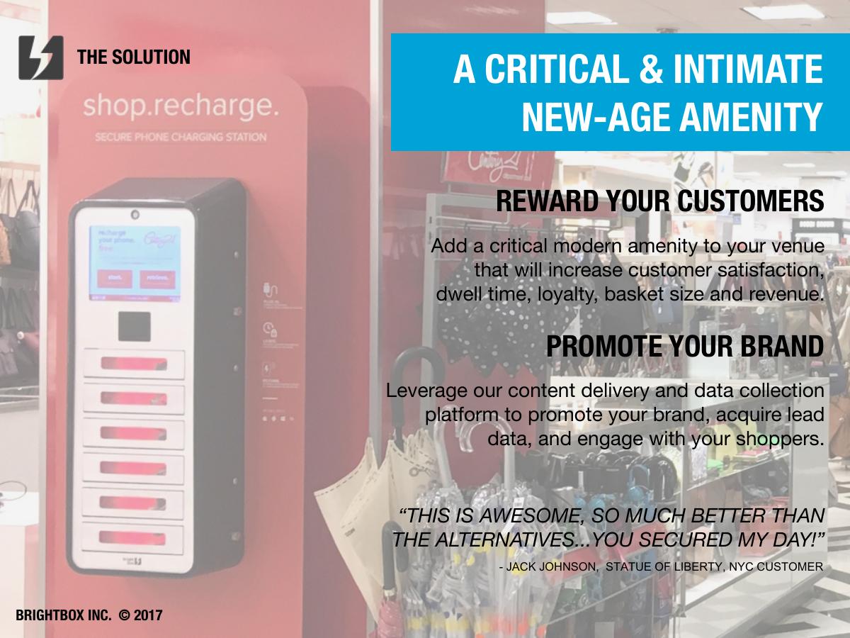
"A CRITICAL & INTIMATE NEW-AGE AMENITY", split into "REWARD YOUR CUSTOMERS" (satisfaction, dwell time, loyalty, basket size, revenue) and "PROMOTE YOUR BRAND" (content delivery, lead data, engagement). Underneath, a customer quote: "THIS IS AWESOME, SO MUCH BETTER THAN THE ALTERNATIVES...YOU SECURED MY DAY!" — Jack Johnson, Statue of Liberty, NYC customer.
The two-column split is the right structure: it separates the shopper benefit from the retailer benefit, which is exactly the distinction a category manager cares about. The quote is a weaker asset than it looks — it is an end-consumer's reaction, quoted in a deck being read by a corporate buyer, and it makes five claims about business outcomes (satisfaction, dwell, loyalty, basket size, revenue) with zero evidence for any of them on the slide. "Increase basket size" is a testable, measurable claim about a retailer's P&L. Asserting it without a single data point is the fastest way to be dismissed by someone who measures basket size for a living.
Slide 4 — Secure recharging enhances experience
The 95%-of-2,000-shoppers claim, plus the Memorial City Mall testimonial from Assistant GM Elizabeth Ricarte: "Installation of the Brightbox units was easy! The units work flawlessly and provide our shoppers with an important amenity."
The testimonial is the good part: named person, named title, named venue, and it addresses the two objections a facilities buyer actually raises — installation pain and reliability. That is a well-chosen quote. Pair it with an installed-unit count and an uptime figure and the slide would carry real weight.
Slide 5 — How it works
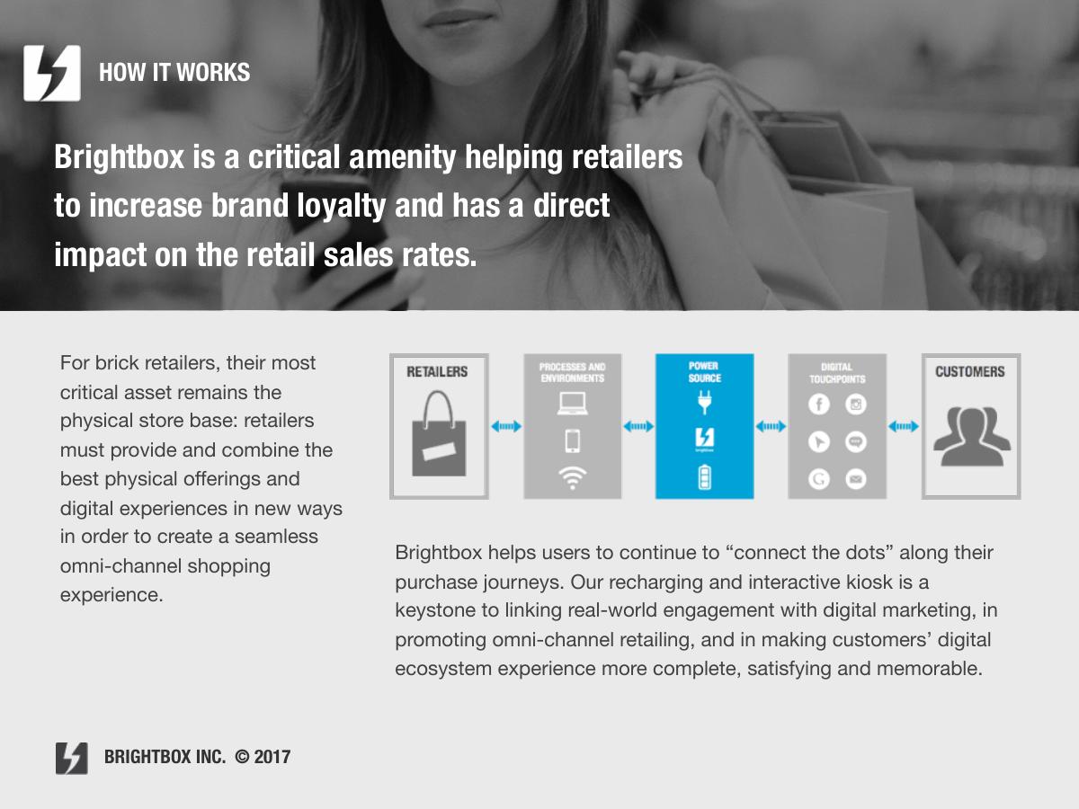
A "RETAILERS / CUSTOMERS" diagram with a paragraph on omni-channel retail and "connecting the dots along purchase journeys".
This is the weakest slide in the deck, and it is titled "How it works" — the slide where a reader most expects mechanism. It contains no mechanism. It contains a paragraph of 2017 retail-conference vocabulary ("omni-channel", "seamless", "digital ecosystem", "keystone") and the unsupported assertion that the kiosk "has a direct impact on the retail sales rates". A genuine how-it-works slide here would be four panels: shopper locks phone → screen serves brand content → shopper opts in with SMS or email → retailer receives usage and audience data. The deck describes all four of those things — across slides 11, 13, 14, 15, 16 and 17 — but never assembles them into the one sequence that would let a reader hold the whole product in their head.
Slide 6 — The Brightbox platform
The stolen-phones statistic, then an eight-point capability list: universality (4 cable types, 99% of smartphones), security (6 chambers, up to 2.7 amps), adaptability (complimentary or paid), accessibility (pin code, bank cards, mag stripe, RFID), privacy (PCI compliant, encrypted card reader, no data connection), certification (UL, CE, FCC, RoHS), 24/7 support, remote management.
This is a strong slide and the densest useful information in the file. Certifications and PCI compliance are exactly the objections that kill hardware deals inside large retailers, and answering them unprompted signals an adult company. One tension goes unaddressed: the deck promises "no data connection" as a privacy feature on this slide, and an on-unit camera performing demographic audience measurement on slide 17. Both may be true and reconcilable — but the deck should reconcile them, because the buyer's legal team will ask.
Slide 7 — Why provide this consumer service
Fourteen bullets, each a verb: Attract, Empower, Engage, Impress, Inform, Convert, Capture, Measure, Retain, Reward, Enlist, Link, Reconfigure, Reconnect. Target's own "Expect More. Pay Less." lock-up appears on the slide.
The verb pattern is a nice device and the customisation to Target's brand line is a good touch. But fourteen benefits is zero benefits: a list this long tells the reader the company has not decided which one matters, and forces the buyer to do the prioritisation themselves. Three bullets — the three Target would actually be measured on — with a number attached to each would outperform all fourteen. The slide also contains a real landmine in "Capture: capture (opt in or not) data and lead information". Opt in or not is a phrase no retailer's privacy counsel will let past, and it undercuts the privacy positioning two slides earlier.
Slide 8 — The mobile influence
Five numbered claims: solves the "Power Gap", influences purchase decisions, attracts consumers, increases dwell time and repeat visits, increases ROI. A small chart appears with the fragment "How much of a concern is running out…" — unlabelled and unsourced in the text layer.
Structurally this repeats slide 7 in different words, which means the deck spends two consecutive slides asserting benefits and zero slides evidencing them. Point 5 is the one worth keeping: the argument that Brightbox differs from "other passive recharging solutions" by reporting usage and enabling coupon, email and SMS follow-up is the actual competitive wedge. It is the only competitive statement in twenty-three slides, and it is buried as sub-point five of a bulleted list.
Slide 9 — The details / kiosk specs
Wall-mounted and free-standing renders, electrical requirements (standard 110V socket, internet or wireless), installation and maintenance ("we ship, install, operate and maintain units with on-site service as needed"), chamber-key options, colours (black or white, custom with purchase), and graphic-panel rules. Base plate: 20" by 30".
Exactly right for a sales deck and exactly wrong for an investor deck. "We ship, install, operate and maintain" is the sentence that closes facilities objections. It is also, unexamined, a description of an operationally heavy, capital-intensive service business — the thing an investor would want costed and a retailer wants reassured about. Same sentence, opposite implications, which is precisely why one document cannot serve both audiences.
Slide 10 — Wealth of key choices
Five access methods: on-screen pin code, credit and debit cards, branded key cards, existing loyalty or ID cards, RFID cards, bands and badges.
Useful, and the fourth option — existing loyalty cards — is quietly the most commercially interesting idea in the deck for a Target pitch, since Target's REDcard is a loyalty instrument. Using the charging locker as a REDcard-activated amenity is a specific, ownable proposal. It is listed as one bullet among five and never developed. Note also the copyright stamp on this slide reads "BRIGHTBOX INC. © 2015" while the rest of the deck says 2017.
Slide 11 — Pin code chamber key
The on-screen pin code flow (SMS capture): universal, "each user creates 2 secure pin codes (one masked)", unique codes to prevent duplication while "capturing remote verifiable data points (like SMS number)". Screens are watermarked "GRAPHICS ARE FOR SIMULATION ONLY".
Honest labelling of simulated screens is to the company's credit. The security explanation, though, is the deck's most confident and least substantiated passage. Two pin codes, one masked, is described as "Highly Secure" and "complete reliability" — absolute language about a locker holding a $700 device, with no mention of what happens on a forgotten code, a power cut, a false open, or a theft. For a product whose entire premise is security, the failure modes deserve a slide.
Slide 12 — Branding choices
Three deployment formats: floor stands with large branded panels, wall mount with branded panel, and a "K3 Stand" mobile unit on wheels for large multi-location venues. Again watermarked as simulation.
Slide 13 — Brand engagement
"PROMOTE. CONNECT. ACQUIRE. MEASURE." across three columns: static ads (up to 5 ads and 2 videos, up to 30 seconds), digital ads (HD and SD, 30-second clips), and survey and acquisition (email or mobile opt-in, survey questions, brand enrolment cards).
The four-verb spine is the clearest articulation of the product in the whole file and should have been slide 3. Concrete inventory limits — five ads, two videos, thirty seconds — are good, specific, buyer-useful facts. What is missing is the number that makes it a media proposition: impressions per unit per week. Without it, an advertising buyer cannot value the inventory at all.
Slide 14 — Surveys
Data capture — email, zip code, survey results — illustrated with Target-specific mock-ups: a "save with your REDcard" screen, a "Bullseye View" newsletter subscription, and "5% OFF EVERY DAY".
This is the best-executed slide in the deck. It stops describing capability and starts showing the prospect's own brand inside the product, tied to two real Target objectives (REDcard applications and newsletter signups). That is how you make a category manager picture the pilot. It arrives on slide 14 of 23.
Slide 15 — SMS acquisition
Automated SMS relay, with a mocked message: "Thanks for recharging with Target today! Please visit www.bityl.trgt.com to download our App today!" Same strength as slide 14 — prospect-specific, concrete, imaginable. No opt-in rate, no click-through rate, no compliance note on TCPA or carrier rules, which for automated SMS to US consumers in 2017 is a conspicuous gap.
Slide 16 — Platform portals
The content-management and reporting back end: manage on-screen advertising, track usage and impressions, know how long and where impressions occur. Two halves — digital media management and audience data and analytics — with a dashboard screenshot showing a "CUMULATIVE USAGE SUMMARY JANUARY 2015 – FEB…" panel.
Showing the real reporting portal is the right move; self-serve content control is a genuine differentiator against passive charging lockers. The screenshot is also, incidentally, the only place in the deck where actual usage data exists — and it is rendered too small to read, in a two-year-old date range, inside a 2017 deck. Blowing up one real month of one real venue's usage chart would have been worth more than slides 7 and 8 combined.
Slide 17 — BrightEyeQ audience measurement
"Real-time, anonymized measurement of audience via on-unit camera. Delivery of data about 'glance', 'watch' and 'dwell' times, and audience demographics."
A trademarked capability with clean, specific metric definitions. It is also the slide most likely to trigger an internal review at a retailer, and it gets three lines. Cameras performing demographic inference on shoppers is a decision with policy, signage and legal consequences; a buyer needs to know what is stored, for how long, whether images leave the device, and how it interacts with the "no data connection" privacy claim on slide 6. None of that is answered.
Slide 18 — Zip code heat map analysis
A geographic heat map of captured zip codes — "gain valuable insight about the potential customers you're interacting with". Strong idea for a retailer with catchment-area questions, presented at a size where nothing is legible.
Slides 19–22 — Deployment examples
Four consecutive slides of installation photographs, one carrying visible Citi branding on the unit. Slide 19's footer reads "BRIGHTBOX INC. © 2016" , another leftover.
Real photographs of real installations are valuable — they prove the product exists and looks acceptable in a retail environment, which is a genuine facilities concern. Four slides of them is at least two too many, none is captioned with the venue name, and the deck asks the reader to spend 17% of the presentation on photographs it never labels. Two captioned photos, each naming the venue and the installed unit count, would do more work in half the space.
Slide 23 — Partners
The customer logo wall. Discussed above. Wrong end of the deck.
What this deck does better than most startup pitch decks
It is built for one named buyer. The prospect's name is on the cover, their brand line is on slide 7, and slides 14 and 15 mock up the product with the prospect's own campaigns. Most decks are generic; this one was clearly re-cut for the meeting. · The proof is real and checkable. Named hospitals, hotels, airlines and arenas as customers; a named GM at a named mall as a reference; a photographed live installation with a bank's branding on it. · It pre-answers the objections that actually kill hardware deals. UL, CE, FCC and RoHS certification, PCI compliance, 110V requirement, 24/7 support, and "we ship, install, operate and maintain" all appear unprompted. · The inventory specifics are concrete. Five ads, two videos, thirty-second limits, six chambers, four cable types, 2.7 amps, five access methods. Specific numbers beat adjectives, and the deck has plenty of them on the product side. · Simulated screens are labelled as simulated. A small honesty that most decks skip. · "PROMOTE. CONNECT. ACQUIRE. MEASURE." is a genuinely good four-word summary of a product that is otherwise hard to describe in one line.
Where this deck would fail in an investor meeting
No ask, no financials, no team, no market size, no competition slide. It is not a fundraising document and does not pretend to be — but founders send this deck to investors all the time, and this is what happens when they do. · No commercial model of any kind. Twenty-three slides and the reader still cannot say who pays whom, for what, or how much. · Business outcomes are asserted, never measured. Basket size, dwell time, loyalty, foot traffic and "direct impact on retail sales rates" all appear as claims with no supporting figure anywhere in the file. · The only hard external statistic is three years stale and describes a trend that had since reversed. · The 95% survey is unsourced and asked of self-selected users of the free amenity. · Zero operating metrics. No units deployed, no sessions, no impressions, no opt-in rates, no uptime, no renewals — in a deck whose core promise is measurement. · "Capture (opt in or not)" and an on-unit demographic camera sit unreconciled next to a "no data connection" privacy claim. · Feature list where a mechanism should be. Slides 5, 7 and 8 are three consecutive benefit slides; not one of them explains the flow end to end. · Proof is last, features are first. The logo wall is slide 23; the spec sheet starts on slide 6. · Version hygiene. Copyright footers dated 2015, 2016 and 2017 in the same file, and an internal document title of "Target - Mar 2017 v2" saved in May.
Enterprise sales deck vs. investor deck
Element Brightbox Target deck (2017) What an investor deck needs instead
Audience One named retail buyer A partner sizing a fund-returning outcome
Core question answered "Will this work in my stores?" "How big can this get, and how fast?"
Proof used Logos, certifications, installation photos Revenue, retention, unit economics, growth rate
Product depth 14 slides of features and specs 2–3 slides, then straight to traction
Competition One clause on slide 8 A positioning slide against named rivals
Close Customer logos, no next step Ask, use of funds, milestones, contact
How you would rebuild this deck in twelve slides
Cover with proof. Same cover, plus one line: "N units live across venues including NewYork-Presbyterian, Hyatt and American Airlines." · Slide 2: the logo wall, with numbers. Move slide 23 to position two and attach unit counts and relationship lengths. Lead with the risk reduction. · Slide 3: the product in one sentence and four panels. Lock phone → serve brand content → capture opt-in → report back. Replace slides 5, 7 and 8 with this. · Slide 4: one real dataset. Blow up the reporting-portal usage chart from slide 16, from a comparable venue, with the date range and the venue named. This is the deck's most persuasive unused asset. · Slide 5: three benefits, each with a measured number. Not fourteen verbs. Pick dwell, capture rate and impressions, and give a real figure for each. · Slide 6: the Target-specific mock-ups. Slides 14 and 15 as they already exist — REDcard, Bullseye View newsletter, the app-download SMS. This is the emotional peak; put it in the first half. · Slide 7: the objection sheet. Certifications, PCI, power, connectivity, install, maintenance, support — slides 6 and 9 compressed into one dense reference page. · Slide 8: privacy and data governance. What the camera does, what is stored, where it goes, retention, signage, consent. Delete "opt in or not" from the company's vocabulary. · Slide 9: competition. Name the passive charging-station vendors and show the one-line wedge — reporting, content control and acquisition versus a cable on a wall. · Slide 10: two captioned deployment photos. Not four uncaptioned slides. · Slide 11: the commercial model. Who pays whom, the pilot price, the term, and the ROI arithmetic in the buyer's own units. · Slide 12: the pilot proposal. N units, M stores, 90 days, three success metrics agreed in advance, named owner, start date. Every deck should end on the specific next action.
Twelve slides, nothing invented, everything already somewhere in the existing twenty-three except the commercial model and the pilot — and those two are the reason a deck like this stalls after a good meeting.
The transferable lesson
Brightbox's deck fails in one specific way that is easy to copy without noticing: it spends its strongest evidence last and its weakest assertions first. Eighteen slides describe what the product can do; one slide proves that serious institutions already bought it. That order is backwards for every audience — investors, customers, partners, hires.
The second lesson is about audience. This is a competent sales deck and it would be a catastrophic investor deck, and the difference is not tone or polish — it is that the two readers are answering different questions. A buyer asks "will this work in my building?" An investor asks "how big does this get, and what does a dollar in return?" The Brightbox file answers the first question thoroughly and the second one not at all. If you have one deck doing both jobs, it is doing neither.
Go and look at your own deck with a stopwatch. Count how many slides pass before a reader encounters a number that someone outside your company generated — a customer name, a revenue figure, a retention rate, a measured result. If the answer is more than three, you have built a brochure, and the reader will decide what they think of you long before they reach your best slide.
Frequently asked questions
- Is the Brightbox deck a pitch deck for investors?
- No. The file is titled 'Target - Mar 2017 v2' and the cover reads 'smartphone recharging and marketing platform for Target'. It is a B2B enterprise sales and partnership deck built for one named retail prospect. There is no funding ask, no financials, no valuation, no team slide, no market size and no competition slide — all of which an investor deck requires.
- What is Brightbox?
- Brightbox Inc. is a B2B kiosk technology company selling secure smartphone-recharging lockers combined with a digital advertising, survey and data-capture platform. Units offer six lockable charging chambers, four cable types, several access methods including pin codes and loyalty cards, plus a reporting portal and a camera-based audience-measurement product called BrightEyeQ.
- Which Brightbox slides should founders copy?
- Three. The customer logo wall on slide 23, which names real hospitals, hotels and airlines as buyers. The objection-handling list on slide 6, which pre-answers certification, PCI compliance, power and support questions unprompted. And slides 14 and 15, which mock the product up with the prospect's own campaigns instead of describing capability generically.
- What is the biggest weakness in the Brightbox deck?
- Ordering. The deck spends eighteen slides asserting features and benefits before showing, on the final slide, that serious institutions have already bought the product. The logo wall belongs on slide two. A close second is the total absence of a commercial model: after 23 slides the reader still cannot say who pays whom, how much, or on what terms.
- How many slides is the Brightbox pitch deck?
- Twenty-three slides, in 4:3 landscape at 1024 x 768 points, produced in Keynote on macOS and saved in May 2017. The internal document title is 'Target - Mar 2017 v2', indicating a second revision of a March 2017 deck. Copyright footers inside the same file are variously dated 2015, 2016 and 2017.
- What is the difference between a sales deck and an investor deck?
- A sales deck answers 'will this work in my building?' with proof of reliability, references, certifications and specs. An investor deck answers 'how big can this get and what does a dollar return?' with traction, unit economics, market size, team and an ask. The Brightbox deck answers the first question thoroughly and the second not at all — which is why one document cannot serve both audiences.