Ookra's seven-slide deck, built in Google Slides and circulated in November 2014, pitched a marketplace for personal photography under the tagline 'The world is your studio.' - one of the cleanest positioning lines in this series. The deck's fatal flaw is a pair of adjacent slides nobody read together: slide 5 sizes the market by naming ShootProof.com at '10,000+' users, and slide 6 builds the entire business model on '10,000' users at $25 a month to reach $3 million in yearly revenue. The arithmetic is right; the plan it describes is capturing one hundred percent of a named competitor's inst…
Key takeaways
- Ookra's deck is seven slides, 16:9, built in Google Slides and circulated publicly in November 2014, pitching a marketplace for personal photography under the tagline 'The world is your studio.'
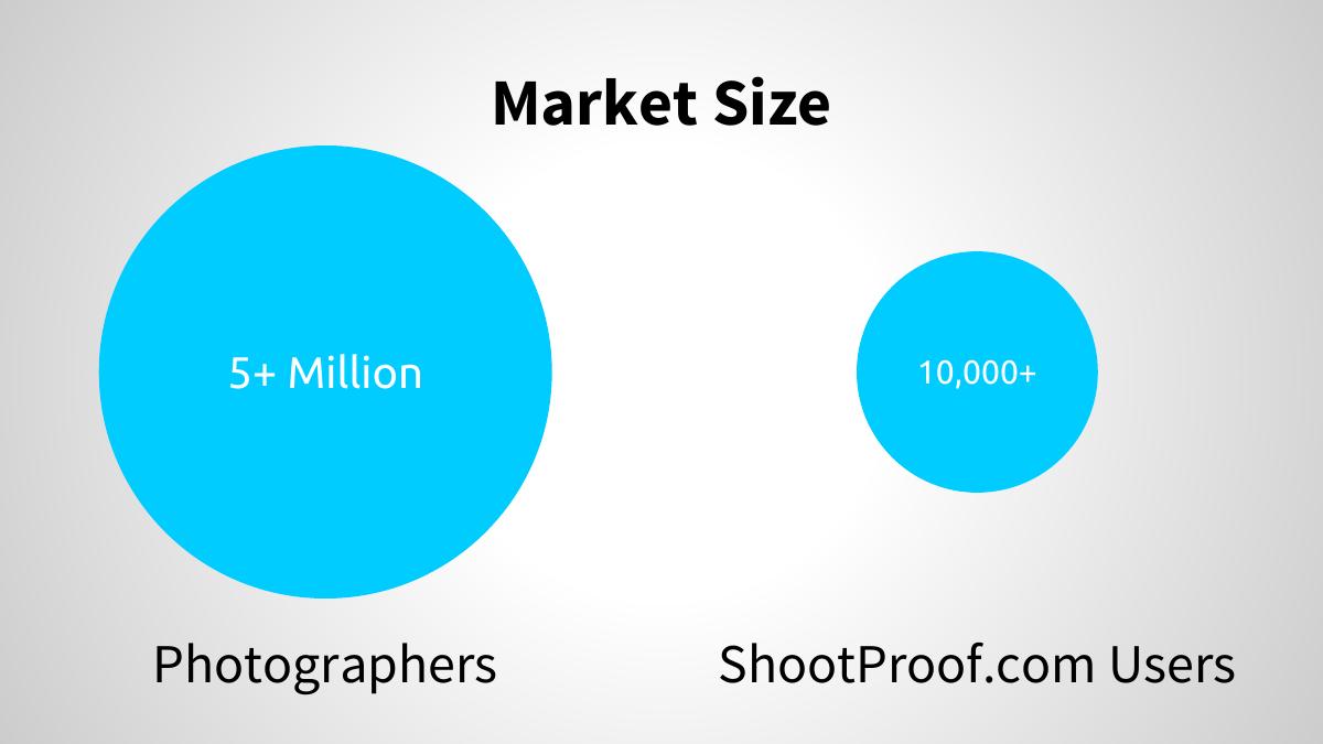
- The market slide sizes ShootProof.com at '10,000+' users; the very next slide builds the entire revenue model on '10,000' users at $25/month - meaning the plan, as printed, is to capture 100% of a named competitor's installed base.
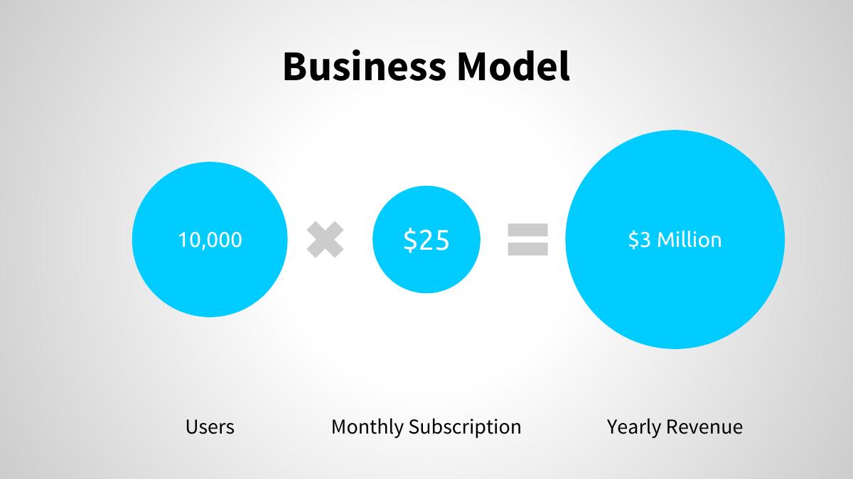
- The arithmetic itself is correct: 10,000 x $25 = $250,000 a month = $3 million a year, but it is labelled 'Yearly Revenue' with no cost, margin, CAC or churn line anywhere in the deck.
- Both bubble charts are drawn at the wrong scale: 5,000,000 versus 10,000 is a 500x gap rendered as roughly 4x by area, and the business-model slide sizes 10,000 users, $25 and $3 million against each other as if people, monthly dollars and annual dollars were comparable units.
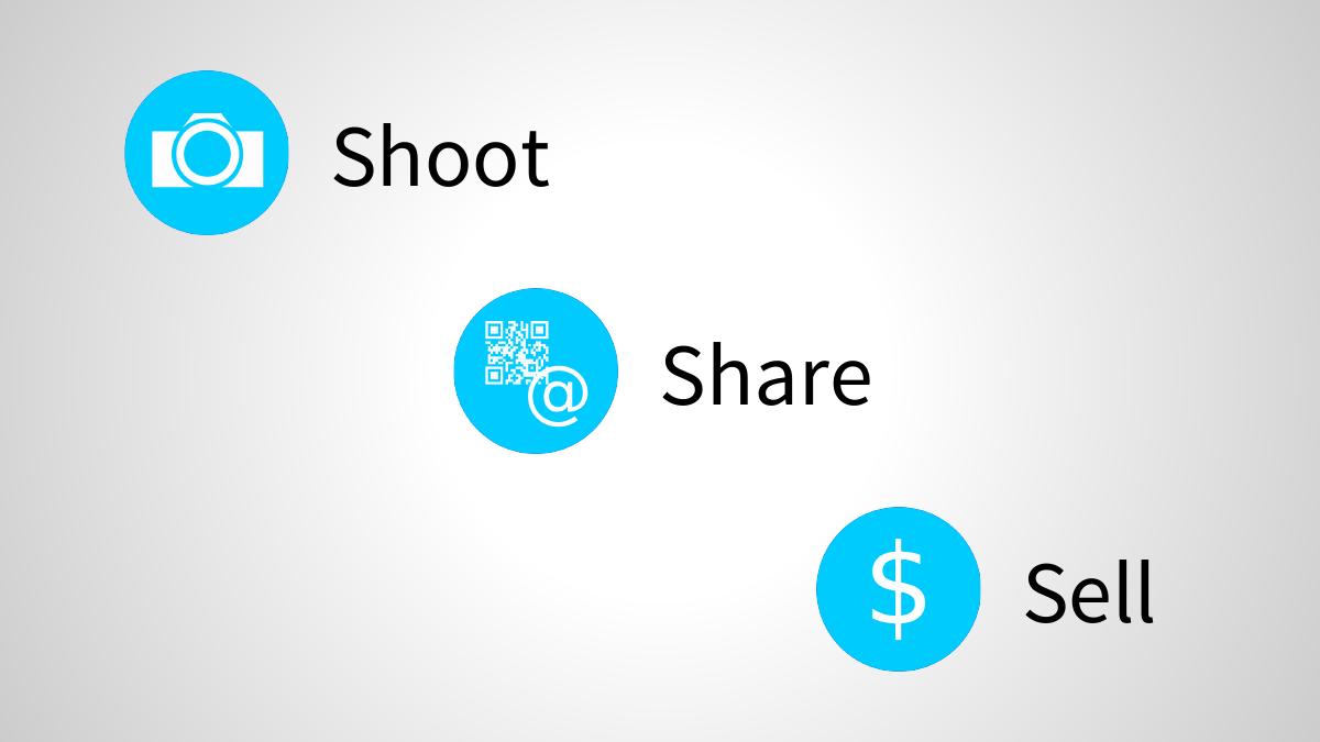
- There is no product screenshot anywhere in a seven-slide deck about a visual product - slide 4, one seventh of the entire deck, is the three words 'Shoot', 'Share' and 'Sell' with three icons.
- The deck has no funding ask, no valuation, no use of funds, no traction, no competition slide, no go-to-market and no contact details, and it ends on the team slide.
- The $25 monthly subscription is never justified against what ShootProof, SmugMug, Zenfolio or PhotoShelter charged in 2014, and a per-seat fee means ookra earns the same whether a photographer sells nothing or sells thousands.
- Worth copying: the five-word tagline, the stock-down/personal-up problem contrast, naming a real checkable comparable instead of a generic TAM triangle, and stating the business model as one readable equation.
What this deck actually is
Seven slides. 16:9 landscape at 720 x 405pt, produced in Google Slides — the PDF producer string simply reads "Google" — and circulated publicly in November 2014 . There is no cover date, no round name, no confidentiality marking, no company descriptor and no contact slide. What exists is a title, a problem, a solution, a three-word product flow, a market size, a business model and a founders page. Then the file ends.
Ookra was pitching a marketplace for personal photography: instead of a photographer earning through stock libraries or a traditional studio, the platform would let them shoot, share and sell direct. The tagline — "The world is your studio." — is the best thing in the file. It is short, it is visual, it states the whole thesis, and it would survive being repeated back by an investor a week later. Most decks in this series never get one line that clean.
Everything after the tagline is where it comes apart. Seven slides is not automatically a problem; a great seven-slide deck is a legitimate format for a first meeting. But a seven-slide deck has to spend every slide on something an investor cannot infer. This one spends slide 4 on the words "Shoot", "Share" and "Sell" with three icons and nothing else, and spends slides 5 and 6 on two bubble charts whose bubbles are drawn at the wrong sizes and whose numbers, read together, describe a business plan nobody would underwrite.
There is no product screenshot, no traction, no revenue, no user count, no pricing rationale, no competition slide, no go-to-market, no roadmap, no cost base, no funding ask, no use of funds and no contact details . The two founders are named with photos and titles, and that is all the deck knows about them — no bios, no prior companies, no domain history, no equity split.
The market-size slide and the business-model slide contradict each other
This is the finding worth the read, and it takes both slides at once.
Slide 5, "Market Size", draws two bubbles: 5+ Million "Photographers" and 10,000+ "ShootProof.com Users" . Slide 6, "Business Model", draws three bubbles: 10,000 Users x $25 Monthly Subscription = $3 Million Yearly Revenue .
The arithmetic is right. 10,000 x $25 = $250,000 a month, $3.0 million a year. That is the only correct thing about the pair.
The 10,000 in the revenue model is the same 10,000 the previous slide attributed to ShootProof.com — a competing photographer-gallery and photo-selling product that existed, shipped and was charging money in 2014. The deck has, in effect, printed its revenue plan as: take one hundred percent of a named competitor's entire customer base, every single user, and charge each of them $25 a month . Not 10% of them. Not 10,000 photographers drawn from the 5 million. The identical number, one slide later, unremarked.
If that reuse was accidental — if 10,000 was simply a round number picked twice — the effect on the reader is worse, not better, because it means the model number was never anchored to anything. Either reading kills the slide. The fix costs one line: "10,000 users = 0.2% of the 5M photographers we can reach, at $25/mo." That sentence turns an implausible clean-sweep into a modest, defensible penetration assumption using the deck's own two numbers. It is not written anywhere in the file.
The second problem on slide 6 is the word "Yearly Revenue" presented as the terminal bubble — the biggest circle, on the right, where a financial slide puts the outcome. Revenue is not the outcome. There is no cost line, no payment-processing fee, no hosting or storage cost for a photo product, no customer-acquisition cost, no churn assumption and no gross margin anywhere in the deck. A subscription photo marketplace carries real storage and bandwidth costs and real CAC in a category with organic acquisition problems; $3M of revenue at unknown cost is not a number an investor can price. And $25 a month arrives with no justification at all — no comparison to what ShootProof, SmugMug, Zenfolio or PhotoShelter charged in 2014, no willingness-to-pay evidence, no tiering, no annual option.
Both bubble charts are drawn at the wrong scale
This is a smaller point that a numerate investor will notice in about two seconds, and it costs credibility disproportionately.
On slide 5, the "5+ Million" bubble is roughly twice the diameter of the "10,000+" bubble, which reads to the eye as about a 4x difference by area. The actual ratio between 5,000,000 and 10,000 is 500x . A truthful area-proportional chart would render the ShootProof circle at about 1/22nd of the diameter of the big one — a dot you would struggle to label. The chart understates the gap by more than two orders of magnitude.
The direction of the distortion is the interesting part: it makes the competitor's installed base look large relative to the market, which is the opposite of what a founder normally wants a market slide to say. It is not spin; it is a default shape dragged to a pleasing size. But an investor cannot distinguish those two explanations from the outside, and the charitable reading — that the founders did not check — is still the reading that costs the meeting.
Slide 6 has a different version of the same problem: it draws 10,000 users, $25 and $3 million as three circles on one visual scale . Those are three incompatible units — people, dollars per month, dollars per year — sized against each other as if they were comparable quantities. The $25 bubble is smaller than the 10,000 bubble because 25 is a smaller number than 10,000, which is meaningless. It is an equation wearing a chart costume. Written as plain text — 10,000 users x $25/mo = $3M ARR — it would be clearer, more honest and take a tenth of the space.
Slide-by-slide walkthrough
Slide 1 — "The world is your studio."
The ookra wordmark and one line of positioning, on a light gradient. No date, no round, no descriptor, no URL, no email.
The tagline is genuinely good — it compresses "you do not need a studio, you can shoot and sell anywhere" into five words, and it carries the product's promise without jargon. What is missing is the sentence underneath it that tells a cold reader what the company is . "The world is your studio" is a slogan; "a marketplace where photographers sell personal shoots direct to clients" is a company. A cover needs both, because the cover is the slide that gets screenshotted and forwarded.
Slide 2 — Problem: "How to make money as a photographer?"
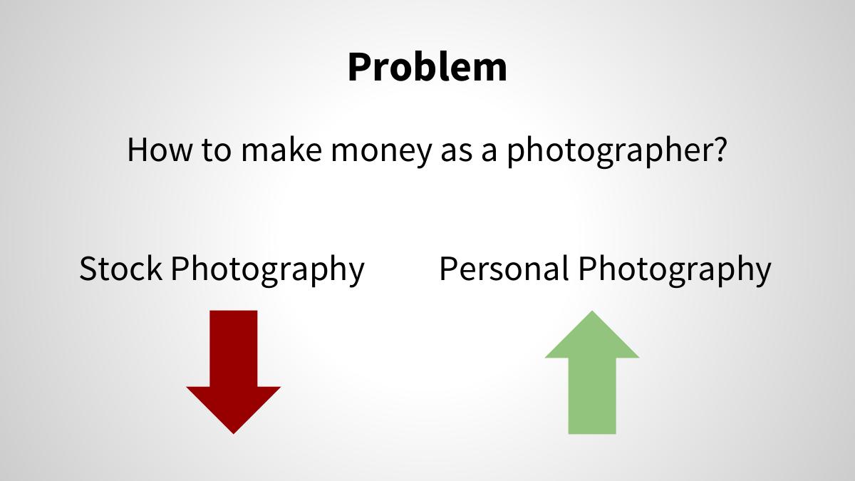
The question, then two columns: Stock Photography with a red arrow pointing down, and Personal Photography with a green arrow pointing up.
The instinct is right and the framing is efficient — one market is declining, an adjacent one is growing, and the company is positioned in the growing one. In 2014 that was also broadly true: stock rates were under sustained pressure from microstock and smartphone supply while direct-to-consumer shoot demand was rising.
But the slide has no numbers, no dates, no source and no magnitude. Two coloured arrows are a claim, not evidence, and this is the cheapest slide in the whole deck to have fixed: one line of stock-price-per-image data and one line of consumer photography spend, each with a source and a year, converts the arrows from decoration into an argument. As drawn, an investor who already believes the thesis nods, and an investor who does not has been given nothing to change their mind with.
There is also a framing miss. The stated problem is the photographer's problem — how do I earn. The buyer's problem is never stated anywhere in the deck. A marketplace has two sides, and a deck that only articulates the supply side's pain has not yet explained why demand shows up.
Slide 3 — Solution: Traditional Studio vs ookra
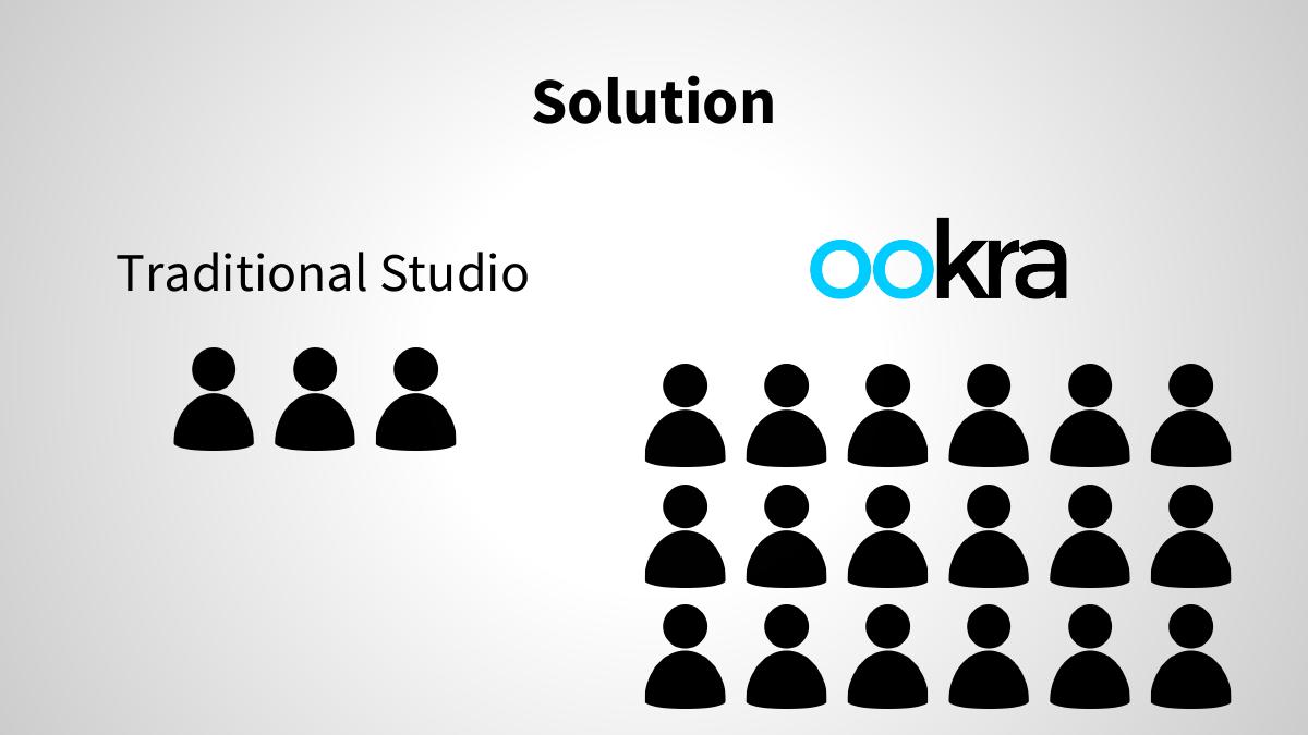
A pictogram comparison. On the left, "Traditional Studio" with three person icons. On the right, the ookra logo with eighteen person icons.
The visual metaphor is clear: a studio reaches a handful of people, the platform reaches many. As a picture of network scale it works and it needs no explanation.
The problem is that it is an assertion of outcome placed on the slide where the mechanism belongs. This is the solution slide, and the reader has just been asked how photographers make money. Six-versus-three icons does not answer that. It does not say how a photographer is discovered, how a client books, how pricing is set, who handles delivery, who takes payment, or what ookra does that a photographer's own Instagram account and a bank transfer did not already do in 2014. The slide asserts more reach without describing the machine that produces it.
It also concedes something unintentionally. By naming "Traditional Studio" as the incumbent, the deck picks the weakest possible opponent. The real competition for a personal-photography marketplace in 2014 was Instagram for discovery, Facebook for booking, and ShootProof, SmugMug, Zenfolio and PhotoShelter for galleries and payment — one of which the deck itself names on the very next slide, without ever calling it a competitor.
Slide 4 — Shoot / Share / Sell
Three words with three icons, arranged on a diagonal: a camera for Shoot, a QR-code-and-@ symbol for Share, a dollar sign for Sell. No other text on the slide.
As a mnemonic it is memorable and the three verbs do describe a coherent flow. In a live pitch, with a founder talking over it, this slide can work.
Standing alone in a forwarded PDF — which is how almost every deck is actually read — it is close to empty. It is the fourth of seven slides, which means 14% of the entire deck is three words , and it lands at exactly the moment the reader most wants to see the product. The "Share" icon is doing something odd too: a QR code and an @ sign suggests offline-to-online sharing, possibly printed codes on physical prints, which would be a genuinely distinctive mechanic — and the deck never says a word about it. An interesting idea is buried inside an icon.
This is the slide that should have carried a screenshot. Seven slides in a photography product with zero images of the product is the deck's structural failure in a single observation.
Slide 5 — Market Size
Two bubbles: 5+ Million Photographers, 10,000+ ShootProof.com Users. No sources, no geography, no date, no definition of "photographer" (professional? working? registered? anyone who owns a camera?).
Naming a specific comparable — ShootProof — is a better instinct than the usual vague TAM triangle, because it is checkable and it shows the founders know the landscape. But the slide does not say why ShootProof is on it. Is it a competitor? A proxy for market validation? An acquisition comparable? A benchmark for what "good" looks like at this stage? The reader has to guess, and the guess they will make is "competitor" — at which point the absence of any competition slide anywhere in the deck becomes conspicuous.
The 5 million figure has no source and no geography attached. Whether that is 5 million professional photographers worldwide, 5 million in the US, or 5 million people with photography listed as an interest changes the addressable market by an order of magnitude, and changes whether $25 a month is a plausible price for the median member of that pool.
Slide 6 — Business Model
10,000 x $25 = $3 Million, drawn as three bubbles, labelled Users, Monthly Subscription and Yearly Revenue.
Covered in full above: the arithmetic is correct, the user number is a competitor's entire installed base recycled from the previous slide, the price has no justification, the units are incomparable, the bubbles are decorative, and "Yearly Revenue" is presented in the position where an investor expects profit — with no cost line anywhere in the deck to net it against.
One more absence worth naming. A marketplace normally monetises the transaction; this one monetises the seat. A $25 monthly subscription means ookra earns the same whether a photographer sells nothing or sells $20,000 of shoots through the platform — which removes the company's own incentive to drive demand, and removes the demand side from the revenue story entirely. That may have been a deliberate and defensible choice. The deck does not defend it, or acknowledge that a choice was made.
Slide 7 — Founders
Joseph Mantha, Co-Founder and CEO. Alexandre Laplante, Co-Founder and CTO. Two names, two titles, two casual photographs. The deck ends here.
Having a named technical co-founder on the page is a real positive, and the CEO/CTO split answers the "can they build it" question at the crudest level. But there are no bios, no prior companies, no photography-industry background, no shipped products, no LinkedIn links and no reason given why these two people win this market. At seed there is usually nothing to underwrite except the founders, which makes an evidence-free team slide the most expensive omission in a deck this short.
Ending on the team is also the wrong close for a fundraising document. The last slide is the one the reader is looking at when they decide what to do next, and this one gives them no ask, no number, no milestones, no email address and no next step. Whatever the raise was, the deck never names it.
What this deck does better than most startup pitch decks
The tagline actually works. "The world is your studio." states the thesis, the product and the emotional promise in five words. Most decks never produce a line this reusable, and this one leads with it. · It is short and it is legible. Seven slides, one idea per slide, huge type, no wall of text, consistent visual language throughout. Nobody bounces off this deck because it was exhausting. · The problem framing is genuinely sharp. Stock down, personal up, one question at the top. That is a clean two-column contrast that a reader retains, and it correctly identifies where the market was moving in 2014. · It names a real, checkable comparable. Putting "ShootProof.com" on the market slide instead of a generic $XX billion triangle is the more honest instinct, and it signals the founders had looked at the actual landscape. · The business model is stated in one readable equation. Users x price = revenue, printed plainly. Plenty of far longer decks never tell you how the company makes money at all; this one does it on one slide in three numbers. · The team slide names a technical co-founder. A CEO/CTO pair with faces attached, not an anonymous "world-class team" claim.
Where this deck would fail in an investor meeting
No ask. No amount, no instrument, no valuation, no runway, no use of funds, no milestones. The deck never states what it wants. · The revenue plan is a competitor's entire user base. The 10,000 on the business-model slide is the same 10,000 attributed to ShootProof.com one slide earlier — 100% capture, presented without comment. · No product. Zero screenshots, zero mockups, zero interface, in a deck about a visual product for visual professionals. · No traction of any kind. No users, no shoots, no revenue, no waitlist, no pilot photographer, no beta, no letter of intent. · No costs, no margin, no CAC, no churn. "$3 Million Yearly Revenue" is the terminal number in a deck with no cost line anywhere. · The $25 price is unjustified. No comparison to incumbent pricing, no willingness-to-pay evidence, no tiers, no rationale. · Both charts are drawn at the wrong scale. A 500x difference rendered as roughly 4x; three different units sized against each other as if comparable. · No competition slide. The one named competitor appears on the market slide and is never characterised as one. · Only the supply side of the marketplace is addressed. The buyer — who they are, what they pay, how they arrive — is absent from all seven slides. · No go-to-market. Nothing about how the first 100, let alone the first 10,000, photographers are acquired. · The team slide has no evidence. Names, titles, photographs. No bios, no track record, no reason to believe. · No contact details. A persuaded reader has no way to respond.
Seven-slide teaser vs. what a seed deck needs
Positioning "The world is your studio." Keep it — plus one plain sentence saying what the company is
Problem Two coloured arrows, no data One sourced, dated number per side of the contrast
Solution 3 icons vs 18 icons The mechanism: how a client finds, books, pays and receives
Product Three words on one slide Two or three real screens of the actual product
Market 5M and 10,000, unsourced, mis-scaled Defined segment, source, geography, and the slice being targeted
Business model 10,000 x $25 = $3M, no costs Price rationale, gross margin, CAC, churn, payback
Competition Absent; one competitor named as "market size" Named alternatives and an explicit wedge
Traction None Anything real, however small, with a date on it
Ask None Amount, instrument, use of funds, milestones it buys
Close Ends on the team slide Ends on the ask and a contact address
How you would rebuild this deck today
Keep slide 1 exactly as it is, and add one sentence. "The world is your studio." stays. Underneath: "A marketplace where photographers sell personal shoots direct to clients." Cover slides get forwarded without the founder attached; make it self-explaining. · Put a number on each arrow. Slide 2 keeps the two-column contrast but each column gets one sourced, dated figure. The structure is already right; it is missing its evidence. · Replace the icon comparison with the mechanism. Slide 3 should show the actual flow: client searches, books a slot, pays in-app, photographer shoots, gallery delivers, funds settle. That is the solution. Reach is the result of it, not a substitute for it. · Spend slide 4 on the product. Three real screens — search, booking, gallery-and-buy — with two words of caption each. Delete "Shoot / Share / Sell" as a standalone slide and use it as the header running across those three screens. · Rewrite the market slide as a funnel, not two bubbles. Total photographers (defined, sourced, with a geography), then the addressable segment, then the beachhead, then the target penetration. And draw bubbles to area, or drop the bubbles and use plain numbers. · Anchor the user number to the market, not to a competitor. "10,000 users = 0.2% of the 5M we can reach" — one line, and the whole revenue slide becomes credible. Never let a competitor's headcount silently become your plan. · Add the cost side. $25/mo against gross margin, storage and processing cost, CAC, monthly churn, and payback period. Show the path to $3M with an assumption stack a reader can argue with. · Justify the price, or test it. One line on what ShootProof, SmugMug and Zenfolio charged, and where $25 sits. If ten photographers have already said yes at $25, that sentence is worth more than the entire market slide. · Add the demand side. Who buys a personal shoot, what triggers it, what they spend, and how ookra reaches them. A one-sided marketplace deck is half a deck. · Add a competition slide and name the real ones. Instagram, Facebook, ShootProof, SmugMug, Zenfolio, and the photographer's own website. Then state the wedge in one sentence. · Add traction, at whatever scale it exists. Ten photographers on a waitlist, one paid shoot, a working prototype with a date — any real fact beats a projection. · Give the team slide evidence and end on the ask. Two lines of bio each, then a final slide with the amount, the instrument, the use of funds, the milestones it buys, and an email address.
The transferable lesson
Ookra's deck fails in a way that is unusually easy to copy by accident, because nothing in it is dishonest. The arithmetic is correct. The tagline is good. The problem is real. The slides are clean. It fails because two numbers were placed one slide apart without anyone reading them together — and read together, they say the plan is to take a named competitor's entire customer base.
Almost every deck has a pair like this. A market number that does not reconcile with a revenue number. A price that appears in the model but nowhere in the pricing rationale. A user count in the projection that quietly matches something on an earlier slide. The founder never sees it, because the founder reads each slide as the thing that slide is about. The investor reads the whole file in four minutes, in one pass, and the mismatched pair is the thing that surfaces.
The other lesson is about brevity. Seven slides can absolutely work — but at seven slides, every slide is 14% of your case, and a slide holding three words has spent 14% of your case on nothing. Short decks are not decks with less content; they are decks with the same content and no padding. Ookra's had the padding and not the content.
Before you send yours, read it the way an investor will: straight through, once, checking whether any two numbers in the file argue with each other — and whether the last slide tells the reader what to do.
Frequently asked questions
- What was Ookra?
- Ookra was a startup pitching an online marketplace for personal photography, under the tagline 'The world is your studio.' The idea was that instead of earning through declining stock photography or a traditional studio, a photographer could shoot, share and sell directly through the platform, paying a $25 monthly subscription. The circulating deck is seven slides and dates from November 2014.
- Is the Ookra deck a real investor pitch deck?
- It is a real seven-slide deck built in Google Slides, 16:9 at 720 x 405pt, uploaded publicly in November 2014. It reads as a short teaser or first-meeting deck rather than a complete investor deck: it contains a title, problem, solution, product flow, market size, business model and founders page, but no funding ask, no traction, no financial model, no competition slide and no contact details.
- How much was Ookra raising?
- The deck never says. There is no funding amount, no instrument, no valuation, no runway, no use of funds and no milestone plan across any of the seven slides. The file ends on the founders slide, which lists two names, two titles and two photographs, with no email address or next step for a persuaded reader.
- What is the biggest problem with the Ookra pitch deck?
- Two numbers placed one slide apart that contradict each other. Slide 5 sizes the market by naming ShootProof.com at '10,000+' users. Slide 6 then builds the whole revenue model on '10,000' users at $25 a month to reach $3 million a year. Read together, the deck's revenue plan is to capture one hundred percent of a named competitor's entire customer base - and it never remarks on this or anchors the number to the 5 million photographers on the same market slide. One line, '10,000 users = 0.2% of the 5M we can reach', would have fixed it.
- Are the charts in the Ookra deck accurate?
- The arithmetic is, but the visuals are not. The market slide draws 5,000,000 and 10,000 as bubbles roughly two diameters apart, which reads as about a 4x difference by area when the true ratio is 500x - a truthful chart would render the smaller circle at about a twenty-second of the diameter. The business-model slide is worse in kind: it sizes 10,000 users, $25 per month and $3 million per year as three circles on a single scale, comparing people to monthly dollars to annual dollars as if they were the same unit.
- What should founders copy from the Ookra deck?
- Four things. The tagline - 'The world is your studio.' says the thesis, the product and the promise in five words. The problem slide's two-column contrast, one market declining and an adjacent one growing, which is a structure a reader retains. Naming a real, checkable comparable like ShootProof instead of a generic billion-dollar market triangle. And stating the business model as one readable equation rather than burying it. What not to copy: shipping a visual product's deck with no screenshots, spending a seventh of a short deck on three words, and ending without an ask.