The Cubie Messenger deck is a quintessential example of a 'traction deck.' In 2012, the mobile messaging space was hyper-competitive, yet Cubie managed to stand out by highlighting over 5 million organic downloads within its first year (Slide 2). The deck avoids lengthy market analysis or problem statements, opting instead to show the product's global reach—ranking #1 in social in 16 countries (Slide 3)—and its unique engagement hook: hand-drawn 'doodles' which accounted for 30% of their 800 million monthly messages (Slide 9). While it lacks a formal 'Ask' slide or detailed financial projecti…
Key takeaways
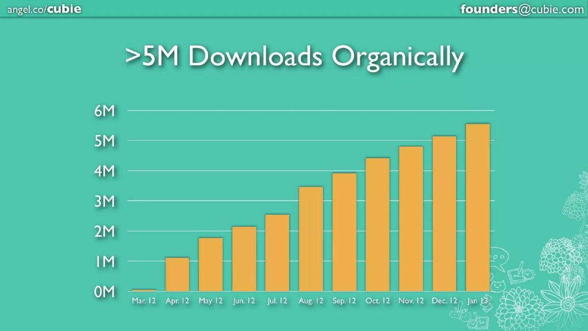
- The company achieved over 5 million organic downloads between March 2012 and January 2013, as shown on Slide 2.
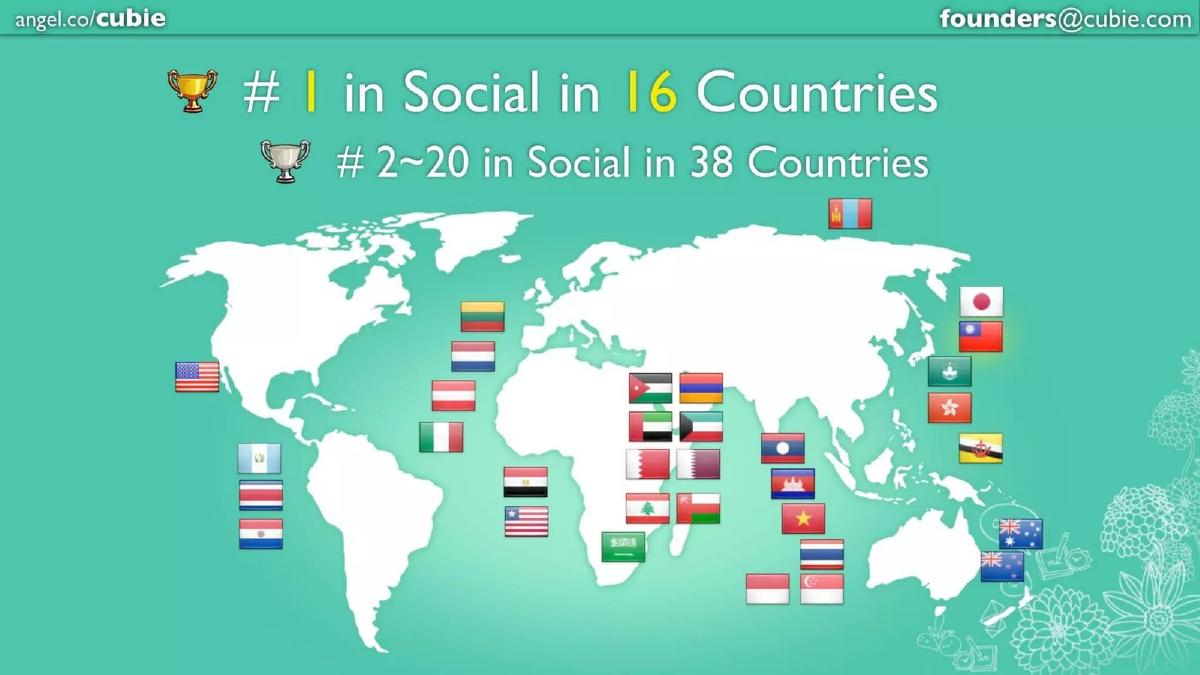
- Cubie successfully localized its appeal, reaching the #1 social app rank in 16 countries and top 20 in 38 countries (Slide 3).
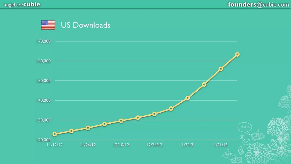
- The deck highlights a specific growth vector in the US market, climbing from approximately 123,000 to over 160,000 downloads in just two months (Slide 4).
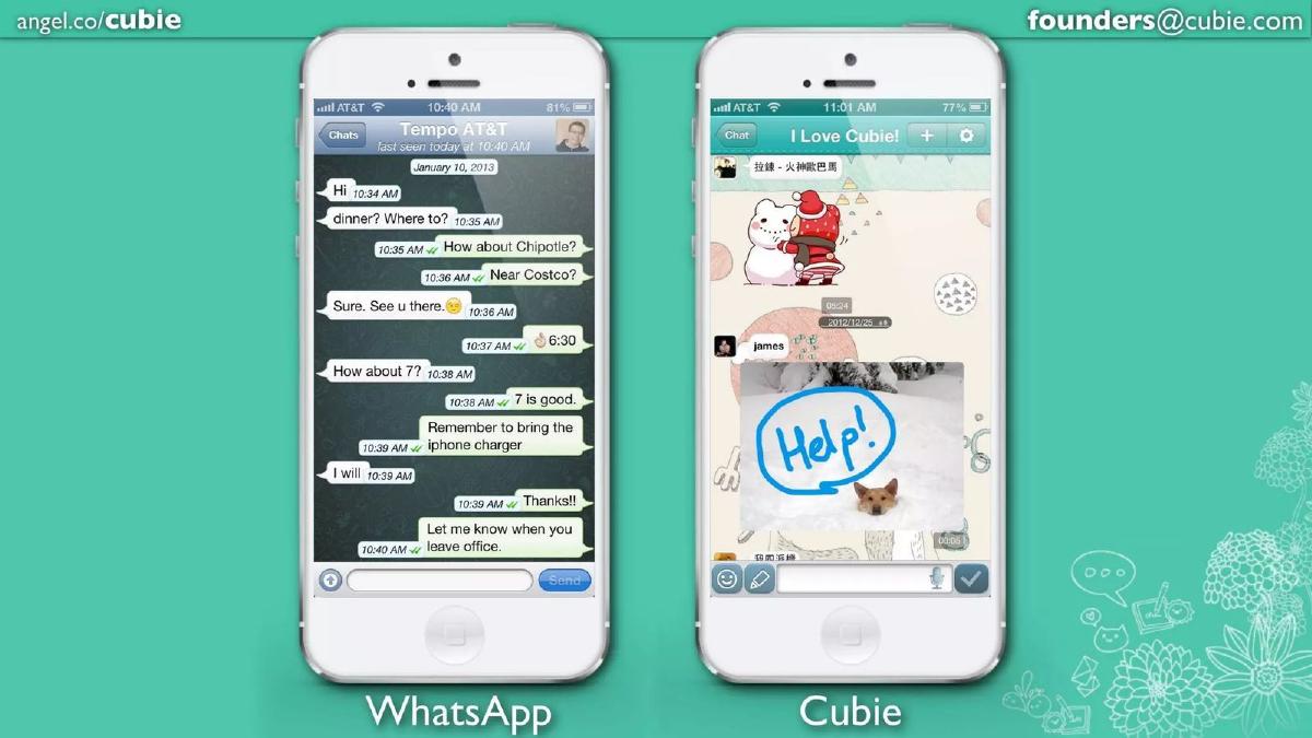
- Product differentiation is established through a direct UI comparison with WhatsApp, emphasizing creative tools over plain text (Slide 5).
- Engagement is exceptionally high, with the platform processing 800 million messages per month (Slide 9).
- A significant portion of user activity (30%) involves non-text media like doodles, stickers, and images (Slide 9).
- The team leveraged a $1.1M seed round from prominent investors including 500 Startups and Gumi to reach these milestones (Slide 11).
- The deck omits a business model, competition matrix, and a specific funding request for the Series A round.
The Traction-First Narrative
The Cubie Messenger pitch deck is a relic of the early 2010s mobile gold rush, but its structure remains highly relevant for founders with strong metrics. At 11 slides, it is lean and aggressive. It does not spend time explaining why mobile messaging is a large market; by 2012, investors already knew that. Instead, it focuses entirely on the fact that Cubie was winning a significant slice of that market without spending money on user acquisition.
Slide 1: Title and Positioning
The cover slide introduces the brand with a distinctive owl mascot and the tagline Messaging Beyond Chat . This immediately sets the stage for a product that offers more than just text. The inclusion of Google Play and App Store badges signals that the product is live and cross-platform. Notably, the slide includes the AngelList URL and a direct founder email, making it clear this is a fundraising document.
Slides 2-4: The Growth Story
Slide 2 is the 'hook.' It displays a bar chart showing a steady climb from near-zero in March 2012 to >5M Downloads Organically by January 2013. The word 'Organically' is the most important word on this slide, as it implies a K-factor (virality) that investors crave. If a product grows to 5 million users without a marketing budget, it suggests the product itself is the marketing engine.
Slide 3 expands this story to a global scale. It claims the #1 spot in Social in 16 countries and a top 20 spot in 38 countries. The map is crowded with flags, primarily across Asia and the Middle East, proving that the app's appeal transcends its home market of Taiwan. Slide 4 then zooms into the US market, showing a growth curve from 123,000 to over 160,000 downloads in the two months leading up to the pitch. This is a tactical inclusion intended to show that they can compete in the high-value Western markets.
Slides 5-8: Product Differentiation and User Behavior
Slide 5 is a classic 'Us vs. Them' comparison. By placing a WhatsApp screenshot next to a Cubie screenshot, the founders visually demonstrate their value proposition. WhatsApp is shown as a wall of text; Cubie is shown with a hand-drawn 'Help!' bubble over a photo and a large character sticker. The message is clear: Cubie is for expression, not just communication.
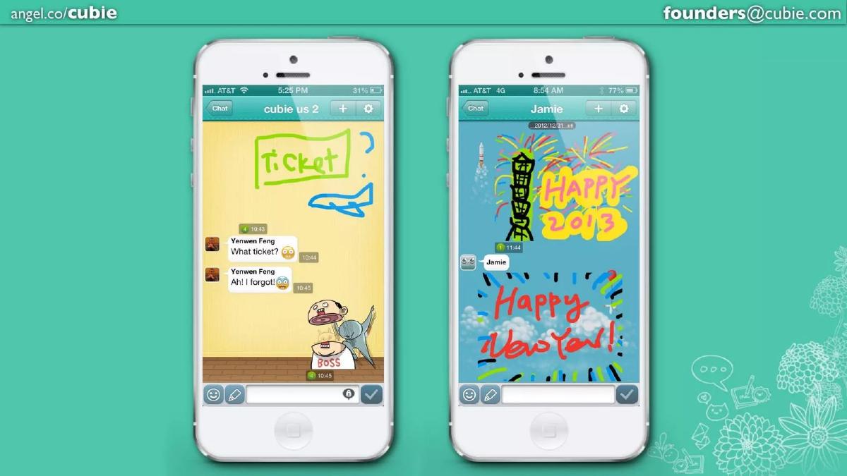
Slides 6, 7, and 8 function as a gallery of user-generated content. They show 'doodles'—hand-drawn images ranging from simple sketches of tickets to elaborate 'Happy New Year' art. Slide 7 even shows a 'Space' feature, which appears to be a public or semi-public feed where users can like and comment on each other's drawings. This highlights a social layer beyond one-to-one messaging, increasing the 'stickiness' of the app.
Slides 9-10: Engagement and Validation
Slide 9 provides the hard data to back up the pretty pictures. The company was Processing 800M Messages per Month . A pie chart reveals that 30% of these messages (240M) are Doodles, Stickers, and Images . This is a critical metric because it proves that the differentiating features shown in the previous slides are actually being used at scale. It isn't just a gimmick; it's a core part of the user experience.
Slide 10 focuses on qualitative feedback. It shows a 4.5-star rating on Google Play and a 4-star rating on the App Store, alongside two tweets from users calling it the 'cutiest chat messenger ever' and praising the 'stupid drawings.' This humanizes the data and shows that the brand has emotional resonance with its audience.
Slide 11: Team and Backing
The final slide introduces the co-founders, Yenwen Feng and Cjin Cheng, and two high-profile advisors: Andrew Chen and Hiroyuki Watanabe. The bottom half of the slide lists the $1.1M Seed Round investors, which includes 500 Startups, NTT Investment Partners, Gumi, B Dash Ventures, Biglobe, and Pinehurst Advisors . This slide serves as the ultimate validation—if these sophisticated entities already put in over a million dollars, the Series A investors are joining a vetted winner.
What Works in This Deck
1. Momentum is the Hero: The deck starts with growth and ends with engagement. It doesn't waste time on 'Problem' slides because the 'Solution' is already being used by millions. For a Series A, this is the strongest possible position.
2. Visual Proof: Instead of listing features in bullet points, the deck uses four consecutive slides (5-8) to show the product in action. The contrast with WhatsApp is particularly effective because it uses a competitor's ubiquity to highlight Cubie's uniqueness.
3. The 'Organic' Emphasis: By highlighting that growth was organic, the founders are telling investors that their capital will be used to pour gasoline on an already burning fire, rather than trying to spark a flame from scratch.
What is Missing
1. The Business Model: There is zero mention of how Cubie intends to make money. While common in 2012, modern decks usually need at least a slide on monetization strategy (e.g., sticker sales, advertising, or subscriptions).
2. The Ask: The deck does not state how much money they are looking to raise in the Series A or what the specific milestones for the next 18 months will be. While the catalogue facts state they raised $2.4M, that information is not in the slides.
3. Competitive Landscape: Beyond the visual nod to WhatsApp, there is no analysis of other competitors like Line, WeChat, or KakaoTalk, which were also growing rapidly in the same regions at that time.
What a Founder Should Copy
1. The 'Traction First' Layout: If you have a 'hockey stick' graph, put it on Slide 2. Do not make investors wait until Slide 10 to see your best metric.
2. Side-by-Side Comparisons: If your product is a 'better' version of a well-known tool, show them side-by-side. It eliminates the need for complex technical explanations.
3. Engagement Ratios: Cubie didn't just say they had 800M messages; they specified that 30% were high-value creative messages. Founders should look for the 'magic metric' that proves their unique feature is actually driving the platform's usage.
Conclusion The Cubie deck is a masterclass in brevity. It relies on the strength of its numbers and the visual appeal of its user-generated content to tell a story of a product that users love and share. While it lacks the financial rigor required in today's more cautious venture environment, its focus on product-market fit through organic growth remains a gold standard for consumer app pitching.
Frequently asked questions
- How did Cubie differentiate itself from WhatsApp in 2012?
- Slide 5 provides a side-by-side visual comparison. While WhatsApp is shown as a standard text-based interface, Cubie is presented as a multimedia canvas. The slide highlights features like drawing directly on photos and sending large, expressive stickers. This 'Messaging Beyond Chat' positioning aimed to capture a younger, more creative demographic that found standard SMS-style apps too utilitarian.
- What was the primary growth engine for Cubie according to the deck?
- Organic virality was the core driver. Slide 2 explicitly labels their 5M+ downloads as 'Organically' achieved. The deck suggests that the creative nature of the messages—specifically the 'doodles' mentioned on Slide 9—acted as a built-in referral mechanism, as users shared their drawings with friends, prompting them to download the app to respond in kind.
- Who were the key people involved in the company at this stage?
- Slide 11 identifies Yenwen Feng and Cjin Cheng as the co-founders. The company also boasted significant advisory weight, listing Andrew Chen (a well-known growth expert) and Hiroyuki Watanabe. This combination of technical founders and growth-focused advisors was likely a major selling point for Series A investors.
- What geographical markets were most important to Cubie?
- While the company was headquartered in Taipei, Slide 3 shows a global footprint with heavy concentration in Southeast Asia, the Middle East, and parts of Europe. However, Slide 4 specifically breaks out US downloads, indicating that proving traction in the American market was a strategic priority for their fundraising narrative.
- Is there a clear monetization strategy presented in these slides?
- No. The deck is entirely focused on user acquisition and engagement metrics. There is no mention of revenue, unit economics, or a business model (such as sticker stores or premium features). In the 2012 era of 'land grab' mobile apps, investors were often willing to overlook immediate revenue in favor of massive, active user bases.