Pair (formerly Pair3D) utilized a 12-slide minimalist deck to secure its seed funding in 2016. The presentation is notable for its lack of traditional slides—there is no explicit problem, solution, or business model slide. Instead, the deck relies on high-impact growth metrics, such as 38% month-over-month MAU growth and a 61% retention rate, to prove market fit. By showcasing a library of 2,500+ products and a strategic partnership with Wayfair, Pair demonstrated immediate commercial viability. The deck’s strength lies in its ability to quantify the 'stickiness' of AR, citing 47-second engag…
Key takeaways
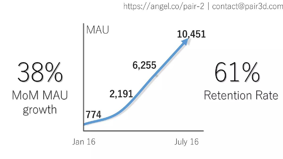
- The deck demonstrates significant early traction with a 38% MoM MAU growth rate from January to July 2016 (Slide 3).
- User stickiness is a core highlight, featuring a 61% retention rate (Slide 3).
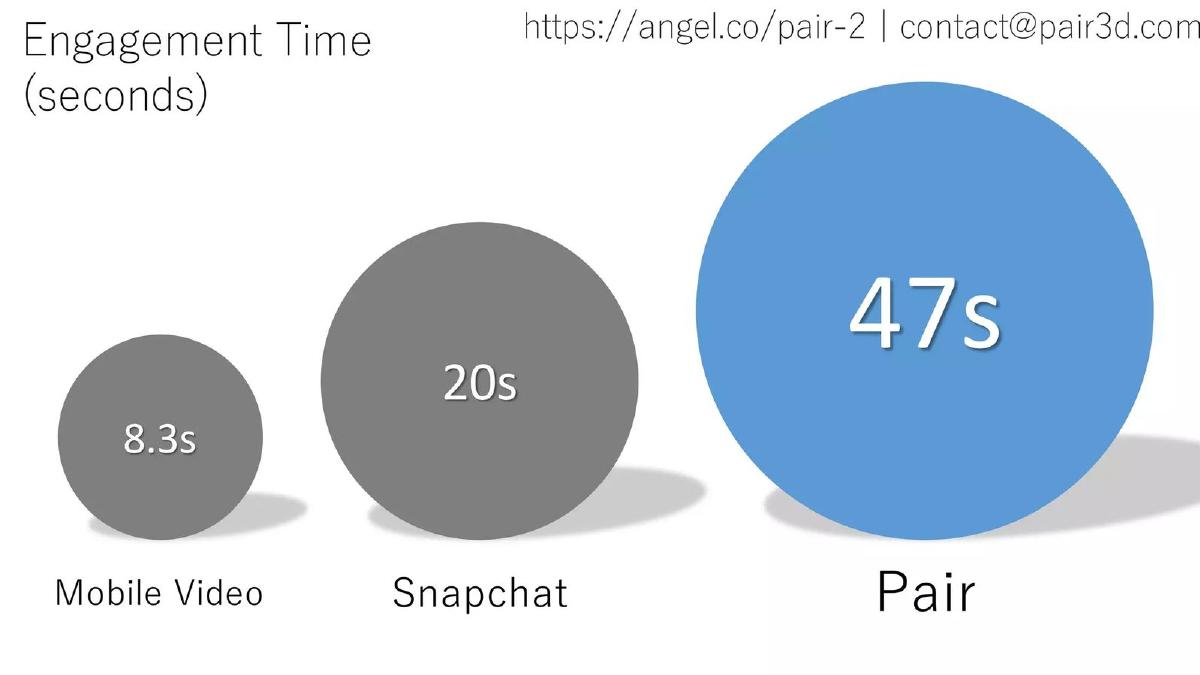
- Pair quantifies the value of AR through engagement time, claiming 47 seconds per session compared to Snapchat's 20 seconds (Slide 6).
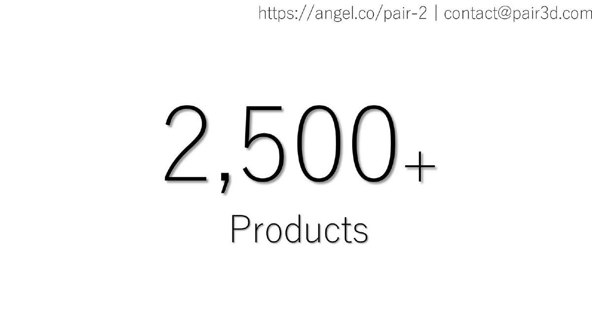
- The platform's scale is established by showing a catalog of 2,500+ products (Slide 4).
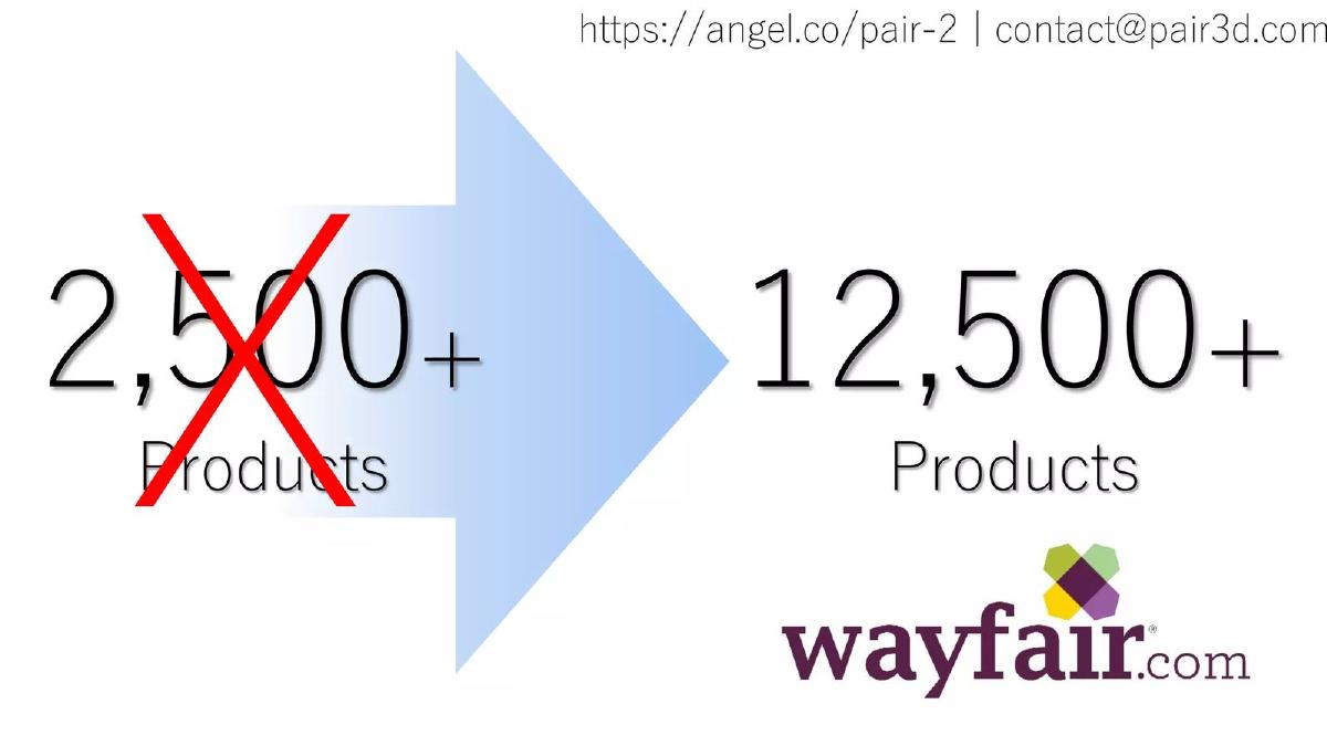
- A strategic relationship with Wayfair is implied through a slide showing a transition to 12,500+ products (Slide 5).
- The deck uses computer vision visualizations to demonstrate technical depth without technical jargon (Slides 7 and 9).
- The team slide leverages high-authority logos including WB Games, Gensler, and the U.S. Air Force to establish credibility (Slide 11).
- Traditional fundraising elements like a competitive matrix, financial ask, and business model are entirely omitted from the slides.
The Minimalist Traction Play
Pair’s pitch deck is a fascinating example of the 'show, don’t tell' philosophy. In an era where many AR startups were over-promising on future tech, Pair focused almost exclusively on what they had already built and how users were interacting with it. The deck is light on text and heavy on full-bleed imagery and large-font metrics. This approach works well for a seed round where the product is highly visual, but it leaves several structural gaps that more conservative investors might find frustrating.
Slide 1: Title and Branding
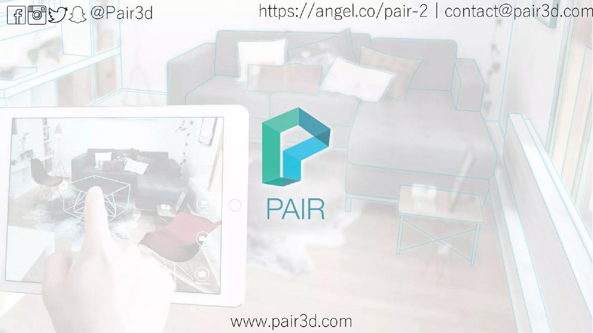
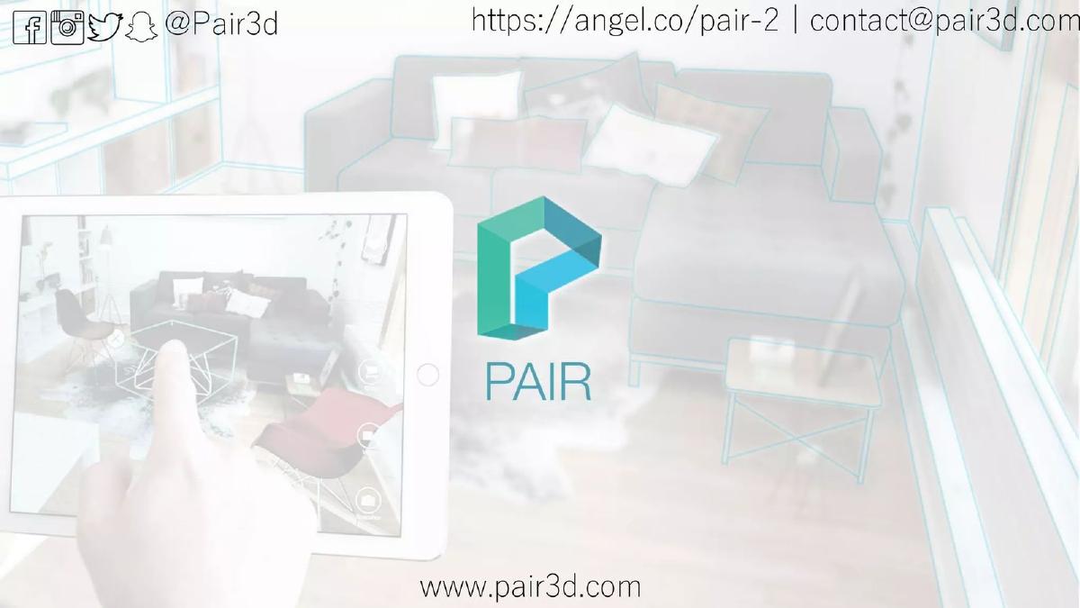
The cover slide is clean, featuring the Pair logo—a stylized 'P' that evokes 3D geometry—over a faded background of an iPad being used to visualize furniture in a room. It includes social media handles (@Pair3d), a website, and a contact email. As noted in the editorial context, there is no tagline. The brand name 'Pair' is intended to do the heavy lifting, suggesting the pairing of digital objects with physical spaces.
Slide 2: The Product in Action
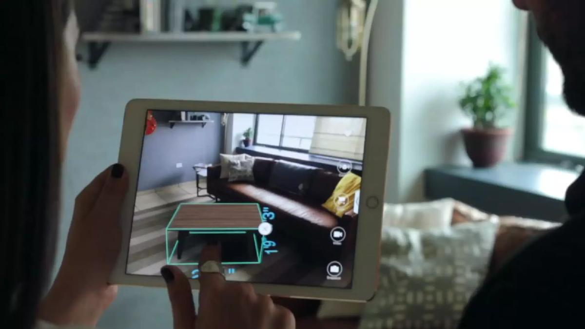
Slide 2 is a full-screen photo of the app being used. It shows a user’s hand interacting with a 3D coffee table on an iPad screen. The UI shows measurements (1' 9" x 3') and various icons for snapshots and video. This slide serves as a silent 'Solution' slide, immediately showing the investor exactly what the product does without a single word of copy.
Slide 3: The Growth Engine
This is arguably the most important slide in the deck. It features a line graph showing Monthly Active Users (MAU) climbing from 774 in January 2016 to 10,451 in July 2016. To the left, it highlights '38% MoM MAU growth' and to the right, a '61% Retention Rate' . These are elite-tier metrics for a seed-stage consumer/B2B hybrid app. High retention in AR is rare, as the technology is often seen as a 'one-and-done' novelty; 61% suggests genuine utility.
Slides 4 & 5: Catalog Scale and Partnerships
Slide 4 simply states '2,500+ Products' . This addresses the 'chicken and egg' problem of marketplaces—the app is only useful if it has the furniture users want. Slide 5 takes this further, showing an arrow moving from the 2,500+ figure to '12,500+ Products' with the Wayfair.com logo. This implies a massive expansion of the catalog through a major retail partnership, signaling that Pair has moved beyond a demo and into a scalable platform.
Slide 6: The Attention Metric
Pair makes a bold comparison on Slide 6 regarding 'Engagement Time (seconds)'. They claim '47s' for Pair, compared to '20s' for Snapchat and '8.3s' for Mobile Video. By positioning themselves against Snapchat, they are framing Pair not just as a utility tool, but as a high-engagement platform. For retailers, 47 seconds of focused attention on a product is an eternity and highly valuable for conversion.
Slides 7, 8 & 9: Technical Depth and Computer Vision
These three slides move away from business metrics and into the 'how'. Slide 7 shows a sparse point cloud and a camera frustum, indicating their proprietary spatial mapping. Slide 8 shows an 'augmented' room where existing furniture is outlined and labeled (e.g., 'Sofa: Grey; Wayfair: $699' and 'Ottoman: Black; IKEA: $299' ). This suggests the app can identify what a user already owns, which is a significant step up from simple AR placement. Slide 9 shows a dense 3D reconstruction of a room, further proving their computer vision capabilities.
Slide 10: The Team
The team slide features six headshots but, notably, no names or titles. Instead, it relies on a 'logo wall' of previous affiliations: U.S. Air Force, WB Games, Gensler, University of Alberta Center for Machine Learning, and BrandSource . This tells a story of a team with backgrounds in high-end architecture (Gensler), gaming (WB Games), and advanced AI. While effective, the lack of names is an unusual choice that forces investors to do extra homework.
Slides 11 & 12: Use Cases and Closing
Slide 11 is a dark, somewhat blurry image of what appears to be a commercial or outdoor space, perhaps hinting at construction or architectural use cases. Slide 12 shows a 3D Tesla Model S rendered in a driveway. This suggests that the 'Pair' technology is vertical-agnostic—if it can render a sofa, it can render a car. It broadens the Total Addressable Market (TAM) without needing a dedicated slide for it.
What Works in This Deck
Traction-First Narrative: By putting the 38% growth and 61% retention on Slide 3, Pair answers the most important question (Does anyone want this?) immediately. · Visual Proof: The deck uses almost no bullet points. For a technology as visual as AR, this is the correct choice. The 'Product in Action' and 'Computer Vision' slides prove the tech is real. · Strategic Benchmarking: Comparing engagement time to Snapchat is a clever way to make a niche utility app feel like a massive platform opportunity. · Implied Partnerships: The Wayfair slide is a powerful 'social proof' anchor that suggests the business model is already being validated by industry giants.
What is Missing
The Problem Slide: While the solution is clear, the deck doesn't explicitly state the size of the pain point or the inefficiency of current furniture shopping. · Business Model: There is no mention of how Pair makes money. Is it a SaaS fee for retailers? A commission on sales? A white-label solution? This is a major omission for a seed round. · The Ask: The deck ends without stating how much capital is being raised or what the 'milestones' for the next 18 months are. · Competitive Landscape: In 2016, several companies were entering the AR space. Pair ignores them entirely, which can sometimes be perceived as a lack of market awareness.
What a Founder Should Copy
The Engagement Comparison: If your product has a specific metric that outperforms a well-known giant (like Snapchat), use a bubble chart to visualize that gap. It provides instant context. · The 'Implied' Roadmap: Slide 5 (the arrow to 12,500 products) is a perfect way to show where the company is going without using a boring 'Roadmap' slide with dates and checkboxes. · Logo-Driven Credibility: If your team has worked at prestigious places, let the logos do the talking. It’s faster for an investor to scan a logo than to read a bio.
Frequently asked questions
- What was the primary goal of the Pair pitch deck?
- The primary goal was to demonstrate rapid user adoption and high engagement for their AR furniture placement app. By focusing on a 38% MoM growth rate and 61% retention, Pair aimed to prove that their technology wasn't just a gimmick but a high-utility tool that users returned to frequently. The inclusion of the Wayfair logo suggested a clear path to enterprise scaling and revenue.
- Why did Pair omit a 'Problem' slide?
- Pair likely assumed the problem—the difficulty of visualizing furniture in a home—was self-evident. By 2016, the 'pain point' of online furniture shopping was well-understood by investors. Instead of wasting time explaining the problem, Pair used the space to show they had solved the technical hurdles of AR, as evidenced by their product count and engagement metrics.
- How does Pair compare its engagement to other apps?
- On Slide 6, Pair compares its 'Engagement Time' of 47 seconds to Snapchat (20 seconds) and Mobile Video (8.3 seconds). This is a strategic move to frame AR as a superior medium for capturing consumer attention. For investors, higher engagement time often correlates with higher conversion rates in e-commerce, making the business case more compelling.
- What technical capabilities are highlighted in the deck?
- The deck highlights computer vision and spatial mapping. Slide 7 shows a point-cloud-style visualization of a room, while Slide 9 shows a 3D reconstructed environment. Slide 8 demonstrates 'object recognition' or tagging, where a sofa, ottoman, and lamp are identified with their prices and retailers (IKEA and Wayfair). This suggests the tech can do more than just place items; it can understand existing spaces.
- Is the lack of a financial 'ask' a mistake?
- In the context of a 2016 seed round, omitting the 'ask' from a circulated deck was common for privacy or to allow for flexible terms during different meetings. However, for a standalone presentation, it leaves a gap. Investors generally want to know how much is being raised and what the specific milestones are for that capital. Pair relied on the strength of their traction to prompt that conversation.