Bothsider.com presented a 12-slide deck in 2014 that leans heavily on minimalism and visual metaphors. The deck is notable for its refusal to claim a traditional 'problem,' instead positioning the product as 'filling a gap' left by platforms like Twitter. While it provides a comprehensive list of competitors across web and mobile, the deck suffers from a lack of concrete data, missing team information, and a revenue slide composed entirely of icons without labels. The funding ask is also redacted or left as a placeholder, making it more of a conceptual framework than a complete investment pro…
Key takeaways
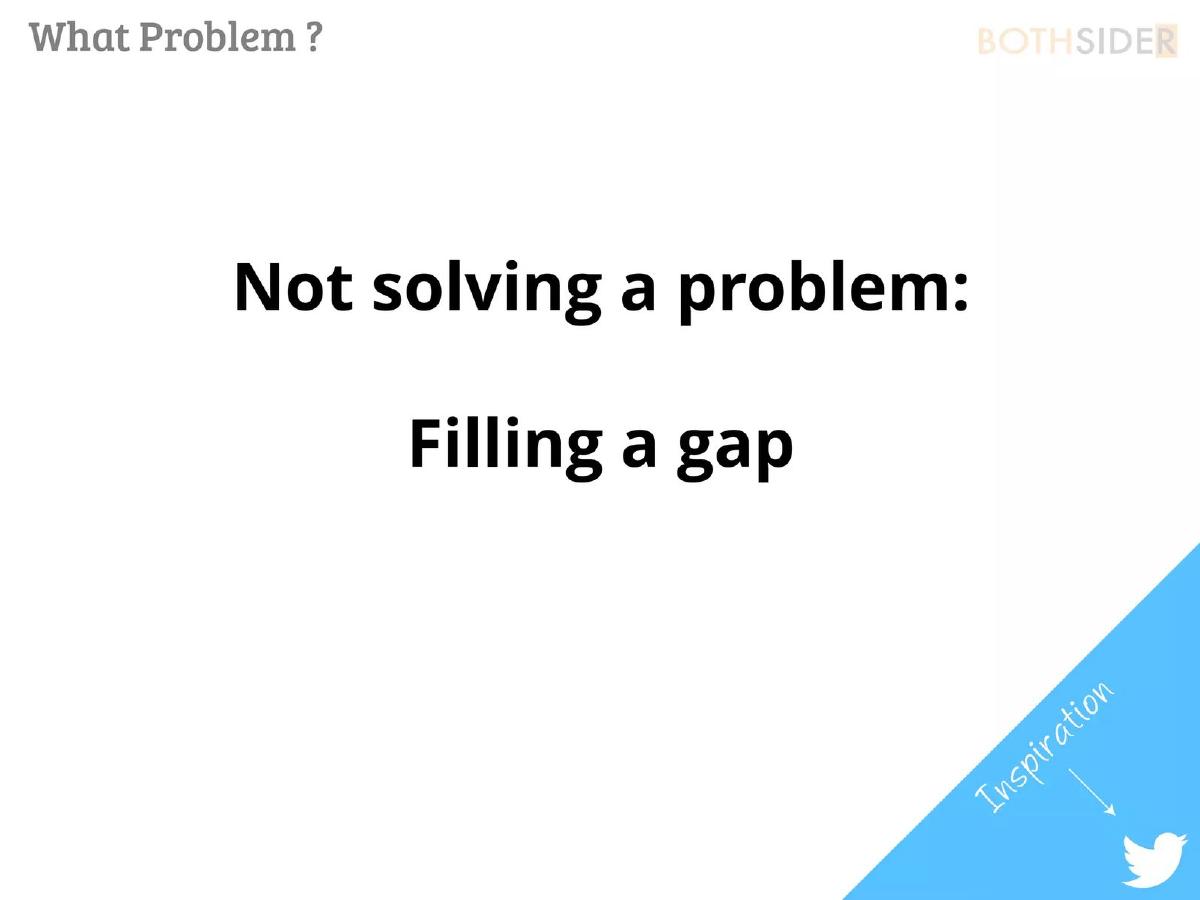
- The deck explicitly states the company is 'Not solving a problem' but rather 'Filling a gap' on slide 2.
- Twitter is cited as the primary inspiration for the product's direction on slide 2.
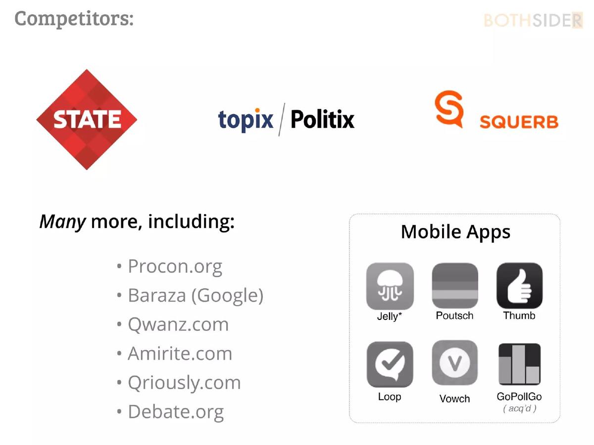
- A robust competitive analysis lists 15 different entities, including State, Topix, and Google's Baraza on slide 3.
- The company identifies three core operational hurdles: Fatigue, Purpose, and Engagement on slide 4.
- Monetization is represented purely through six icons with no supporting text or financial projections on slide 5.
- The funding request is conditional, stating they are 'ONLY seeking $$$ IF engagement' reaches a certain threshold on slide 6.
- The deck omits a team slide, product screenshots, and specific user growth metrics in the provided pages.
- The 'Use of Funds' section on slide 6 contains only placeholder text rather than specific allocations.
Introduction
The Bothsider.com pitch deck, dated May 2014, is a minimalist document that reflects the 'lean startup' aesthetic of its era. With only 12 slides total (6 of which are analyzed here), the deck relies on high-level concepts rather than granular data. It attempts to carve out a space in the social polling and debate market, which was heavily crowded at the time. The deck is notable for its honesty regarding the challenges of the sector, though it leaves much to the imagination regarding execution and team expertise.
Slide 1: Title Slide
The cover slide is extremely simple, featuring the brand name 'BOTHSIDER' in a sans-serif font against a solid orange background. The 'R' at the end is enclosed in a dark grey box, a stylistic choice that serves as the company's logo. There is no tagline, no date, and no presenter information on this specific slide. It establishes a high-contrast visual identity but provides zero context for what the business actually does.
Slide 2: The Problem (or Lack Thereof)
Slide 2 is titled 'What Problem?' and contains a surprising statement for a pitch deck: 'Not solving a problem: Filling a gap.' This is a risky rhetorical move. Most investors are trained to look for 'pain points' that a startup solves. By claiming there is no problem, the founders are betting that the 'gap' in the market is so obvious that it justifies a new platform. In the bottom right corner, a blue triangle labeled 'Inspiration' points to the Twitter logo. This suggests that Bothsider.com intended to be a more structured or 'two-sided' version of the real-time discourse found on Twitter.
Slide 3: Competitive Landscape
This slide provides a comprehensive look at the 2014 social polling market. It categorizes competitors into three groups: major logos (State, Topix/Politix, Squerb), a list of web-based platforms (Procon.org, Google's Baraza, Qwanz.com, Amirite.com, Qriously.com, Debate.org), and a grid of mobile apps (Jelly, Poutsch, Thumb, Loop, Vowch, and GoPollGo). The inclusion of GoPollGo with an '(acq’d)' note shows the founders were tracking exit activity in the space. This slide is the most information-dense part of the deck, proving the founders had done their homework on the existing ecosystem.
Slide 4: Challenges
Slide 4 uses a large orange warning triangle to highlight three 'Challenges': Fatigue, Purpose, and Engagement. This is an editorialized 'Risk' slide. It acknowledges the primary reasons why social polling apps fail: users get tired of answering questions (Fatigue), they don't see the point of the data being collected (Purpose), and they stop opening the app (Engagement). While identifying these risks is good, the slide offers no solutions or strategies for how Bothsider.com intends to overcome them.
Slide 5: Revenue Model
Titled 'How to Make Money,' this slide is entirely visual. It features six icons separated by dotted lines. The icons represent:
A link (likely affiliate marketing or referral traffic). · A megaphone (traditional display or native advertising). · A database (selling anonymized user sentiment data). · A desk lamp (potentially featured content or 'spotlight' polls). · A gift box and a bucket (possibly subscriptions, 'tipping,' or freemium features). · A crossed-out eye (privacy-focused features or an ad-free experience).
The lack of text on this slide is a significant weakness. Without labels or projected percentages, these are merely guesses at revenue streams rather than a cohesive business model.
Slide 6: Funding and Ask
The final slide in this set, titled 'Funding:', is highly unconventional. It states they are 'ONLY seeking $$$ IF engagement' reaches a certain point, with an arrow pointing toward the Bothsider logo. It lists a 'Seed, Summer 2014' round, but the dollar amount is represented by a grey box, suggesting it was either redacted or left as a template. Below this are two placeholder bars labeled '(use of funds)' and '(use of funds cont’d)'. This slide suggests the deck may have been used for early 'soft' conversations with investors rather than a formal hard-close pitch, as it lacks a specific ask and clear milestones.
What Bothsider.com Does Well
The deck excels at market awareness . Slide 3 is a very honest assessment of the competition. Many founders try to hide their competitors or claim they have none; Bothsider leans into the fact that they are entering a busy room. This builds credibility with investors who likely already know about these other players.
The visual consistency is also strong. The use of orange, grey, and white creates a professional, if somewhat sterile, brand identity. The deck is not cluttered with text, which makes it easy to digest during a live presentation where the founder would be speaking over the slides.
What is Missing from the Deck
The most glaring omission is the Team Slide . In early-stage seed rounds, the team is often more important than the idea. Without knowing who is building the product, an investor cannot assess the technical or operational feasibility of the project.
Second, there are no Product Screenshots . For a company that claims to be 'filling a gap' left by Twitter, showing the user interface is essential. Investors need to see how the 'both sides' aspect is handled visually to understand the 'Purpose' and 'Engagement' mentioned on slide 4.
Finally, the Revenue Slide is too vague. While icons are great for a high-level overview, a 'How to Make Money' slide needs to explain which of those six streams is the primary driver and what the unit economics look like. As it stands, it looks like a 'throw everything at the wall' approach to monetization.
Founder's Takeaway: What to Copy and What to Avoid
Copy the competitive analysis style. The way slide 3 categorizes competitors by platform (web vs. mobile) and acknowledges acquisitions is a best practice. It shows you are a student of your industry and understand the current state of the market.
Avoid the 'No Problem' trap. Even if you feel you are 'filling a gap,' you should always frame that gap as a problem for the user. For example, instead of saying 'not solving a problem,' they could have said 'Current social media creates echo chambers; Bothsider creates balanced discourse.' This turns a 'gap' into a 'solution' for a specific pain point (echo chambers).
Avoid placeholder text in shared decks. Slide 6, with its '(use of funds)' labels, should never be seen by an external party. If you aren't ready to disclose your use of funds, remove the slide entirely or speak to it generally. Placeholders make a deck look unfinished and unprofessional.
Conclusion
The Bothsider.com deck is a product of its time—a period when 'engagement' was the primary currency and business models were often an afterthought. While the minimalist design is aesthetically pleasing, the lack of concrete details regarding the product, the team, and the financial path forward makes it a weak standalone document. It functions more as a visual aid for a conversation than a persuasive investment case.
Frequently asked questions
- What is the core value proposition of Bothsider.com?
- Based on the slides, Bothsider.com positions itself as a platform for structured debate or polling that fills a gap in the current social media landscape. Slide 2 indicates that Twitter served as the inspiration, suggesting a focus on short-form, public discourse, but the deck lacks a specific product description or feature list to clarify how it differs from a standard microblogging site.
- How does Bothsider.com plan to generate revenue?
- Slide 5, titled 'How to Make Money,' uses six icons to represent revenue streams. These include a link (affiliate marketing), a megaphone (advertising), a database (data sales), a lamp (possibly premium content or 'spotlight' features), a gift/bucket (donations or subscriptions), and a crossed-out eye (privacy features). However, there is no text to confirm these interpretations or provide projected margins.
- Who are the main competitors identified in the deck?
- Slide 3 lists a wide array of competitors. Major web-based rivals include State, Topix/Politix, and Squerb. It also mentions niche sites like Procon.org and Debate.org. In the mobile space, it identifies Jelly, Poutsch, Thumb, Loop, Vowch, and the acquired GoPollGo. This suggests the founders were aware of a highly saturated market in the social polling sector.
- What is the 'gap' the company refers to on slide 2?
- The deck does not explicitly define the gap in text. However, by placing it in the context of 'Inspiration: Twitter' and listing competitors like 'Debate.org' and 'Procon.org,' it implies that existing social networks are too disorganized for structured 'both sides' arguments, while existing debate sites lack the social engagement and speed of mobile apps.
- What are the biggest risks mentioned in the pitch?
- Slide 4 highlights three 'Challenges' arranged in a warning triangle: Fatigue, Purpose, and Engagement. This is a candid admission that social polling apps often struggle with user retention (fatigue), giving users a reason to return (purpose), and maintaining high levels of interaction (engagement) over time.