Gridle.io's 16-slide deck, created on 15 October 2014, pitches an Indian team-collaboration platform five weeks after launch. The measured numbers are real and respectable - 602 signups, 329 teams, 200 active users, 69 companies on the free plan, coverage in Business Standard and The Times of India - and two slides candidly print what users disliked. But six slides share one three-big-numbers template that formats hopes exactly like facts: $80 a month had never been charged because the payment gateway was still on the roadmap, 29 companies is claimed as cash-even against an ask eight times la…
Key takeaways
- Gridle's 16-slide October 2014 deck was made 35 days after launch, and the deck never states that its headline numbers come from five weeks of data.
- Six of sixteen slides use the same three-big-numbers layout, giving identical visual weight to measured signups, unsourced industry statistics and a price no customer had ever paid.
- Slide 5 claims 29 companies make the business cash-even - $2,320 a month - while slide 16 asks for INR 1.5 crore (about US$245,000) to fund 18 months.
- The $80 monthly price was untested: slide 8 shows 69 companies on the free version and slide 12 lists 'Payment Gateway' as a feature to be built the following quarter.
- 602 signups across 329 teams is 1.83 people per team, which cannot coexist with the claim that 85% of signups invited at least two colleagues.
- The team slide has four photographs and no names, roles, prior companies or credentials - on the page a seed investor underwrites.
- The competition slide claims 12 players and names two, omitting Slack, which had launched eight months earlier on the same premise.
- The deck's most unusual strength is a 'Most Worrisome' column printing user complaints, including that 11 of 200 users could not work out how to add colleagues - the exact mechanism behind its headline engagement metric.
What this deck actually is
Sixteen slides, created in PowerPoint on 15 October 2014, from Gridle.io — an Indian team-collaboration product built in Ahmedabad. The tagline on the cover is "Visualize. Communicate. Execute". The running order is cover, issue, problem statistics, solution, business model, competition, key metric, traction, user feedback (two slides), product roadmap (two slides), team, finances, media mentions, and the ask.
The product had launched thirty-five days before the deck was made. That is the single most important fact about this document, and the deck never says it out loud: every number in it comes from five weeks of life.
The design is disciplined and, in one respect, unusual. Six of the sixteen slides use exactly the same layout — three large blue numerals separated by vertical rules, with a caption under each. Problem, business model, competition, key metric and traction are all rendered as three-number triptychs. It reads as confident and data-driven. Look closely at what those numbers are and the confidence starts to look like a costume: the same visual weight is given to a measured signup count, an unsourced industry statistic, and a price nobody has ever paid.
The ask, on the final slide, is INR 1.5 crore for eighteen months — roughly US$245,000 at October 2014 exchange rates — split across three unlabelled buckets with no amounts, no percentages and no milestones.
Slide-by-slide walkthrough
Slide 1 — Cover
The Gridle.io wordmark over a world map drawn from coloured dots, the tagline "Visualize. Communicate. Execute", and a footer strip of six logos: Business Standard, The Times of India, Microsoft BizSpark, CIIE, and IBM PartnerWorld.
Putting third-party logos on the cover is a legitimate move for an unknown company from an unknown city — it buys three seconds of attention. But the strip mixes two different kinds of credential without distinguishing them. Business Standard and The Times of India are press coverage. Microsoft BizSpark and IBM PartnerWorld are self-serve developer programmes that in 2014 required little more than a filled-in form. CIIE is a real accelerator at IIM Ahmedabad and is the strongest logo on the row. Presented as one undifferentiated line, the weakest badges dilute the strongest one.
The cover also has no date, no round name, no stage, no contact details and no presenter. A file that circulates by email needs all four.
Slide 2 — "Issue"
The observation is correct and, in 2014, timely — Slack had launched in February of that year on exactly this premise. What the slide does not do is tell you whose problem it is. Not a persona, not a company size, not an industry, not a country. "At work" is every knowledge worker on earth, and a problem that belongs to everyone is a problem no salesperson can find a buyer for.
The word "Issue" also undersells the pitch. An issue is an inconvenience. Fundable problems are described as costs, and the very next slide has the cost — it is just on the wrong page.
Slide 3 — "Working is hard. Working together is even harder."
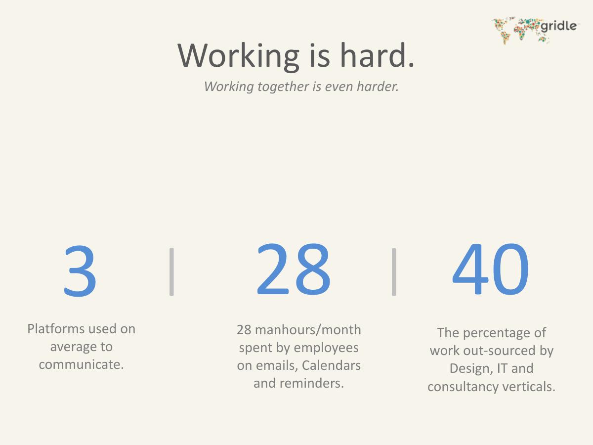
Three numbers: 3 platforms used on average to communicate; 28 manhours per month spent by employees on emails, calendars and reminders; 40 as "the percentage of work out-sourced by Design, IT and consultancy verticals".
Not one of the three carries a source. No report, no analyst, no survey, no year, no sample. Two of them are the kind of figure an investor will Google during the meeting, and the third — 40% of work outsourced in three named verticals — is specific enough to sound researched and vague enough to be unverifiable, because it never says outsourced by whom, measured how, or in which market.
The 28 manhours figure is the one worth keeping, because it is convertible. Twenty-eight hours a month at any plausible Indian or US loaded salary produces a monetary cost per employee per month, and that number can be set directly against the $80 monthly price on the next slide. The deck does the hard part — finding a quantified pain — and then skips the easy part, which is turning it into the arithmetic that justifies the price.
The third statistic points somewhere else entirely. If 40% of work is outsourced, the real problem is coordinating with people outside your company, which is a different product from an internal team chat tool. That thread is dropped and never picked up again.
Slide 4 — Solution
This is the emptiest slide in the deck, and it sits in the position where an investor decides whether to keep reading. There is no screenshot, no feature list, no workflow, no description of what Gridle actually does. The reader has to reach slides 9 and 10 — the user-feedback pages — before learning that the product contains tasks, a desk, chat, files, a calendar, an activity log and network stats. The product is described only in the negative space of what users complained about.
"A unified platform" is also the answer every competitor gives. Basecamp, Asana, Podio and Zoho all described themselves as unified platforms in 2014. A solution slide has to say what is different, and the deck's own differentiation — "visually contextual communication", which appears in a subtitle two slides later — is nowhere on the slide meant to carry it.
Slide 5 — Business Model
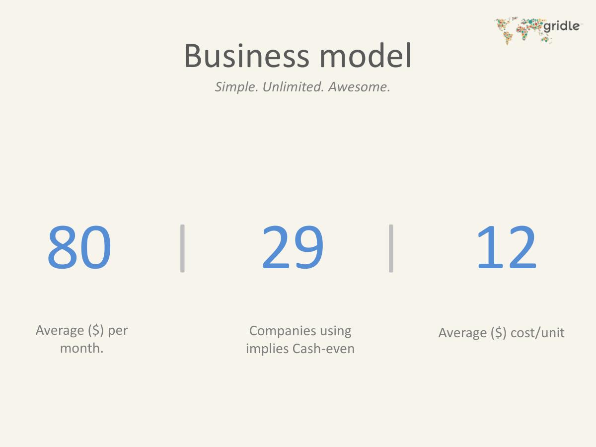
Subtitle: "Simple. Unlimited. Awesome." Three numbers: 80, average dollars per month; 29, "Companies using implies Cash-even"; 12, average dollar cost per unit.
This is the slide where the deck breaks. Start with the claim buried in the middle caption: twenty-nine paying companies make Gridle cash-even. Set that against the ask on the final slide — INR 1.5 crore, about US$245,000, for eighteen months. Twenty-nine companies at $80 a month is $2,320 a month, or roughly $28,000 a year. A company that is cash-even at $28,000 a year of revenue has an all-in burn of about $2,300 a month, which does not survive contact with a team of four plus servers, let alone with the product development and marketing budget the last slide is asking to fund. Either the cash-even figure excludes founder salaries and everything else that matters, or the $245,000 ask has no relationship to the operating model. The deck presents both on the same document and reconciles neither.
Then the $80. On the very next slide the deck states that the average competitor price is $6 per user per month. Eighty dollars a month against a $6 competitor benchmark could be perfectly reasonable — $80 is presumably per company, so a ten-seat team pays $8 per seat — but the deck never says whether $80 is per user, per company or per team, and it never sets the two figures side by side. Two adjacent slides carry two prices in incompatible units.
Worst of all, nobody has paid the $80. Slide 8 says sixty-nine companies are using the free version, and slide 12's roadmap lists "Payment Gateway" as a feature to be built between October 2014 and January 2015. There was no way to charge a customer when this deck was written. The $80 is a hypothesis rendered in the same forty-point blue numeral as the 602 real signups.
"Average ($) cost/unit — 12" is never explained. Cost of what unit: a customer, a user, a server, a support ticket? If $12 is the cost to serve a company paying $80, that is an 85% gross margin and belongs on the slide in words. As printed, it is a number with no noun.
Slide 6 — Competition
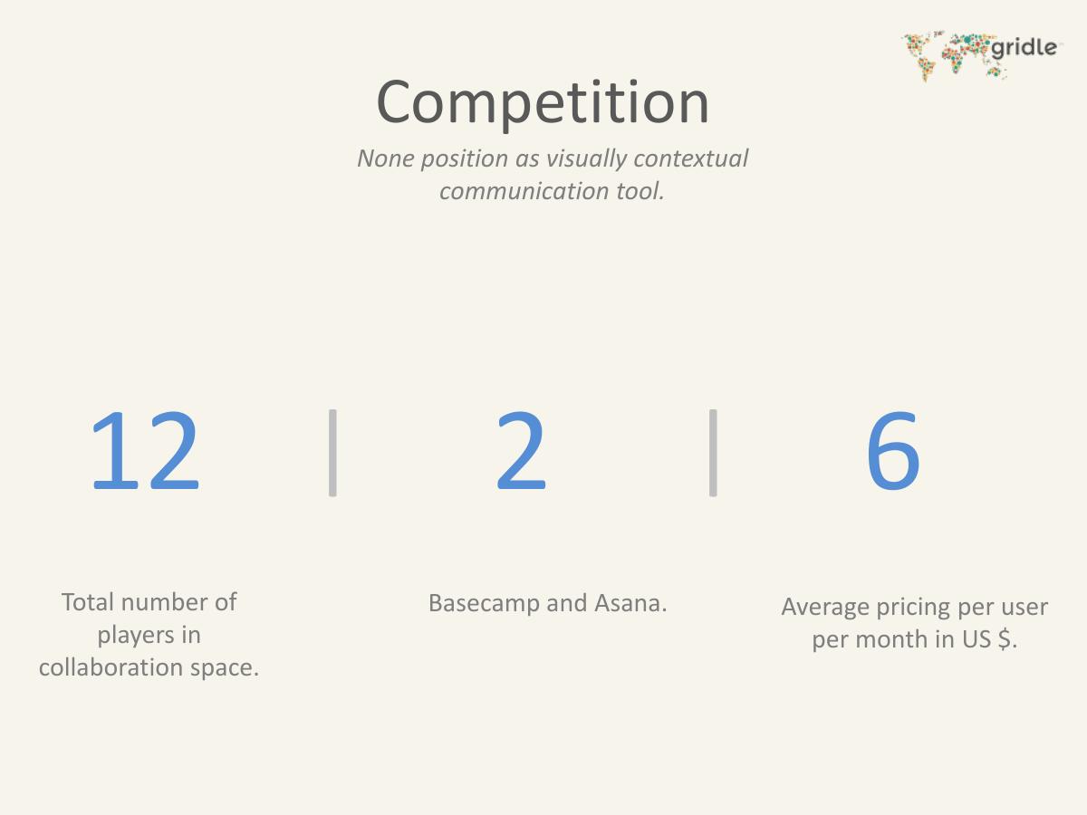
Subtitle: "None position as visually contextual communication tool." Three numbers: 12 total players in the collaboration space; 2, being "Basecamp and Asana"; 6, average pricing per user per month in US dollars.
The differentiation claim in the subtitle is the sharpest sentence in the deck, and it is set in nine-point italic under a heading. "Visually contextual communication" is the whole positioning; it should be the title of the solution slide, not a caption on the competition slide.
The number 12 is asserted and then contradicted by the deck's own honesty: only two players are named. In 2014 the collaboration space contained Basecamp, Asana, Trello, Podio, Wrike, Redbooth, Producteev, Yammer, HipChat, Flowdock, Zoho Projects, Bitrix24, Microsoft SharePoint, Google Apps and a Slack that had launched eight months earlier and was already the fastest-growing business application anyone had seen. Twelve is not a count of the market; it is a count of the ones the founders thought about.
Slack's absence is the most consequential omission in the document. An investor reading a team-communication deck in October 2014 had Slack in mind before opening the file. A deck that does not name it either has not noticed or is hoping the reader will not — and both readings are fatal in the meeting.
Naming Basecamp and Asana as the two real competitors is also a category error the deck does not seem to see. Basecamp and Asana are project-and-task tools. Gridle's own problem slide is about communication channels. Comparing yourself to the wrong two companies makes the "nobody positions as we do" claim true by construction.
Slide 7 — Key Metric
Subtitle: "Launched on 10th Sept. 2014." Three numbers: 602 people signed up; 85, the percentage who invited at least two others to work together; 329 teams supported by Gridle.
This is the best slide in the deck. It is dated, it is specific, and the middle number is a genuine engagement metric rather than a vanity count. Eighty-five percent of signups inviting two or more colleagues would be an outstanding viral coefficient, and it is exactly the sort of thing a seed investor wants to see from a five-week-old product.
It also does not add up. Six hundred and two signups across 329 teams is 1.83 people per team. If 85% of those signups had each brought in at least two others, average team size could not be below three. The two numbers on the same slide describe two different products: one where almost everybody invites colleagues, and one where the median team is a person and a half. The likeliest explanation is that "invited" counts invitations sent rather than accepted — which is a much weaker claim, and one the caption should have made.
The slide is also missing the number that decides the round: retention. Six hundred signups in five weeks tells you the marketing worked. How many of the 602 came back in week four tells you whether the product did. There is no weekly active figure, no cohort, no churn, and no revenue anywhere on the page — and this slide is titled "Key-Metric", singular.
Slide 8 — Traction
Subtitle: "Proof of concept." Three numbers: 23 of 29 companies agreed to the need; 69 companies using the free version; 1 exclusive licensing deal for Singapore.
The first number is not traction. Twenty-three of twenty-nine companies agreeing that a problem exists is customer research, and agreement in an interview is the cheapest signal in software — people say yes to problems and no to invoices. Presenting it as the lead traction figure signals that the founders did not have a stronger one.
The 29 is also doing double duty. On slide 5, twenty-nine companies is the number that makes the business cash-even. On slide 8, twenty-nine is the number of companies interviewed, of which twenty-three merely agreed there was a need. The reader is invited, without being told, to treat a research sample as a revenue forecast.
Sixty-nine companies on the free version, five weeks after launch, is a real and respectable number. It also quietly confirms that paying customers were zero.
The Singapore licensing deal is the most interesting item in the deck and gets four words. Who is the licensee? What are the terms, the minimum guarantee, the duration, the territory rights given away? An exclusive licence for a country, signed by a five-week-old startup, is either a meaningful commercial validation or a serious encumbrance on the cap table's future — and an investor will need to know which before wiring money. The deck offers no way to tell.
Slides 9 and 10 — Feedback from 200 active users
Two slides of tallied user feedback. Most valuable: UX/UI, flow and feel (27 mentions); task management, speed and feedback (13); Desk (6); Chat (2). Least valuable: activity log (13); network stats (8); calendar (6); profile (3). Wanted more of: mobile app (23); integrations (15); file viewer (11); online status in chat (6); video calling and whiteboarding (5); detailed statistics and monthly reports (2); time tracking (2); @mentions and #tagging (2); comments on tasks and files (2). Most worrisome: "Can't figure out how to add users on the first go" (11); "Go mobile first and then web" (3); "User on-boarding is hard for an enterprise" (2).
Devoting two of sixteen slides to user feedback, including a column explicitly headed "Most Worrisome", is a genuinely unusual act of candour. Very few seed decks print what users disliked, and fewer still print the words "user on-boarding is hard". A founder who shows the bad feedback is telling the investor they can be trusted with the next set of bad news, which is worth more than the slide costs.
The problem is what these slides reveal when read against slide 7. Eleven of two hundred active users could not work out how to add colleagues on the first attempt. Adding colleagues is the entire mechanism behind the 85% invite rate and the 329 teams. The deck's headline engagement metric and its most-cited usability failure are the same feature, and the deck never notices.
The numbers are also unnormalised. Twenty-seven mentions of UX out of how many respondents? Two hundred users were surveyed, but the tallies sum to far fewer than two hundred on every column, so the reader cannot tell whether 27 means 13.5% of users or 60% of the ones who answered that question. And "200 active users" appears here for the first time, with no definition of active and no relationship stated to the 602 signups on slide 7. If 200 of 602 are active five weeks in, that is a 33% activation rate and it should be on the metrics slide as a headline, not implied by a subtitle two pages later.
Slides 11 and 12 — Product Roadmap
The first covers 15 September to 18 October 2014: product stabilisation, simpler UI flow, network delete and upgrade, mobile and tablet optimisation, transactional emails, a knowledge base, a tour, caching and compression, and IP restriction for networks. The second covers 19 October 2014 to 15 January 2015: user invitation mechanism, optimised real-time notifications and chat, advanced network analytics, UI transitions, an illustrated tour, homepage conversion optimisation, comments on files and tasks, checklists in tasks, advanced search, integrations with Framebench, Cliqmeet, Dropbox and Google, image and PDF preview, keyboard shortcuts, @mentions, a payment gateway, and a mobile app.
The first roadmap slide expires three days after the deck was created. Showing an investor a plan that is already over, with no column marking what shipped and what slipped, wastes a slide and invites the question of why the delivered items are not simply listed as achievements.
The second is a list of nineteen items for one quarter from a team of four. Nothing is prioritised, nothing is sized, and the two entries that determine whether the company has a business — the payment gateway and the mobile app — sit at positions fifteen and sixteen, formatted identically to "keyboard shortcuts onDesk". The mobile app is the single most requested item in the user feedback, with 23 votes, and one user explicitly said the company should go mobile first. The payment gateway is the reason the $80 price on slide 5 is theoretical. Both are buried.
Two roadmap slides out of sixteen is also the wrong allocation for a seed deck. Roadmaps belong in the data room; the deck should show the wedge and the evidence.
Slide 13 — The Team
Title: "The Team". Subtitle: "And their audacity to change the way people work together." Four photographs of people speaking at events. No names. No roles. No prior companies. No education. No years of experience. No LinkedIn links.
This is the most serious structural failure in the deck. At seed stage, with five weeks of data and no revenue, the team is what an investor is actually underwriting — and this deck gives four unlabelled photographs. A reader cannot tell who is the CEO, who writes the code, whether anyone has shipped a product before, or whether anyone has sold software to a business.
The information exists: the PDF metadata names Yash Shah as the author, and CIIE at IIM Ahmedabad had backed the company. None of it is on the slide. Four names, four one-line roles and four prior credentials would have cost the same amount of space the photographs already occupy.
Slide 14 — Finances
Subtitle: "Investors, advisors and awesome people..". Two logos with descriptive paragraphs. CIIE — "fosters innovation driven entrepreneurship in India through incubation, investment and training. Apart from investing in over 50 innovative ventures..." Hiraco Ventures — "the investment arm of Hiraco India Pvt Ltd. They are in the angel investing space and are looking at ideas that bring creativity and innovation to the fore."
A slide titled "Finances" that contains no finances. There is no amount raised, no valuation, no date, no instrument, no cap table, no current cash balance and no monthly burn. Both paragraphs are boilerplate describing what the investors do in general, not what they did for Gridle.
The one thing a professional investor needs from this page — how much money is already in, on what terms, and how much runway is left — is absent. Naming two credible existing backers is worth real credibility; withholding the amounts converts that credibility into an awkward question in the first meeting.
Slide 15 — Media Mentions
Three pull quotes with logos. YourStory: "With a sleek and clean UI, a secure cloud based service, and prices that are easy on the pocket, Gridle comes to the rescue". The TechPanda: "Gridle definitely fills in a gap in the existing SMB Collaboration Market, by offering a visually appealing tool which unifies platforms and simplifies communication". Business Standard: "Gridle provides important tools for organisations to optimise workforce efficiency and eases project management. Its ability to self-manage and sync-team is of value, while data-visualisation in collaboration is unique." Below, five more logos: Pointo, NextBigWhat, StartupCentral, The Times of India.
This is a well-executed slide. Real publications, real quotes, quotes chosen because they articulate the positioning rather than because they are flattering. The TechPanda quote in particular does the job the solution slide failed at: it names the segment (SMB collaboration), the mechanism (unifies platforms) and the differentiator (visually appealing) in one sentence.
Two things are missing. None of the quotes is dated, and press coverage ages badly. And the deck never converts coverage into effect — five weeks after launch with national press, how many of the 602 signups came from these articles? That single number would turn a credibility slide into a distribution slide.
Slide 16 — The Ask
"INR 1.5 Cr" in large type. Under it, "For 18 months". Below, three words separated by vertical rules: Product Development, Marketing, Buffer. No figures, no percentages, no bars, no milestones.
An ask slide with no allocation is not an ask slide. The reader cannot tell whether product development is 70% of the money or 30%, how many hires the budget covers, what the monthly burn implied by INR 1.5 crore over eighteen months is (about INR 8.3 lakh a month, which the deck leaves the reader to calculate), or what "Buffer" means as a category — buffer is what is left after planning, not a line item.
There is no instrument, no valuation, no equity offered, no minimum cheque and no lead status. Nothing states what the company will have proved when the eighteen months are over — no target revenue, no target paying customers, no retention goal. And with a payment gateway not yet built, the most important commitment the slide could have made is the one it does not: how many paying customers will exist when the money runs out.
The deck also ends here. There is no closing slide, no contact details, no email address and no name. A reader who wants to invest has to go back to the cover, which has no contact details either.
What Gridle got right
It published its own bad feedback. A column headed "Most Worrisome" that includes "user on-boarding is hard for an enterprise" is rare and buys real trust. · The key metric slide is dated. "Launched on 10th Sept. 2014" lets the reader convert every number into a rate, which most decks make impossible. · It shipped and measured before raising. Five weeks post-launch with 602 signups, 329 teams and 200 active users beats any deck of mockups. · The positioning line is genuinely differentiated. "Visually contextual communication tool" describes a real product difference in four words. · Press quotes are real, named and on-message. Three publications, three quotes that each articulate the value proposition rather than just praising the team. · An engagement metric leads over a vanity metric. Whatever the 85% invite figure actually measures, choosing invitation behaviour over raw downloads is the right instinct. · Existing backers are named. CIIE at IIM Ahmedabad is a credential a cold reader can verify in one search. · The design is consistent and legible. Sixteen slides, one typeface, one palette, generous whitespace, no clip art.
Where this deck would fail in an investor meeting
No team names. Four unlabelled photographs on the slide that carries the entire seed-stage investment case. · Slack is not mentioned. A team-communication deck in October 2014 that does not name the year's fastest-growing business application. · Cash-even at 29 companies contradicts a $245,000 ask. $2,320 a month of revenue cannot break even against the budget the last slide requests. · The $80 price has never been charged. The payment gateway appears on the roadmap for the following quarter. · Two prices in two units on adjacent slides. $80 per month on slide 5, $6 per user per month on slide 6, never reconciled. · 602 signups across 329 teams is 1.8 people per team — arithmetically incompatible with 85% inviting two or more colleagues. · No retention data of any kind. No weekly actives, no cohort, no churn, five weeks after launch. · Three problem statistics, zero sources. 3 platforms, 28 manhours, 40% outsourced — no report, no year, no sample. · The solution slide says "A unified platform" and nothing else. No screenshot appears anywhere in sixteen slides. · "23 of 29 companies agreed to the need" is presented as traction. It is interview agreement, the cheapest signal available. · The 29 does double duty — the research sample on slide 8 becomes the cash-even customer count on slide 5. · A "Finances" slide with no financial figures. No amount raised, no valuation, no burn, no runway. · The Singapore exclusive licence gets four words. No counterparty, terms, value or duration for a deal that encumbers a whole market. · Two roadmap slides, one of them already expired three days after the file was created. · Nineteen roadmap items for one quarter from a four-person team, unprioritised and unsized. · The most-requested feature is buried. A mobile app has 23 user votes and sits sixteenth on a roadmap list. · The ask has no allocation. Three unlabelled buckets, no percentages, no instrument, no valuation, no milestones. · No contact details anywhere. No email, no phone, no name, on the cover or the closing slide.
Numbers that do not reconcile
29 companies = cash-even Slide 5, business model $2,320/month revenue vs a US$245,000 / 18-month ask on slide 16 $80 average per month Slide 5 $6 average per user per month on slide 6; no unit stated for either $80 price Slide 5 Payment gateway is a Q4 2014–Q1 2015 roadmap item on slide 12 85% invited 2+ colleagues Slide 7 602 signups / 329 teams = 1.83 people per team 29 companies interviewed Slide 8 Same 29 used as the paying-customer break-even count on slide 5 200 active users Slides 9–10 subtitle Never defined, never related to the 602 signups on slide 7 12 players in the market Slide 6 Only 2 named; Slack, Trello, Podio, Yammer and HipChat all absent "Finances" Slide 14 Contains no amount, valuation, burn or runway
How you would rebuild this deck without changing the company
Put names on the team slide. Four names, four roles, four prior credentials, and the CIIE affiliation stated in words. This is the cheapest and largest single improvement available. · Name Slack on the competition slide and answer it. One sentence on why a visually contextual tool wins where a chat river does not. Ignoring it does not make the question go away; it just means you answer it live, unprepared. · Show the product. Replace "A unified platform" with two screenshots and the sentence from The TechPanda quote — a visually appealing tool that unifies platforms for SMB teams. · Source the three problem statistics or delete them. Keep 28 manhours, cite it, and convert it into money per employee per month so it sets up the price. · Fix the pricing slide into one unit. State price per user per month, expected seats per company, resulting revenue per company, and the gross margin implied by the $12 cost. Then compare like-for-like with the $6 benchmark. · Replace "cash-even at 29" with a real break-even model. Monthly burn including salaries, revenue per company, and the customer count where the two meet. If that number is 300 companies rather than 29, say 300 — it is a credible plan; 29 is not. · Add retention. Week-one to week-four activation and return rates for the launch cohort, plus the 200-active-of-602 ratio stated explicitly as an activation number. · Resolve the invite arithmetic. Report invitations sent and invitations accepted as two separate figures, then show accepted invitations per signup alongside average team size. · Give the Singapore deal a full slide or cut it. Counterparty, term, territory, minimum guarantee, expected revenue. An exclusive licence is either an asset worth explaining or a liability worth disclosing. · Cut the roadmap to one slide, three items. Payment gateway, mobile app, invitation flow fix — the three things the deck's own data says matter — each with a ship date. · Turn the press slide into a distribution slide. Keep the quotes, add the signups attributable to each article, and state the resulting cost per signup. · Rebuild the ask. INR 1.5 crore split into hires, marketing and infrastructure with percentages and headcount, the implied monthly burn, the instrument and valuation, and the three metrics that will be true in eighteen months — paying customers, monthly recurring revenue, and retention. · Add a closing slide with a name and an email. A deck that circulates without contact details relies on the reader to work for the privilege of replying.
The transferable lesson
Gridle's deck was made by founders who had done the hard things. They shipped a product, they got national press, they collected feedback from two hundred users, they wrote down what those users hated, and they had 602 signups five weeks after launch. That is more than most seed decks are standing on.
What the deck does with that material is the lesson. Six slides use the same three-big-numbers layout, and it looks authoritative. But the layout gives identical visual weight to 602 signups (measured), 28 manhours (unsourced), $80 per month (never charged), 23 of 29 companies agreeing there is a problem (an interview), and 29 companies equalling cash-even (arithmetically impossible against the ask on the last page). A consistent template made facts and hopes indistinguishable, and an experienced investor separates them in about ninety seconds — at which point the measured numbers, which were genuinely good, are tainted by proximity to the invented ones.
The rule this deck teaches is simple: never format a projection like a measurement. Put what you have measured on one page, with dates and denominators, and put what you believe on another page, labelled as a plan with the assumptions written out. Investors will fund a small measured number attached to an honest plan. They will not fund a large number they cannot tell the origin of — and they will stop trusting the small true ones sitting next to it.
Frequently asked questions
- What was Gridle.io?
- Gridle.io was an Indian team-collaboration product built in Ahmedabad and launched on 10 September 2014. It positioned itself as a 'visually contextual communication tool' that unified the channels teams use at work, combining tasks, chat, files, a calendar and a shared desk in one platform. Its investor deck was created on 15 October 2014, five weeks after launch, and asked for INR 1.5 crore over 18 months.
- What is the biggest problem with Gridle's pitch deck?
- The team slide. It carries four photographs of people speaking at events with no names, no roles, no prior companies and no credentials. At seed stage, with a five-week-old product, no revenue and no retention data, the founders are what an investor is actually funding - and the deck gives a reader no way to evaluate them. The PDF metadata names an author the slide itself does not.
- Why does the business model slide not work?
- It states that 29 paying companies would make Gridle cash-even. At the deck's own $80 monthly price that is $2,320 a month, or about $28,000 a year - a burn rate no four-person team plus servers can hit. The last slide then asks for roughly US$245,000 to cover 18 months, which implies about eight times that monthly spend. The two slides describe two different companies, and neither reconciles the other.
- Had Gridle actually charged anyone the $80 price?
- No. Slide 8 reports 69 companies using the free version and no paying customers, and slide 12's roadmap lists 'Payment Gateway' as an item to be built between 19 October 2014 and 15 January 2015. There was no mechanism to take payment when the deck was written, so the $80 average monthly price is a hypothesis presented in the same large blue numeral used for measured signup counts.
- What should founders copy from the Gridle deck?
- Two things. First, the dated metric slide - 'Launched on 10th Sept. 2014' above the numbers lets a reader convert every figure into a rate, which most decks make impossible. Second, the feedback slides, which print what users found least valuable and a column headed 'Most Worrisome' including 'user on-boarding is hard for an enterprise'. Publishing your own bad feedback is rare and it buys credibility that flattering data cannot.
- Why does omitting Slack matter in a 2014 collaboration deck?
- Slack launched publicly in February 2014 on the same premise Gridle's second slide states - too many channels used to communicate at work - and by that October it was the reference point any investor would have in mind. A competition slide that claims 12 players, names only Basecamp and Asana, and asserts that nobody positions the way Gridle does invites the reader to conclude either that the founders had not noticed the category leader or were hoping the reader would not raise it.
- How should a seed deck present a price it has never charged?
- Label it as an assumption and show the working. State the intended price, the unit it is charged in, the comparable prices in the market, the evidence you have that customers will pay it - letters of intent, pilot commitments, willingness-to-pay interviews - and the date the billing goes live. A projection formatted exactly like a measurement destroys the credibility of the measurements printed next to it.