GrindHub presents a 13-slide deck (7 analyzed here) aimed at solving the problem of browser tab overload by creating a unified dashboard for web-based services. The deck follows a classic problem-solution-timeline structure but is notably light on professional business metrics. While it successfully identifies a relatable pain point—too many open tabs—it fails to provide a business model, market analysis, or competitive landscape. The use of copyrighted imagery (Dr. Mario) and Lego metaphors suggests an early-stage concept or a student project rather than a formal institutional fundraise. The…
Key takeaways
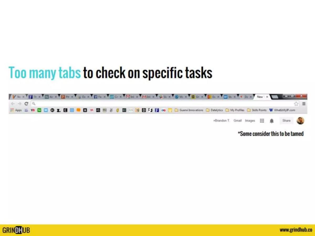
- The deck identifies a specific user pain point: 'Too many tabs to check on specific tasks' on slide 2.
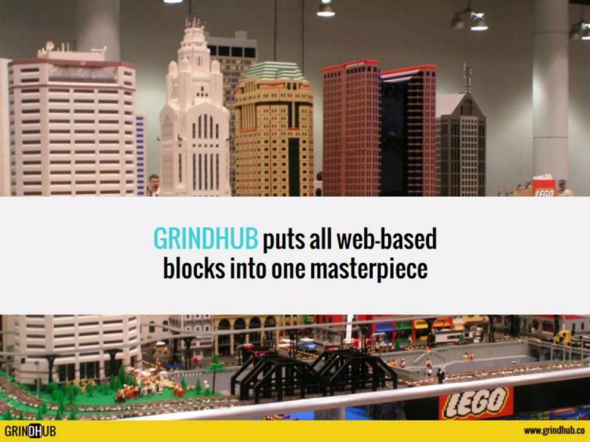
- GrindHub positions itself as a tool to put 'all web-based blocks into one masterpiece' as shown on slide 3.
- The product workflow is simplified into a three-step process: sign-in, add services/users, and 'Get stuff done!' on slide 4.
- The deck claims three primary benefits: reduced tabs, enhanced collaboration, and working in one spot on slide 5.
- Traction is limited to a '2nd beta run' with 100 users as of April, according to the timeline on slide 6.
- The company planned a Seed Round for August, following a public launch in May, per slide 6.
- There is no mention of a business model, pricing, or how the company intends to generate revenue.
- The deck lacks a team slide, leaving the founders' backgrounds and technical capabilities unknown.
The GrindHub Pitch Deck Analysis
GrindHub enters the productivity space with a pitch focused on simplicity and consolidation. The deck is characterized by a minimalist aesthetic, using large metaphors and minimal text to convey its message. However, for a fundraising document, it leaves significant gaps in the business case that an investor would require to perform due diligence.
Slide 1: Title Slide
The title slide features the GrindHub logo in black and white against a bright yellow background. The tagline, "one dashboard to rule all," is a clear nod to popular culture and immediately establishes the company's ambition: to be the central hub for a user's digital workflow. The branding is bold, but the slide lacks any information regarding the company's location or the specific purpose of the presentation (e.g., "Seed Round Pitch").
Slide 2: The Problem
Slide 2 identifies the pain point: "Too many tabs to check on specific tasks." It uses a screenshot of a browser window with over 20 tabs open and a cluttered bookmark bar. A small note in the corner states, "Some consider this to be tamed," which attempts to build rapport with users who experience even more extreme digital clutter. This is a relatable problem, but the slide does not quantify the cost of this problem in terms of lost time or productivity for businesses.
Slide 3: The Solution Metaphor
Instead of showing a product screenshot immediately, slide 3 uses a photo of a Lego city. The text reads, "GRINDHUB puts all web-based blocks into one masterpiece." This is a conceptual slide intended to convey the idea of organization and integration. While the metaphor is clear, it delays the investor's ability to see what the actual software looks like, which is a risk in a product-led category like productivity tools.
Slide 4: Product Workflow
Slide 4 outlines the user journey in three steps: "1) Sign-in with email, 2) Add services and users, 3) Get stuff done!" The background image is a modern staircase, perhaps symbolizing upward progress. This slide confirms that the tool is intended for both individual use and team collaboration ("add... users"), but it remains vague on the technical execution. There is no mention of API integrations or security protocols for handling multiple logins.
Slide 5: Value Proposition
Slide 5 lists the "Side effects" of using GrindHub: "Reduce opened tabs, Enhance collaboration, Work in one spot." The use of a Dr. Mario graphic is a questionable choice for a professional pitch deck due to potential copyright issues and the informal tone it sets. While the benefits listed are desirable, they are qualitative. The deck would be stronger if it cited data on how much time is saved or how much collaboration is improved.
Slide 6: Traction and Timeline
This is the most data-rich slide in the deck. It outlines the following milestones:
Feb: Prototype · Mar: Private beta - 20 users · Apr: 2nd beta run - 100 users · May: Public launch · Aug: Seed Round
The timeline shows a very tight window between the prototype and the public launch. The user numbers (100 users) are modest, suggesting the company is in the very early stages of validating product-market fit. The background of the slide appears to be a Google Calendar interface, which reinforces the productivity theme but makes the text slightly harder to read.
Slide 7: Contact Information
The final slide provides the website (www.grindhub.co), a Facebook link, and an email address for Brandon at Guanxi Innovations . The inclusion of a parent company name suggests that GrindHub may be a project coming out of a venture studio or a smaller development shop. There is no final "ask" on this slide—no mention of the dollar amount being raised or the intended use of funds.
What Works in This Deck
The deck excels at identifying a universal frustration . Almost every knowledge worker has experienced the cognitive load of managing too many browser tabs. By focusing heavily on this one problem, GrindHub makes its value proposition easy to understand in seconds. The visual consistency of the yellow branding throughout the slides also helps in creating a memorable, if somewhat informal, brand identity. Furthermore, the clear timeline gives investors a sense of the founders' intended pace, even if the user numbers are currently low.
What Is Missing
The omissions in this deck are significant and would likely prevent it from securing institutional funding in its current form:
Business Model: There is no explanation of how GrindHub will make money. Is it a SaaS subscription? A freemium model? Enterprise licensing? · Market Size (TAM/SAM/SOM): The deck does not address how many people suffer from this problem or how large the addressable market for productivity dashboards is. · Competition: The dashboard aggregation space is crowded (e.g., Shift, Station, Franz). Failing to acknowledge competitors makes the founders look uninformed about their own industry. · Team: Investors invest in people. The lack of a team slide means there is no evidence of the founders' ability to build, scale, or sell this product. · The Ask: A pitch deck should clearly state how much money is being raised and what milestones that money will help the company achieve.
Founder Takeaways
Founders should look at this deck as a lesson in narrative vs. substance . While the narrative of "fixing the tab problem" is strong, the substance of the business is missing. If you are building a productivity tool, use metaphors sparingly. Investors want to see the actual interface (UI/UX) because, in this sector, the product is the moat. Additionally, avoid using copyrighted characters like Dr. Mario; it signals a lack of professionalism. Finally, always include a Team slide and a Business Model slide —without these, you have a product concept, not a startup pitch.
Frequently asked questions
- What is the core problem GrindHub is trying to solve?
- GrindHub targets 'tab fatigue.' As stated on slide 2, users struggle with having 'too many tabs to check on specific tasks.' The deck uses a screenshot of a cluttered browser to illustrate the inefficiency of switching between multiple web-based tools, positioning this fragmentation as the primary obstacle to productivity.
- How does the product actually work?
- The deck provides a very high-level overview on slide 4. It describes a three-step process: signing in with an email, adding services and users, and then using the dashboard to work. It implies a centralized interface that aggregates various third-party web services, though it does not specify which integrations are supported or how the technical architecture handles authentication.
- What stage of development is GrindHub in?
- Based on the timeline on slide 6, the company was in its '2nd beta run' with 100 users in April. It had previously run a private beta with 20 users in March. The deck indicates a public launch was scheduled for May, with a Seed Round following in August, placing the company at the pre-seed or very early seed stage.
- Who is behind GrindHub?
- The deck does not include a dedicated team slide. However, the contact information on slide 7 lists an email address for 'brandon@guanxiinnovations.com' and the browser screenshot on slide 2 shows a profile for '+Brandon T.' This suggests Brandon T. is a key figure, likely operating under the Guanxi Innovations brand.
- Is there a clear path to monetization in this deck?
- No. The deck completely omits a business model, revenue projections, or pricing strategy. It focuses entirely on the user experience and the 'side effects' of using the tool (slide 5), such as enhanced collaboration. Without a slide detailing how the company will make money, it serves more as a product pitch than a comprehensive investment proposal.