Cooleaf's 2013 pitch deck is a 13-slide presentation that prioritizes visual impact over dense information. The deck successfully establishes immediate credibility by leading with a $30,000 MRR figure and a roster of recognizable customers like WestRock and Children's Healthcare of Atlanta. It then builds an emotional and financial 'villain'—employee turnover—citing that it costs 5x an annual salary to replace an employee and totals $11 billion annually. The solution is framed as 'Active Talent Retention' through results, recognition, and relationships. While the deck is visually striking and…
Key takeaways
- The deck leads with immediate traction, showcasing $30k MRR on Slide 2 to validate the business before explaining the product.
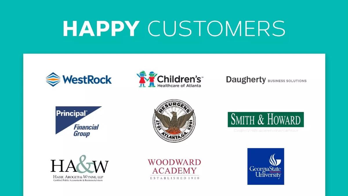
- Social proof is established early with a 'Happy Customers' slide featuring nine logos, including Georgia State University and Principal Financial Group (Slide 3).
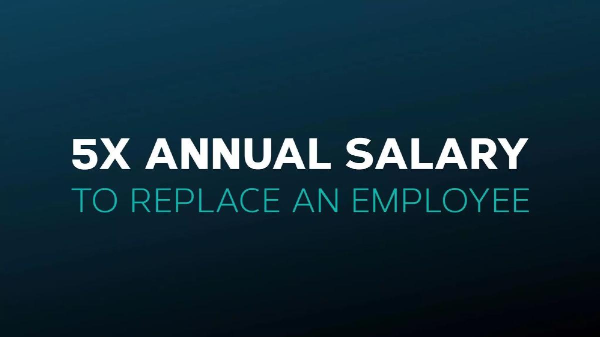
- The problem is quantified with high-stakes metrics: replacing an employee costs 5x their annual salary (Slide 5).
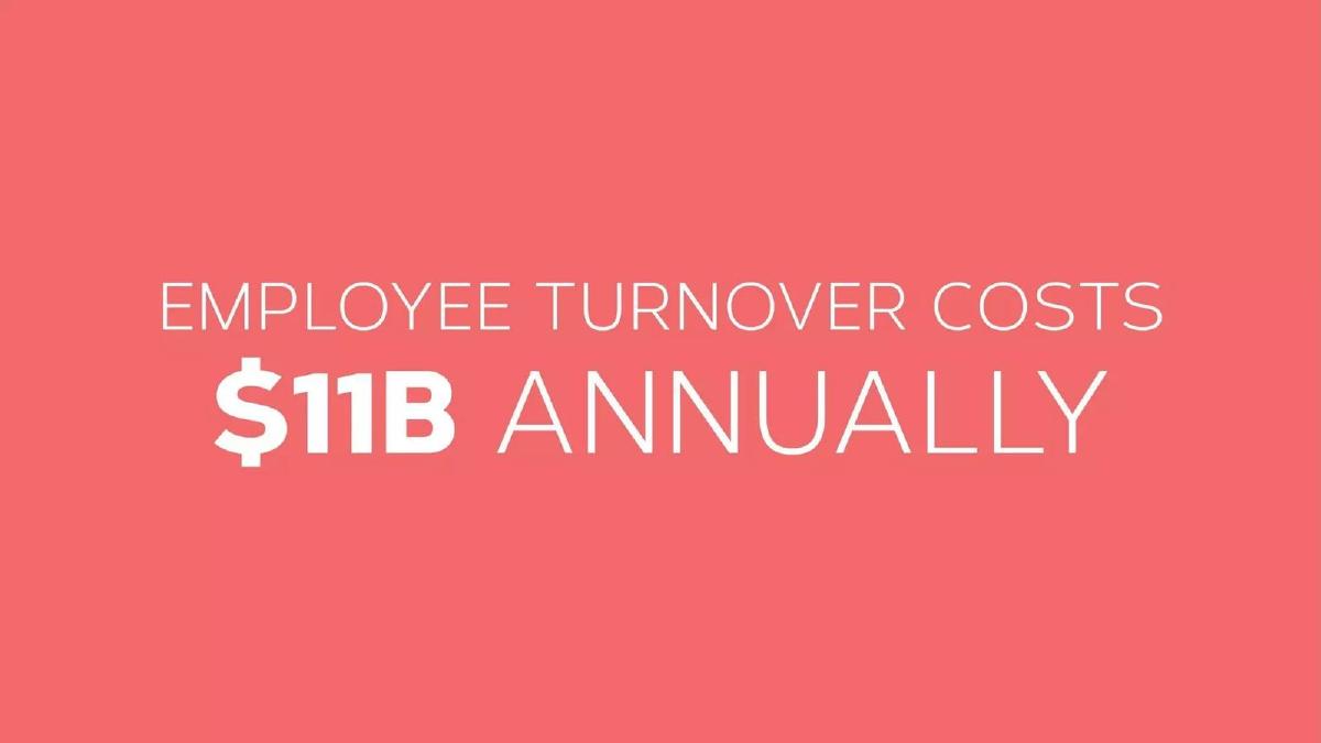
- The macro-market opportunity is defined by an $11B annual cost for employee turnover (Slide 6).
- Cooleaf defines its category as 'Active Talent Retention' based on three pillars: Results, Recognition, and Relationships (Slide 8).
- The value proposition is distilled into a single, powerful outcome: a 40% reduction in unwanted turnover (Slide 9).
- The deck provides a specific ROI example, claiming $1M in savings for a firm with approximately 250 people (Slide 10).
- Product functionality is shown through high-fidelity web and mobile mockups rather than feature lists (Slides 11 and 12).
The Power of Minimalist Traction
Cooleaf’s 13-slide deck from 2013 is a masterclass in the 'less is more' philosophy of fundraising. At a time when many enterprise SaaS decks were cluttered with architectural diagrams and dense feature matrices, Cooleaf opted for a high-impact, visual narrative. The deck doesn't just ask for money; it presents a mathematical inevitability: turnover is expensive, and Cooleaf is the solution to stop the bleeding.
The Hook: Traction and Social Proof
Slide 1: Title The deck opens with a clean logo on a dark gradient background. The inclusion of an AngelList URL and a founder email address in the top right corner suggests this was used as a teaser or a leave-behind deck designed for quick consumption.
Slide 2: $30K MRR This is a bold move. By putting their Monthly Recurring Revenue (MRR) on the second slide in massive white text against a teal background, Cooleaf eliminates the 'does this work?' question immediately. They are leading with proof of product-market fit.
Slide 3: Happy Customers Social proof follows traction. The deck displays logos for WestRock, Children’s Healthcare of Atlanta, Daugherty Business Solutions, Principal Financial Group, Resurgens, Smith & Howard, HA&W, Woodward Academy, and Georgia State University. This mix of healthcare, education, and financial services proves the platform's horizontal applicability.
The Villain: The High Cost of Turnover
Slide 4: Crazy Using a still from 'The Wolf of Wall Street,' this slide acts as a pattern interrupt. It signals a shift from 'what we have achieved' to 'the problem we are solving.'
Slide 5: 5X Annual Salary The deck begins to build its economic case. It states that it costs 5x an annual salary to replace an employee. This is the 'anchor' metric that makes the eventual cost of Cooleaf’s software seem negligible by comparison.
Slide 6: $11B Annually Cooleaf zooms out to the macro level, stating that employee turnover costs $11B annually. This defines the Total Addressable Market (TAM) not by how much companies spend on HR software, but by how much they are losing due to the problem the software solves.
The Solution: Active Talent Retention
Slide 7: Modernizing Retention The company mission is stated simply: "We help companies modernize their approach to talent retention." It’s a bridge between the $11B problem and the Cooleaf product.
Slide 8: Active Talent Retention Cooleaf breaks its solution into three pillars: Results, Recognition, and Relationships. This is the closest the deck gets to a 'how it works' slide, using icons to represent a holistic approach to employee engagement.
Slide 9: 40% Reduction This is the 'hero' metric. Cooleaf claims a 40% reduction in unwanted turnover. By placing this on its own slide in large font, they ensure the investor associates the company with a specific, high-value outcome.
Slide 10: $1M Savings To make the 40% reduction tangible, Cooleaf provides a case study example: $1M in savings for a firm with approximately 250 people. This allows an investor to quickly calculate the potential ROI for any given customer size.
Product and Team
Slide 11: Web Interface The deck shows a comprehensive dashboard. Notable data points visible on the mockup include 315 published events, 1,015 registrations, and 442,181 reward points earned. This reinforces the 'Traction' theme by showing the platform in active use with real data.
Slide 12: Mobile Interface Two iPhone mockups show the 'Home' feed and an 'Interests' selection screen. This demonstrates that the solution is accessible for on-the-go employees, a key requirement for modern engagement tools.
Slide 13: Thank You / Team The final slide features a group photo of six team members. While it lacks names and titles, the bottom of the slide features logos of prestigious institutions and companies: Emory University, Fanatics, McKesson, IBM, American Express, Georgia Tech, and Availity. This implies that the team or their previous experience is rooted in these high-caliber organizations.
What Works
Metric-First Storytelling: Leading with $30k MRR and following up with a 40% turnover reduction creates a narrative of success that is hard to ignore. · Visual Hierarchy: The use of massive typography for key figures ensures that even a 30-second skim of the deck conveys the core value proposition. · Economic Framing: By framing the problem in terms of 'replacement cost' and 'annual loss,' Cooleaf moves the conversation from 'employee happiness' (a soft metric) to 'bottom-line savings' (a hard metric).
What is Missing
The Ask: There is no slide indicating how much money is being raised, the valuation, or the milestones the funding will help achieve. · Business Model: The deck does not explain the pricing structure. Is it a flat fee, per-seat, or tiered? This is a critical piece of information for evaluating the $30k MRR. · Competition: The employee engagement and recognition space is crowded. The deck fails to mention competitors or explain Cooleaf’s unique moat. · Detailed Team Bios: A group photo is a nice touch for culture, but investors need to know the specific pedigree of the founders and their ability to scale an enterprise SaaS company.
What a Founder Should Copy
The 'Villain' Slide: Every founder should have a slide like Slide 5 or 6 that quantifies the cost of the status quo. If you can prove your customer is losing money by NOT using your product, the sale becomes much easier. · The Outcome Slide: Slide 9 ("40% Reduction") is perfect. Don't bury your results in a bulleted list; give your biggest win its own stage. · Clean Design: The consistent use of the brand's teal and coral palette, combined with high-quality product mockups, makes the company look professional and established, even at an early stage.
Frequently asked questions
- What is the primary strength of the Cooleaf pitch deck?
- The primary strength is its extreme clarity and focus on ROI. By using large, bold text for key metrics—like the $11B turnover cost and the 40% reduction in turnover—the deck ensures that the investor remembers the 'why' and the 'what' without getting bogged down in technical details. It effectively frames the product as a cost-saving necessity rather than a 'nice-to-have' HR tool.
- Does the deck explain how Cooleaf makes money?
- No, the deck completely omits a business model or pricing slide. While it mentions $30k MRR, it does not specify if this revenue comes from per-user SaaS fees, annual contracts, or implementation services. For a 'Later' stage deck as categorized, this is a significant omission that would require extensive follow-up discussion regarding unit economics and scalability.
- How does Cooleaf handle the 'Product' section?
- Cooleaf uses two slides (11 and 12) to show the product interface. Slide 11 displays a web dashboard showing 'Most Popular Events,' 'Most Active Employees,' and 'Reward Points Earned.' Slide 12 shows a mobile app interface for interest-based groups like cycling and cooking. This visual approach demonstrates that the platform is built and functional without using bulleted feature lists.
- What is missing from the Cooleaf deck?
- The deck is missing several standard components: a dedicated team slide with professional backgrounds (though a group photo exists on Slide 13), a competitive analysis, a go-to-market strategy, and a specific 'Ask' slide detailing how much capital is being raised and how it will be deployed. It relies heavily on the strength of its current traction to fill these gaps.
- Is the use of the 'Wolf of Wall Street' image effective?
- Slide 4 features Leonardo DiCaprio from 'The Wolf of Wall Street' with the word 'CRAZY.' While this adds personality and breaks the monotony of corporate slides, it is a risky choice. It serves as a transition to the 'crazy' costs of turnover, but some investors might find the association with a film about financial fraud to be off-brand for a professional HR platform.