The Fingertips Lab deck for their product, O6, is an exercise in extreme minimalism, consisting of only seven slides. It focuses heavily on the visual and functional integration of a tactile hardware controller with a mobile app to solve the problem of distracted driving. By highlighting a massive pain point—660,000 drivers looking at phones every second—and contrasting their sub-100 millisecond response time against industry giants like Amazon and Google, the deck builds a case for technical superiority. However, the deck is notably light on business fundamentals, omitting a market size anal…
Key takeaways
- The deck identifies a specific safety crisis: 660,000 US drivers look away from the road every second to check smartphones (Slide 2).
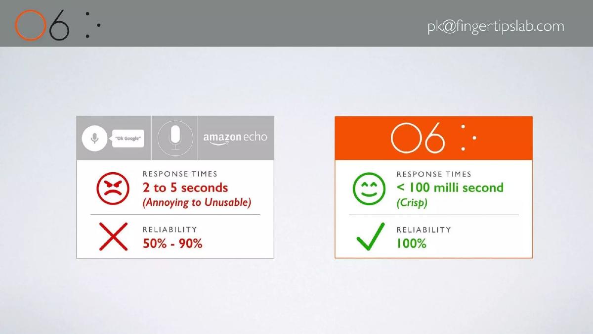
- O6 claims a technical performance advantage with response times under 100 milliseconds, compared to 2-5 seconds for Amazon Echo and Google (Slide 4).
- The company asserts 100% reliability for their system, contrasting it with a 50%-90% reliability range for voice-based competitors (Slide 4).
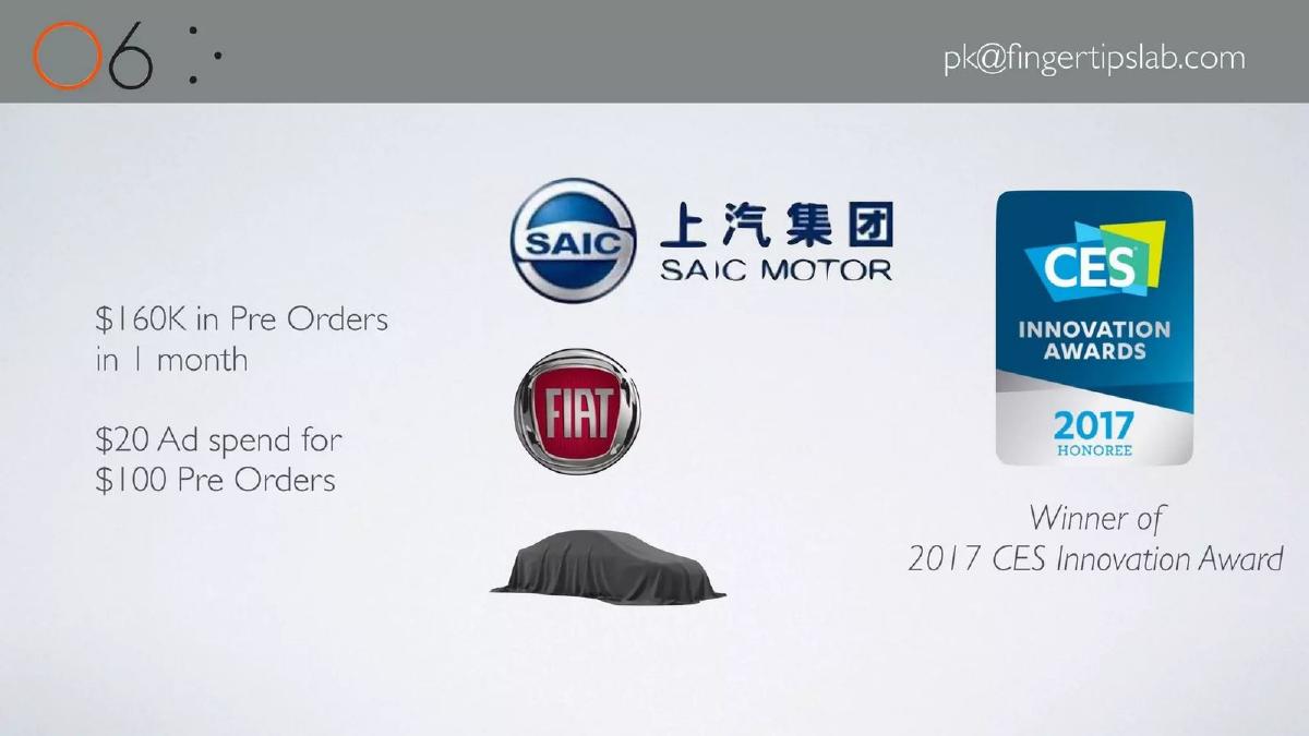
- Traction is demonstrated through $160,000 in pre-orders generated within a single month (Slide 5).
- The marketing efficiency is highlighted by a metric of $20 in ad spend resulting in $100 in pre-orders (Slide 5).
- The startup received external validation as a 2017 CES Innovation Award Honoree (Slide 5).
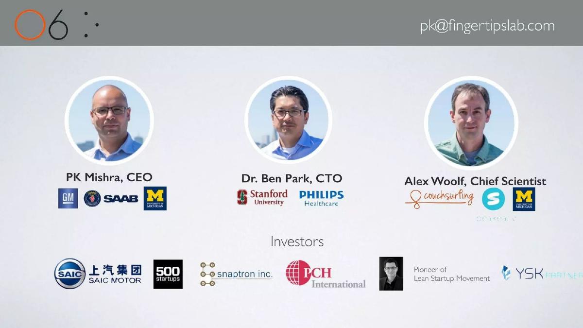
- The team features experience from major corporations and institutions including GM, Saab, Philips Healthcare, and Stanford University (Slide 6).
- Existing backing includes notable entities such as SAIC Motor, 500 Startups, and PCH International (Slide 6).
The O6 Pitch Deck: A Minimalist Approach to Hardware Fundraising
Fingertips Lab entered the market with O6 at a time when distracted driving was becoming a top-tier public safety concern. Their pitch deck, consisting of only seven slides, is a study in visual storytelling and performance-based differentiation. Rather than overwhelming the reader with text-heavy slides about market dynamics, the founders chose to lead with the product's physical form and its immediate technical advantages over voice-controlled incumbents.
The deck is highly focused on the 'how' and 'who,' but leaves the 'how much' and 'what next' to the imagination. For a hardware startup, which typically requires significant capital for manufacturing and distribution, this level of brevity is unusual and suggests the deck may have been used as a teaser or a supplement to a more detailed technical demonstration.
Slide 1: Title and Visual Identity
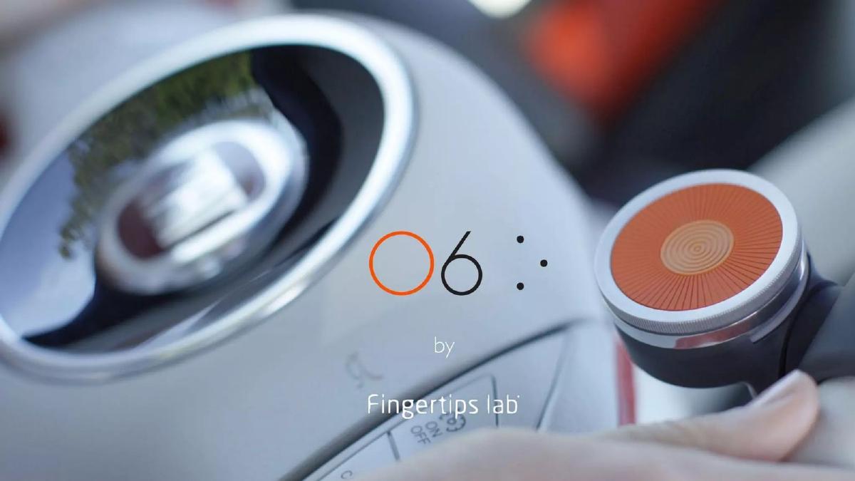
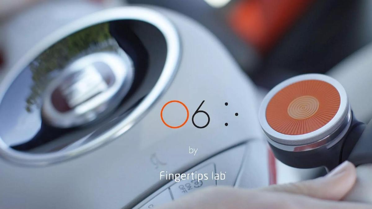
The opening slide serves as a high-quality product shot. It features the O6 device—a circular, tactile controller with an orange center—mounted in a vehicle. The branding is clean, identifying the product as 'O6 by Fingertips Lab.' By placing the device in a high-end automotive context (a Fiat dashboard), the slide immediately establishes the primary use case without needing a single word of explanation. The design language is premium, signaling that this is not a cheap plastic peripheral but a considered piece of hardware engineering.
Slide 2: The Problem Statement
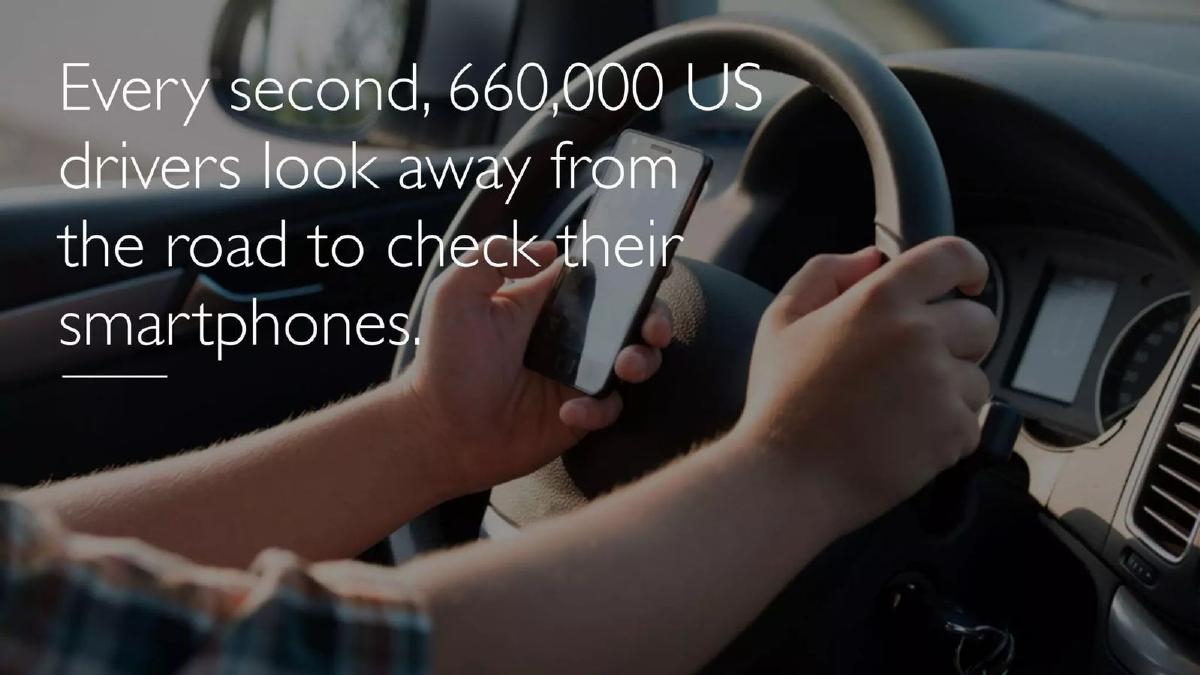
Slide 2 is a classic 'shock' slide. It features a dark, blurred image of a driver holding a smartphone while behind the wheel. The text is sparse but impactful: 'Every second, 660,000 US drivers look away from the road to check their smartphones.' By using a specific, large-scale statistic, the deck validates the urgency of the problem. It frames the product not just as a convenience, but as a safety necessity. The use of a simple underline under the final word emphasizes the source of the distraction.
Slide 3: The Solution in Context
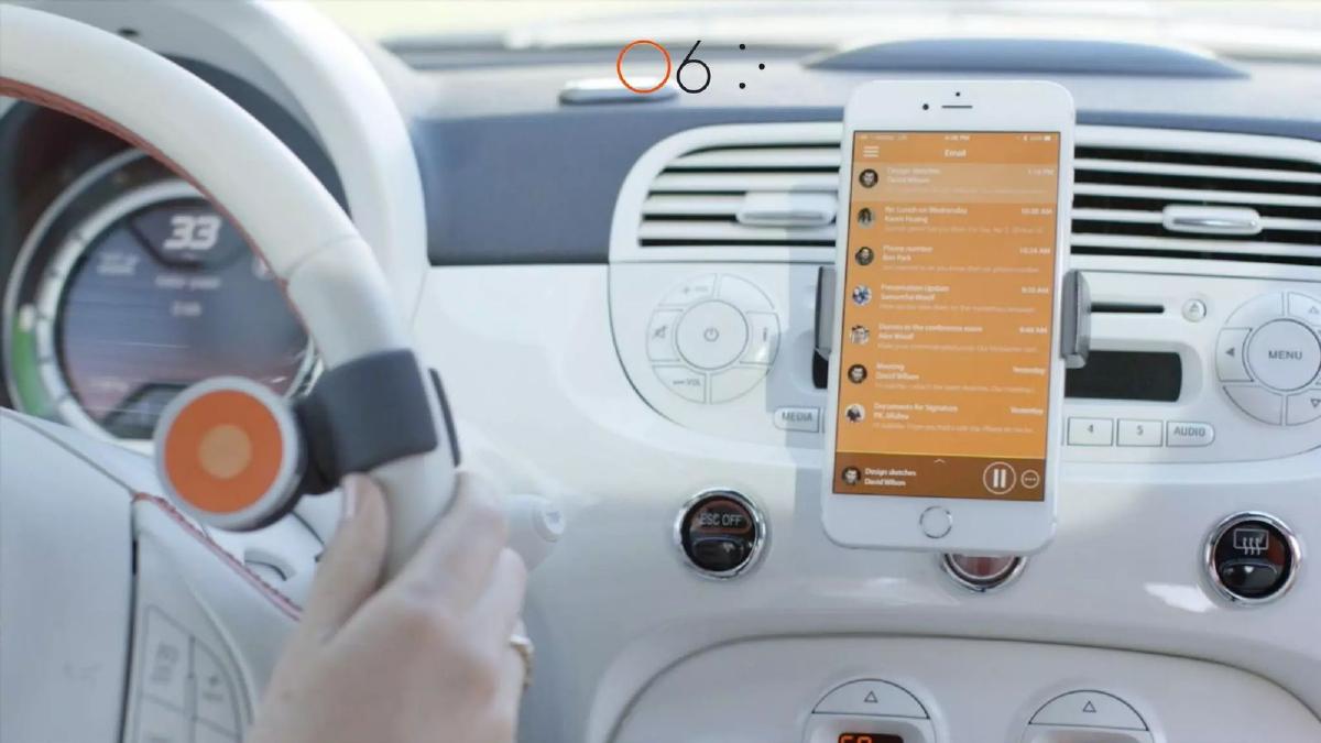
This slide provides a clear view of the hardware-software integration. It shows the O6 controller mounted on a steering wheel, while a smartphone in a dashboard mount displays the O6 app interface. The app appears to be an email inbox converted into a media-player-style list. This visual confirms the catalogue description: the system turns 'inboxes into interactive audio playlists.' The proximity of the controller to the driver's thumb demonstrates the 'eyes-free' ergonomics that the company is pitching as its core value proposition.
Slide 4: Technical Differentiation and Competitive Landscape
Slide 4 is the most data-dense slide in the deck. It sets up a head-to-head comparison between O6 and industry standards like 'Ok Google' and 'Amazon Echo.' The comparison is divided into two metrics: Response Times and Reliability. O6 claims response times of ' , which it describes as 'Crisp,' while the competitors are listed at '2 to 5 seconds,' described as 'Annoying to Unusable.' Furthermore, O6 claims '100%' reliability , contrasting with the '50% - 90%' reliability of voice assistants. This slide is designed to address the primary frustration users have with voice commands—latency and failure to understand—positioning O6's tactile approach as the superior alternative.
Slide 5: Traction and Validation
To prove that there is market appetite for this solution, Slide 5 lists three key achievements. First, it notes '$160K in Pre Orders in 1 month.' Second, it provides a unit economic hint: '$20 Ad spend for $100 Pre Orders,' suggesting a healthy 5:1 return on marketing spend. Finally, it displays the 'CES Innovation Awards 2017 Honoree' badge. The inclusion of the SAIC Motor and Fiat logos, alongside a silhouetted car, suggests ongoing conversations or integrations with major automotive manufacturers, though the exact nature of these relationships is not detailed on the slide.
Slide 6: The Team and Investors
The team slide emphasizes pedigree and industry experience. CEO PK Mishra is linked to GM, Saab, and the University of Michigan . CTO Dr. Ben Park is associated with Stanford University and Philips Healthcare . Chief Scientist Alex Woolf is credited with Couchsurfing and the University of Michigan . Below the team, the deck lists an impressive roster of investors and partners, including SAIC Motor, 500 Startups, Snaptron Inc., PCH International, and YSK Partner . It also mentions a 'Pioneer of Lean Startup Movement,' likely referring to an individual advisor or investor. This slide aims to de-risk the investment by showing that experienced operators and reputable firms are already involved.
Slide 7: Closing Visual
The final slide is a minimalist close, showing a close-up of the O6 app interface on an iPhone next to the physical device in a different colorway (blue). The app screen shows a list of emails with timestamps from 4/5/16, including names like 'Karen Huang' and 'Ben Park.' This reinforces the product's function as a communication tool and serves as a final reminder of the hardware-software synergy before the presentation ends.
What Works in the Fingertips Lab Deck
The primary strength of this deck is its visual clarity . In an era of cluttered slides, Fingertips Lab uses high-resolution photography and ample white space to let the product speak for itself. The hardware looks finished and professional, which is a major hurdle for early-stage hardware startups to overcome in the eyes of investors.
The competitive comparison on Slide 4 is also highly effective. By choosing two specific, measurable pain points—latency and reliability—the founders create a clear 'why now' and 'why us' argument. They aren't just saying they are better; they are claiming a 20x to 50x improvement in speed, which is a compelling technical hook.
Finally, the traction metrics on Slide 5 are concise. The $20 to $100 ad-spend-to-pre-order ratio is a powerful way to demonstrate that the product has a clear path to scalable customer acquisition, even if the total dollar amount ($160k) is relatively small for a hardware launch.
What is Missing from the Fingertips Lab Deck
The most glaring omission is the Financial Ask and Use of Funds . An investor viewing this deck would have no idea how much money the company is seeking or what milestones that money would buy. This suggests the deck was likely used for general partnership meetings or as a high-level overview rather than a formal Series A or Seed round pitch.
There is also no Market Size (TAM) slide . While the problem of 660,000 distracted drivers is mentioned, the deck fails to translate this into a dollar-value market opportunity. Investors need to know if this is a niche accessory for tech enthusiasts or a mass-market safety device that could be integrated into every car on the road.
Additionally, the Business Model is vague. While pre-orders are mentioned, the deck does not explain the long-term revenue strategy. Is it a one-time hardware sale? Is there a subscription for the app's premium features? Is there a B2B play with insurance companies or automakers? These questions are left unanswered.
What a Founder Should Copy from this Deck
Founders should emulate the minimalist design and high-quality imagery . If you are building a physical product, the quality of your renders or photos is your first impression of your engineering standards. Fingertips Lab succeeds in making the O6 look like a premium consumer electronic device.
The direct competitive comparison is another element worth copying. Instead of a generic 'feature checkmark' grid, Fingertips Lab focused on two metrics that actually matter to the user experience. If your product is faster or more reliable than the market leader, put the numbers on the slide and let the contrast do the work.
Lastly, the use of logos for social proof on the team and investor slides is handled well. By placing the logos of GM, Stanford, and 500 Startups directly under the relevant names, the deck communicates authority instantly without requiring the reader to scan through long paragraphs of biographical text.
Final Thoughts
The Fingertips Lab deck for O6 is a 'product-first' presentation. It excels at showing what the device is and why it is technically superior to voice-only alternatives. However, as a fundraising tool, it is incomplete. It lacks the structural business data—market size, revenue model, and funding requirements—that professional investors require to conduct due diligence. It is a brilliant example of how to pitch a product, but a cautionary tale on how much business context can be lost when minimalism is taken to the extreme.
Frequently asked questions
- What is the primary problem Fingertips Lab is solving?
- The deck focuses on the danger of distracted driving. Slide 2 states that 660,000 US drivers look at their phones every second. The O6 product aims to mitigate this by providing a tactile, eyes-free way to interact with mobile content, turning apps and messages into audio playlists that can be controlled without visual engagement.
- How does O6 compare to existing voice assistants like Siri or Alexa?
- Slide 4 provides a direct comparison. O6 claims a response time of less than 100 milliseconds, which it labels as 'Crisp,' while competitors like Amazon Echo and Google are listed at 2 to 5 seconds. Additionally, O6 claims 100% reliability, whereas voice assistants are rated between 50% and 90% reliable in the deck's assessment.
- What evidence of market demand does the deck provide?
- The deck cites $160,000 in pre-orders achieved in one month on Slide 5. It also provides a glimpse into their customer acquisition cost efficiency, stating that $20 of advertising spend converted into $100 of pre-orders. This suggests a 5x return on ad spend during their initial pre-order phase.
- Who are the key people behind Fingertips Lab?
- The leadership team includes CEO PK Mishra, who has a background with GM and Saab; CTO Dr. Ben Park, with experience at Stanford and Philips Healthcare; and Chief Scientist Alex Woolf, who has ties to Couchsurfing and the University of Michigan. The deck also lists 500 Startups and SAIC Motor as investors on Slide 6.
- What is missing from this pitch deck that an investor would typically expect?
- This deck is missing several standard components: a slide defining the Total Addressable Market (TAM), a detailed business model or pricing strategy, a roadmap for future product development, and a specific funding ask. There is no mention of how much capital is being raised or how that capital will be allocated to achieve specific milestones.