PartyRound’s deck is a radical departure from traditional fundraising materials, consisting of only seven slides with almost no data, team bios, or market sizing. Instead, it relies on a powerful 'X for Y' analogy—specifically, 'Venmo for fundraising'—to immediately anchor the investor's understanding of the product's utility. The deck focuses entirely on the user experience, illustrating a three-step process for both founders and investors to close rounds using SAFEs. While it lacks the standard rigors of a Seed or Series A deck, such as unit economics or competitive landscapes, its visual c…
Key takeaways
- The deck uses a high-impact anchor statement on Slide 1, defining the company as 'Venmo for fundraising' to simplify a complex regulated process.
- Product functionality is reduced to a simple three-step workflow for founders: Create a round, Configure SAFE, and Invite investors (Slide 3).
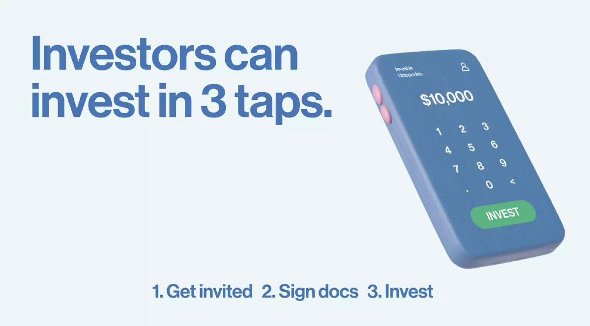
- The investor experience is mirrored as a three-tap process: Get invited, Sign docs, and Invest (Slide 4).
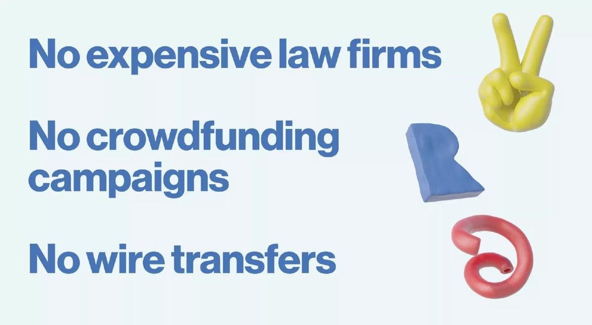
- The deck explicitly positions itself against three major pain points: expensive law firms, crowdfunding campaigns, and wire transfers (Slide 6).
- There is a complete absence of a team slide, omitting founder backgrounds or previous successes.
- No financial projections, current traction, or specific 'Ask' amount are included in the 7-slide sequence.
- The visual identity is highly cohesive, using 3D clay-style renders to make 'boring' fintech feel accessible and modern (Slides 1-7).
The Power of the Minimalist Narrative
The PartyRound deck is a case study in extreme brevity. At only seven slides, it ignores almost every rule in the traditional fundraising playbook. There is no market slide, no competitive matrix, no team slide, and no financial model. Instead, the deck functions as a visual manifesto for a product that aims to remove friction from the venture capital process. By the time an investor reaches the final slide, they understand exactly what the product does, who it is for, and what legacy problems it solves, even without a single spreadsheet in sight.
Slide 1: The Anchor Analogy
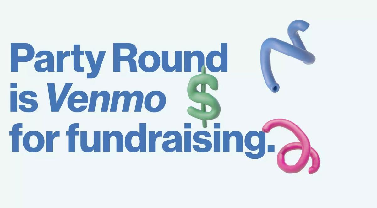
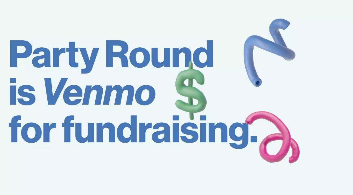
Slide 1 opens with a bold, blue-text statement: "Party Round is Venmo for fundraising." This is a classic 'X for Y' value proposition. By invoking Venmo, the company immediately communicates three things: it is mobile-first, it is social, and it makes moving money effortless. The background features abstract 3D shapes, including a green dollar sign, establishing a playful but financial context. This slide does the heavy lifting of positioning the brand before the user even sees a feature.
Slide 2: The Target Audience
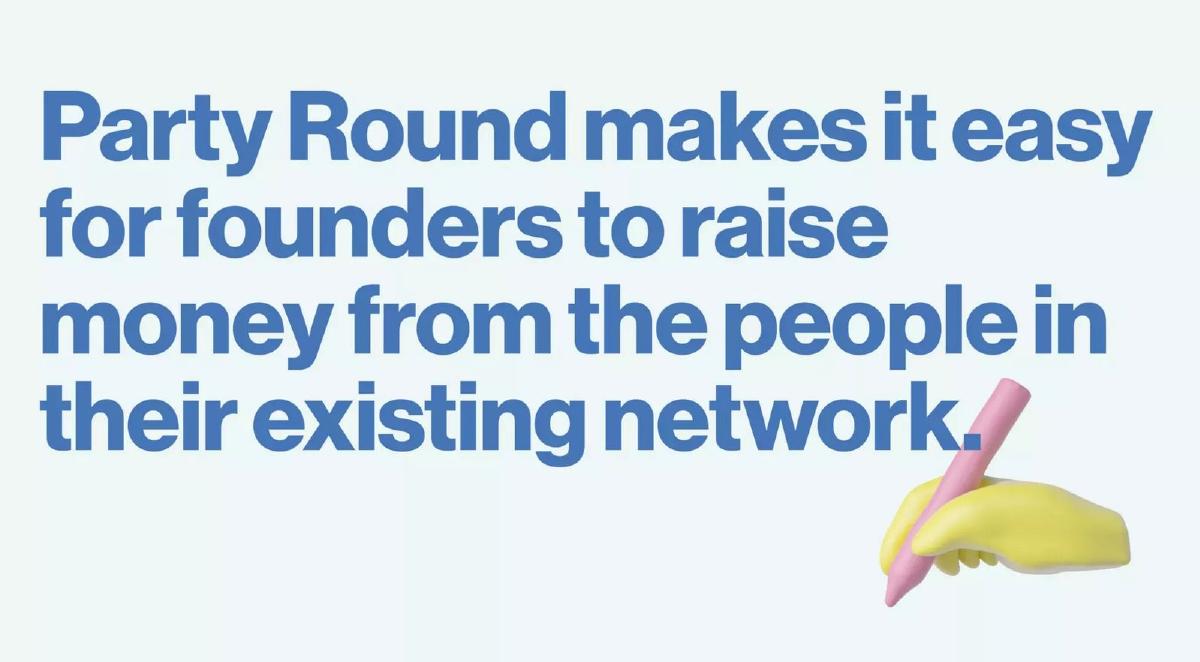
Slide 2 states, "Party Round makes it easy for founders to raise money from the people in their existing network." This slide defines the 'Who' and the 'How.' It narrows the scope from general fundraising to 'network-based' fundraising. The imagery of a yellow hand holding a pink pen suggests the act of signing or creating, reinforcing the theme of active participation.
Slide 3: The Founder Workflow
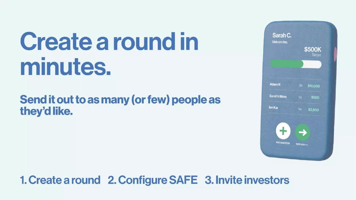
Slide 3 introduces the product interface via a 3D render of a mobile device. The headline is "Create a round in minutes." Below the main text, the deck outlines a three-step process: "1. Create a round 2. Configure SAFE 3. Invite investors." The phone screen shows a mockup for 'Unicorn Inc.' with a "$500K Target" and a list of investors including 'Adam N' for $10,000 and 'Sarah's Mom' for $500. This is a critical detail; it shows the platform handles both professional checks and small personal amounts, democratizing the cap table.
Slide 4: The Investor Workflow
Slide 4 mirrors the previous slide but focuses on the check-writer. "Investors can invest in 3 taps." The steps are listed as: "1. Get invited 2. Sign docs 3. Invest." The visual shows a simple keypad interface with a "$10,000" amount and a large green "INVEST" button. This slide addresses the primary pain point for angel investors: the administrative burden of signing documents and coordinating wires.
Slide 5: The Value Proposition
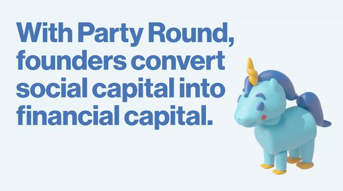
Slide 5 moves into the philosophical benefit: "With Party Round, founders convert social capital into financial capital." This is the 'Why.' It suggests that founders have value in their networks that is currently trapped by the high friction of traditional fundraising. The inclusion of a 3D unicorn character adds to the 'party' atmosphere and leans into the startup culture aesthetic.
Slide 6: The 'No' Slide (Competitive Positioning)
Slide 6 is the closest the deck gets to a competitive analysis, but it frames it through negation. It lists: "No expensive law firms," "No crowdfunding campaigns," and "No wire transfers." By doing this, PartyRound identifies its three biggest enemies: cost, complexity, and legacy banking infrastructure. It positions the product as the 'clean' alternative to these messy, traditional methods.
Slide 7: The Call to Action
The final slide, Slide 7, features the headline "Welcome to the Party" above four clay-style characters. The only contact information provided is "jordi@partyround.co." There is no 'Ask' slide detailing how much money they are raising or what the valuation is. This suggests the deck was used as a teaser or as part of a highly sought-after round where the terms were likely discussed verbally or in a separate term sheet.
What Works in This Deck
The primary strength of this deck is its clarity of vision . By using a single, well-understood analogy (Venmo), the founders avoid having to explain the technicalities of fintech infrastructure. The visual consistency is also exceptional. The 3D claymation style is carried through every slide, creating a brand identity that feels friendly and approachable—the polar opposite of a traditional bank or law firm. Finally, the process simplification (the 1-2-3 steps on Slides 3 and 4) makes a daunting task like 'raising a seed round' seem as simple as ordering a pizza.
What Is Missing
From a traditional analyst's perspective, this deck is missing almost everything required for due diligence. There is no team slide. We do not know if the founders have ever built a regulated financial product before. There is no market sizing (TAM/SAM/SOM). While we know founders raise money, the deck doesn't quantify how many founders or how much total volume PartyRound expects to capture. There is no business model. It is unclear if they charge a flat fee, a percentage of the round, or a SaaS subscription. Most importantly, there is no traction data. We don't know if 'Unicorn Inc.' from Slide 3 is a real customer or a hypothetical example.
What Founders Should Copy
Founders should emulate the radical simplification found here. If you can explain your product in three steps, do it. If you can find a 'household name' analogy that fits your business, use it. PartyRound proves that you don't need 20 slides of text to get an investor's attention; you need a compelling narrative that promises to solve a specific, painful problem. Additionally, the brand-first approach is a powerful way to signal that you are building something for a specific subculture (in this case, modern tech founders), which can create a sense of community and 'FOMO' among investors who want to be part of that 'party.'
Frequently asked questions
- Why does this deck have no team slide?
- PartyRound likely relied on the existing reputation of its founders in the tech ecosystem or used this deck as a visual supplement to a conversation rather than a standalone document. In high-hype rounds, founders sometimes omit bios to keep the focus entirely on the 'vibe' and the product's simplicity, though this is risky for unknown teams.
- Is 'Venmo for fundraising' a legally accurate description?
- Slide 1 uses this as a metaphorical hook. While the underlying mechanics involve SAFEs and regulated banking (Slide 3 mentions SVB), the analogy communicates the speed and social ease of the transaction rather than the specific regulatory framework. It tells the investor how the product *feels* to use.
- How does the deck handle competition?
- It doesn't name specific competitors like AngelList or Republic. Instead, Slide 6 lists 'expensive law firms' and 'crowdfunding campaigns' as the status quo it intends to replace. This frames the competition as 'friction' and 'cost' rather than specific rival software platforms.
- What is the significance of the claymation-style graphics?
- The 3D renders (Slides 5 and 7) serve to differentiate the brand from 'stiff' traditional finance tools. By using playful imagery, PartyRound signals that they are building for a new generation of founders who value design and user experience over legacy banking interfaces.
- Can a typical startup raise money with only 7 slides and no data?
- Generally, no. This deck is an outlier that works because the product itself is a tool for fundraising. It demonstrates the 'show, don't tell' principle. Most startups will need to include market size, business model, and traction slides which are entirely absent here.