Bubbletask’s 2015 pitch deck is a study in minimalist, icon-driven storytelling. The company identifies a clear pain point in professional services: the financial and reputational cost of disorganized client communication. The deck effectively uses visual contrast to show product evolution, moving from a basic 'Bootstrap' prototype to a sophisticated Kanban-style interface featuring integrated chat. While the market slide provides a strong macro tailwind with a $21 billion projection for cloud collaboration, the deck relies heavily on hypothetical traction steps rather than realized historica…
Key takeaways
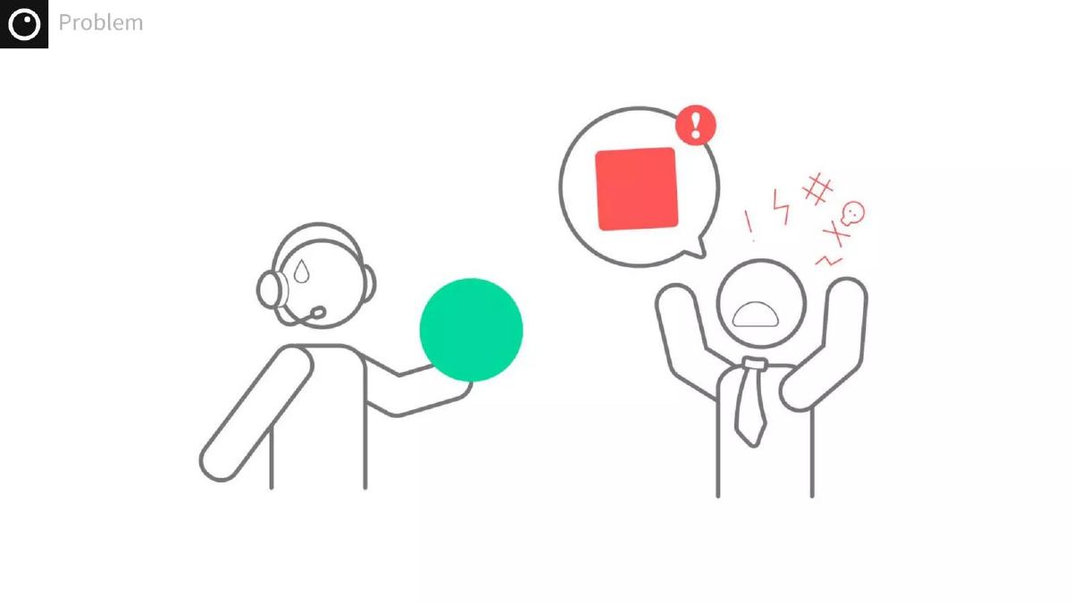
- The problem is framed around three pillars: messy communication, lost trust/clients, and waste of resources (Slide 3).
- The product evolution is shown through a 'first prototype' based on Bootstrap elements (Slide 5) compared to a high-fidelity final UI (Slide 6).
- The final product interface integrates a Kanban board with a persistent sidebar chat, featuring a 'General Electric Ltd.' placeholder client (Slide 6).
- Market size is cited as $21 billion by 2018 for cloud-based collaboration applications, based on WinterGreen Research (Slide 8).
- The 'Projection of traction' outlines a three-step plan starting with a free trial for 20 companies for one year (Slide 9).
- Revenue tiers are projected at $9, $49, and $99 price points, aiming for 2,500 total users by the third phase (Slide 9).
- The team slide is entirely non-functional, featuring only an image of a Bigfoot figurine and the text 'SO PROUD!' (Slide 2).
- The deck lacks a specific 'Ask' slide or financial breakdown of how investment capital would be deployed.
Executive Summary: The Minimalist Workflow Pitch
Bubbletask’s 2015 deck is a product of its time, leaning heavily into the flat design aesthetic and icon-based storytelling popularized by early SaaS successes. The deck focuses almost entirely on the 'What' and the 'How' of the product, while leaving the 'Who' and the 'How Much' largely unanswered. It presents a clear transition from a technical prototype to a user-centric design, which is a strong signal for early-stage investors interested in product-led growth.
Slides 1-2: Branding and the Missing Team
The deck opens with a clean, mint-green title slide featuring the Bubbletask logo—a simple circle with an inner dot, suggestive of an eye or a 'bubble.' It establishes a modern, tech-forward brand identity immediately. However, Slide 2, titled Team , is a complete departure from professional standards. It shows a Bigfoot figurine in a forest with a speech bubble stating 'SO PROUD!' There are no names, titles, or LinkedIn profiles. In a fundraising context, this is a wasted slide. Investors back people, and by omitting the team's credentials, the founders miss the opportunity to establish their authority in the project management space.
Slide 3: The Cost of Chaos
Slide 3, titled Problem , uses simple line illustrations to communicate three pain points. First, 'Messy communication,' represented by two figures overwhelmed by floating icons for mail, phone calls, and notes. Second, 'Lost trust, credibility and clients,' shown by a one-star rating and a client walking away in anger. Third, 'Waste of time, resources and therefore money,' depicted by Euro, Dollar, and Yen symbols being dropped into a trash bin. This slide is effective because it connects abstract organizational problems to concrete financial losses.
Slides 4-7: The Product Evolution
Slide 4 is a simple transition slide labeled Solution . This leads into Slide 5, which shows the First prototype based on Bootstrap elements . This is a crucial inclusion for a seed-stage deck. It shows that the team has already built something functional, even if it lacks aesthetic polish. The prototype shows a simple progress bar and a list of tasks like 'Bring first mentors to meet' and 'Create product MVP.'
Slide 6 provides the 'After' shot—a high-fidelity UI. This interface is a significant step up, featuring a Kanban-style board with columns for 'TO DO (backlog),' 'DOING,' and 'DONE.' A key differentiator visible here is the integrated 'Chat' sidebar on the right. By placing communication directly next to the task board, Bubbletask visually addresses the 'messy communication' problem mentioned on Slide 3. The use of a recognizable name like 'General Electric Ltd.' as a placeholder client helps investors visualize the product in a corporate B2B environment.
Slide 7 returns to the line-art style of the problem slide, showing the two figures now in sync, with green squares (representing tasks) in their speech bubbles and a green checkmark between them. This reinforces the idea that the 'Solution' is alignment.
Slide 8: Market Opportunity
The Market size slide asks, 'Is it growing?' and answers with a resounding yes. Citing WinterGreen Research, the slide shows a bar graph of expected revenues for cloud-based collaboration applications. The graph projects a rise from roughly $4 billion in 2011 to $21 billion by 2018. The use of a third-party research firm adds a layer of objective credibility to the pitch, suggesting that even a small slice of this market represents a massive revenue opportunity.
Slide 9: The Traction Roadmap
The final slide in this set, Projection of traction | Steps , outlines a three-phase go-to-market strategy. 1st (2 months) : Target 20 companies for a 1-year free trial. 2nd (2-3 months) : Convert 50 users at a $9 price point. 3rd (6 months) : Scale to 1,500 users at $9, 750 users at $49, and 250 users at $99. This slide is purely speculative ('Projection'), which is less powerful than a slide showing actual historical growth. However, it does demonstrate that the founders have thought through their pricing tiers and the volume of users required to reach significant revenue.
What Bubbletask Does Well
The deck excels at visual consistency. The color palette is restricted to mint green, white, and grey, which makes the product screenshots pop. The transition from the 'Bootstrap' prototype to the final UI is a very smart move; it proves the team can build (Slide 5) and that they have a vision for a premium user experience (Slide 6). By focusing on the 'Client' aspect of project management, they carve out a specific niche in a crowded market dominated by internal-only tools like Trello or Asana.
What is Missing from the Deck
The Team: As noted, Slide 2 provides zero information about the founders. Without knowing if the team has experience in SaaS, engineering, or project management, the rest of the deck feels like a hypothetical exercise. · The Ask: There is no slide indicating how much money is being raised, the valuation, or what the milestones for the next 18 months look like. · Unit Economics: While Slide 9 shows pricing tiers, it doesn't mention Customer Acquisition Cost (CAC) or Lifetime Value (LTV) projections, which are vital for SaaS investors. · Competition: The deck ignores the elephant in the room. By 2015, Slack, Trello, and Asana were already established. Bubbletask needed a slide explaining why their integrated chat/Kanban approach was superior to using two separate tools.
Founder's Guide: What to Copy
Show the 'Ugly' Version: Don't be afraid to show your early MVP or Bootstrap prototype. It demonstrates a bias toward action and shows how far your design thinking has evolved. It makes the 'Final UI' look even more impressive by comparison.
Connect Pain to Profit: Bubbletask’s problem slide (Slide 3) doesn't just say 'communication is hard.' It says communication is a 'waste of money.' Always tie your problem back to the bottom line of your target customer.
Use Third-Party Data: If you are in a growing sector, find a reputable research firm (like Gartner, Forrester, or in this case, WinterGreen) to validate your market size. It is much more convincing than a founder's 'back of the napkin' estimate.
Keep it Simple: The use of icons and minimal text makes the deck very easy to digest in under two minutes. In an initial screening, brevity is a competitive advantage.
Frequently asked questions
- What specific problem does Bubbletask aim to solve?
- According to Slide 3, Bubbletask targets the inefficiencies of 'messy communication.' It specifically highlights the downstream effects of this messiness: the loss of client trust and credibility, and the literal 'waste of money' illustrated by currency symbols being thrown into a trash can. It positions itself as a tool to prevent client churn caused by administrative disorganization.
- How does the product handle client-facing collaboration?
- Slide 6 shows a sophisticated UI where project tasks are categorized into 'TO DO,' 'DOING,' and 'DONE' columns. Uniquely, it features a right-hand sidebar dedicated to 'Chat,' allowing for real-time discussion alongside specific tasks. The presence of a 'Client' field (labeled General Electric Ltd.) suggests the platform is intended for agencies or firms to collaborate directly with their external customers.
- What is Bubbletask's pricing strategy based on the deck?
- Slide 9 outlines a tiered subscription model. The initial phase involves a free trial to gain 20 companies. The subsequent 'steps' project a low-tier entry at $9 per user, a mid-tier at $49, and a high-tier at $99. The goal is to scale from 50 users in the second phase to 2,500 users across all tiers by the end of the third phase (approximately 11 months total).
- What market data does the company use to justify its existence?
- On Slide 8, the company cites a report from WinterGreen Research. The chart shows a steady climb in revenues for cloud-based collaboration applications, starting from approximately $4 billion in 2011 and projected to reach $21 billion by 2018. This is used to demonstrate that Bubbletask is entering a high-growth sector with significant tailwinds.
- Is there a clear team or leadership section in this deck?
- No. Slide 2 is titled 'Team' but contains no names, biographies, or professional history. Instead, it features a stylized photo of a Bigfoot toy with a speech bubble saying 'SO PROUD!' This is a significant omission for a professional pitch, as it provides no evidence of the founders' ability to execute the vision.